@zulkarnainshah/ng-rating-bar
Version:
Fully customizable rating bar component for Angular based apps
143 lines (102 loc) • 4.14 kB
Markdown
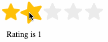
**ng-rating-bar** is a fully customizable rating bar component for Angular based applications. It supports displaying read-only ratings, editable ratings, average ratings, customizable icons/images to use in place of the default stars and much more.
This library was generated with [Angular CLI](https://github.com/angular/angular-cli) version 13.2.0.
1. Run `npm i @zulkarnainshah/ng-rating-bar` to install the library
2. Create a new folder named **ng-rating-bar** inside your **assets** folder
3. Modify your **angular.json** file to add the following object to the **assets** array after the **src/assets** line :
"assets":[
"src/favicon.ico",
"src/assets",
```json
{
"glob": "**/*",
"input": "./node_modules/@zulkarnainshah/ng-rating-bar/assets",
"output": "./assets/ng-rating-bar"
}
```
]
1. In your `app.module.ts` file add the following import:
```
import NgRatingBarModule from @zulkarnainshah/ng-rating-bar
```
2. Then add `NgRatingBarModule` in the imports array of `app.module.ts`:
```
imports: [...., NgRatingBarModule]
```
By default 3 image resources are included with the library for showing filled, half and empty stars. You can modify the images for each of those states by supplying your own images. Just place your **png** images _(at least 256 x 256)_ inside the **assets** folder (not necessarily inside the **ng-rating-bar** folder) and pass their path as input parameters to the component for the following attributes:
- filledImgSrc
- halfFilledImgSrc
- emptyImgSrc
You can use the component in any of your templates like below:
Example 1 : Using default 5 as totalStars and setting the rating to 4.
```
<ng-rating-bar
[]="4">
</ng-rating-bar>
```
Example 2 : 6 totalStars with fractional rating
```
<ng-rating-bar
[]="1.5"
[]="6">
</ng-rating-bar>
```
Example 3: Changing the default size of the star images
```
<ng-rating-bar
[]="1.5"
[]="10"
size="40px">
</ng-rating-bar>
```
Example 4: Using custom images for filled, half-filled and empty stars
```
<ng-rating-bar
[]="3.5"
[]="5"
size="25px"
filledImgSrc="../../assets/tomato.png"
halfFilledImgSrc="../../assets/tomato_half.png"
emptyImgSrc="../../assets/tomato_empty.png">
</ng-rating-bar>
```
Example 5: Disabling mouse events by passing **true** to the **disabled** property
```
<ng-rating-bar
[]="3"
[]="5"
[]="true"
>
</ng-rating-bar>
```
Example 6: Handling **ratingChanged** event
```
<ng-rating-bar
[]="3.5"
[]="5"
(ratingChanged)="onRatingChanged($event)">
</ng-rating-bar>
```
**onRatingChanged** method you will implement in your component and the **$event** parameter will contain the new rating (number type)
## Properties table
| Name | Type | Required | Default |
| :--------------- | ------- | -------- | :----------------------------------- |
| rating | number | optional | 0 |
| totalStars | number | optional | 5 |
| size | string | optional | 20px |
| filledImgSrc | string | optional | assets/ng-rating-bar/star_filled.png |
| halfFilledImgSrc | string | optional | assets/ng-rating-bar/star_half.png |
| emptyImgSrc | string | optional | assets/ng-rating-bar/star_empty.png |
| disabled | boolean | optional | false |
| animateOnHover | boolean | optional | true |
| gap | string | optional | 3px |
## Events table
| Name | Return Type | Required | Fires when |
| :------------ | ----------- | -------- | :-------------------- |
| ratingChanged | number | optional | User clicks on a star |
## Demo