@wordpress/editor
Version:
Enhanced block editor for WordPress posts.
1,642 lines (1,010 loc) • 54.3 kB
Markdown
# Editor
This module utilizes components from the `@wordpress/block-editor` package. Having an awareness of the concept of a WordPress post, it associates the loading and saving mechanism of the value representing blocks to a post and its content. It also provides various components relevant for working with a post object in the context of an editor (e.g., a post title input component). This package can support editing posts of any post type and does not assume that rendering happens in any particular WordPress screen or layout arrangement.
## Installation
Install the module
```bash
npm install @wordpress/editor --save
```
_This package assumes that your code will run in an **ES2015+** environment. If you're using an environment that has limited or no support for such language features and APIs, you should include [the polyfill shipped in `@wordpress/babel-preset-default`](https://github.com/WordPress/gutenberg/tree/HEAD/packages/babel-preset-default#polyfill) in your code._
## How it works
The logic flow concerning the editor includes: inferring a block representation of the post content (parsing); describing the state of a post (representation); rendering of the post to the DOM (rendering); attaching controls to manipulate the content a.k.a blocks (UI).
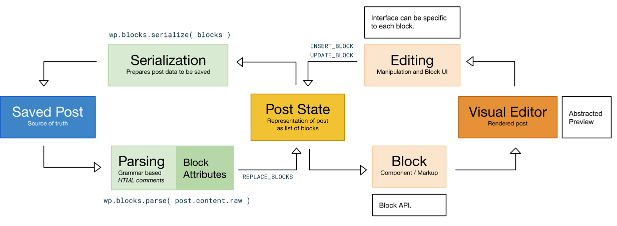
The goal of the editor element is to let the user manipulate the content of their posts in a deterministic way—organized through the presence of blocks of content. Usually, in a declarative flow, the pieces that compose a post would be represented in a certain order and the machine would be able to generate an output view from it with the necessary UI controls. However, we don’t begin in WordPress with a representation of the state of the post that is conductive to this expression nor one that even has any knowledge of blocks because content is stored in a serialized way in a single field.
Such a crucial step is handled by the grammar parsing which takes the serialized content of the post and infers an ordered block list using, preferably, syntax hints present in HTML comments. The editor is initialized with a state representation of the block nodes generated by the parsing of the raw content of a post element: `wp.blocks.parse( post.content.raw )`.
The _visual editor_ is thus a component that contains and renders the list of block nodes from the internal state into the page. This removes any trace of imperative handling when it comes to finding a block and manipulating a block. As a matter of fact, the visual editor or the text editor are just two different—equally valid—views of the same representation of state. The internal representation of the post content is updated as blocks are updated and it is serialized back to be saved in `post_content`.
Individual blocks are handled by the `VisualBlock` component, which attaches event handlers and renders the `edit` function of a block definition to the document with the corresponding attributes and local state. The `edit` function is the markup shape of a component while in editing mode.
## Components
Because many blocks share the same complex behaviors, reusable components are made available to simplify implementations of your block's `edit` function.
### `BlockControls`
When returned by your block's `edit` implementation, renders a toolbar of icon buttons. This is useful for block-level modifications to be made available when a block is selected. For example, if your block supports alignment, you may want to display alignment options in the selected block's toolbar.
Example:
```js
( function ( editor, React ) {
var el = React.createElement,
BlockControls = editor.BlockControls,
AlignmentToolbar = editor.AlignmentToolbar;
function edit( props ) {
return [
// Controls: (only visible when block is selected)
el(
BlockControls,
{ key: 'controls' },
el( AlignmentToolbar, {
value: props.align,
onChange: function ( nextAlign ) {
props.setAttributes( { align: nextAlign } );
},
} )
),
// Block content: (with alignment as attribute)
el(
'p',
{ key: 'text', style: { textAlign: props.align } },
'Hello World!'
),
];
}
} )( window.wp.editor, window.React );
```
Note in this example that we render `AlignmentToolbar` as a child of the `BlockControls` element. This is another pre-configured component you can use to simplify block text alignment.
Alternatively, you can create your own toolbar controls by passing an array of `controls` as a prop to the `BlockControls` component. Each control should be an object with the following properties:
- `icon: string` - Slug of the Dashicon to be shown in the control's toolbar button
- `title: string` - A human-readable localized text to be shown as the tooltip label of the control's button
- `subscript: ?string` - Optional text to be shown adjacent the button icon as subscript (for example, heading levels)
- `isActive: ?boolean` - Whether the control should be considered active / selected. Defaults to `false`.
To create divisions between sets of controls within the same `BlockControls` element, passing `controls` instead as a nested array (array of arrays of objects). A divider will be shown between each set of controls.
### `RichText`
Render a rich [`contenteditable` input](https://developer.mozilla.org/en-US/docs/Web/Guide/HTML/Editable_content), providing users the option to add emphasis to content or links to content. It behaves similarly to a [controlled component](https://facebook.github.io/react/docs/forms.html#controlled-components), except that `onChange` is triggered less frequently than would be expected from a traditional `input` field, usually when the user exits the field.
The following properties (non-exhaustive list) are made available:
- `value: string` - Markup value of the field. Only valid markup is
allowed, as determined by `inline` value and available controls.
- `onChange: Function` - Callback handler when the value of the field changes,
passing the new value as its only argument.
- `placeholder: string` - A text hint to be shown to the user when the field
value is empty, similar to the
[`input` and `textarea` attribute of the same name](https://developer.mozilla.org/en-US/docs/Learn/HTML/Forms/HTML5_updates#The_placeholder_attribute).
Example:
```js
( function ( editor, React ) {
var el = React.createElement,
RichText = editor.RichText;
function edit( props ) {
function onChange( value ) {
props.setAttributes( { text: value } );
}
return el( RichText, {
value: props.attributes.text,
onChange: onChange,
} );
}
// blocks.registerBlockType( ..., { edit: edit, ... } );
} )( window.wp.editor, window.React );
```
## API
<!-- START TOKEN(Autogenerated API docs) -->
### AlignmentToolbar
> **Deprecated** since 5.3, use `wp.blockEditor.AlignmentToolbar` instead.
### Autocomplete
> **Deprecated** since 5.3, use `wp.blockEditor.Autocomplete` instead.
### AutosaveMonitor
Monitors the changes made to the edited post and triggers autosave if necessary.
The logic is straightforward: a check is performed every `props.interval` seconds. If any changes are detected, `props.autosave()` is called. The time between the change and the autosave varies but is no larger than `props.interval` seconds. Refer to the code below for more details, such as the specific way of detecting changes.
There are two caveats:
- If `props.isAutosaveable` happens to be false at a time of checking for changes, the check is retried every second.
- The timer may be disabled by setting `props.disableIntervalChecks` to `true`. In that mode, any change will immediately trigger `props.autosave()`.
_Usage_
```jsx
<AutosaveMonitor interval={ 30000 } />
```
_Parameters_
- _props_ `Object`: - The properties passed to the component.
- _props.autosave_ `Function`: - The function to call when changes need to be saved.
- _props.interval_ `number`: - The maximum time in seconds between an unsaved change and an autosave.
- _props.isAutosaveable_ `boolean`: - If false, the check for changes is retried every second.
- _props.disableIntervalChecks_ `boolean`: - If true, disables the timer and any change will immediately trigger `props.autosave()`.
- _props.isDirty_ `boolean`: - Indicates if there are unsaved changes.
### BlockAlignmentToolbar
> **Deprecated** since 5.3, use `wp.blockEditor.BlockAlignmentToolbar` instead.
### BlockControls
> **Deprecated** since 5.3, use `wp.blockEditor.BlockControls` instead.
### BlockEdit
> **Deprecated** since 5.3, use `wp.blockEditor.BlockEdit` instead.
### BlockEditorKeyboardShortcuts
> **Deprecated** since 5.3, use `wp.blockEditor.BlockEditorKeyboardShortcuts` instead.
### BlockFormatControls
> **Deprecated** since 5.3, use `wp.blockEditor.BlockFormatControls` instead.
### BlockIcon
> **Deprecated** since 5.3, use `wp.blockEditor.BlockIcon` instead.
### BlockInspector
> **Deprecated** since 5.3, use `wp.blockEditor.BlockInspector` instead.
### BlockList
> **Deprecated** since 5.3, use `wp.blockEditor.BlockList` instead.
### BlockMover
> **Deprecated** since 5.3, use `wp.blockEditor.BlockMover` instead.
### BlockNavigationDropdown
> **Deprecated** since 5.3, use `wp.blockEditor.BlockNavigationDropdown` instead.
### BlockSelectionClearer
> **Deprecated** since 5.3, use `wp.blockEditor.BlockSelectionClearer` instead.
### BlockSettingsMenu
> **Deprecated** since 5.3, use `wp.blockEditor.BlockSettingsMenu` instead.
### BlockTitle
> **Deprecated** since 5.3, use `wp.blockEditor.BlockTitle` instead.
### BlockToolbar
> **Deprecated** since 5.3, use `wp.blockEditor.BlockToolbar` instead.
### CharacterCount
Renders the character count of the post content.
_Returns_
- `number`: The character count.
### cleanForSlug
Performs some basic cleanup of a string for use as a post slug
This replicates some of what sanitize_title() does in WordPress core, but is only designed to approximate what the slug will be.
Converts Latin-1 Supplement and Latin Extended-A letters to basic Latin letters. Removes combining diacritical marks. Converts whitespace, periods, and forward slashes to hyphens. Removes any remaining non-word characters except hyphens and underscores. Converts remaining string to lowercase. It does not account for octets, HTML entities, or other encoded characters.
_Parameters_
- _string_ `string`: Title or slug to be processed
_Returns_
- `string`: Processed string
### ColorPalette
> **Deprecated** since 5.3, use `wp.blockEditor.ColorPalette` instead.
### ContrastChecker
> **Deprecated** since 5.3, use `wp.blockEditor.ContrastChecker` instead.
### CopyHandler
> **Deprecated** since 5.3, use `wp.blockEditor.CopyHandler` instead.
### createCustomColorsHOC
> **Deprecated** since 5.3, use `wp.blockEditor.createCustomColorsHOC` instead.
### DefaultBlockAppender
> **Deprecated** since 5.3, use `wp.blockEditor.DefaultBlockAppender` instead.
### DocumentBar
This component renders a navigation bar at the top of the editor. It displays the title of the current document, a back button (if applicable), and a command center button. It also handles different states of the document, such as "not found" or "unsynced".
_Usage_
```jsx
<DocumentBar />
```
_Parameters_
- _props_ `Object`: The component props.
- _props.title_ `string`: A title for the document, defaulting to the document or template title currently being edited.
- _props.icon_ `IconType`: An icon for the document, no default. (A default icon indicating the document post type is no longer used.)
_Returns_
- `React.ReactNode`: The rendered DocumentBar component.
### DocumentOutline
Renders a document outline component.
_Parameters_
- _props_ `Object`: Props.
- _props.onSelect_ `Function`: Function to be called when an outline item is selected
- _props.hasOutlineItemsDisabled_ `boolean`: Indicates whether the outline items are disabled.
_Returns_
- `React.ReactNode`: The rendered component.
### DocumentOutlineCheck
Component check if there are any headings (core/heading blocks) present in the document.
_Parameters_
- _props_ `Object`: Props.
- _props.children_ `React.ReactNode`: Children to be rendered.
_Returns_
- `React.ReactNode`: The component to be rendered or null if there are headings.
### EditorHistoryRedo
Renders the redo button for the editor history.
_Parameters_
- _props_ `Object`: - Props.
- _ref_ `Ref`: - Forwarded ref.
_Returns_
- `React.ReactNode`: The rendered component.
### EditorHistoryUndo
Renders the undo button for the editor history.
_Parameters_
- _props_ `Object`: - Props.
- _ref_ `Ref`: - Forwarded ref.
_Returns_
- `React.ReactNode`: The rendered component.
### EditorKeyboardShortcuts
Handles the keyboard shortcuts for the editor.
It provides functionality for various keyboard shortcuts such as toggling editor mode, toggling distraction-free mode, undo/redo, saving the post, toggling list view, and toggling the sidebar.
### EditorKeyboardShortcutsRegister
Component for registering editor keyboard shortcuts.
_Returns_
- `Element`: The component to be rendered.
### EditorNotices
> **Deprecated** since 7.0, use `wp.notices.InlineNotices` instead.
### EditorProvider
This component establishes a new post editing context, and serves as the entry point for a new post editor (or post with template editor).
It supports a large number of post types, including post, page, templates, custom post types, patterns, template parts.
All modification and changes are performed to the `@wordpress/core-data` store.
_Usage_
```jsx
<EditorProvider
post={ post }
settings={ settings }
__unstableTemplate={ template }
>
{ children }
</EditorProvider>
```
_Parameters_
- _props_ `Object`: The component props.
- _props.post_ `[Object]`: The post object to edit. This is required.
- _props.\_\_unstableTemplate_ `[Object]`: The template object wrapper the edited post. This is optional and can only be used when the post type supports templates (like posts and pages).
- _props.settings_ `[Object]`: The settings object to use for the editor. This is optional and can be used to override the default settings.
- _props.children_ `[React.ReactNode]`: Children elements for which the BlockEditorProvider context should apply. This is optional.
_Returns_
- `React.ReactNode`: The rendered EditorProvider component.
### EditorSnackbars
> **Deprecated** since 7.0, use `wp.notices.SnackbarNotices` instead.
### EntitiesSavedStates
Renders the component for managing saved states of entities.
_Parameters_
- _props_ `Object`: The component props.
- _props.close_ `Function`: The function to close the dialog.
- _props.renderDialog_ `boolean=`: Whether to render the component with modal dialog behavior.
- _props.variant_ `string`: Changes the layout of the component. When an `inline` value is provided, the action buttons are rendered at the end of the component instead of at the start.
_Returns_
- `React.ReactNode`: The rendered component.
### ErrorBoundary
ErrorBoundary is used to catch JavaScript errors anywhere in a child component tree, log those errors, and display a fallback UI.
It uses the lifecycle methods getDerivedStateFromError and componentDidCatch to catch errors in a child component tree.
getDerivedStateFromError is used to render a fallback UI after an error has been thrown, and componentDidCatch is used to log error information.
### FontSizePicker
> **Deprecated** since 5.3, use `wp.blockEditor.FontSizePicker` instead.
### getColorClassName
> **Deprecated** since 5.3, use `wp.blockEditor.getColorClassName` instead.
### getColorObjectByAttributeValues
> **Deprecated** since 5.3, use `wp.blockEditor.getColorObjectByAttributeValues` instead.
### getColorObjectByColorValue
> **Deprecated** since 5.3, use `wp.blockEditor.getColorObjectByColorValue` instead.
### getFontSize
> **Deprecated** since 5.3, use `wp.blockEditor.getFontSize` instead.
### getFontSizeClass
> **Deprecated** since 5.3, use `wp.blockEditor.getFontSizeClass` instead.
### getTemplatePartIcon
Helper function to retrieve the corresponding icon by area name.
_Parameters_
- _areaOrIconName_ `string`: The area name (e.g., 'header', 'navigation-overlay').
_Returns_
- `Object`: The corresponding icon.
### InnerBlocks
> **Deprecated** since 5.3, use `wp.blockEditor.InnerBlocks` instead.
### Inserter
> **Deprecated** since 5.3, use `wp.blockEditor.Inserter` instead.
### InspectorAdvancedControls
> **Deprecated** since 5.3, use `wp.blockEditor.InspectorAdvancedControls` instead.
### InspectorControls
> **Deprecated** since 5.3, use `wp.blockEditor.InspectorControls` instead.
### LocalAutosaveMonitor
Monitors local autosaves of a post in the editor. It uses several hooks and functions to manage autosave behavior:
- `useAutosaveNotice` hook: Manages the creation of a notice prompting the user to restore a local autosave, if one exists.
- `useAutosavePurge` hook: Ejects a local autosave after a successful save occurs.
- `hasSessionStorageSupport` function: Checks if the current environment supports browser sessionStorage.
- `LocalAutosaveMonitor` component: Uses the `AutosaveMonitor` component to perform autosaves at a specified interval.
The module also checks for sessionStorage support and conditionally exports the `LocalAutosaveMonitor` component based on that.
### MediaPlaceholder
> **Deprecated** since 5.3, use `wp.blockEditor.MediaPlaceholder` instead.
### MediaUpload
> **Deprecated** since 5.3, use `wp.blockEditor.MediaUpload` instead.
### mediaUpload
Upload a media file when the file upload button is activated. Wrapper around uploadMedia() that injects the current post ID.
_Parameters_
- _$0_ `Object`: Parameters object passed to the function.
- _$0.additionalData_ `?Object`: Additional data to include in the request.
- _$0.allowedTypes_ `string`: Array with the types of media that can be uploaded, if unset all types are allowed.
- _$0.filesList_ `Array`: List of files.
- _$0.maxUploadFileSize_ `?number`: Maximum upload size in bytes allowed for the site.
- _$0.onError_ `Function`: Function called when an error happens.
- _$0.onFileChange_ `Function`: Function called each time a file or a temporary representation of the file is available.
- _$0.onSuccess_ `Function`: Function called after the final representation of the file is available.
- _$0.multiple_ `boolean`: Whether to allow multiple files to be uploaded.
### MediaUploadCheck
> **Deprecated** since 5.3, use `wp.blockEditor.MediaUploadCheck` instead.
### MultiSelectScrollIntoView
> **Deprecated** since 5.3, use `wp.blockEditor.MultiSelectScrollIntoView` instead.
### NavigableToolbar
> **Deprecated** since 5.3, use `wp.blockEditor.NavigableToolbar` instead.
### ObserveTyping
> **Deprecated** since 5.3, use `wp.blockEditor.ObserveTyping` instead.
### PageAttributesCheck
Wrapper component that renders its children only if the post type supports page attributes.
_Parameters_
- _props_ `Object`: - The component props.
- _props.children_ `React.ReactNode`: - The child components to render.
_Returns_
- `React.ReactNode`: The rendered child components or null if page attributes are not supported.
### PageAttributesOrder
Renders the Page Attributes Order component. A number input in an editor interface for setting the order of a given page. The component is now not used in core but was kept for backward compatibility.
_Returns_
- `React.ReactNode`: The rendered component.
### PageAttributesPanel
Renders the Page Attributes Panel component.
_Returns_
- `React.ReactNode`: The rendered component.
### PageAttributesParent
Renders the Page Attributes Parent component. A dropdown menu in an editor interface for selecting the parent page of a given page.
_Returns_
- `React.ReactNode`: The component to be rendered. Return null if post type is not hierarchical.
### PageTemplate
Provides a dropdown menu for selecting and managing post templates.
The dropdown menu includes a button for toggling the menu, a list of available templates, and options for creating and editing templates.
_Returns_
- `React.ReactNode`: The rendered ClassicThemeControl component.
### PanelColorSettings
> **Deprecated** since 5.3, use `wp.blockEditor.PanelColorSettings` instead.
### PlainText
> **Deprecated** since 5.3, use `wp.blockEditor.PlainText` instead.
### PluginBlockSettingsMenuItem
Renders a new item in the block settings menu.
_Usage_
```js
// Using ES5 syntax
var __ = wp.i18n.__;
var PluginBlockSettingsMenuItem = wp.editor.PluginBlockSettingsMenuItem;
function doOnClick() {
// To be called when the user clicks the menu item.
}
function MyPluginBlockSettingsMenuItem() {
return React.createElement( PluginBlockSettingsMenuItem, {
allowedBlocks: [ 'core/paragraph' ],
icon: 'dashicon-name',
label: __( 'Menu item text' ),
onClick: doOnClick,
} );
}
```
```jsx
// Using ESNext syntax
import { __ } from '@wordpress/i18n';
import { PluginBlockSettingsMenuItem } from '@wordpress/editor';
const doOnClick = () => {
// To be called when the user clicks the menu item.
};
const MyPluginBlockSettingsMenuItem = () => (
<PluginBlockSettingsMenuItem
allowedBlocks={ [ 'core/paragraph' ] }
icon="dashicon-name"
label={ __( 'Menu item text' ) }
onClick={ doOnClick }
/>
);
```
_Parameters_
- _props_ `Object`: Component props.
- _props.allowedBlocks_ `[Array]`: An array containing a list of block names for which the item should be shown. If not present, it'll be rendered for any block. If multiple blocks are selected, it'll be shown if and only if all of them are in the allowed list.
- _props.icon_ `[WPBlockTypeIconRender]`: The [Dashicon](https://developer.wordpress.org/resource/dashicons/) icon slug string, or an SVG WP element.
- _props.label_ `string`: The menu item text.
- _props.onClick_ `Function`: Callback function to be executed when the user click the menu item.
- _props.small_ `[boolean]`: Whether to render the label or not.
- _props.role_ `[string]`: The ARIA role for the menu item.
_Returns_
- `React.ReactNode`: The rendered component.
### PluginDocumentSettingPanel
Renders items below the Status & Availability panel in the Document Sidebar.
_Usage_
```js
// Using ES5 syntax
var el = React.createElement;
var __ = wp.i18n.__;
var registerPlugin = wp.plugins.registerPlugin;
var PluginDocumentSettingPanel = wp.editor.PluginDocumentSettingPanel;
function MyDocumentSettingPlugin() {
return el(
PluginDocumentSettingPanel,
{
className: 'my-document-setting-plugin',
title: 'My Panel',
name: 'my-panel',
},
__( 'My Document Setting Panel' )
);
}
registerPlugin( 'my-document-setting-plugin', {
render: MyDocumentSettingPlugin,
} );
```
```jsx
// Using ESNext syntax
import { registerPlugin } from '@wordpress/plugins';
import { PluginDocumentSettingPanel } from '@wordpress/editor';
const MyDocumentSettingTest = () => (
<PluginDocumentSettingPanel
className="my-document-setting-plugin"
title="My Panel"
name="my-panel"
>
<p>My Document Setting Panel</p>
</PluginDocumentSettingPanel>
);
registerPlugin( 'document-setting-test', { render: MyDocumentSettingTest } );
```
_Parameters_
- _props_ `Object`: Component properties.
- _props.name_ `string`: Required. A machine-friendly name for the panel.
- _props.className_ `[string]`: An optional class name added to the row.
- _props.title_ `[string]`: The title of the panel
- _props.icon_ `[WPBlockTypeIconRender]`: The [Dashicon](https://developer.wordpress.org/resource/dashicons/) icon slug string, or an SVG WP element, to be rendered when the sidebar is pinned to toolbar.
- _props.children_ `React.ReactNode`: Children to be rendered
_Returns_
- `React.ReactNode`: The component to be rendered.
### PluginMoreMenuItem
Renders a menu item in `Plugins` group in `More Menu` drop down, and can be used to as a button or link depending on the props provided. The text within the component appears as the menu item label.
_Usage_
```js
// Using ES5 syntax
var __ = wp.i18n.__;
var PluginMoreMenuItem = wp.editor.PluginMoreMenuItem;
var moreIcon = wp.element.createElement( 'svg' ); //... svg element.
function onButtonClick() {
alert( 'Button clicked.' );
}
function MyButtonMoreMenuItem() {
return wp.element.createElement(
PluginMoreMenuItem,
{
icon: moreIcon,
onClick: onButtonClick,
},
__( 'My button title' )
);
}
```
```jsx
// Using ESNext syntax
import { __ } from '@wordpress/i18n';
import { PluginMoreMenuItem } from '@wordpress/editor';
import { more } from '@wordpress/icons';
function onButtonClick() {
alert( 'Button clicked.' );
}
const MyButtonMoreMenuItem = () => (
<PluginMoreMenuItem icon={ more } onClick={ onButtonClick }>
{ __( 'My button title' ) }
</PluginMoreMenuItem>
);
```
_Parameters_
- _props_ `Object`: Component properties.
- _props.children_ `[React.ReactNode]`: Children to be rendered.
- _props.href_ `[string]`: When `href` is provided then the menu item is represented as an anchor rather than button. It corresponds to the `href` attribute of the anchor.
- _props.icon_ `[WPBlockTypeIconRender]`: The [Dashicon](https://developer.wordpress.org/resource/dashicons/) icon slug string, or an SVG WP element, to be rendered to the left of the menu item label.
- _props.onClick_ `[Function]`: The callback function to be executed when the user clicks the menu item.
- _props.other_ `[...*]`: Any additional props are passed through to the underlying [Button](/packages/components/src/button/README.md) component.
_Returns_
- `React.ReactNode`: The rendered component.
### PluginPostPublishPanel
Renders provided content to the post-publish panel in the publish flow (side panel that opens after a user publishes the post).
_Usage_
```jsx
// Using ESNext syntax
import { __ } from '@wordpress/i18n';
import { PluginPostPublishPanel } from '@wordpress/editor';
const MyPluginPostPublishPanel = () => (
<PluginPostPublishPanel
className="my-plugin-post-publish-panel"
title={ __( 'My panel title' ) }
initialOpen={ true }
>
{ __( 'My panel content' ) }
</PluginPostPublishPanel>
);
```
_Parameters_
- _props_ `Object`: Component properties.
- _props.className_ `[string]`: An optional class name added to the panel.
- _props.title_ `[string]`: Title displayed at the top of the panel.
- _props.initialOpen_ `[boolean]`: Whether to have the panel initially opened. When no title is provided it is always opened.
- _props.icon_ `[WPBlockTypeIconRender]`: The [Dashicon](https://developer.wordpress.org/resource/dashicons/) icon slug string, or an SVG WP element, to be rendered when the sidebar is pinned to toolbar.
- _props.children_ `React.ReactNode`: Children to be rendered
_Returns_
- `React.ReactNode`: The rendered component.
### PluginPostStatusInfo
Renders a row in the Summary panel of the Document sidebar. It should be noted that this is named and implemented around the function it serves and not its location, which may change in future iterations.
_Usage_
```js
// Using ES5 syntax
var __ = wp.i18n.__;
var PluginPostStatusInfo = wp.editor.PluginPostStatusInfo;
function MyPluginPostStatusInfo() {
return React.createElement(
PluginPostStatusInfo,
{
className: 'my-plugin-post-status-info',
},
__( 'My post status info' )
);
}
```
```jsx
// Using ESNext syntax
import { __ } from '@wordpress/i18n';
import { PluginPostStatusInfo } from '@wordpress/editor';
const MyPluginPostStatusInfo = () => (
<PluginPostStatusInfo className="my-plugin-post-status-info">
{ __( 'My post status info' ) }
</PluginPostStatusInfo>
);
```
_Parameters_
- _props_ `Object`: Component properties.
- _props.className_ `[string]`: An optional class name added to the row.
- _props.children_ `React.ReactNode`: Children to be rendered.
_Returns_
- `React.ReactNode`: The rendered component.
### PluginPrePublishPanel
Renders provided content to the pre-publish side panel in the publish flow (side panel that opens when a user first pushes "Publish" from the main editor).
_Usage_
```jsx
// Using ESNext syntax
import { __ } from '@wordpress/i18n';
import { PluginPrePublishPanel } from '@wordpress/editor';
const MyPluginPrePublishPanel = () => (
<PluginPrePublishPanel
className="my-plugin-pre-publish-panel"
title={ __( 'My panel title' ) }
initialOpen={ true }
>
{ __( 'My panel content' ) }
</PluginPrePublishPanel>
);
```
_Parameters_
- _props_ `Object`: Component props.
- _props.className_ `[string]`: An optional class name added to the panel.
- _props.title_ `[string]`: Title displayed at the top of the panel.
- _props.initialOpen_ `[boolean]`: Whether to have the panel initially opened. When no title is provided it is always opened.
- _props.icon_ `[WPBlockTypeIconRender]`: The [Dashicon](https://developer.wordpress.org/resource/dashicons/) icon slug string, or an SVG WP element, to be rendered when the sidebar is pinned to toolbar. If `false` is passed, no icon will be rendered.
- _props.children_ `React.ReactNode`: Children to be rendered
_Returns_
- `React.ReactNode`: The rendered component.
### PluginPreviewMenuItem
Renders a menu item in the Preview dropdown, which can be used as a button or link depending on the props provided. The text within the component appears as the menu item label.
_Usage_
```jsx
import { __ } from '@wordpress/i18n';
import { PluginPreviewMenuItem } from '@wordpress/editor';
import { external } from '@wordpress/icons';
function onPreviewClick() {
// Handle preview action
}
const ExternalPreviewMenuItem = () => (
<PluginPreviewMenuItem icon={ external } onClick={ onPreviewClick }>
{ __( 'Preview in new tab' ) }
</PluginPreviewMenuItem>
);
registerPlugin( 'external-preview-menu-item', {
render: ExternalPreviewMenuItem,
} );
```
_Parameters_
- _props_ `Object`: Component properties.
- _props.children_ `[React.ReactNode]`: Children to be rendered.
- _props.href_ `[string]`: When `href` is provided, the menu item is rendered as an anchor instead of a button. It corresponds to the `href` attribute of the anchor.
- _props.icon_ `[WPBlockTypeIconRender]`: The icon to be rendered to the left of the menu item label. Can be a Dashicon slug or an SVG WP element.
- _props.onClick_ `[Function]`: The callback function to be executed when the user clicks the menu item.
- _props.other_ `[...*]`: Any additional props are passed through to the underlying MenuItem component.
_Returns_
- `React.ReactNode`: The rendered menu item component.
### PluginSidebar
Renders a sidebar when activated. The contents within the `PluginSidebar` will appear as content within the sidebar. It also automatically renders a corresponding `PluginSidebarMenuItem` component when `isPinnable` flag is set to `true`. If you wish to display the sidebar, you can with use the `PluginSidebarMoreMenuItem` component or the `wp.data.dispatch` API:
```js
wp.data
.dispatch( 'core/edit-post' )
.openGeneralSidebar( 'plugin-name/sidebar-name' );
```
_Related_
- PluginSidebarMoreMenuItem
_Usage_
```js
// Using ES5 syntax
var __ = wp.i18n.__;
var el = React.createElement;
var PanelBody = wp.components.PanelBody;
var PluginSidebar = wp.editor.PluginSidebar;
var moreIcon = React.createElement( 'svg' ); //... svg element.
function MyPluginSidebar() {
return el(
PluginSidebar,
{
name: 'my-sidebar',
title: 'My sidebar title',
icon: moreIcon,
},
el( PanelBody, {}, __( 'My sidebar content' ) )
);
}
```
```jsx
// Using ESNext syntax
import { __ } from '@wordpress/i18n';
import { PanelBody } from '@wordpress/components';
import { PluginSidebar } from '@wordpress/editor';
import { more } from '@wordpress/icons';
const MyPluginSidebar = () => (
<PluginSidebar name="my-sidebar" title="My sidebar title" icon={ more }>
<PanelBody>{ __( 'My sidebar content' ) }</PanelBody>
</PluginSidebar>
);
```
_Parameters_
- _props_ `Object`: Element props.
- _props.name_ `string`: A string identifying the sidebar. Must be unique for every sidebar registered within the scope of your plugin.
- _props.children_ `[React.ReactNode]`: Children to be rendered.
- _props.className_ `[string]`: An optional class name added to the sidebar body.
- _props.title_ `string`: Title displayed at the top of the sidebar.
- _props.isPinnable_ `[boolean]`: Whether to allow to pin sidebar to the toolbar. When set to `true` it also automatically renders a corresponding menu item.
- _props.icon_ `[WPBlockTypeIconRender]`: The [Dashicon](https://developer.wordpress.org/resource/dashicons/) icon slug string, or an SVG WP element, to be rendered when the sidebar is pinned to toolbar.
### PluginSidebarMoreMenuItem
Renders a menu item in `Plugins` group in `More Menu` drop down, and can be used to activate the corresponding `PluginSidebar` component. The text within the component appears as the menu item label.
_Usage_
```js
// Using ES5 syntax
var __ = wp.i18n.__;
var PluginSidebarMoreMenuItem = wp.editor.PluginSidebarMoreMenuItem;
var moreIcon = React.createElement( 'svg' ); //... svg element.
function MySidebarMoreMenuItem() {
return React.createElement(
PluginSidebarMoreMenuItem,
{
target: 'my-sidebar',
icon: moreIcon,
},
__( 'My sidebar title' )
);
}
```
```jsx
// Using ESNext syntax
import { __ } from '@wordpress/i18n';
import { PluginSidebarMoreMenuItem } from '@wordpress/editor';
import { more } from '@wordpress/icons';
const MySidebarMoreMenuItem = () => (
<PluginSidebarMoreMenuItem target="my-sidebar" icon={ more }>
{ __( 'My sidebar title' ) }
</PluginSidebarMoreMenuItem>
);
```
_Parameters_
- _props_ `Object`: Component props.
- _props.target_ `string`: A string identifying the target sidebar you wish to be activated by this menu item. Must be the same as the `name` prop you have given to that sidebar.
- _props.children_ `[React.ReactNode]`: Children to be rendered.
- _props.icon_ `[WPBlockTypeIconRender]`: The [Dashicon](https://developer.wordpress.org/resource/dashicons/) icon slug string, or an SVG WP element, to be rendered to the left of the menu item label.
_Returns_
- `React.ReactNode`: The rendered component.
### PostAuthor
Renders the component for selecting the post author.
_Returns_
- `React.ReactNode`: The rendered component.
### PostAuthorCheck
Wrapper component that renders its children only if the post type supports the author.
_Parameters_
- _props_ `Object`: The component props.
- _props.children_ `React.ReactNode`: Children to be rendered.
_Returns_
- `React.ReactNode`: The component to be rendered. Return `null` if the post type doesn't supports the author or if there are no authors available.
### PostAuthorPanel
Renders the Post Author Panel component.
_Returns_
- `React.ReactNode`: The rendered component.
### PostComments
A form for managing comment status.
_Returns_
- `React.ReactNode`: The rendered PostComments component.
### PostDiscussionPanel
This component allows to update comment and pingback settings for the current post. Internally there are checks whether the current post has support for the above and if the `discussion-panel` panel is enabled.
_Returns_
- `React.ReactNode`: The rendered PostDiscussionPanel component.
### PostExcerpt
Renders an editable textarea for the post excerpt. Templates, template parts and patterns use the `excerpt` field as a description semantically. Additionally templates and template parts override the `excerpt` field as `description` in REST API. So this component handles proper labeling and updating the edited entity.
_Parameters_
- _props_ `Object`: - Component props.
- _props.hideLabelFromVision_ `[boolean]`: - Whether to visually hide the textarea's label.
- _props.updateOnBlur_ `[boolean]`: - Whether to update the post on change or use local state and update on blur.
### PostExcerptCheck
Component for checking if the post type supports the excerpt field.
_Parameters_
- _props_ `Object`: Props.
- _props.children_ `React.ReactNode`: Children to be rendered.
_Returns_
- `React.ReactNode`: The rendered component.
### PostExcerptPanel
Is rendered if the post type supports excerpts and allows editing the excerpt.
_Returns_
- `React.ReactNode`: The rendered PostExcerptPanel component.
### PostFeaturedImage
Renders the component for managing the featured image of a post.
_Parameters_
- _props_ `Object`: Props.
- _props.currentPostId_ `number`: ID of the current post.
- _props.featuredImageId_ `number`: ID of the featured image.
- _props.onUpdateImage_ `Function`: Function to call when the image is updated.
- _props.onRemoveImage_ `Function`: Function to call when the image is removed.
- _props.media_ `Object`: The media object representing the featured image.
- _props.postType_ `string`: Post type.
- _props.noticeUI_ `Element`: UI for displaying notices.
- _props.noticeOperations_ `Object`: Operations for managing notices.
_Returns_
- `Element`: Component to be rendered .
### PostFeaturedImageCheck
Wrapper component that renders its children only if the post type supports a featured image and the theme supports post thumbnails.
_Parameters_
- _props_ `Object`: Props.
- _props.children_ `React.ReactNode`: Children to be rendered.
_Returns_
- `React.ReactNode`: The rendered component.
### PostFeaturedImagePanel
Renders the panel for the post featured image.
_Parameters_
- _props_ `Object`: Props.
- _props.withPanelBody_ `boolean`: Whether to include the panel body. Default true.
_Returns_
- `React.ReactNode`: The component to be rendered. Return Null if the editor panel is disabled for featured image.
### PostFormat
`PostFormat` a component that allows changing the post format while also providing a suggestion for the current post.
_Usage_
```jsx
<PostFormat />
```
_Returns_
- `React.ReactNode`: The rendered PostFormat component.
### PostFormatCheck
Component check if there are any post formats.
_Parameters_
- _props_ `Object`: The component props.
- _props.children_ `React.ReactNode`: The child elements to render.
_Returns_
- `React.ReactNode`: The rendered component or null if post formats are disabled.
### PostLastRevision
Renders the component for displaying the last revision of a post.
_Returns_
- `React.ReactNode`: The rendered component.
### PostLastRevisionCheck
Wrapper component that renders its children if the post has more than one revision.
_Parameters_
- _props_ `Object`: Props.
- _props.children_ `React.ReactNode`: Children to be rendered.
_Returns_
- `React.ReactNode`: Rendered child components if post has more than one revision, otherwise null.
### PostLastRevisionPanel
Renders the panel for displaying the last revision of a post.
_Returns_
- `React.ReactNode`: The rendered component.
### PostLockedModal
A modal component that is displayed when a post is locked for editing by another user. The modal provides information about the lock status and options to take over or exit the editor.
_Returns_
- `React.ReactNode`: The rendered PostLockedModal component.
### PostPendingStatus
A component for displaying and toggling the pending status of a post.
_Returns_
- `React.ReactNode`: The rendered component.
### PostPendingStatusCheck
This component checks the publishing status of the current post. If the post is already published or the user doesn't have the capability to publish, it returns null.
_Parameters_
- _props_ `Object`: Component properties.
- _props.children_ `React.ReactNode`: Children to be rendered.
_Returns_
- `React.ReactNode`: The rendered child elements or null if the post is already published or the user doesn't have the capability to publish.
### PostPingbacks
Renders a control for enabling or disabling pingbacks and trackbacks in a WordPress post.
### PostPreviewButton
Renders a button that opens a new window or tab for the preview, writes the interstitial message to this window, and then navigates to the actual preview link. The button is not rendered if the post is not viewable and disabled if the post is not saveable.
_Parameters_
- _props_ `Object`: The component props.
- _props.className_ `string`: The class name for the button.
- _props.textContent_ `string`: The text content for the button.
- _props.forceIsAutosaveable_ `boolean`: Whether to force autosave.
- _props.role_ `string`: The role attribute for the button.
- _props.onPreview_ `Function`: The callback function for preview event.
_Returns_
- `React.ReactNode`: The rendered button component.
### PostPublishButton
Renders the publish button.
### PostPublishButtonLabel
Renders the label for the publish button.
_Returns_
- `string`: The label for the publish button.
### PostPublishPanel
Renders a panel for publishing a post.
### PostSavedState
Component showing whether the post is saved or not and providing save buttons.
_Parameters_
- _props_ `Object`: Component props.
- _props.forceIsDirty_ `?boolean`: Whether to force the post to be marked as dirty.
_Returns_
- `React.ComponentType`: The component.
### PostSchedule
Renders the PostSchedule component. It allows the user to schedule a post.
_Parameters_
- _props_ `Object`: Props.
- _props.onClose_ `Function`: Function to close the component.
_Returns_
- `React.ReactNode`: The rendered component.
### PostScheduleCheck
Wrapper component that renders its children only if post has a publish action.
_Parameters_
- _props_ `Object`: Props.
- _props.children_ `React.ReactNode`: Children to be rendered.
_Returns_
- `React.ReactNode`: - The component to be rendered or null if there is no publish action.
### PostScheduleLabel
Renders the PostScheduleLabel component.
_Parameters_
- _props_ `Object`: Props.
_Returns_
- `React.ReactNode`: The rendered component.
### PostSchedulePanel
Renders the Post Schedule Panel component.
_Returns_
- `React.ReactNode`: The rendered component.
### PostSticky
Renders the PostSticky component. It provides a checkbox control for the sticky post feature.
_Returns_
- `React.ReactNode`: The rendered component.
### PostStickyCheck
Wrapper component that renders its children only if post has a sticky action.
_Parameters_
- _props_ `Object`: Props.
- _props.children_ `React.ReactNode`: Children to be rendered.
_Returns_
- `React.ReactNode`: The component to be rendered or null if post type is not 'post' or hasStickyAction is false.
### PostSwitchToDraftButton
Renders a button component that allows the user to switch a post to draft status.
_Returns_
- `React.ReactNode`: The rendered component.
### PostSyncStatus
Renders the sync status of a post.
_Returns_
- `React.ReactNode`: The rendered sync status component.
### PostTaxonomies
Renders the taxonomies associated with a post.
_Parameters_
- _props_ `Object`: The component props.
- _props.taxonomyWrapper_ `Function`: The wrapper function for each taxonomy component.
_Returns_
- `Array`: An array of JSX elements representing the visible taxonomies.
### PostTaxonomiesCheck
Renders the children components only if the current post type has taxonomies.
_Parameters_
- _props_ `Object`: The component props.
- _props.children_ `React.ReactNode`: The children components to render.
_Returns_
- `React.ReactNode`: The rendered children components or null if the current post type has no taxonomies.
### PostTaxonomiesFlatTermSelector
Renders a flat term selector component.
_Parameters_
- _props_ `Object`: The component props.
- _props.slug_ `string`: The slug of the taxonomy.
_Returns_
- `React.ReactNode`: The rendered flat term selector component.
### PostTaxonomiesHierarchicalTermSelector
Hierarchical term selector.
_Parameters_
- _props_ `Object`: Component props.
- _props.slug_ `string`: Taxonomy slug.
_Returns_
- `Element`: Hierarchical term selector component.
### PostTaxonomiesPanel
Component that renders the post taxonomies panel.
_Returns_
- `React.ReactNode`: The rendered component.
### PostTemplatePanel
Displays the template controls based on the current editor settings and user permissions.
_Returns_
- `React.ReactNode`: The rendered PostTemplatePanel component.
### PostTextEditor
Displays the Post Text Editor along with content in Visual and Text mode.
_Returns_
- `React.ReactNode`: The rendered PostTextEditor component.
### PostTitle
Renders the `PostTitle` component.
_Parameters_
- \_\_\_ `Object`: Unused parameter.
- _forwardedRef_ `Element`: Forwarded ref for the component.
_Returns_
- `React.ReactNode`: The rendered PostTitle component.
### PostTitleRaw
Undocumented declaration.
### PostTrash
Displays the Post Trash Button and Confirm Dialog in the Editor.
_Parameters_
- _An_ `?{onActionPerformed: Object}`: object containing the onActionPerformed function.
_Returns_
- `React.ReactNode`: The rendered PostTrash component.
### PostTrashCheck
Wrapper component that renders its children only if the post can be trashed.
_Parameters_
- _props_ `Object`: The component props.
- _props.children_ `React.ReactNode`: The child components.
_Returns_
- `React.ReactNode`: The rendered child components or null if the post can't be trashed.
### PostTypeSupportCheck
A component which renders its own children only if the current editor post type supports one of the given `supportKeys` prop.
_Parameters_
- _props_ `Object`: Props.
- _props.children_ `React.ReactNode`: Children to be rendered if post type supports.
- _props.supportKeys_ `(string|string[])`: String or string array of keys to test.
_Returns_
- `React.ReactNode`: The component to be rendered.
### PostURL
Renders the `PostURL` component.
_Usage_
```jsx
<PostURL />
```
_Parameters_
- _props_ `{ onClose: () => void }`: The props for the component.
- _props.onClose_ `() => void`: Callback function to be executed when the popover is closed.
_Returns_
- `React.ReactNode`: The rendered PostURL component.
### PostURLCheck
Check if the post URL is valid and visible.
_Parameters_
- _props_ `Object`: The component props.
- _props.children_ `React.ReactNode`: The child components.
_Returns_
- `React.ReactNode`: The child components if the post URL is valid and visible, otherwise null.
### PostURLLabel
Represents a label component for a post URL.
_Returns_
- `React.ReactNode`: The PostURLLabel component.
### PostURLPanel
Renders the `PostURLPanel` component.
_Returns_
- `React.ReactNode`: The rendered PostURLPanel component.
### PostVisibility
Allows users to set the visibility of a post.
_Parameters_
- _props_ `Object`: The component props.
- _props.onClose_ `Function`: Function to call when the popover is closed.
_Returns_
- `React.ReactNode`: The rendered component.
### PostVisibilityCheck
Determines if the current post can be edited (published) and passes this information to the provided render function.
_Parameters_
- _props_ `Object`: The component props.
- _props.render_ `Function`: Function to render the component. Receives an object with a `canEdit` property.
_Returns_
- `React.ReactNode`: The rendered component.
### PostVisibilityLabel
Returns the label for the current post visibility setting.
_Returns_
- `string`: Post visibility label.
### privateApis
Undocumented declaration.
### registerEntityAction
Registers a new DataViews action.
This is an experimental API and is subject to change. it's only available in the Gutenberg plugin for now.
_Parameters_
- _kind_ `string`: Entity kind.
- _name_ `string`: Entity name.
- _config_ `Action`: Action configuration.
### registerEntityField
Registers a new DataViews field.
This is an experimental API and is subject to change. it's only available in the Gutenberg plugin for now.
_Parameters_
- _kind_ `string`: Entity kind.
- _name_ `string`: Entity name.
- _config_ `Field`: Field configuration.
### RichText
> **Deprecated** since 5.3, use `wp.blockEditor.RichText` instead.
### RichTextShortcut
> **Deprecated** since 5.3, use `wp.blockEditor.RichTextShortcut` instead.
### RichTextToolbarButton
> **Deprecated** since 5.3, use `wp.blockEditor.RichTextToolbarButton` instead.
### ServerSideRender
Undocumented declaration.
### SkipToSelectedBlock
> **Deprecated** since 5.3, use `wp.blockEditor.SkipToSelectedBlock` instead.
### store
Store definition for the editor namespace.
_Related_
- <https://github.com/WordPress/gutenberg/blob/HEAD/packages/data/README.md#createReduxStore>
### storeConfig
Post editor data store configuration.
_Related_
- <https://github.com/WordPress/gutenberg/blob/HEAD/packages/data/README.md#registerStore>
### TableOfContents
Renders a table of contents component.
_Parameters_
- _props_ `Object`: The component props.
- _props.hasOutlineItemsDisabled_ `boolean`: Whether outline items are disabled.
- _props.repositionDropdown_ `boolean`: Whether to reposition the dropdown.
- _ref_ `Element.ref`: The component's ref.
_Returns_
- `React.ReactNode`: The rendered table of contents component.
### TextEditorGlobalKeyboardShortcuts
Handles the keyboard shortcuts for the editor.
It provides functionality for various keyboard shortcuts such as toggling editor mode, toggling distraction-free mode, undo/redo, saving the post, toggling list view, and toggling the sidebar.
### ThemeSupportCheck
Checks if the current theme supports specific features and renders the children if supported