@wordpress/components
Version:
UI components for WordPress.
123 lines (73 loc) • 4.14 kB
Markdown
# RadioControl
Use radio buttons when you want users to select one option from a set, and you want to show them all the available options at once.

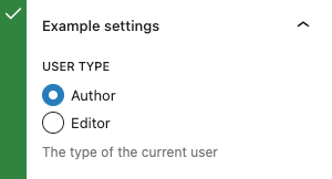
Selected and unselected radio buttons
## Design guidelines
### Usage
#### When to use radio buttons
Use radio buttons when you want users to:
- Select a single option from a list.
- Expose all available options.
If you have a list of available options that can be collapsed, consider using a dropdown menu instead, as dropdowns use less space. A country selection field, for instance, would be very large as a group of radio buttons and wouldn't help the user gain more context by seeing all options at once.
#### Do
Use radio buttons when only one item can be selected from a list.
#### Don’t
Don’t use checkboxes when only one item can be selected from a list. Use radio buttons instead.
#### Defaults
When using radio buttons **one should be selected by default** (i.e., when the page loads, in the case of a web application).
##### User control
In most interactions, a user should be able to undo and redo their actions. With most selection controls you can un-choose a selection, but in this instance you cannot click or tap a selected radio button to deselect it—selecting is a final action. The finality isn’t conveyed when none are selected by default. Selecting a radio button by default communicates that the user is required to choose one in the set.
##### Expediting tasks
When one a choice in a set of radio buttons is the most desirable or frequently selected, it’s helpful to select it by default. Doing this reduces the interaction cost and can save the user time and clicks.
##### The power of suggestion
Designs with a radio button selected by default make a strong suggestion to the user. It can help them make the best decision and increase their confidence. (Use this guidance with caution, and only for good.)
## Development guidelines
### Usage
Render a user interface to select the user type using radio inputs.
```jsx
import { RadioControl } from '/components';
import { useState } from 'react';
const MyRadioControl = () => {
const [ option, setOption ] = useState( 'a' );
return (
<RadioControl
label="User type"
help="The type of the current user"
selected={ option }
options={ [
{ label: 'Author', value: 'a' },
{ label: 'Editor', value: 'e' },
] }
onChange={ ( value ) => setOption( value ) }
/>
);
};
```
### Props
The component accepts the following props:
#### `help`: `string | Element`
If this property is added, a help text will be generated using help property as the content.
- Required: No
#### `hideLabelFromVision`: `boolean`
If true, the label will only be visible to screen readers.
- Required: No
#### `label`: `string`
If this property is added, a label will be generated using label property as the content.
- Required: No
#### `onChange`: `( value: string ) => void`
A function that receives the value of the new option that is being selected as input.
- Required: Yes
#### `options`: `{ label: string, value: string }[]`
An array of objects containing the value and label of the options.
- `label`: `string` The label to be shown to the user.
- `value`: `string` The internal value compared against select and passed to onChange.
* Required: No
#### `selected`: `string`
The value property of the currently selected option.
- Required: No
## Related components
- To select one or more items from a set, use the `CheckboxControl` component.
- To toggle a single setting on or off, use the `ToggleControl` component.
- To format as a segmented button group, use the `ToggleGroupControl` component.