@wordpress/components
Version:
UI components for WordPress.
111 lines (74 loc) • 2.85 kB
Markdown
# GradientPicker
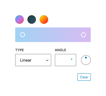
GradientPicker is a React component that renders a color gradient picker to define a multi step gradient. There's either a _linear_ or a _radial_ type available.
## Usage
Render a GradientPicker.
```jsx
import { useState } from 'react';
import { GradientPicker } from '@wordpress/components';
const myGradientPicker = () => {
const [ gradient, setGradient ] = useState( null );
return (
<GradientPicker
value={ gradient }
onChange={ ( currentGradient ) => setGradient( currentGradient ) }
gradients={ [
{
name: 'JShine',
gradient:
'linear-gradient(135deg,#12c2e9 0%,#c471ed 50%,#f64f59 100%)',
slug: 'jshine',
},
{
name: 'Moonlit Asteroid',
gradient:
'linear-gradient(135deg,#0F2027 0%, #203A43 0%, #2c5364 100%)',
slug: 'moonlit-asteroid',
},
{
name: 'Rastafarie',
gradient:
'linear-gradient(135deg,#1E9600 0%, #FFF200 0%, #FF0000 100%)',
slug: 'rastafari',
},
] }
/>
);
};
```
## Props
The component accepts the following props:
### `className`: `string`
The class name added to the wrapper.
- Required: No
### `value`: `string`
The current value of the gradient. Pass a css gradient like `linear-gradient(90deg, rgb(6, 147, 227) 0%, rgb(155, 81, 224) 100%)`. Optionally pass in a `null` value to specify no gradient is currently selected.
- Required: No
- Default: `linear-gradient(90deg, rgb(6, 147, 227) 0%, rgb(155, 81, 224) 100%)`
### `onChange`: `( currentGradient: string | undefined ) => void`
The function called when a new gradient has been defined. It is passed the `currentGradient` as an argument.
- Required: Yes
### `gradients`: `GradientsProp[]`
An array of objects of predefined gradients displayed above the gradient selector.
- Required: No
- Default: `[]`
### `clearable`: `boolean`
Whether the palette should have a clearing button or not.
- Required: No
- Default: true
### `disableCustomGradients`: `boolean`
If true, the gradient picker will not be displayed and only defined gradients from `gradients` are available.
- Required: No
- Default: false
### `headingLevel`: `1 | 2 | 3 | 4 | 5 | 6 | '1' | '2' | '3' | '4' | '5' | '6'`
The heading level. Only applies in cases where gradients are provided from multiple origins (ie. when the array passed as the `gradients` prop contains two or more items).
- Required: No
- Default: `2`
### `asButtons`: `boolean`
Whether the control should present as a set of buttons, each with its own tab stop.
- Required: No
- Default: `false`
### `loop`: `boolean`
Prevents keyboard interaction from wrapping around. Only used when `asButtons` is not true.
- Required: No
- Default: `true`