@wordpress/block-editor
Version:
90 lines (62 loc) • 2.71 kB
Markdown
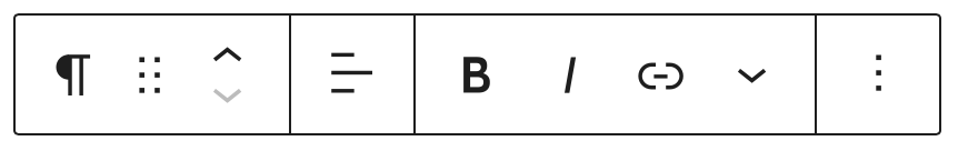
When the user selects a particular block, a toolbar positioned above the selected block displays a set of control buttons. Certain block-level controls are automatically included in the toolbar under specific circumstances. For example, there is a control for converting the block into a different type or when the focused element is a RichText component.
With `BlockControls`, you can customize the toolbar to include controls specific to your block type. If the return value of your block type's `edit` function includes a `BlockControls` element, the controls nested inside it will be shown in the selected block's toolbar.
```jsx
/**
* WordPress dependencies
*/
import {
BlockControls,
__experimentalBlockAlignmentMatrixControl as BlockAlignmentMatrixControl,
useBlockProps,
} from '@wordpress/block-editor';
import { __ } from '@wordpress/i18n';
export default function MyBlockEdit( { attributes, setAttributes } ) {
const blockProps = useBlockProps( {
className: 'my-block__custom-class',
} );
const { contentPosition } = attributes;
return (
<div { ...blockProps }>
{
<BlockControls>
<BlockAlignmentMatrixControl
label={ __( 'Change content position' ) }
value={ contentPosition }
onChange={ ( nextPosition ) =>
setAttributes( {
contentPosition: nextPosition,
} )
}
/>
</BlockControls>
}
</div>
);
}
/// ...
<MyBlockEdit />;
```
See [this custom block tutorial page](/docs/getting-started/fundamentals/block-in-the-editor.md) for more information and block controls examples.
Furthermore, the READMEs of various components inside the block editor package and the components package include examples that also utilize `BlockControls` and can be a good reference.
The component accepts the following props:
Group of the block controls. Allows you to create and render multiple groups of block controls.
- Type: `string`
- Default: `default`
- Required: No
Allows overriding the default `controls` if the `default` group is used.
See [this custom block tutorial page](/docs/getting-started/fundamentals/block-in-the-editor.md) for more details and examples with block controls.
- Type: `array`
Additional control components to be rendered.
- Type: `Element`
- Required: No.
Whether the additional block controls should be added to the block toolbars of child blocks.
- Type: `boolean`
- Default: `false`