@vj97/react-date-picker
Version:
Plugin for date selection and date range selection in reactjs
113 lines (71 loc) • 6.11 kB
Markdown
# React Date Picker
A lightweight plugin to select both **Single Date** and a **Date Range**.
## Features
- Single Date Selection
- Date Range Selection
- Relative and Absolute Picker Option
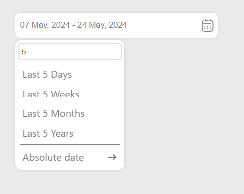
- Search on Relative Option
- Month/Year Selection View
## Demo
[See demo here](https://vijaykumawat897.github.io/datepicker-demo/)
## Screenshots
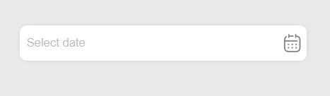
Date Picker
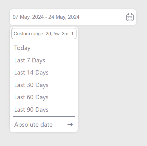
Relative Options
Relative Search
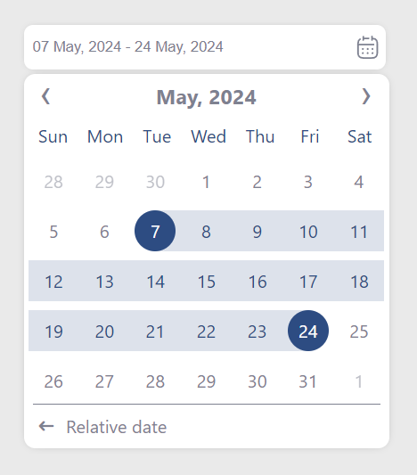
Absolute Date Picker
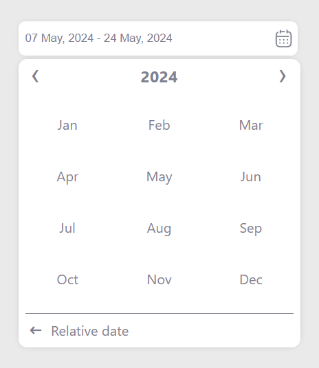
Month Selection
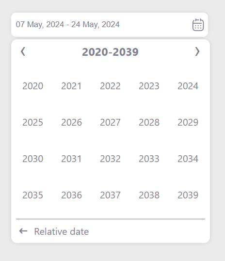
Year Selection
## Usage/Examples
Import css
```
import "@vj97/react-date-picker/dist/style.css";
```
Code Example
```javascript
import { DatePicker } from '@vj97/react-date-picker'
<DatePicker
placeholder="Choose Date"
selectionType="range"
onChange={handleDateChange}
/>
function handleDateChange (dates) {
console.log(dates)
// output for single date will be string
// output for date range will be object as below
// {stateDate: "", endDate: ""}
}
```
## Supported props
| Property name | Type | Default | Description |
| ------------------ | ------------------------- | -------------------- | ------------------------------------------------------------------------------------------------------------------------------------------------------------------------ |
| selectionType | single/range | single | Type of the picker
| dateFormat | string | DD MMM, YYYY | The date format to be returned in the onChange event |
| viewFormat | string | dateFormat | The date format to be shown in the input field |
| selectedDates | string/date for single and array of 2 string/date for range, in 'YYYY-MM-DD' format | NULL | Date/Range to be selected
| minDate | string/date | NULL | Minimun date |
| maxDate | string/date | dark | Maximum date |
| placeholder | string | NULL | Placeholder |
| colors | object | {} | Theme colors, refer below for supported colors |
| showCalendarIcon | boolean | true | To show calendar icon on input right |
| containerStyle | style object | {} | Style of the input container |
| inputStyle | style object | {} | Style of the input |
| containerClass | string | NULL | Custom class for input container |
| inputClass | string | NULL | Custom class for input
| disabled | boolean | false | disable datepicker input
| required | boolean | false | required datepicker input |
| defaultPickerType | relative/absolute | absolute | Picker type to be opened be default |
| onChange | function | n/a | Callback called when date is selected |
#### Colors
```
{
selection: "", // Highlight color for selected dates
text: "", // Text color for picker
background: "", // Background color for date picker popup
}
```