@unleashit/modal
Version:
Responsive modal component for React with custom header, footer and more.
33 lines (21 loc) • 1.18 kB
Markdown
## Modal
[](https://github.com/unleashit/npm-library/blob/master/LICENSE)
[](https://www.npmjs.com/package/@unleashit/modal)
[](https://bundlephobia.com/result?p=@unleashit/modal)
Customizable React modal component. Optional animation support when adding/removing from DOM.
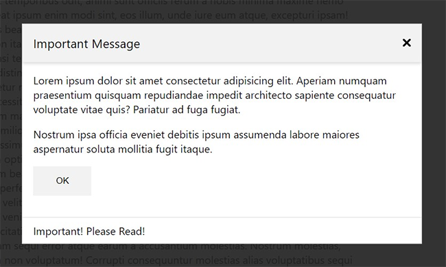
### Features
- Lightweight modal component.
- Animation support: optionally adds animation classes when adding/removing from DOM.
- Custom header and/or footer.
- Portal free. Detects the highest z-index to place modal above other elements without having to insert markup at the root.
- Default CSS with light/dark mode available
- CSS module support can override internal styles with a custom module.
### Install
```
npm install @unleashit/modal
```
### Documentation
https://unleashit.github.io/npm-library/components/modal
### Demo
https://npm-library-demo.vercel.app/modal