@uiwwsw/virtual-keyboard
Version:
**A revolutionary virtual keyboard solution for React that solves the Korean `composition` issue.**
103 lines (69 loc) • 4.11 kB
Markdown
**A revolutionary virtual keyboard solution for React that solves the Korean `composition` issue.**
[](https://www.npmjs.com/package/@uiwwsw/virtual-keyboard)
[](https://github.com/uiwwsw/virtual-keyboard/actions/workflows/publish.yml)
[](https://github.com/uiwwsw/virtual-keyboard/blob/main/LICENSE)
[](https://github.com/uiwwsw/virtual-keyboard/stargazers)
[**Visit the Demo →**](https://composed-input-y46p.vercel.app/)
---
`virtual-keyboard` is a React component library that provides a custom virtual keyboard and input field, specifically designed to solve the infamous Korean `composition` event issues in web environments. It offers a seamless and native-like typing experience, free from common bugs like character duplication, cursor jumping, and broken compositions.
- ✨ **Composition-Free Input**: Directly handles Korean character composition, bypassing native IME events to prevent common bugs.
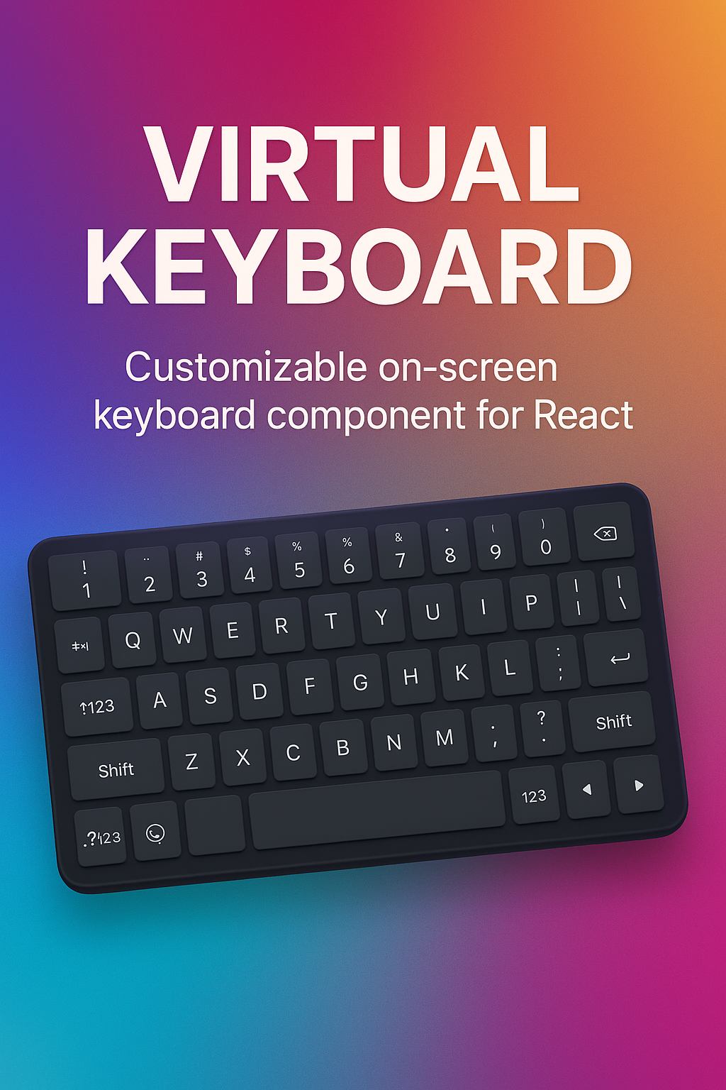
- 🎹 **Customizable Keyboard UI**: Provides a default keyboard and supports fully custom layouts for any use case (e.g., number pads, phone keypads).
- 📱 **Mobile-First**: Blocks the native mobile keyboard for a consistent and controlled user experience in web apps.
- ⚛️ **React-Friendly API**: Simple, component-based architecture using `Provider` and `Input` for easy integration.
## Installation
```bash
npm install @uiwwsw/virtual-keyboard
```
## Usage
Wrap your input fields with the `VirtualInputProvider`. This provider manages the keyboard's state and renders the UI.
### Basic Usage
Use the default QWERTY keyboard for Korean and English input.
```tsx
import { VirtualInput, VirtualInputProvider } from "@uiwwsw/virtual-keyboard";
function App() {
return (
<VirtualInputProvider>
<p>Your virtual input is here:</p>
<VirtualInput placeholder="텍스트를 입력하세요..." />
</VirtualInputProvider>
);
}
```
You can provide a custom layout for specialized inputs, such as a number pad for phone numbers.
```tsx
import { VirtualInput, VirtualInputProvider } from "@uiwwsw/virtual-keyboard";
const numberPadLayout = [
[{ value: "1" }, { value: "2" }, { value: "3" }],
[{ value: "4" }, { value: "5" }, { value: "6" }],
[{ value: "7" }, { value: "8" }, { value: "9" }],
// You can define special keys like 'Backspace'
[{ value: "010" }, { value: "0" }, { value: "Backspace", type: "action" }],
];
function App() {
return (
<VirtualInputProvider layout={numberPadLayout}>
<p>Enter your phone number:</p>
<VirtualInput placeholder="010-0000-0000" />
</VirtualInputProvider>
);
}
```
The main provider that manages the keyboard state and UI.
| Prop | Type | Description |
| :--------- | :--------------------- | :-------------------------------------------------- |
| `layout` | `Key[][][]` (optional) | A 2D array to define a custom keyboard layout. |
| `children` | `ReactNode` | Must contain at least one `VirtualInput` component. |
The replacement for the standard `<input>` element. It accepts all standard input element props like `value`, `defaultValue`, `placeholder`, `onChange`, etc.
[](https://www.star-history.com/#uiwwsw/virtual-keyboard&Date)
[](https://github.com/uiwwsw/virtual-keyboard/graphs/contributors)
[](./LICENSE)