@thomasloven/round-slider
Version:
A simple round slider webcomponent - [demo](https://rawcdn.githack.com/thomasloven/round-slider/master/example.html)
60 lines (41 loc) • 2.72 kB
Markdown
# round-slider
A simple round slider webcomponent - [demo](https://rawcdn.githack.com/thomasloven/round-slider/master/example.html)

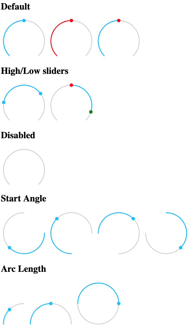
## Properties
- `value` - Required for single slider
- `low` - Required for high/low slider
- `high` - Required for high/low slider
- `min` - Lower limit of values
- `max` - Higher limit of values
- `step` - Step size of slider
- `startAngle` - Angle in degrees at which slider bar starts (default: 135)
- `arcLength` - Length in degrees of slider bar (default: 270)
- `handleSize` - Radius of handle in pixels (default: 6)
- `handleZoom` - The factor the handle size scales when dragged (default: 1.5)
- `disabled` - Boolean property disabling the slider (default: false)
- `readonly` - Boolean property disabling slider events (default: false)
- `rtl` - Boolean property to have the slider move Right to Left (default: false)
- `valueLabel` - Value to apply to `aria-label` property of value handle
- `lowLabel` - Value to apply to `aria-label` property of low handle
- `highLabel` - Value to apply to `aria-label` property of high handle
- `outside` - if true a high/low slider will fill up from the outsides in of inside out (default: false)
## Events
The slider dispatches two events
- `value-changing` when the value is changed but the mouse button is still pressed
- `value-changed` on release of mouse button
Both events pass an object as `detail` with either `value`, `low`, or `high` set to the new value depending on which slider was pulled.
## CSS styles
The following css variables can be used to change the styles:
- `--round-slider-path-color` - color of bar path
- `--round-slider-bar-color` - color of bar
- `--round-slider-handle-color` - color of handles
- `--round-slider-low-handle-color` - color of low handle (overrides `--round-slider-handle-color`)
- `--round-slider-high-handle-color` - color of high handle (overrides `--round-slider-handle-color`)
- `--round-slider-low-bar-color` - color of low bar when `outside` is true (overrides `--round-slider-bar-color`)
- `--round-slider-high-bar-color` - color of high bar when `outside` is true (overrides `--round-slider-bar-color`)
- `--round-slider-handle-cursor` - cursor to use on the handles (default `pointer`)
- `--round-slider-path-width` - bar width in pixels (default: 3)
- `--round-slider-linecap` - svg linecaps of bar (default: `round`)
## Examples
See [example.html](https://rawcdn.githack.com/thomasloven/round-slider/master/example.html) for usage examples.