@swrve/core
Version:
Core set of Swrve UI Components
55 lines (43 loc) • 1.99 kB
Markdown
- *Tabs* - This component provides the scaffolding for functioanlity and no UI
- *Tab* - This is the styled button to use within the Tabs component
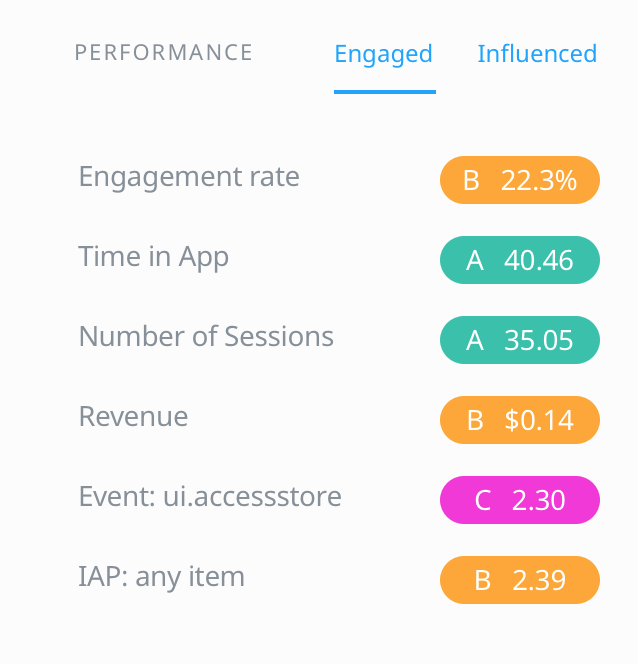
Together they provide a component which will look like this:
This is how it can be used:
```jsx
<Tabs className="bg-cloudWhite">
<Tabs.List>
<Tab>Engaged</Tab>
<Tab>Influenced</Tab>
</Tabs.List>
<Tabs.Views className="p-6">
<div>
<h3>Engaged</h3>
Engaged Content
</div>
<div>
<h3>Influenced</h3>
Influenced Content
</div>
</Tabs.Views>
</Tabs>
```
Each child of `Tabs.List` is a Tab. These should have a corresponding component which (if placed in the same order) as a child of `Tabs.Views` will display when the Tab is clicked. The above example uses the `Tab` component which comes with the library, but it can be any component. By Default the first child of `Tabs.List` and directly, the first child of `Tabs.Views` are active. Views will only mount when they are active and will unmount when they are not active.
If you need to use something else other than `Tab` do something like this:
```jsx
const CustomTab = ({ children, className, isActive, onClickHandler }) => {
const styles = classNames({
'style-class': true,
'active-class': isActive,
className
})
return (
<button onClick={onClickHandler} className={styles}>
{children}
</button>
)
}
```
The main thing to remember is that all children of `Tabs.List` receive a function prop `onClickHandler` which needs to be added to your component as an onClick. This controls the active View. This tab that is clicked will have an `isActive` prop added to it, which can be used to add styles to the appropriate UI component
- [Add animation to default Tab](https://swrvedev.jira.com/browse/SWRVE-19087)