@ssaul/expandable-scrollable-drawer
Version:
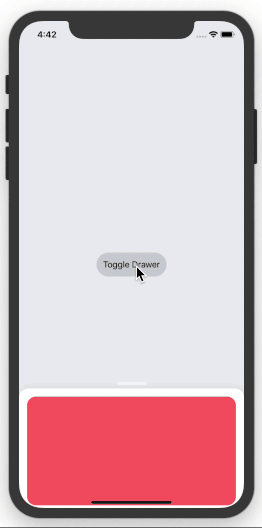
An expandable/collapsible drawer component for React Native that supports scrollable content
44 lines (29 loc) • 1.69 kB
Markdown
## expandable-scrollable-drawer
Expandable drawer component for React Native that supports scrollable content and can be controlled programatically.
## Installation
```$ yarn add expandable-scrollable-drawer```
or
```$ npm install expandable-scrollable-drawer --save```
then
```import { Drawer } from 'expandable-scrollable-drawer'```
## Example
```
<Drawer
drawerPosition={ 'collapsed' }
onChange={ newPosition => {} }>
/* Content Here */
</Drawer>
```
## Props
|Prop | Type |Description |Default |Possible Values |
|-------------|-------------|-------------|-------------|-------------|
| dismissFromFullHeight | bool | If true, swiping down from the full height will dismiss the drawer. If false, swiping down from the full height will collapse the drawer. | ```false``` | ```true```, ```false``` |
| expandable | bool | If true, allows the drawer to be dragged up to expand. If false, the drawer can only be dismissed. | ```true``` | ```true```, ```false``` |
| drawerPosition | string | sets the drawer's starting position and allows it to be controlled programatically. | ```collapsed``` | ```collapsed```, ```expanded```, ```dismissed```
| drawerStyle | object | Customize the drawer's background color or other style props |```{ }``` |```{ }``` |
| handleBarStyle | object | Customize the handle bar's size, color, opactiy, etc. | ```{ }``` |```{ }``` |
| onChange | func | Function is called when the drawer's state changes | ```()=>{ }``` |```collapsed```, ```expanded```, ```dismissed``` |
## Try It
Expo Snack:
https://snack.expo.io/@ssaul/expandable-drawer-with-scrollable-content