@sreyaj/ng-star-rating
Version:
A Simple and Customizable SVG based Star Rating Component For Angular
63 lines (45 loc) • 2.16 kB
Markdown
# SVG Based Angular Star Rating Component
Simple Rating Component for your next Angular Project. Very simple to setup and use and comes with a lot of customizations.
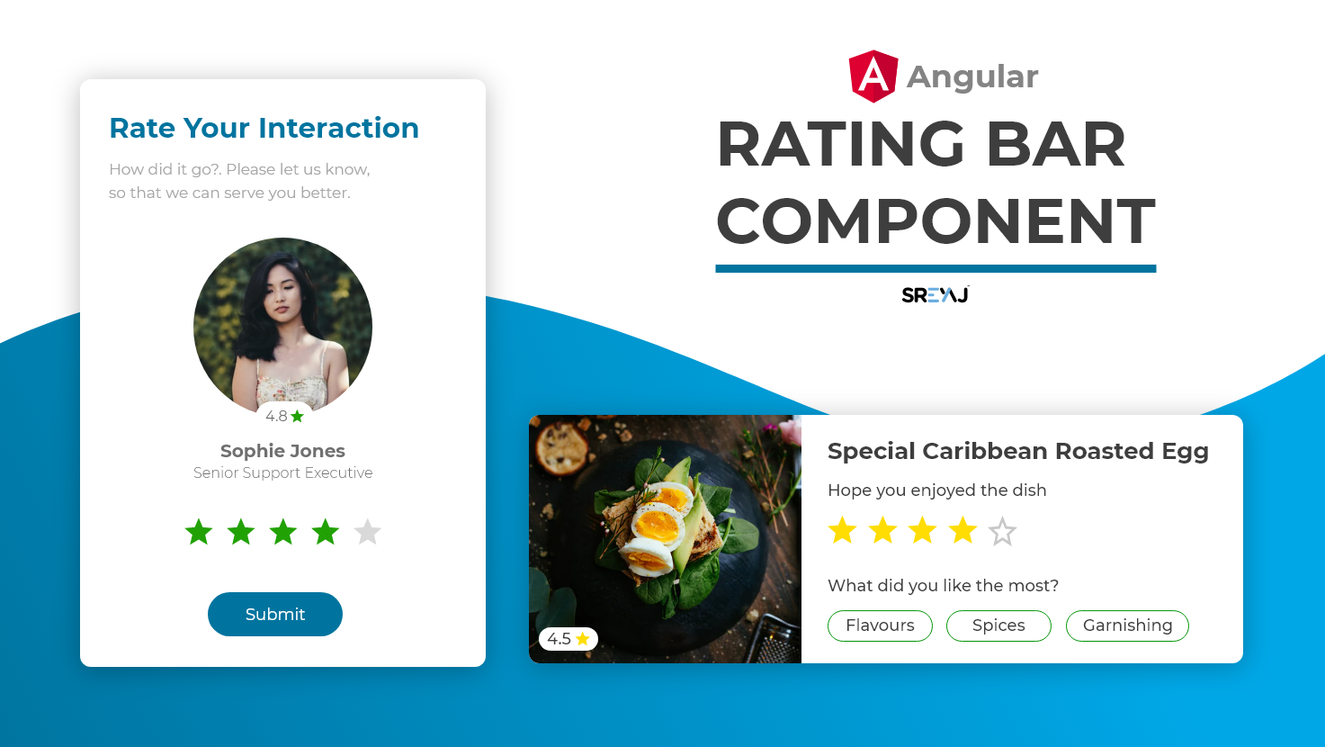
### Features
- Simple and Easy to Setup
- Ease to use
- SVG based super light
- Material Spec Icons for Standard Feel
- Zero Dependencies
- Supports **half-star** rating
- Supports Rating Mode and also Display only Mode
## How to Use the Component
#### Install the package using the command:
```
npm i @sreyaj/ng-star-rating
```
#### Import the StarRatingModule into your module
```ts
import { StarRatingModule } from '@sreyaj/ng-star-rating';
@NgModule({
...
imports: [StarRatingModule],
...
})
export class AppModule {}
```
#### Now you can use the component inside your application
```html
<ngx-star-rating></ngx-star-rating>
```
#### You can now customize it with the following attributes
Eg with few options:
```html
<ngx-star-rating [total]="5" [filledColor]="'#ff0000'"></ngx-star-rating>
```
## Customizations
| Feature | Description | Attribute | Type | Default |
| ------------- | ------------------------------------------------------------ | ----------- | ---------------- | ------- |
| No of Stars | You can change the total rating number | total | number | 5 |
| Display Mode | Star Rating component can be used to just display the rating | readonly | boolean | false |
| Type of Stars | The component supports filled stars and hollow stars design | type | filled or hollow | hollow |
| Rating Color | The color for the filled Stars | filledColor | string | #3db700 |
| Rating Color | The color for the empty Stars | emptyColor | string | #e0e0e0 |
| Rating Event | Rating Emitted when user clicks on the rating | rated | number | nil |
Feel free to open Issues and Pull Requests