@smashing/select-menu
Version:
Component used to select options
93 lines (75 loc) • 1.61 kB
Markdown
# Select Menu
```sh
yarn add @smashing/select-menu
```
#### Default appearance
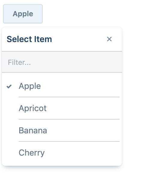
```jsx
<SelectMenu
options={options}
value={singleSelectedOption}
onSelect={changeSingleSelectedOption}
hasFilter
hasTitle
title="Select Item"
/>
```
#### Card appearance
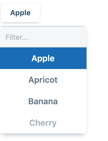
```jsx
<SelectMenu
options={options}
value={singleSelectedOption}
onSelect={changeSingleSelectedOption}
appearance="card"
hasFilter
/>
```
#### Minimal appearance and multiselect option
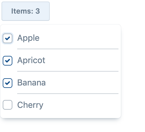
```jsx
<SelectMenu
options={options}
value={selectedOptions}
placeholderForMultipleSelected={selected => `Items: ${selected.length}`}
onSelect={select}
onDeselect={deselect}
appearance="minimal"
/>
```
#### Custom select menu
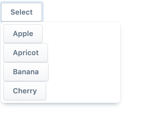
```jsx
<SelectMenu
options={options}
value={selectedOptions}
onSelect={select}
onDeselect={deselect}
appearance="primary"
renderItem={(option, click, options, selected) => {
return (
<div key={option.value}>
<Button onClick={click}>{option.label} </Button>
</div>
)
}}
children={props => (
<Button ref={props.getRef} onClick={props.toggle}>
Select
</Button>
)}
/>
```
#### Change the height and width
```jsx
<SelectMenu
width={100}
height={100}
options={options}
value={singleSelectedOption}
onSelect={changeSingleSelectedOption}
/>
```
### Remove title and filter
- `hasFilter={false}`: to remove the search input filter.
- `hasTitle={false}`: to remove the title from the popover.