@sherby/code-block
Version:
A web component that utilizes Prism.js and LitElement to display nicely formatted code.
118 lines (81 loc) • 5.06 kB
Markdown
[](https://www.npmjs.com/package/@sherby/code-block)
[](https://github.com/SherbyElements/code-block/releases)
[](https://www.webcomponents.org/element/SherbyElements/code-block)
[](https://github.com/SherbyElements/code-block/blob/master/LICENSE.md)
[](https://npm-stat.com/charts.html?package=%40sherby%2Fsherby-metadata)
[](https://bundlephobia.com/result?p=@sherby/code-block)
# \<code-block\>
> A Web component that displays colorfully **formatted code** with [Prism.js]
> and [LitElement].
## Features
- Loads [Prism.js] language definitions and custom themes on demand via dynamic
imports
- Support the languages aliases of Prism.js
- Add the language name automatically in the top-right corner of the block
- Remove automatically beginning spaces to allow you to format your code with
indentation
- Allow to extend the class for further customizations
- Built as a web component on [LitElement]
## Installation
```bash
npm install @sherby/code-block
```
## Use
To use this element, import it in your component:
```javascript
import '@sherby/code-block';
```
And add a `code-block` element in your component template.
```html
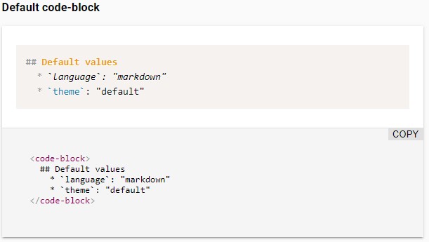
<code-block language="javascript">function helloWorld(say) { console.log(say); } helloWorld('Hi there!');</code-block>
```
## Attributes
You can override the following attributes to met your needs:
| Name | Description | Default |
| ---------------------- | ----------------------------------------------------------------------------------------------------------------------- | ---------------------------------------------------------- |
| `language` | Code language you wish to utilize from Prism | `markdown` |
| `languageFileTemplate` | Template URL where the language file can be automatically imported, where `{LANGUAGE}` will be replaced by the language | `/node_modules/prismjs/components/prism-{LANGUAGE}.min.js` |
| `theme` | Path to Prism CSS theme file | `twilight` |
| `themeFileTemplate` | Template URL where the theme file can be automatically imported, where `{THEME}` will be replaced by the theme | `/node_modules/prismjs/themes/prism.css` |
## Building
If you want the ability to load the full spectrum of languages that Prism
supports, you'll want to make sure your build script includes the
`/node_modules/prismjs/**`, as there are many language resources.
## Develop
```bash
# Clone the project
git clone git@github.com:sherby/code-block.git
# Go to the project directory
cd code-block
# Install the dependencies
npm install
# Start the demo page
npm start
```
## Polyfills Required
`code-block` utilizes Custom Elements and Shadow DOM ([Web Components](https://developer.mozilla.org/en-US/docs/Web/Web_Components)). As you can see in the table below, you'll need some polyfills to make use of this across a wide range of browsers.
| Platform Support | Chrome | Chrome for Android | Firefox | Safari | iOS Safari | Edge | IE 11 |
| -------------------- | :----: | :----------------: | :-----: | :----: | :--------: | :--: | :---: |
| Supported | ✓ | ✓ | ✓ | ✓ | ✓ | ✓ | ✓ |
| Polyfill(s) Required | - | - | ✓ | ✓ | ✓ | ✓ | ✓ |
Within your project, you can load them as such:
```html
<script src="../node_modules/@webcomponents/webcomponentsjs/webcomponents-loader.js"></script>
```
## Thanks
Special thanks to [Justin Ribeiro](https://github.com/justinribeiro) for his [code-block](https://github.com/justinribeiro/code-block) component that this project is forked from.
## Publish
Increment the `version` defined in the `package.json` file and run the command below to publish the module in the
registry:
```bash
# Dry run
npm publish --dry-run
# For real (are you really sure?)
npm publish --access public
```
## License
The [MIT License][1] (MIT)
[1]: https://opensource.org/licenses/MIT
[prism.js]: https://prismjs.com/
[litelement]: https://lit.dev/