@rnwonder/solid-date-picker
Version:
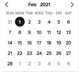
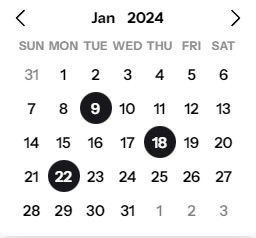
A responsive, highly-customizable datepicker component for SolidJS.
107 lines (79 loc) • 4.08 kB
Markdown
# /solid-date-picker
A simple and reusable Datepicker component for SolidJS ([Demo](https://stackblitz.com/edit/solidjs-templates-dof6jl?file=src%2FApp.tsx))
[Documentation](https://soliddatepicker.netlify.app/)

## Installation
```bash
npm i /solid-date-picker
```
```bash
yarn add /solid-date-picker
```
```bash
pnpm add /solid-date-picker
```
This package depends on `solid-js` so you need to have it installed
## Usage
```tsx
import '@rnwonder/solid-date-picker/dist/style.css'
import DatePicker from "@rnwonder/solid-date-picker";
const App = () => {
return (
<DatePicker
onChange={(data) => {
if (data.type === "range") {
console.log(data.startDate, data.endDate);
}
if (data.type === "single") {
console.log(data.selectedDate);
}
if (data.type === "multiple") {
console.log(data.multipleDates);
}
}}
/>
);
};
```
For Solid Start, you want to use the `DatePicker` component as a client-side component. You can do this by using the `unstable_clientOnly` from `solid-start`.
```tsx
import { clientOnly } from "@solidjs/start";
const DatePicker = clientOnly(() => import("@rnwonder/solid-date-picker"));
```
After importing the `DatePicker` component, you can use it the same way as above.
### Styling With Props, Classes, or Attributes
- You can style the datepicker using class props, color props, default css class names or data attributes.
- Check out the [documentation](https://soliddatepicker.netlify.app/docs/styling/) for more details
### Themes
- We have a growing list of themes you can use. Please check them out [here](https://soliddatepicker.netlify.app/docs/themes/)
### Other Datepicker Props
- We have some other props that can be useful when working with the datepicker. Please check them out [here](https://soliddatepicker.netlify.app/docs/other-props/)
### Formatting
- Formatting the datepicker input label is done with the `formatInputLabel`, `formatInputLabelRangeStart`, `formatInputLabelRangeEnd`, `localOptions` and `locale` props
- Check out the [documentation](https://soliddatepicker.netlify.app/docs/formatting/) for more details
### Utility Functions
- We have some utility functions that can be useful when working with the datepicker. Please check them out [here](https://soliddatepicker.netlify.app/docs/helpers-utilities/)
### Other Components
- We have some other components that you may find useful. Please check them out [here](https://soliddatepicker.netlify.app/docs/popover/)
### Time Picker
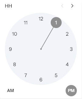
- This is in beta and can be used like this
```tsx
import '@rnwonder/solid-date-picker/dist/style.css'
import TimePicker from "@rnwonder/solid-date-picker/timePicker";
const App = () => {
return <TimePicker />
};
```
### Road Map
- Time Picker (In progress)
- More themes
- More utility functions
- Add more tests
### Contributing
- Send a message to the author on [X](https://twitter.com/Rnwonder101) if you have any questions or suggestions. Don't forget to follow me on twitter.
- Feel free to open an issue [here](https://github.com/rnwonder/solid-date-picker/issues) if you run into any problem while using this library.
- You can also contribute to this project [here](https://github.com/rnwonder/solid-date-picker/pulls).
<a href="https://www.buymeacoffee.com/rnwonderw" target="_blank"><img src="https://cdn.buymeacoffee.com/buttons/v2/default-yellow.png" alt="Buy Me A Coffee" height="40px" width="170px"></a>