@redbluenat/react-native-expandable-flatlist
Version:
Animated expandable FlatList
271 lines (232 loc) • 10.6 kB
Markdown
# React Native Expandable Flatlist
## Description
React Native Expandable Flatlist component for React Native, with support for iOS, Android, and React Native Web. It works with custom components and styles.
Library is using [react-native-reanimated](https://docs.swmansion.com/react-native-reanimated/docs/2.x/) version 2 for animations. Make sure you have installed it.
**Support: RN >=0.59.0**
## Demo
| Android | iOS |
| :-----------------------------------------------------------------------------------------------------------------------------: | :-----------------------------------------------------------------------------------------------------------------: |
|  | 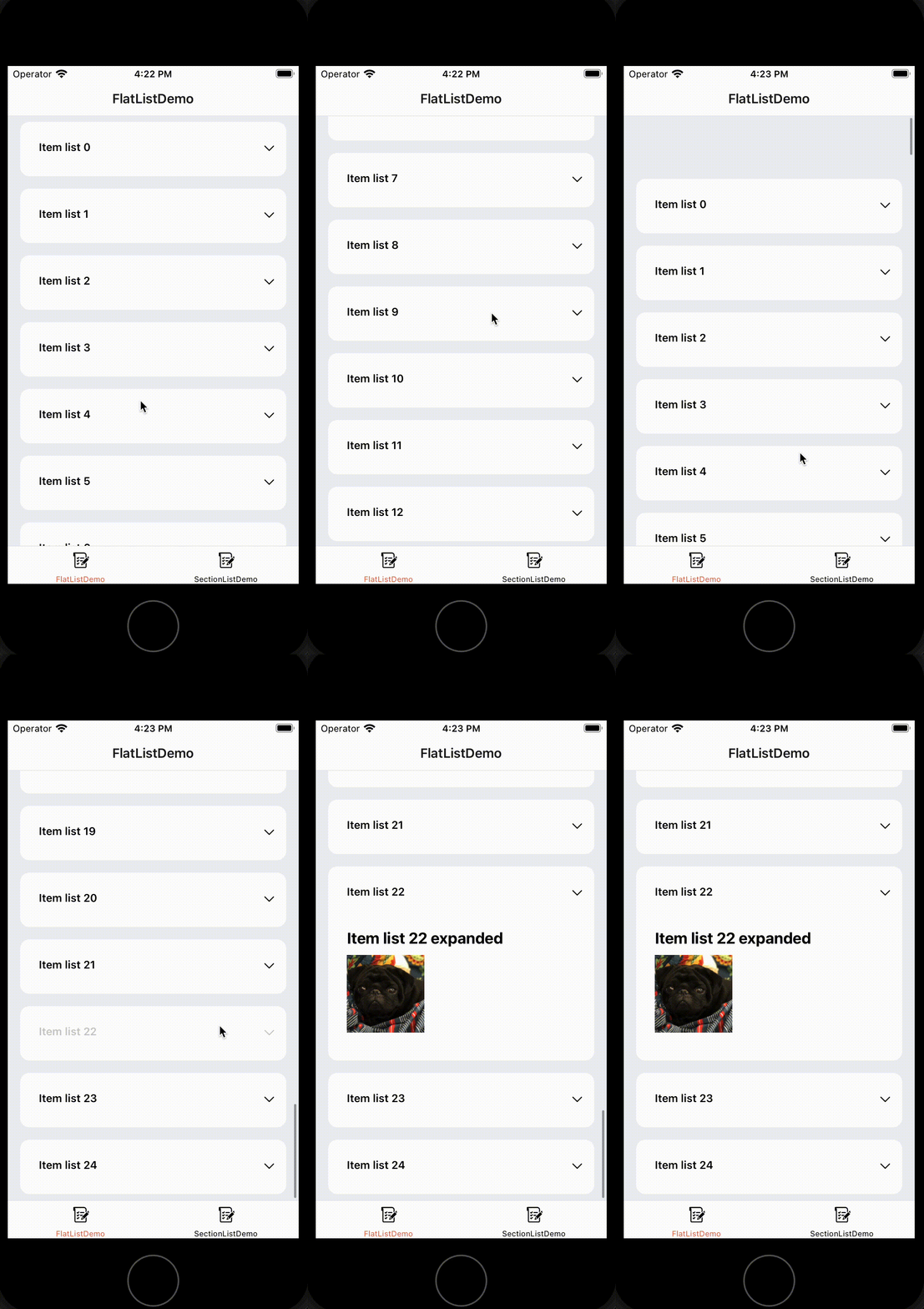 |
| 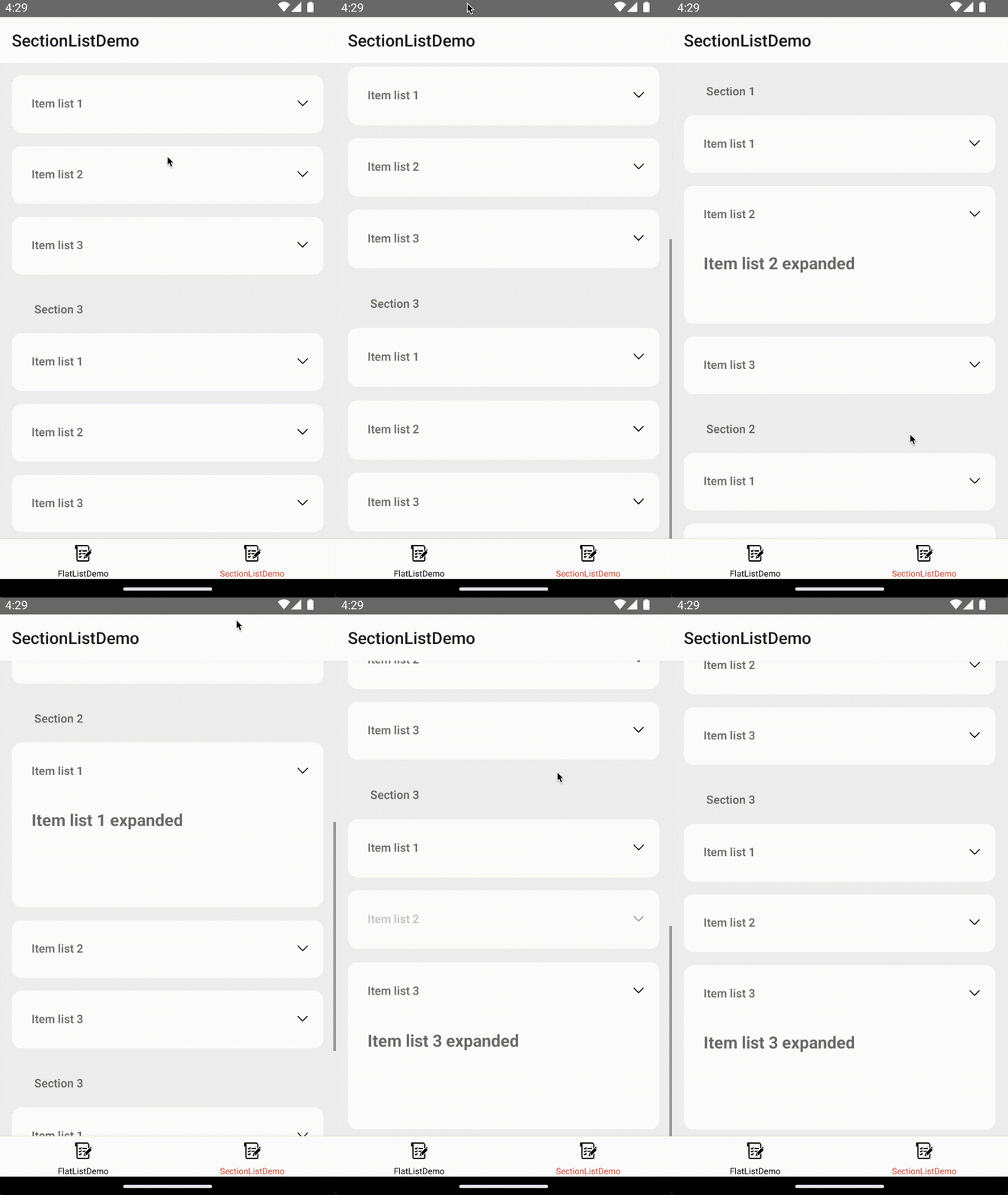 |  |
## Getting started
### Installation
Install the package with npm.
```bash
npm install @redbluenat/react-native-expandable-flatlist
```
or with yarn
```bash
yarn add @redbluenat/react-native-expandable-flatlist
```
### Run example
```bash
cd example
yarn install
cd ios
pod install
cd ..
yarn android or yarn ios
```
## Flatlist Example
```js
import React from 'react';
import {SafeAreaView, Text, View, Image, StyleSheet} from 'react-native';
import ExpandableList from '@redbluenat/react-native-expandable-flatlist';
const LIST_ITEMS = 25;
const FlatListDemo = () => {
function generateData() {
let data: string[] = [];
for (let i = 0; i < LIST_ITEMS; i++) {
data.push('Item list ' + i);
}
return data;
}
return (
<SafeAreaView style={styles.container}>
<ExpandableList
sectionList={false}
listData={generateData()}
expandItemHeight={250}
initialNumToRender={10}
renderExpandListItem={({item}) => (
<View style={styles.expandItemStyle}>
<Text style={styles.expandText}>{item} expanded</Text>
<Image source={require('../assets/leo.png')} style={styles.image} />
</View>
)}
duration={500}
defaultItemHeight={70}
listItemStyle={styles.itemList}
renderItem={({item}) => (
<View style={styles.itemListContainer}>
<View style={styles.leftItemSection}>
<Text style={styles.itemText}>{item}</Text>
</View>
<View style={styles.rightItemSection}>
<Image
source={require('../assets/chevron.png')}
style={styles.icon}
/>
</View>
</View>
)}
/>
</SafeAreaView>
);
};
export default FlatListDemo;
const styles = StyleSheet.create({
container: {backgroundColor: '#EFF0F4', flex: 1},
scrollView: {
height: '100%',
},
itemList: {
backgroundColor: 'white',
borderRadius: 12,
marginVertical: 8,
marginHorizontal: 16,
},
sectionListConfiner: {
justifyContent: 'center',
marginLeft: 24,
flexDirection: 'row',
marginTop: 24,
marginBottom: 12,
},
itemListContainer: {
justifyContent: 'center',
marginLeft: 24,
flexDirection: 'row',
marginTop: 24,
marginBottom: 12,
},
leftItemSection: {flex: 0.9},
rightItemSection: {flex: 0.1},
icon: {width: 20, height: 20},
image: {width: 100, height: 100, marginTop: 10},
itemText: {fontWeight: '600'},
expandItemStyle: {
marginLeft: 24,
marginTop: 24,
marginBottom: 12,
},
expandText: {fontSize: 20, fontWeight: 'bold'},
});
```
## Section list Example
```js
import React from 'react';
import {Text, View, Image, StyleSheet} from 'react-native';
import ExpandableList from '@redbluenat/react-native-expandable-flatlist';
const SectionListDemo = () => {
return (
<ExpandableList
sectionList={true}
sectionData={[
{
data: ['Item list 1', 'Item list 2', 'Item list 3'],
title: 'Section 1',
},
{
data: ['Item list 1', 'Item list 2', 'Item list 3'],
title: 'Section 2',
},
{
data: ['Item list 1', 'Item list 2', 'Item list 3'],
title: 'Section 3',
},
]}
expandItemHeight={200}
duration={500}
renderExpandListItem={({item}) => (
<View style={styles.expandItemStyle}>
<Text style={styles.expandText}>{item} expanded</Text>
</View>
)}
renderSectionHeader={title => (
<View style={styles.sectionListConfiner}>
<View style={styles.leftItemSection}>
<Text style={styles.itemText}>{title}</Text>
</View>
</View>
)}
sectionListHeaderStyle={styles.sectionListConfiner}
defaultItemHeight={70}
sectionItemStyle={styles.itemList}
listItemStyle={styles.itemList}
renderItem={item => {
return (
<View style={styles.sectionListConfiner}>
<View style={styles.leftItemSection}>
<Text style={styles.itemText}>{item.item}</Text>
</View>
<View style={styles.rightItemSection}>
<Image
source={require('../assets/chevron.png')}
style={styles.icon}
/>
</View>
</View>
);
}}
/>
);
};
export default SectionListDemo;
const styles = StyleSheet.create({
container: {backgroundColor: '#EFF0F4', flex: 1},
scrollView: {
height: '100%',
},
itemList: {
backgroundColor: 'white',
borderRadius: 12,
marginVertical: 8,
marginHorizontal: 16,
},
sectionListConfiner: {
justifyContent: 'center',
marginLeft: 24,
flexDirection: 'row',
marginTop: 24,
marginBottom: 12,
},
itemListContainer: {
justifyContent: 'center',
marginLeft: 24,
flexDirection: 'row',
marginTop: 24,
marginBottom: 12,
},
leftItemSection: {flex: 0.9},
rightItemSection: {flex: 0.1},
icon: {width: 20, height: 20},
itemText: {fontWeight: '600'},
expandItemStyle: {
marginLeft: 24,
marginTop: 24,
marginBottom: 12,
},
expandText: {fontSize: 20, fontWeight: 'bold'},
});
```
## Attributes
Properties for this component:
| Prop | Type | Default | Description |
| ------------------------------ | ------------ | ------------- | -------------------------------------------------------------------------------------------------------------------------------------------------------------------------------------------------- |
| `sectionList` (**Required**) | boolean | | Set to false makes the component uses a flat list, and set to true uses a section list. |
| `expandItemHeight` (**Required**) | number | | It is the value of the item when expanded. |
| `defaultItemHeight` (**Required**) | number | | It is the value of the item when not expanded. |
| `sectionData` | object | | Section list data {title: string; data:any[];}[] |
| `listData` | object | | Flatlist data:any[] |
| `sectionItemStyle` | style object | {} | Custom section item style. |
| `listItemStyle` | style object | {} | Custom flatlist item style. |
| `sectionListHeaderStyle` | style object | {} | Custom header section style. |
| `duration` | number | 500ms | Duration for expanding item. |
| `easing` | object | true | { x1: number; y1: number; x2: number; y2: number } Worklet that drives the easing curve for the animation. |
| `onItemPress(isExpand: boolean)` | function | | Callback for the item press. |
| `renderItem` | function | | Function for rendering the list item. |
| `renderExpandListItem` | function | | Function for rendering the expanded item. |
| `renderSectionHeader` | function | | Function for rendering the section header. |
## Author & support
Natalia MS - [Github](https://github.com/redbluenat)