@react-three/uikit
Version:
Build performant 3D user interfaces with react-three-fiber and yoga.
92 lines (70 loc) • 4.99 kB
Markdown
<p align="center">
<img src="./docs/getting-started/logo.svg" width="100" />
</p>
<h1 align="center">uikit</h1>
<h3 align="center">Build performant 3D user interfaces for<br/> threejs using R3F and yoga.</h3>
<br/>
<p align="center">
<a href="https://npmjs.com/package/@react-three/uikit" target="_blank">
<img src="https://img.shields.io/npm/v/@react-three/uikit?style=flat&colorA=000000&colorB=000000" alt="NPM" />
</a>
<a href="https://npmjs.com/package/@react-three/uikit" target="_blank">
<img src="https://img.shields.io/npm/dt/@react-three/uikit.svg?style=flat&colorA=000000&colorB=000000" alt="NPM" />
</a>
<a href="https://twitter.com/pmndrs" target="_blank">
<img src="https://img.shields.io/twitter/follow/pmndrs?label=%40pmndrs&style=flat&colorA=000000&colorB=000000&logo=twitter&logoColor=000000" alt="Twitter" />
</a>
<a href="https://discord.gg/ZZjjNvJ" target="_blank">
<img src="https://img.shields.io/discord/740090768164651008?style=flat&colorA=000000&colorB=000000&label=discord&logo=discord&logoColor=000000" alt="Discord" />
</a>
</p>
> Perfect for games, XR (VR/AR), and any web-based Spatial Computing App.
```bash
npm install three @react-three/fiber @react-three/uikit
```
### What does it look like?
| A simple UI with 2 containers horizontally aligned, rendered in fullscreen. When the user hovers over a container, the container's opacity changes. |  |
| --------------------------------------------------------------------------------------------------------------------------------------------------- | --------------------------------------------------------------------- |
```jsx
import { createRoot } from 'react-dom/client'
import React from 'react'
import { Canvas } from '@react-three/fiber'
import { Fullscreen, Container } from '@react-three/uikit'
createRoot(document.getElementById('root')).render(
<Canvas>
<Fullscreen flexDirection="row" padding={10} gap={10}>
<Container flexGrow={1} backgroundOpacity={0.5} hover={{ backgroundOpacity: 1 }} backgroundColor="red" />
<Container flexGrow={1} backgroundOpacity={0.5} hover={{ backgroundOpacity: 1 }} backgroundColor="blue" />
</Fullscreen>
</Canvas>,
)
```
## How to get started
> Some familiarity with
> react, threejs, and @react-three/fiber, is recommended.
Get started with **[building your first layout](https://docs.pmnd.rs/uikit/getting-started/first-layout)**, take a look at our **[examples](https://docs.pmnd.rs/uikit/getting-started/examples)** to see uikit in action, or learn more about:
- [All components and their properties](https://docs.pmnd.rs/uikit/getting-started/components-and-properties)
- [Interactivity](https://docs.pmnd.rs/uikit/tutorials/interactivity)
- [Custom materials](https://docs.pmnd.rs/uikit/tutorials/custom-materials)
- [Custom fonts](https://docs.pmnd.rs/uikit/tutorials/custom-fonts)
- [Responsive user interfaces](https://docs.pmnd.rs/uikit/tutorials/responsive)
- [Scrolling](https://docs.pmnd.rs/uikit/tutorials/scroll)
- [Sizing](https://docs.pmnd.rs/uikit/tutorials/sizing)
- [Common pitfalls](https://docs.pmnd.rs/uikit/advanced/pitfalls)
- [Optimize performance](https://docs.pmnd.rs/uikit/advanced/performance)
- [Theming components](https://docs.pmnd.rs/uikit/advanced/theming)
## Pre-styled component kits
We provide multiple kits containing **themable pre-styled components**. Inspired by shadcn, you can use our CLI to install the source code of any component to your desired location with one command.
> For example, to add the button from the default kit, run: `npx uikit component add default Button`
| <h3>default</h3> _based on [Shadcn](https://github.com/shadcn-ui/ui)_ | <h3>apfel</h3> _inspired by AVP_ |
| ------------------------------------------------------------------------------------ | -------------------------------------------------------------------------------- |
|  |  |
| [View All Components](https://docs.pmnd.rs/uikit/default-kit/accordion) | [View All Components](https://docs.pmnd.rs/uikit/apfel-kit/button) |
| `npx uikit component add default Button` | `npx uikit component add apfel Button` |
## Migration guides
- from [Koestlich](https://docs.pmnd.rs/uikit/migration/from-koestlich)
- from [HTML/CSS](https://docs.pmnd.rs/uikit/migration/from-html-css)
- from [Tailwind](https://docs.pmnd.rs/uikit/migration/from-tailwind)
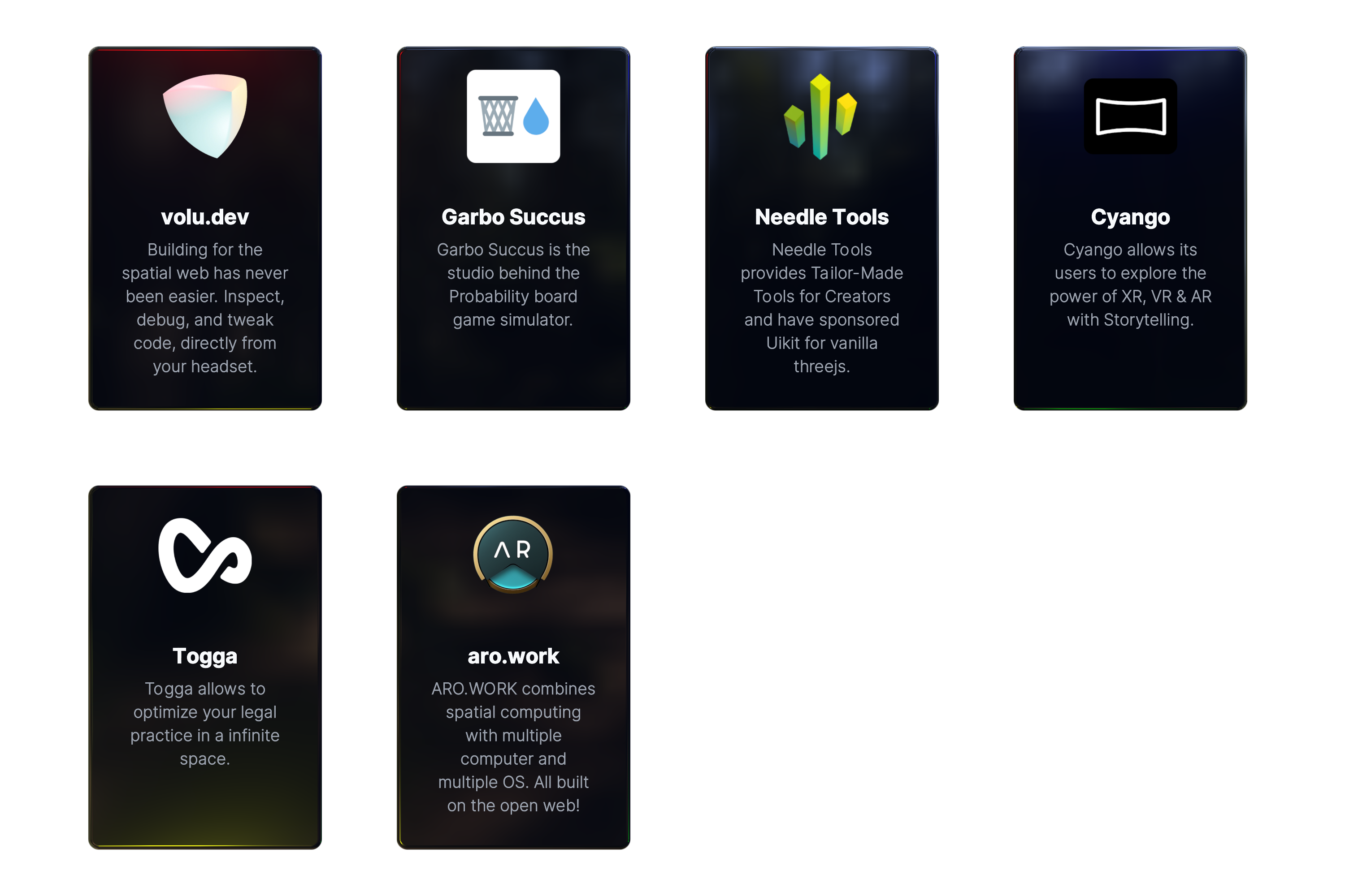
## Sponsors
This project is supported by a few companies and individuals building cutting edge 3D Web & XR experiences. Check them out!