@react-input-validator/rules
Version:
The validation rule objects used by the packages: `@react-input-validator/core`, `@react-input-validator/native` and `@react-input-validator/web`
26 lines (17 loc) • 1.23 kB
Markdown
# **@react-input-validator**
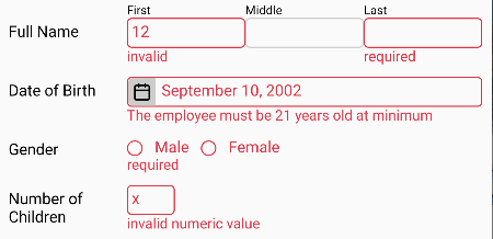
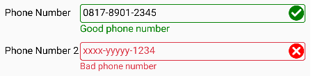
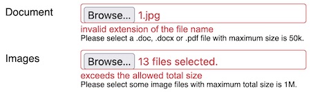
It's to validate the input component value in React app (web and native). The value is validated based on the
rule(s) defined for the input. If the input is invalid, the error message is shown near the input. Moreover,
you can change the inputs' appearance when they are invalid or also valid after the invocation of validation
as depicted by the pictures below:
It's very useful before submitted to the server.
### **How to install**
For web app, install the following package:
npm i @react-input-validator/web
For React Native app, install the following package:
npm i @react-input-validator/native
### **How to use this package**
Please see this [docs](https://atmulyana.github.io/react-input-validator). Additionally, you can take a look at the
[`example`](https://github.com/atmulyana/react-input-validator/tree/main/example) directory in the source code.