@progresso/react-giphy-picker-https
Version:
A react gif picker using giphy API over https
83 lines (57 loc) • 2.23 kB
Markdown
# react-giphy-picker-https
[](https://badge.fury.io/js/%40progresso%2Freact-giphy-picker-https)
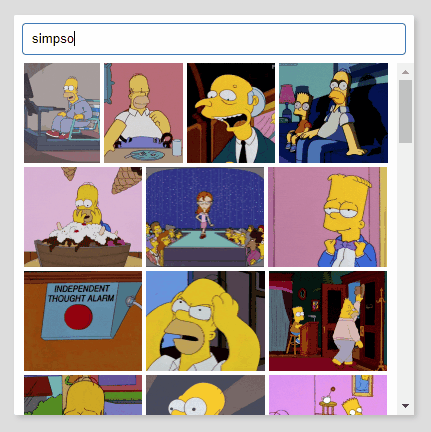
react-giphy-picker-https is a simple gif picker component using giphy API over https.
## Install
`yarn add @progresso/react-giphy-picker-https`
## Usage basic
```jsx
import Picker from 'react-giphy-picker-https'
import ReactDOM from 'react-dom'
import React, { Component, PropTypes } from 'react'
class TestComponent extends Component {
log (gif) {
console.log(gif)
}
render () {
return (
<div>
<Picker apiKey="your-giphy-api-key" onSelected={this.log.bind(this)} />
</div>
)
}
}
ReactDOM.render(
<TestComponent />,
document.getElementById('root')
)
```
## Props
### `apiKey` (required)
Your giphy api key, see [API Quickstart Guide](https://developers.giphy.com/docs/api) on [developers.giphy.com](https://developers.giphy.com/).
### `width` (required)
The width of the control, in pixels. Used for layouting gifs with different sizes.
### `onSelected` (required)
Handles a gif selection and provides the selected gif as a [Gif Object](https://developers.giphy.com/docs/api/schema#gif-object).
### `visible`
Set to `true` to make the component visible.
### `modal`
Set to `true`, if you want the component to be displayed as a floating layer. It will set the component `position: absolute` and add a box shadow.
### `style`
A `React.CSSProperties` object that appies to the outer component shape.
### `searchBoxStyle`
A `React.CSSProperties` object that applies to the component's search box.
### `gifStyle`
A `React.CSSProperties` object that applies to each rendered gif image within the component.
### `scrollComponent`
A `React.Component` that should be used for scrolling. If not provided, a default `<div />` with `overflow-y: auto` is used.
## Development
yarn
yarn dev
## Test
yarn test
## Build
yarn
yarn build
## License
[MIT](http://isekivacenz.mit-license.org/)