@primer/react-brand
Version:
Primer Brand is a GitHub's design system for creating React-based marketing websites and digital experiences.
66 lines (38 loc) • 3.56 kB
Markdown
---
title: Hero
description: Use the hero component to render a full-width banner at the top of a page.
keywords: ['heading', 'intro', 'cta', 'banner']
---
## Anatomy
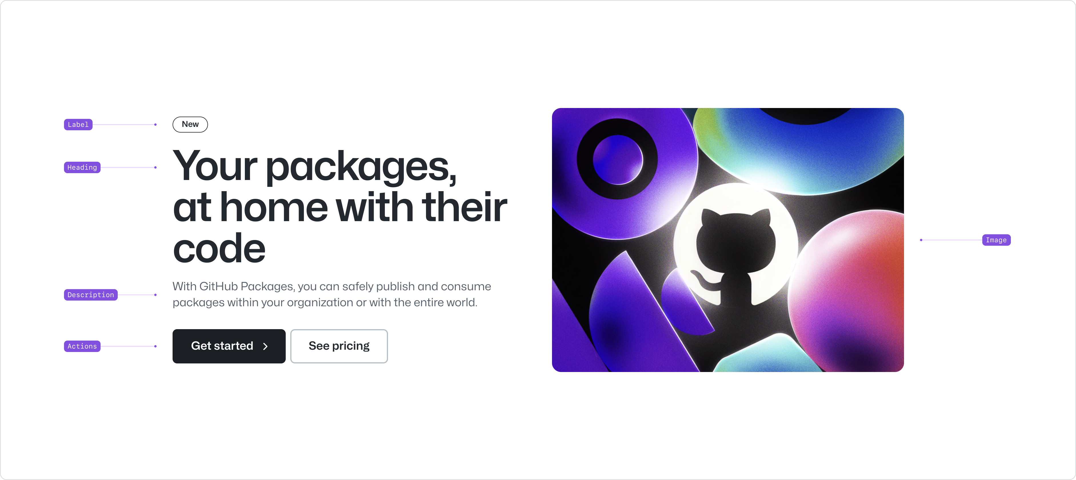
- Label: an optional label to provide leading context to the hero.
- Heading: the main title of the hero.
- Description: a short description of the hero.
- Actions: the main and secondary actions the user should take on the page.
- Image: an optional foreground image that appears adjacent to the text
## Usage
Use the hero component to provide a title, description and action that introduces the main content of a page. The hero component is designed to be positioned at the top of a page and spans the full width of the viewport. Consider using the [CTA banner](../CTABanner/index.md) to replicate the content and actions in other parts of the page.
Both the heading and description of the hero should be concise and descriptive. The heading should not exceed two lines, and the description should be limited to 3–4 lines.
The description must maintain a minimum contrast ratio of 4.5:1 at all times. Since it may appear in either the `default` or `muted` text colors, ensure the `muted` variant is used only when contrast is sufficient and no background imagery is present.
The hero component is not designed to provide a lot of information to the user. Consider using other components, such as the [section intro](../SectionIntro/index.md) or the [river](../River/index.md) component instead.
The hero heading is rendered as an `h1` element by default. You can modify the heading level but be aware that this will affect the page's heading structure and may impact accessibility. [See heading accessibility](../../typography/Heading/index.md#accessibility) for more information.
The hero can optionally include primary and secondary actions. These actions are rendered as a [button group](../ButtonGroup/index.md) and follow the same guidelines as the button group component.
**✅ Do**

_Use the hero component to introduce the page with short, descriptive text._
**❌ Don't**

_Don't use long, complex text in the hero. Consider splitting the content using other components._
## Options
### Alignment
Hero elements can be aligned to the start or center of the page. By default, the hero is aligned to the start of the page to allow for an image or a visual asset to be positioned on the right of the hero. Use the center alignment if the asset is centered or not present, or the scenario calls for it.
**✅ Do**

_Use left alignment if the hero includes an image or visual asset on the right._
**❌ Don't**

_Don't use center alignment if the background interfere with the legibility of the content._
## Related components
- [Section intro](../SectionIntro/index.md): To provide a title, description and a link to a new section in the page.
- [River](../River/index.md): To display a list of content items with a visual asset.
- [CTABanner](../CTABanner/index.md): To draw attention to or create urgency around a user action.