@primer/react-brand
Version:
Primer Brand is a GitHub's design system for creating React-based marketing websites and digital experiences.
61 lines (33 loc) • 2.82 kB
Markdown
title: Stack
description: Use the stack component to create a layout for its immediate children along the vertical or horizontal axis.
keywords: ['layout']

## Usage
Use the stack component to distribute space and alignment between items in a vertical or horizontal direction (one-dimensional layout)[^1]. If you need both vertical and horizontal layout (two-dimensional layout), use the [grid](../Grid/index.md) component instead. When in doubt, we recommend reading the [grid vs stack](../Grid/index.md#grid-vs-stack) documentation.
We recommend using the stack component for inline or text based elements. Stack enables items to scale, wrap, and shrink depending on each item's content and the available space.
[^1]: The stack component is implemented using the [CSS Flexbox Layout](https://developer.mozilla.org/en-US/docs/Web/CSS/CSS_Flexible_Box_Layout) specification.
**✅ Do**

_Use the stack component for inline or text based elements. Like a navigational list or a button group._
**❌ Don't**
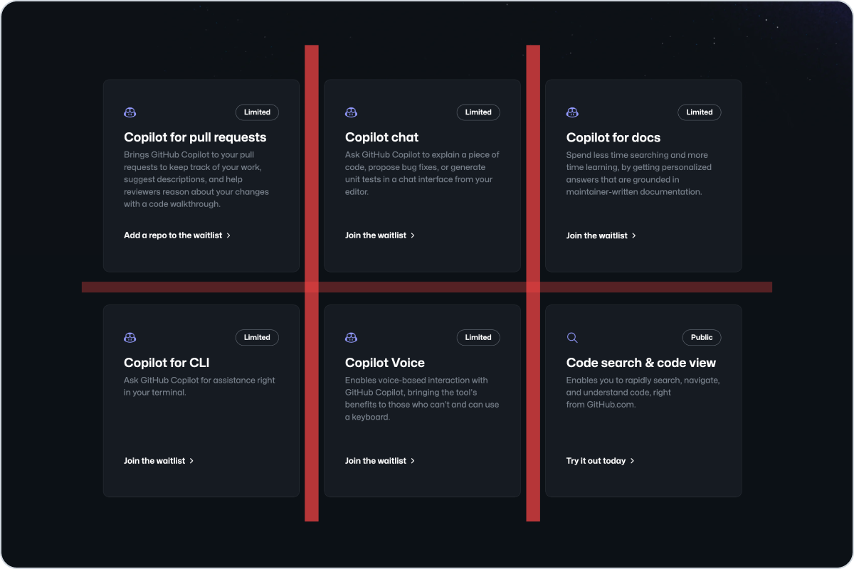
_Don't use the stack component to create a grid of items. Use the grid component instead._
## Options
### Gap
Use the gap to change the space between items. Use small values when grouping closed related items, and larger values to separate sections or non-related items between them.
**✅ Do**

_Use large gap values to separate sections or non-related items._
**❌ Don't**

_Don't use large gap values for related items._
### Direction, alignment, and justification
Use the direction to control the rendering direction of items. The direction can be adjusted on different viewports. For example, an icon and a label might be rendered horizontally on large viewports, but vertically on small viewports for better readability and composition.
Use the align and justify options for determining the rendering alignment on the cross-axis and main-axis respectively. Taking the example above, the icon and label might be aligned to the center on mobile viewports, but aligned to the start on large viewports.
_Video demonstration — see the online docs._
_Use vertical layout on small viewports to ensure that the content is readable. Combine it with center alignment if
the text is short and the context calls for it._
## Related components
- [Grid](../Grid/index.md): Use the grid component to create flexible and responsive grid-based layouts.