@primer/react-brand
Version:
Primer Brand is a GitHub's design system for creating React-based marketing websites and digital experiences.
133 lines (69 loc) • 6.33 kB
Markdown
---
title: Grid
description: Use the grid component to create flexible and responsive grid-based layouts.
keywords: ['layout', 'responsive', 'columns', 'rows', 'spacing']
---
## Usage
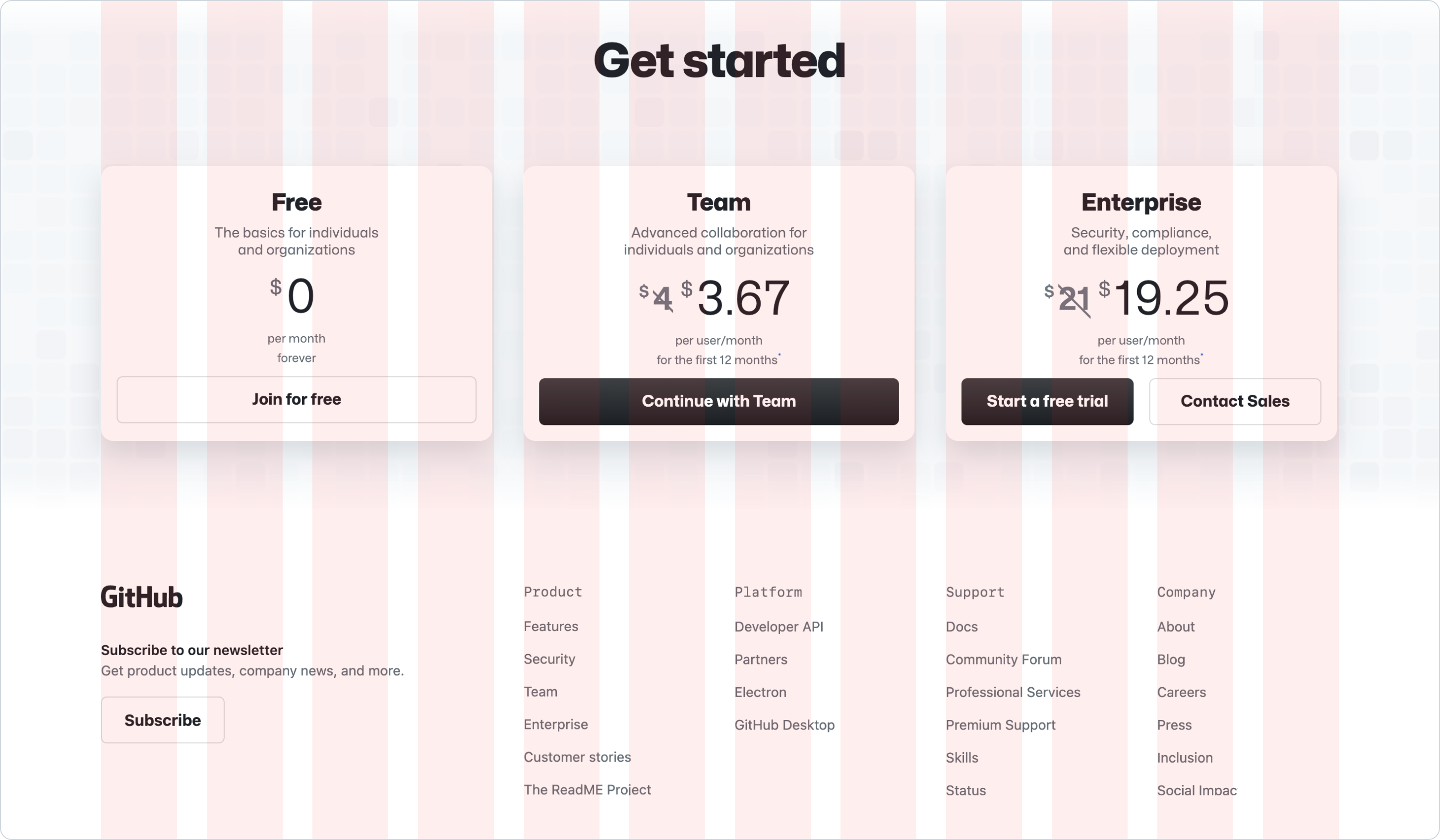
Use the grid component to define a layout that maintains consistent element positioning and sizing across pages. The grid is based on a 12-column layout and uses vertical and horizontal gaps to separate content units consistently[^1].
Use the grid for general page layout, and grouping related elements with a similar purpose. E.g. A "contact us" form or a list of [cards](../../components/Card/index.md).
In most cases, we recommend using the same column span for each element to create a consistent layout.
[^1]: The grid component is implemented using the [CSS Grid Layout](https://developer.mozilla.org/en-US/docs/Web/CSS/CSS_Grid_Layout) specification.
**✅ Do**

_Use the same column span for each content unit to create a consistent layout and spacing._
**❌ Don't**

_Don't use different column spans when grouping the same element type._
Use different column spans instead of an even distribution when creating a visual hierarchy between items or when defining a general page or a section layout. E.g. A section with an [image](../../components/Image/index.md) and [text](../../typography/Text/index.md), a layout with main content and a sidebar or a form with inputs and text areas.
**✅ Do**

_Use different column spans to create a visual hierarchy between a large image and text._
**❌ Don't**

_Don't span in few columns large images or long content text that will create unbalanced layouts._
**✅ Do**

_Use different column spans when you want to create a visual hierarchy on a section between different elements.
Like a footer with notes and navigational lists._
**❌ Don't**
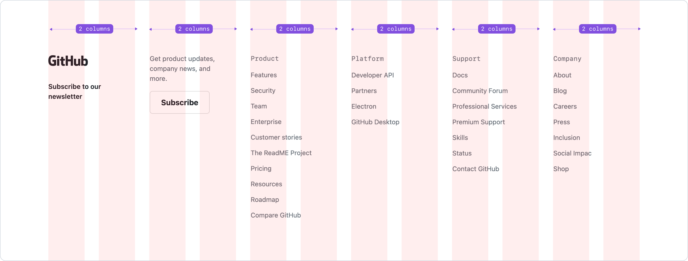
_Don't use equal column spans when the content is not related or the elements are different._
### Responsive
The grid component provides control over the number of columns at each breakpoint. For most of the cases, we recommend using the same column span on each child at each breakpoint to create a consistent layout and spacing in all screen sizes.
For example, a group of cards might span 3 columns on a extra large viewport, 4 columns on large viewports, 6 on medium and 12 columns on small viewports.
_Video demonstration — see the online docs._
_Use the same column span for each content unit at each breakpoint to create visually consistent layouts._
When using even column spans, we recommend to span each item full width on small viewports and stacking the items vertically to ensure that the content is readable and accessible on small screens.
_Video demonstration — see the online docs._
_Use full width on small viewports to ensure that the content is readable and accessible._
## Grid vs Stack
We recommend using either the grid or stack component, depending on how the child items are displayed and how they work on different screen sizes. If the element is a sequential list of items in a vertical or horizontal order, we recommend using the stack component. Otherwise, if the element needs columns and rows or for general page layout, we recommend using the grid component instead[^2].
### Grid examples
#### Page or section layout
When defining the page or a section layout. E.g. A page with navigation, main content and footer areas.

#### Sub sections
When dividing an area into two areas. E.g. A "Send feedback" sidebar and a form, and the form uses the grid for the form layout itself.

#### Card or pillar grids
When laying out cards, pillars, or similar content-based elements.

### Stack examples
#### Navigation
For the page navigation or a list of links. E.g. Having a logo on the left side and the navigation on the right.

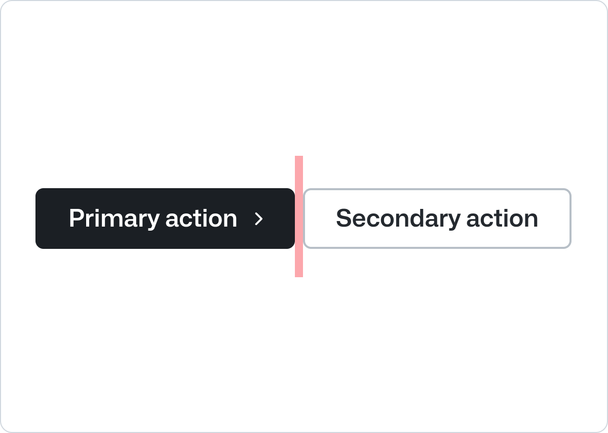
#### List of actions
For a group of action or buttons, where items are displayed next to each other, and they are distributed horizontally or vertically, depending on the content length and the screen size.
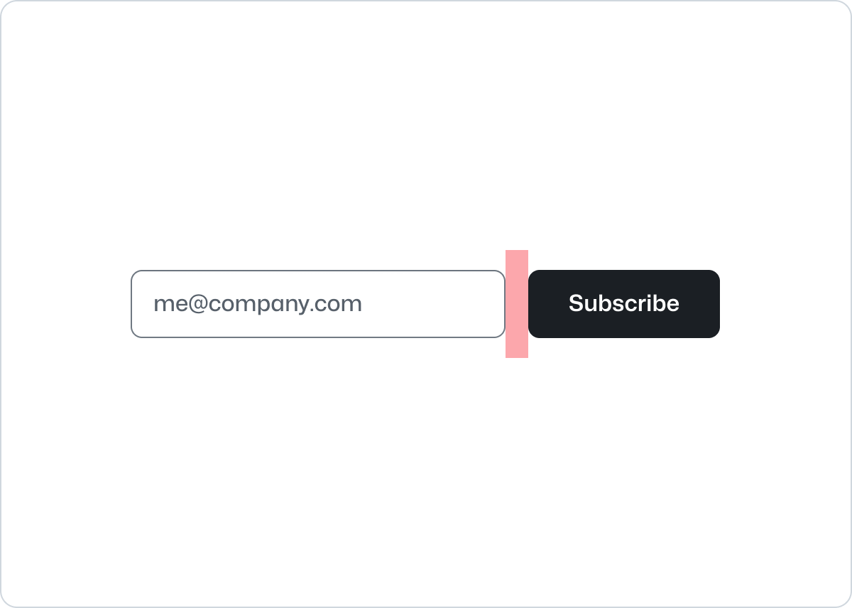
#### Form elements
For combinations of input fields with a button next to it.
#### Profile cards
For combinations of an avatar and descriptive content, where the information takes the remaining space from its parent element. This could be applied to any combinations of an icon and text too.

[^2]: This section is based on the article [Grid for layout, Flexbox for components](https://ishadeed.com/article/grid-layout-flexbox-components/) by [@shadeed](https://github.com/shadeed)
## Accessibility
By default, the grid assumes that it will be used in a purely decorative fashion and thus sets no roles, ARIA attributes, or keyboard shortcuts. This is equivalent to having a sequence of `<div>` elements on the page by default. Any interactive content within the grid should be given an appropriate accessibility treatment based on the specific workflow of your application.
## Related components
- [Stack](../Stack/index.md): To enable layout of its immediate children along the vertical or horizontal axis.