@primer/react-brand
Version:
Primer Brand is a GitHub's design system for creating React-based marketing websites and digital experiences.
64 lines (36 loc) • 2.79 kB
Markdown
---
title: Radio
description: Use the radio component when a user needs to select one option from a list.
keywords: ['radio button', 'selection', 'input', 'form', 'option', 'single choice']
---
## Anatomy
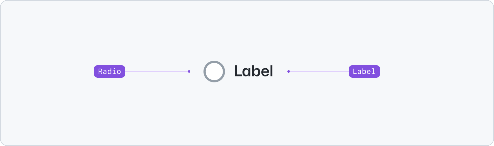
- Radio: A selection control.
- Label: A description for the radio.
## Usage
Use the radio component to enable users to select a single option from a list.
For scenarios that allow for multiple selections, use the [Checkbox](../Checkbox/index.md) component instead. Keep the radio label descriptive and concise: aim for no more than 3 words. Write labels in sentence case and without ending in punctuation.
### Grouping
To group related radio components together in a list, use the [Stack](../../layout/Stack/index.md) and [FormControl](../FormControl/index.md) components. When rendering a group of radio components, make sure to consider all potential option. Remember to include "None" or "Other" options when necessary.
**✅ Do**

_Ensure radio options are are mutually exclusive. Include "None" or "Other" options when necessary._
**❌ Don't**

_Don't overlap or leave out potential radio options from the list._
**✅ Do**

_When used in groups, order the radio options in a logical order (e.g. smallest to largest)._
**❌ Don't**

_Don't order radio options without logic in a group._
### States
Radios have static dimensions and three different states: default, checked, and disabled.

## Accessibility
Please use [FormControl](../FormControl/index.md) to render a standard radio input field. If using standalone, it should always be accompanied by a corresponding `<label>` to improve support for assistive technologies.
## Related components
- [Checkbox](../Checkbox/index.md): Use the checkbox component to select one or more options of a limited number of choices.
- [Select](../Select/index.md): Use the select component to enable selection of one option from a list.
- [FormControl](../FormControl/index.md): Use the form control component to display form inputs alongside labels, validation and more.
- [Stack](../../layout/Stack/index.md): Use the stack component to create a layout for its immediate children along the vertical or horizontal axis.