@primer/react-brand
Version:
Primer Brand is a GitHub's design system for creating React-based marketing websites and digital experiences.
78 lines (43 loc) • 3.51 kB
Markdown
title: Section intro
description: Use the section intro component to provide a title, optional description and link to a new section in the page.
keywords: ['heading', 'intro', 'section']
## Anatomy
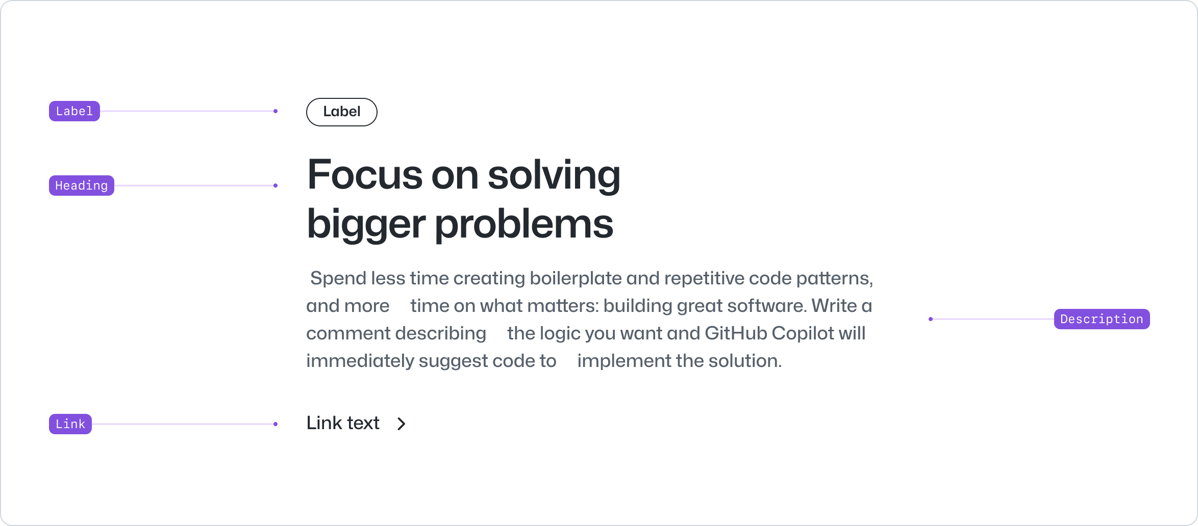
- Label: An optional label to provide leading context to the section intro.
- Heading: The title of the section.
- Description: An optional description of the section.
- Link: An optional link to expand on the content introduced.
## Usage
Use the section intro to introduce a new section element in the page. The section intro uses the full-width of the screen and can be used in conjunction with other components that expand the content introduced. For example, the [card](../Card/index.md) or the [pillar](../Pillar/index.md) components.
We recommend using the section intro as a header of an HTML `<section>` element. Sections divide the content of the page into thematic groups and represent standalone elements that are typically related to a specific topic or subject within the document.
Sections are designed to be self-contained, meaning they should make sense and be meaningful even when viewed independently from the rest of the page. They provide a way to divide the content into meaningful and structured blocks.
Ensure the description is concise, keeping it to one paragraph. Use a link to direct users to a page with further details if needed.
**✅ Do**

_Use section intros to introduce a new topic in a section and combine it with other components and content._
**❌ Don't**

_Don't use it as standalone element followed by other section intros._
**✅ Do**

_Use a short description to introduce the section._
**❌ Don't**

_Don't use section intro for long form content._
## Options
### Align
Section intro can be aligned to the start or center of the page. By default, the section intro is aligned to the start of the page to allow for an image or a visual asset to be positioned on the left. Use the center alignment if the asset is centered, not present, or the scenario calls for it.
**✅ Do**

_Use center alignment if the section intro is paired with a centered image or visual asset._
**❌ Don't**

_Don't use center alignment if the section intro is paired with an image or visual asset aligned to the left._
### Emphasized text
Section intro allows for only one portion of the heading to be highlighted. Use strategically to highlight key ideas and guide effectively through a story.

## Related components
- [Hero](../Hero/index.md): Use the hero component to render a full-width banner on a webpage.
- [CTABanner](../CTABanner/index.md): To draw attention to or create urgency around a user action.