@primer/react-brand
Version:
Primer Brand is a GitHub's design system for creating React-based marketing websites and digital experiences.
63 lines (35 loc) • 2.35 kB
Markdown
title: Button group
description: Use the button group component to group related buttons together.
keywords: ['buttons', 'control', 'action', 'group', 'paired']
## Usage
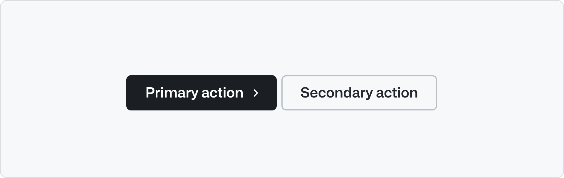
Use button group to group a set of actions that are related between them or to a single application. E,g, "Log in" and "Sign up" or "Try it out" and "Learn more".
Use button group to display a pair of primary and a secondary actions. The primary button is used for the main call to action while the secondary button is a related, less important action.
**✅ Do**
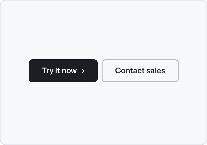
_Use a primary button with a secondary button._
**❌ Don't**
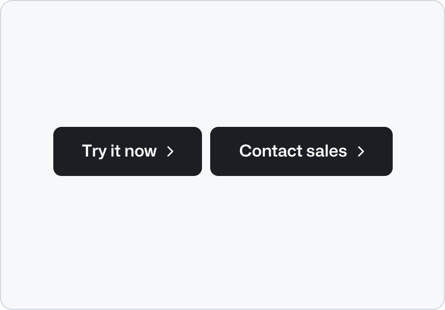
_Don’t place multiple primary buttons together._
**✅ Do**

_Place the primary button at the beginning of a button group._
**❌ Don't**

_Don't place the primary button at the end of a button group._
**✅ Do**

_Stack the buttons vertically when there's not enough horizontal space._
**❌ Don't**

_Don't stack the buttons horizontally when there's not enough space to avoid text wrapping._
## Options
### Size
The button group component has two sizes: `medium` and `large`. The `medium` size should be used for most cases. The `large` size should be used when the button group is used in large headings that introduces a page, as in the [Hero](../Hero/index.md) component.
## Related components
- [Button](../Button/index.md): To display a button that performs an action.
- Link: To display a link that navigates to another page.
- [Hero](../Hero/index.md): To display a large heading and a description with a button group.
- [CTA banner](../CTABanner/index.md): To draw attention to or create urgency around a user action.