@plusify/ngx-markdown-editor
Version:
A customizable Markdown editor for Angular with KaTeX support, syntax highlighting, and a modern toolbar.
126 lines (89 loc) • 3.37 kB
Markdown
# Plusify Markdown Editor
A lightweight, extensible, and user-friendly **Markdown Editor** built with Angular. It features a custom toolbar, live preview, support for KaTeX, copy to clipboard, and interactive popovers for inserting images, links, and headings.
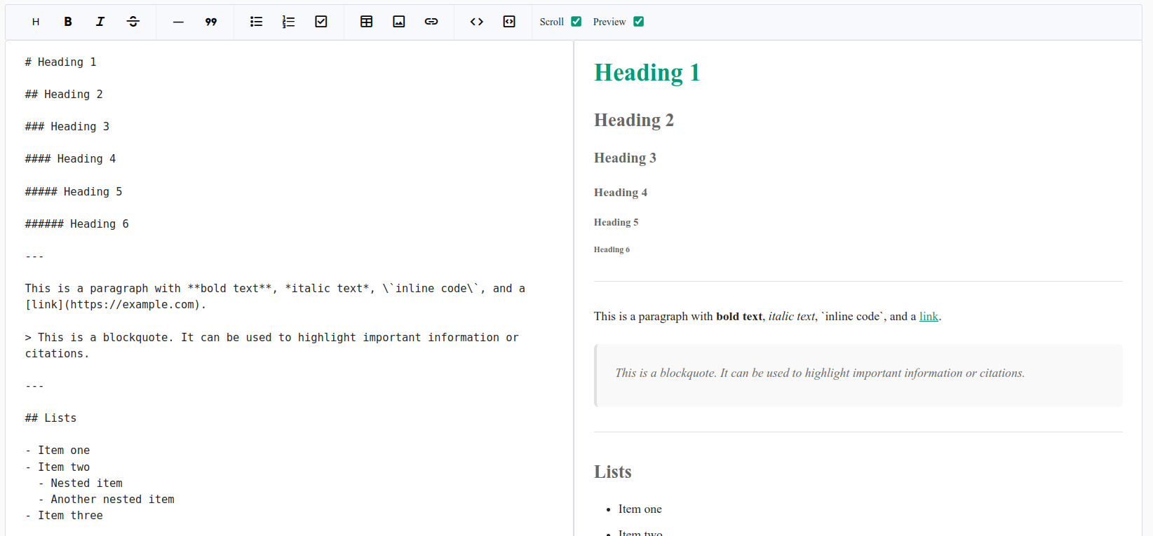
## ✨ Features
- Modular architecture with reusable components.
- Markdown input with syntax helpers (bold, italic, lists, etc.).
- Insert links and images through popovers.
- Select heading levels with a quick menu.
- Synchronized scrolling (optional).
- Live preview powered by [`ngx-markdown`](https://github.com/jfcere/ngx-markdown) and KaTeX.
- Customizable theme with CSS variables.
## Getting Started
### 1. Install Required Dependencies
Run the following command to install `@plusify/ngx-markdown-editor` along with its peer dependencies:
```bash
npm install @plusify/ngx-markdown-editor ngx-markdown marked prismjs katex clipboard
```
### 2. Configure `angular.json`
Add the following entries in your `angular.json` under the corresponding build and test targets:
```json
"styles": [
"node_modules/prismjs/themes/prism-okaidia.css",
"node_modules/katex/dist/katex.min.css"
],
"scripts": [
"node_modules/prismjs/prism.js",
"node_modules/clipboard/dist/clipboard.min.js",
"node_modules/katex/dist/katex.min.js",
"node_modules/katex/dist/contrib/auto-render.min.js"
]
```
> **Note:** Angular CLI does not automatically apply these configurations. You must add them manually to enable syntax highlighting and KaTeX rendering.
### 3. Use the Component
```html
<plusify-markdown-editor
[config]="config"
[customTheme]="{ '--color-primary': '#4caf50' }"
(valueChange)="handleValueChange($event)">
</plusify-markdown-editor>
```
```typescript
config: MarkdownEditorConfig = {
showPreview: false,
readonly: false,
};
handleValueChange(newValue: string) {
console.log('Updated Markdown:', newValue);
}
```
## Components Overview
### `<plusify-markdown-editor>`
The main editor wrapper. Provides toolbar, textarea, and live preview.
| Input | Type | Description |
| ------------- | ------------------------ | ----------------------------------- |
| `themeClass` | `string` | Optional theme class. |
| `customTheme` | `Record<string, string>` | CSS variable overrides. |
| `config` | `MarkdownEditorConfig` | Initial config options. |
## 🎨 Theming
Customize using CSS variables:
```css
:root {
--color-primary: #009b77;
--color-on-primary: #fff;
--color-outline: #ccc;
--color-on-surface: #222;
}
```
Or override directly:
```html
<plusify-markdown-editor
[customTheme]="{ '--color-primary': '#4caf50' }">
</plusify-markdown-editor>
```
## 📦 Dependencies
- [Angular](https://angular.dev/)
- [ngx-markdown](https://github.com/jfcere/ngx-markdown)
- [KaTeX](https://katex.org/)
- [clipboard](https://clipboardjs.com/)
- [prismjs](https://prismjs.com/)
- [marked](https://marked.js.org/)
## 🙌 Contributing
Pull requests are welcome! If you want to add new features or improve the existing ones, feel free to fork the project and submit a PR.