@origin-space/image-cropper
Version:
A headless React component for image cropping
160 lines (122 loc) • 8.72 kB
Markdown
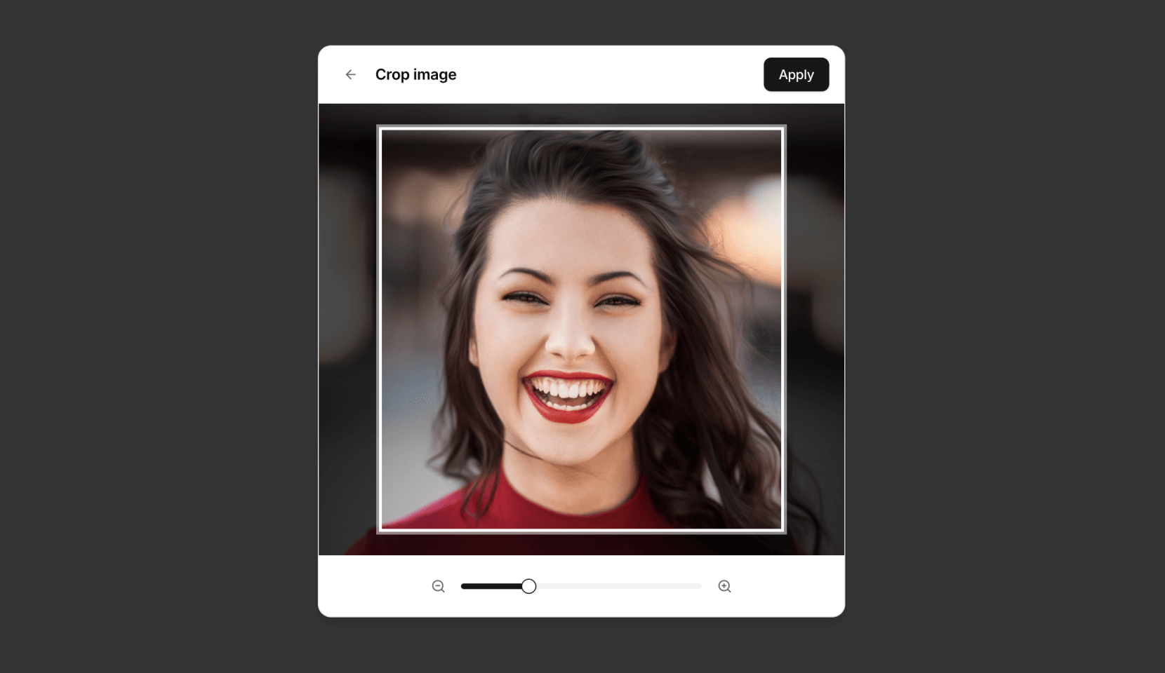
# React Image Cropper
[](https://badge.fury.io/js/%40origin%2Fimage-cropper)
[](https://opensource.org/licenses/MIT)
A simple, composable, headless React component for interactive image cropping — inspired by the experience on <a href="https://x.com" target="_blank">X</a>.
## Features
* **Headless & Composable:** Provides building blocks (`Cropper.Root`, `Cropper.Image`, `Cropper.CropArea`, `Cropper.Description`) for full control over structure and styling.
* **Interactive:** Supports zooming (mouse wheel, pinch gesture) and panning (mouse drag, touch drag, arrow keys).
* **Aspect Ratio:** Enforces a specified aspect ratio for the crop area.
* **Controlled/Uncontrolled:** Manage zoom state internally or control it via props.
* **Crop Calculation:** Outputs precise pixel coordinates of the cropped area relative to the original image.
* **Accessible:** Designed with ARIA attributes and requires a description element for screen reader users.
* **Customizable:** Control zoom limits, sensitivity, padding, keyboard steps, and apply custom styles.
## Installation
```bash
npm install @origin/image-cropper
# or
yarn add @origin/image-cropper
# or
pnpm add @origin/image-cropper
```
## Usage
Here's a basic example of how to use the `Cropper` primitive components:
```tsx
import { Cropper } from "@origin-space/image-cropper"
import React from "react"
function MyImageCropper() {
const [cropData, setCropData] = React.useState<Area | null>(null)
return (
<div>
<Cropper.Root
image="https://images.unsplash.com/photo-1494790108377-be9c29b29330"
aspectRatio={1}
onCropChange={setCropData}
className="relative flex h-80 w-full cursor-move touch-none items-center justify-center overflow-hidden rounded-md border focus:outline-none focus-visible:ring-2 focus-visible:ring-ring"
>
{/* Required for accessibility */}
<Cropper.Description className="sr-only" />
<Cropper.Image className="pointer-events-none h-full w-full select-none object-cover" />
<Cropper.CropArea className="pointer-events-none absolute border-2 border-dashed border-background shadow-[0_0_0_9999px_rgba(0,0,0,0.6)]" />
</Cropper.Root>
{cropData && (
<pre className="mt-4 overflow-auto rounded bg-muted p-2 text-sm">
{JSON.stringify(cropData, null, 2)}
</pre>
)}
</div>
)
}
```
For more examples and integration with UI frameworks, check out the implementation on [Origin UI](http://originui.com/image-cropper).
## Origin UI Abstraction
Origin UI provides a [pre-styled component](https://github.com/origin-space/originui/blob/main/registry/default/ui/cropper.tsx) built on top of `@origin-space/image-cropper`. If you're using Origin UI or want a quicker setup, you can use this abstraction.
### Usage with Abstraction
Using the Origin UI abstraction simplifies the markup:
```tsx
"use client"
import React from "react"
import {
Cropper,
CropperCropArea,
CropperDescription,
CropperImage,
} from "@/registry/default/ui/cropper"
type Area = { x: number; y: number; width: number; height: number }
export default function Component() {
const [cropData, setCropData] = React.useState<Area | null>(null)
return (
<div className="flex flex-col gap-4">
<Cropper
className="h-80"
image="https://images.unsplash.com/photo-1494790108377-be9c29b29330"
aspectRatio={1}
onCropChange={setCropData}
>
<CropperDescription />
<CropperImage />
<CropperCropArea />
</Cropper>
{cropData && (
<pre className="overflow-auto rounded bg-muted p-2 text-sm">
{JSON.stringify(cropData, null, 2)}
</pre>
)}
</div>
)
}
```
## Components
* **`Cropper.Root`**: The main container and controller. It handles logic, state, and interactions.
* **`Cropper.Image`**: Renders the actual `<img>` tag. It's positioned and scaled by `Cropper.Root`.
* **`Cropper.CropArea`**: A simple `<div>` representing the visual crop area. You style this component to show the bounds.
* **`Cropper.Description`**: Renders a `<div>` intended for accessibility instructions. Its `id` is automatically linked via `aria-describedby` on the `Root` element. **This component is required for accessibility.**
## `Cropper.Root` Props
| Prop | Type | Default | Description |
|------------------|--------------------------------|-------------|--------------------------------------------------------------------------------------------------------------|
| `image` | `string` | **Required**| URL of the image to crop. |
| `children` | `React.ReactNode` | **Required**| Should include `Cropper.Image`, `Cropper.CropArea`, and `Cropper.Description`. |
| `aspectRatio` | `number` | `1` | The desired width/height aspect ratio (e.g., `1`, `1.5`, `4 / 3`, `16 / 9`). |
| `cropPadding` | `number` | `25` | Minimum padding (in pixels) between the crop area edges and the container edges. |
| `minZoom` | `number` | `1` | Minimum zoom level (1 = 100% original size relative to crop area). |
| `maxZoom` | `number` | `3` | Maximum zoom level. |
| `zoomSensitivity`| `number` | `0.005` | Multiplier for mouse wheel delta to control zoom speed. |
| `keyboardStep` | `number` | `10` | Number of pixels to pan the image when using arrow keys. |
| `zoom` | `number` | `undefined` | Controlled zoom level. If provided, component zoom state is controlled externally. |
| `onCropChange` | `(pixels: Area \| null) => void` | `undefined` | Callback function triggered whenever the crop area changes. Receives pixel data or `null` if invalid. |
| `onZoomChange` | `(zoom: number) => void` | `undefined` | Callback function triggered when the zoom level changes interactively. Essential for controlled `zoom` prop. |
| `className` | `string` | `undefined` | CSS class for the root container element. |
| `style` | `React.CSSProperties` | `undefined` | Inline styles for the root container element. |
| *...restProps* | | | Any other standard `HTMLDivElement` props are passed to the root container. |
### `onCropChange` Data (`Area`)
The `Area` object received by `onCropChange` contains the following properties relative to the *original* image dimensions:
* `x`: The x-coordinate of the top-left corner of the cropped area.
* `y`: The y-coordinate of the top-left corner of the cropped area.
* `width`: The width of the cropped area in pixels.
* `height`: The height of the cropped area in pixels.
## Accessibility
It is crucial to include a `Cropper.Description` component within `Cropper.Root`. This provides necessary context for screen reader users about how to interact with the cropper. If you don't provide one, a warning will appear in the console. You can visually hide the description using standard CSS techniques (e.g., an `sr-only` class).
## Styling
The component is headless, meaning it doesn't come with built-in styles beyond basic positioning for the image. You are expected to style the `Cropper.Root`, `Cropper.Image`, and especially the `Cropper.CropArea` using CSS classes (`className`) or inline styles (`style`) to match your application's design. The `Cropper.CropArea` typically needs styling to appear as an overlay (e.g., border, semi-transparent background outside the area).
## License
MIT