@mr-fougere/react-trustpilot-widgets
Version:
This library provides a set of customizable Trustpilot widgets for embedding on your website or application. It allows you to integrate Trustpilot's review display system, product ratings, and review collection functionality.
1,065 lines (1,023 loc) • 46.9 kB
TypeScript
import { CSSProperties } from 'react';
import { FC } from 'react';
import { JSX as JSX_2 } from 'react/jsx-runtime';
import { PropsWithChildren } from 'react';
declare const CollectReviewTrustBoxWidgets: {
/**
* ---
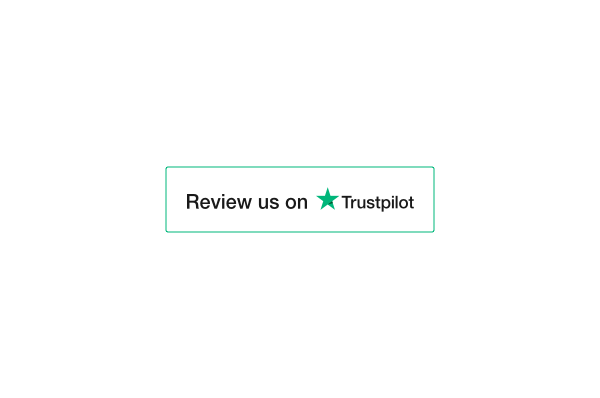
* TrustBox Widget ReviewCollector - Collect Review
* ---
*
* Deliver a seal of trust and collect organic reviews.
*
* Helps you collect reviews directly from your own site. Has a clean and simple design.
*
* ---
*
* @param height Defines the widget height in `px` or `%`. Supports `min` and `max` for responsive sizing.
* @param width Defines the widget width in `px` or `%`. Supports `min` and `max` for responsive sizing.
* @param locale Overrides the language set in the provider.
* @param fontFamily Defines the font family.
* @param borderColor Custom the widget border color.
* @param children Custom loading element (default: none).
*
* @returns The TrustBox ReviewCollector widget.
*
* 
*/
ReviewCollector: (props: TrustBoxWidgetReviewCollectorAttributesProps) => JSX_2.Element;
};
/**
* Defines the available dimensions in pixels or percentages.
*/
declare type DimensionT = `${number}%` | `${number}px`;
declare const EssentialTrustBoxWidgets: {
/**
* ---
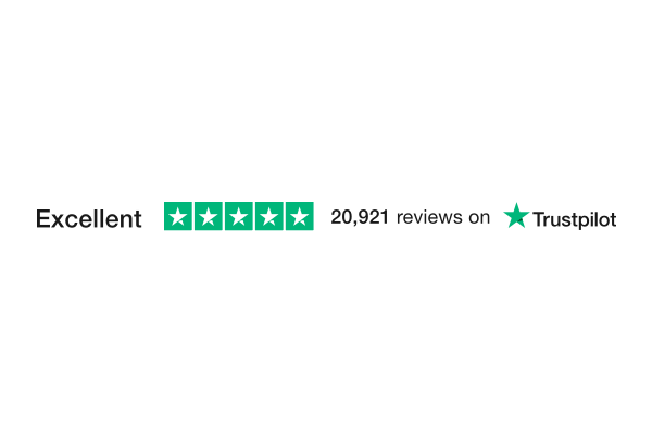
* TrustBox Widget Horizontal - Essential
* ---
*
* Stay top of mind throughout the consumer’s journey.
*
* Minimalistic design. Highly versatile.
*
* ----
*
* @param height Defines the widget height in `px` or `%`. Supports `min` and `max` for responsive sizing.
* @param width Defines the widget width in `px` or `%`. Supports `min` and `max` for responsive sizing.
* @param locale Overrides the language set in the provider.
* @param theme Defines the widget theme (`light` or `dark`).
* @param fontFamily Defines the font family.
* @param children Custom loading element (default: none).
*
* @returns The TrustBox Horizontal widget.
*
* 
*/
Horizontal: (props: TrustBoxWidgetBasicAttributesProps) => JSX_2.Element;
/**
* ---
* TrustBox Widget MicroButton - Essential
* ---
*
* Something extra to accompany your social media icons.
*
* Show off your total number of reviews.
*
* ---
*
* @param height Defines the widget height in `px` or `%`. Supports `min` and `max` for responsive sizing.
* @param width Defines the widget width in `px` or `%`. Supports `min` and `max` for responsive sizing.
* @param locale Overrides the language set in the provider.
* @param fontFamily Defines the font family.
* @param children Custom loading element (default: none).
*
* @returns The TrustBox MicroButton widget.
*
* 
*/
MicroButton: (props: TrustBoxWidgetMicroButtonAttributesProps) => JSX_2.Element;
/**
* ---
* TrustBox Widget MicroCombo - Essential
* ---
*
* A great little starter or something extra to accompany larger TrustBoxes.
*
* Show off your current review count and star rating. So small it fits anywhere!
*
* ---
*
* @param height Defines the widget height in `px` or `%`. Supports `min` and `max` for responsive sizing.
* @param width Defines the widget width in `px` or `%`. Supports `min` and `max` for responsive sizing.
* @param locale Overrides the language set in the provider.
* @param theme Defines the widget theme (`light` or `dark`).
* @param fontFamily Defines the font family.
* @param children Custom loading element (default: none).
*
* @returns The TrustBox MicroCombo widget.
*
* 
*/
MicroCombo: (props: TrustBoxWidgetBasicAttributesProps) => JSX_2.Element;
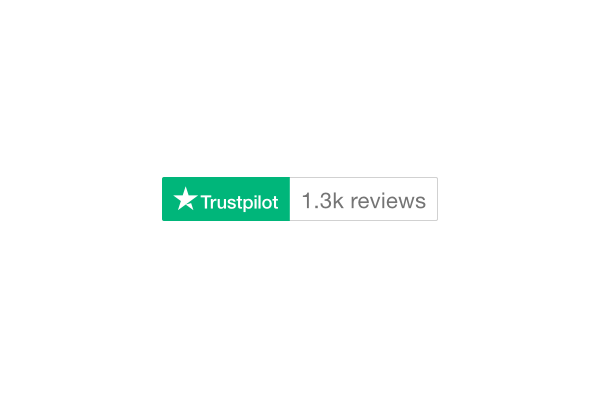
/**
* ---
* TrustBox Widget MicroReviewCount - Essential
* ---
*
* Show your customers that you value real feedback with this free widget.
*
* Display your current review count, or hide it until you’ve reached your preferred amount of reviews. Fits seamlessly anywhere on your website
*
* ---
*
* @param height Defines the widget height in `px` or `%`. Supports `min` and `max` for responsive sizing.
* @param width Defines the widget width in `px` or `%`. Supports `min` and `max` for responsive sizing.
* @param locale Overrides the language set in the provider.
* @param theme Defines the widget theme (`light` or `dark`).
* @param fontFamily Defines the font family.
* @param children Custom loading element (default: none).
* @param styleAlignment Defines the alignment of the widget's content.
* - `left`: Aligns content to the left.
* - `center`: Centers the content.
* - `right`: Aligns content to the right.
* @param minReviewCount Minimum number of reviews required to display the widget.
*
* @returns The TrustBox MicroReviewCount widget.
*
* 
*/
MicroReviewCount: (props: TrustBoxWidgetMicroReviewCountAttributesProps) => JSX_2.Element;
/**
* ---
* TrustBox Widget MicroStar - Essential
* ---
*
* A great little starter or something extra to accompany larger TrustBoxes.
*
* Show off your current review count and star rating. So small it fits anywhere!
*
* ---
*
* @param height Defines the widget height in `px` or `%`. Supports `min` and `max` for responsive sizing.
* @param width Defines the widget width in `px` or `%`. Supports `min` and `max` for responsive sizing.
* @param locale Overrides the language set in the provider.
* @param theme Defines the widget theme (`light` or `dark`).
* @param fontFamily Defines the font family.
* @param children Custom loading element (default: none).
* @returns The TrustBox MicroStar widget.
*
* 
*/
MicroStar: (props: TrustBoxWidgetBasicAttributesProps) => JSX_2.Element;
/**
* ---
* TrustBox Widget MicroTrustScore - Essential
* ---
*
* A great little starter or something extra to accompany larger TrustBoxes.
*
* Show off your TrustScore. So small it fits anywhere!
*
* ---
*
* @param height Defines the widget height in `px` or `%`. Supports `min` and `max` for responsive sizing.
* @param width Defines the widget width in `px` or `%`. Supports `min` and `max` for responsive sizing.
* @param locale Overrides the language set in the provider.
* @param theme Defines the widget theme (`light` or `dark`).
* @param fontFamily Defines the font family.
* @param children Custom loading element (default: none).
* @returns The TrustBox MicroTrustScore widget.
*
* 
*/
MicroTrustScore: (props: TrustBoxWidgetBasicAttributesProps) => JSX_2.Element;
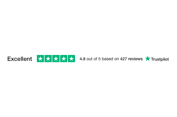
/**
* ---
* TrustBox Widget Mini - Essential
* ---
*
* Get down to basics with the Mini.
*
* Gets to the point. Delivers a seal of trust.
*
* ---
*
* @param height Defines the widget height in `px` or `%`. Supports `min` and `max` for responsive sizing.
* @param width Defines the widget width in `px` or `%`. Supports `min` and `max` for responsive sizing.
* @param locale Overrides the language set in the provider.
* @param theme Defines the widget theme (`light` or `dark`).
* @param fontFamily Defines the font family.
* @param children Custom loading element (default: none).
*
* @returns The TrustBox Mini widget.
*
* 
*/
Mini: (props: TrustBoxWidgetBasicAttributesProps) => JSX_2.Element;
/**
* ---
* TrustBox Widget Starter - Essential
* ---
*
* Get down to basics and watch the reviews roll in.
*
* Showcases your stars and review count. Links to your profile page on Trustpilot
*
* ---
*
* @param height Defines the widget height in `px` or `%`. Supports `min` and `max` for responsive sizing.
* @param width Defines the widget width in `px` or `%`. Supports `min` and `max` for responsive sizing.
* @param locale Overrides the language set in the provider.
* @param theme Defines the widget theme (`light` or `dark`).
* @param fontFamily Defines the font family.
* @param children Custom loading element (default: none).
* @returns The TrustBox Starter widget.
*
* 
*/
Starter: (props: TrustBoxWidgetBasicAttributesProps) => JSX_2.Element;
};
/**
* Defines the available font families for the widget.
*/
declare type FontFamilyProps = "Roboto" | "Open Sans" | "Noto Sans JP" | "Lato" | "Montserrat" | "Roboto Condensed" | "Source Sans Pro" | "Raleway" | "Poppins" | "Noto Sans" | "Roboto Slab" | "Merriweather" | "PT Sans" | "Playfair Display" | "Ubuntu" | "Mukta" | "Muli" | "PT Serif" | "Lora" | "Nunito" | "Work Sans" | "Rubik" | "Fira Sans" | "Titillium Web" | "Noto Sans TC" | "Noto Serif" | "Noto Sans KR" | "Nanum Gothic" | "Quicksand" | "Hind Siliguri" | "Nunito Sans" | "Heebo" | "Arimo" | "Oxygen" | "Dosis" | "Barlow" | "Karla" | "Slabo 27px" | "Libre Baskerville" | "Inconsolata" | "Libre Franklin" | "Crimson Text" | "Josefin Sans";
/**
* Converts camelCase strings to kebab-case.
*/
export declare type KebabKeys<S extends string> = S extends `${infer T}${infer U}` ? T extends Capitalize<T> ? `-${Lowercase<T>}${KebabKeys<U>}` : `${Lowercase<T>}${KebabKeys<U>}` : S;
/**
* Defines size constraints, allowing specific values such as `min` and `max`.
*/
declare type limitSizeProps = DimensionT | "min" | "max";
/**
* Defines the available locales for the widget.
*/
export declare type LocaleProps = "da-DK" | "de-AT" | "de-CH" | "de-DE" | "en-AU" | "en-CA" | "en-GB" | "en-IE" | "en-NZ" | "en-US" | "es-ES" | "fi-FI" | "fr-BE" | "fr-FR" | "it-IT" | "ja-JP" | "nb-NO" | "nl-BE" | "nl-NL" | "pl-PL" | "pt-BR" | "pt-PT" | "ru-RU" | "sv-SE" | "zh-CN";
declare const ProductReviewTrustBoxWidgets: {
/**
* ---
* TrustBox Widget ProductMini - Product Review
* ---
*
* Highlight your customers’ favorite products!
*
* Gives an overview of star ratings. Makes product comparisons easy
*
* ---
*
* @param height Defines the widget height in `px` or `%`. Supports `min` and `max` for responsive sizing.
* @param width Defines the widget width in `px` or `%`. Supports `min` and `max` for responsive sizing.
* @param locale Overrides the language set in the provider.
* @param theme Defines the widget theme (`light` or `dark`).
* @param fontFamily Defines the font family.
* @param sku Product SKU(s) associated with the reviews. Can be a single string or an array of SKUs.
* @param starColor Define the color of the stars
* @param scrollToList Determines whether the widget should scroll to the review list when clicked.
* @param noReviews the visibility of the "No Review" message.
* - `hide`: Do not display when no reviews are available.
* - `show`: Display even if no reviews are available.
* @param styleAlignment Defines the alignment of the widget's content.
* - `left`: Aligns content to the left.
* - `center`: Centers the content.
* - `right`: Aligns content to the right.
* @param children Custom loading element (default: none).
*
* @returns The TrustBox ProductMini widget.
*
* 
*/
ProductMini: (props: TrustBoxWidgeMiniProductReviewsAttributesProps) => JSX_2.Element;
/**
* ---
* TrustBox Widget ProductMiniMultiSource - Product Review
* ---
*
* Import all your product reviews and highlight your customers’ favourite products!
*
* Get all the benefits of the Product Mini plus the option to import reviews from other sources
*
* ---
*
* @param height Defines the widget height in `px` or `%`. Supports `min` and `max` for responsive sizing.
* @param width Defines the widget width in `px` or `%`. Supports `min` and `max` for responsive sizing.
* @param locale Overrides the language set in the provider.
* @param theme Defines the widget theme (`light` or `dark`).
* @param fontFamily Defines the font family.
* @param sku Product SKU(s) associated with the reviews. Can be a single string or an array of SKUs.
* @param starColor Define the color of the stars
* @param scrollToList Determines whether the widget should scroll to the review list when clicked.
* @param noReviews the visibility of the "No Review" message.
* - `hide`: Do not display when no reviews are available.
* - `show`: Display even if no reviews are available.
* @param styleAlignment Defines the alignment of the widget's content.
* - `left`: Aligns content to the left.
* - `center`: Centers the content.
* - `right`: Aligns content to the right.
* @param children Custom loading element (default: none).
*
* @returns The TrustBox ProductMiniMultiSource widget.
*
* 
*/
ProductMiniMultiSource: (props: TrustBoxWidgeMiniProductReviewsAttributesProps) => JSX_2.Element;
/**
* ---
* TrustBox Widget ProductReviews - Product Review
* ---
*
* A convenient overview of your products’ reviews.
*
* Shows reviews directly on the website. Focuses on one specific product
*
* ---
*
* @param height Defines the widget height in `px` or `%`. Supports `min` and `max` for responsive sizing.
* @param width Defines the widget width in `px` or `%`. Supports `min` and `max` for responsive sizing.
* @param locale Overrides the language set in the provider.
* @param theme Defines the widget theme (`light` or `dark`).
* @param fontFamily Defines the font family.
* @param sku Product SKU(s) associated with the reviews. Can be a single string or an array of SKUs
* @param starColor Define the color of the stars
* @param noReviews the visibility of the "No Review" message.
* - `hide`: Do not display when no reviews are available.
* - `show`: Display even if no reviews are available.
* @param children Custom loading element (default: none).
*
* ⚠️ **Warning:** If you use the next parameter, be sure to inform the customer
* that reviews are being filtered.
*
* @param reviewLanguages Filter review to display by language of the review
*
* @returns The TrustBox ProductReviews widget.
*
* 
*/
ProductReviews: (props: TrustBoxWidgeProductReviewsAttributesProps) => JSX_2.Element;
/**
* ---
* TrustBox Widget ProductReviewsCarousel - Product Review
* ---
*
* A simple way to display customer feedback for your products.
*
* Fits seamlessly on your website’s product pages. Shows 15 of your latest product reviews
*
* ---
*
* @param height Defines the widget height in `px` or `%`. Supports `min` and `max` for responsive sizing.
* @param width Defines the widget width in `px` or `%`. Supports `min` and `max` for responsive sizing.
* @param locale Overrides the language set in the provider.
* @param theme Defines the widget theme (`light` or `dark`).
* @param fontFamily Defines the font family.
* @param sku Product SKU(s) associated with the reviews. Can be a single string or an array of SKUs.
* @param starColor Define the color of the stars
* @param thirdPartyReviews Determines whether third-party reviews should be included.
* @param noReviews the visibility of the "No Review" message.
* - `hide`: Do not display when no reviews are available.
* - `show`: Display even if no reviews are available.
* @param children Custom loading element (default: none).
*
* ⚠️ **Warning:** If you use the next parameter, be sure to inform the customer
* that reviews are being filtered.
*
* @param reviewLanguages Filter review to display by language of the review
*
* @returns The TrustBox ProductReviewsCarousel widget.
*
* 
*/
ProductReviewsCarousel: (props: TrustBoxWidgeProductReviewsCarouselAttributesProps) => JSX_2.Element;
/**
* ---
* TrustBox Widget ProductReviewsGallery - Product Review
* ---
*
* Lead with photos and videos to visually complement your product reviews.
*
* Fits seamlessly on your website’s product pages
*
* ---
*
* @param height Defines the widget height in `px` or `%`. Supports `min` and `max` for responsive sizing.
* @param width Defines the widget width in `px` or `%`. Supports `min` and `max` for responsive sizing.
* @param locale Overrides the language set in the provider.
* @param theme Defines the widget theme (`light` or `dark`).
* @param fontFamily Defines the font family.
* @param sku Product SKU(s) associated with the reviews. Can be a single string or an array of SKUs.
* @param starColor Define the color of the stars
* @param noReviews the visibility of the "No Review" message.
* - `hide`: Do not display when no reviews are available.
* - `show`: Display even if no reviews are available.
* @param children Custom loading element (default: none).
*
* @returns The TrustBox ProductReviewsGallery widget.
*
* 
*/
ProductReviewsGallery: (props: TrustBoxWidgeProductReviewsGalleryAttributesProps) => JSX_2.Element;
/**
* ---
* TrustBox Widget ProductReviewsMultiSource - Product Review
* ---
*
* A TrustBox to display product reviews from multiple sources.
*
* Easily combine your Trustpilot product reviews with reviews imported from other sources
*
* ---
*
* @param height Defines the widget height in `px` or `%`. Supports `min` and `max` for responsive sizing.
* @param width Defines the widget width in `px` or `%`. Supports `min` and `max` for responsive sizing.
* @param locale Overrides the language set in the provider.
* @param theme Defines the widget theme (`light` or `dark`).
* @param fontFamily Defines the font family.
* @param sku Product SKU(s) associated with the reviews. Can be a single string or an array of SKUs.
* @param starColor Define the color of the stars
* @param linkColor Define the color of the link to the review
* @param noReviews the visibility of the "No Review" message.
* - `hide`: Do not display when no reviews are available.
* - `show`: Display even if no reviews are available.
* @param children Custom loading element (default: none).
*
* ⚠️ **Warning:** If you use the next parameter, be sure to inform the customer
* that reviews are being filtered.
*
* @param reviewLanguages Filter review to display by language of the review
*
* @returns The TrustBox ProductReviewsMultiSource widget.
*
* 
*/
ProductReviewsMultiSource: (props: TrustBoxWidgeProductReviewsMultiSourceAttributesProps) => JSX_2.Element;
/**
* ---
* TrustBox Widget ProductReviewsMultiSourceSEO - Product Review
* ---
*
* Import all your product reviews and boost your website SEO.
*
* All the benefits of the MultiSource TrustBox, now with SEO power to boost your website’s ranking
*
* ---
*
* @param height Defines the widget height in `px` or `%`. Supports `min` and `max` for responsive sizing.
* @param width Defines the widget width in `px` or `%`. Supports `min` and `max` for responsive sizing.
* @param locale Overrides the language set in the provider.
* @param theme Defines the widget theme (`light` or `dark`).
* @param fontFamily Defines the font family.
* @param sku Product SKU(s) associated with the reviews. Can be a single string or an array of SKUs.
* @param starColor Define the color of the stars
* @param name
* @param linkColor Define the color of the link to the review
* @param noReviews the visibility of the "No Review" message.
* - `hide`: Do not display when no reviews are available.
* - `show`: Display even if no reviews are available.
* @param children Custom loading element (default: none).
*
* ⚠️ **Warning:** If you use the next parameter, be sure to inform the customer
* that reviews are being filtered.
*
* @param reviewLanguages Filter review to display by language of the review
*
* @returns The TrustBox ProductReviewsMultiSourceSEO widget.
*
* 
*/
ProductReviewsMultiSourceSEO: (props: TrustBoxWidgeProductReviewsMultiSourceSEOAttributesProps) => JSX_2.Element;
/**
* ---
* TrustBox Widget ProductReviewSEO - Product Review
* ---
*
* Get the power of SEO with your product reviews.
*
* Shows reviews directly on your website. Boosts the organic ranking of your site
*
* ---
*
* @param height Defines the widget height in `px` or `%`. Supports `min` and `max` for responsive sizing.
* @param width Defines the widget width in `px` or `%`. Supports `min` and `max` for responsive sizing.
* @param locale Overrides the language set in the provider.
* @param theme Defines the widget theme (`light` or `dark`).
* @param fontFamily Defines the font family.
* @param sku Product SKU(s) associated with the reviews. Can be a single string or an array of SKUs.
* @param starColor Define the color of the stars
* @param name
* @param noReviews the visibility of the "No Review" message.
* - `hide`: Do not display when no reviews are available.
* - `show`: Display even if no reviews are available.
* @param children Custom loading element (default: none).
*
* ⚠️ **Warning:** If you use the next parameter, be sure to inform the customer
* that reviews are being filtered.
*
* @param reviewLanguages Filter review to display by language of the review
*
* @returns The TrustBox ProductReviewSEO widget.
*
* 
*/
ProductReviewSEO: (props: TrustBoxWidgeProductReviewsSEOAttributesProps) => JSX_2.Element;
};
/**
* Defines the available languages for reviews.
*/
declare type ReviewLanguageProps = "da" | "de" | "en" | "es" | "fi" | "fr" | "it" | "ja" | "nb" | "nl" | "pl" | "pt" | "ru" | "sv" | "zh";
/**
* Represents the available star ratings.
*/
declare type StarsProps = (1 | 2 | 3 | 4 | 5)[];
declare const TestimonialTrustBoxWidget: {
/**
* ---
* TrustBox Widget Carousel - Testimonial
* ---
*
* An eye-catching non-clickable TrustBox suitable for your checkout page.
*
* Focuses on overall TrustScore. Shows 15 latest reviews
*
* ---
*
* @param height Defines the widget height in `px` or `%`. Supports `min` and `max` for responsive sizing.
* @param width Defines the widget width in `px` or `%`. Supports `min` and `max` for responsive sizing.
* @param locale Overrides the language set in the provider.
* @param theme Defines the widget theme (`light` or `dark`).
* @param fontFamily Defines the font family.
* @param tags Filters reviews by selected tags.
* - `SelectedReview`: Displays only selected reviews.
* @param children Custom loading element (default: none).
*
* ⚠️ **Warning:** If you use one of the two next parameters, be sure to inform the customer
* that reviews are being filtered.
*
* @param stars Filter reviews to display by stars count,
* @param reviewLanguages Filter review to display by language of the review
*
* @returns The TrustBox Carousel widget.
*
* 
*/
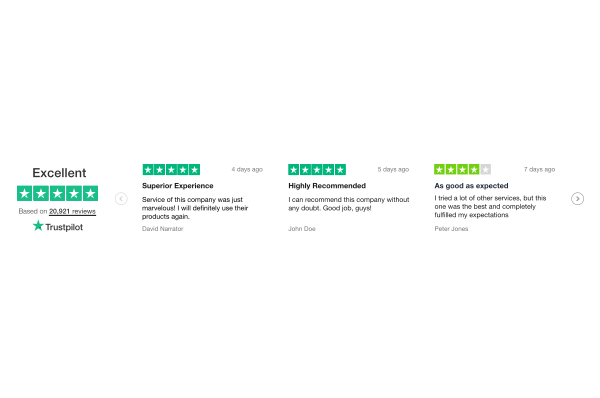
Carousel: (props: TrustBoxWidgetBasicReviewAttributesProps) => JSX_2.Element;
/**
* ---
* TrustBox Widget DropDown - Testimonial
* ---
*
* Be discreet, then expand!
*
* Shows stars discreetly. Clicks to a drop-down with reviews.
*
* ---
*
* @param height Defines the widget height in `px` or `%`. Supports `min` and `max` for responsive sizing.
* @param width Defines the widget width in `px` or `%`. Supports `min` and `max` for responsive sizing.
* @param locale Overrides the language set in the provider.
* @param theme Defines the widget theme (`light` or `dark`).
* @param fontFamily Defines the font family.
* @param tags Filters reviews by selected tags.
* - `SelectedReview`: Displays only selected reviews.
* @param children Custom loading element (default: none).
*
* ⚠️ **Warning:** If you use one of the two next parameters, be sure to inform the customer
* that reviews are being filtered.
*
* @param stars Filter reviews to display by stars count,
* @param reviewLanguages Filter review to display by language of the review
*
* @returns The TrustBox DropDown widget.
*
* 
*/
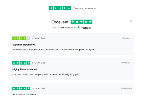
DropDown: (props: TrustBoxWidgetBasicReviewAttributesProps) => JSX_2.Element;
/**
* ---
* TrustBox Widget Grid - Testimonial
* ---
*
* Give consumers a broad overview.
*
* Responsive and adaptable. Showcases customer testimonials
*
* ---
*
* @param height Defines the widget height in `px` or `%`. Supports `min` and `max` for responsive sizing.
* @param width Defines the widget width in `px` or `%`. Supports `min` and `max` for responsive sizing.
* @param locale Overrides the language set in the provider.
* @param theme Defines the widget theme (`light` or `dark`).
* @param fontFamily Defines the font family.
* @param tags Filters reviews by selected tags.
* - `SelectedReview`: Displays only selected reviews.
* @param children Custom loading element (default: none).
*
* ⚠️ **Warning:** If you use one of the two next parameters, be sure to inform the customer
* that reviews are being filtered.
*
* @param stars Filter reviews to display by stars count,
* @param reviewLanguages Filter review to display by language of the review
*
* @returns The TrustBox Grid widget.
*
* 
*/
Grid: (props: TrustBoxWidgetBasicReviewAttributesProps) => JSX_2.Element;
/**
* ---
* TrustBox Widget List - Testimonial
* ---
*
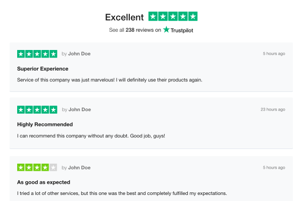
* Draw attention to your stellar customer service.
*
* Shows 20 latest reviews and replies. Lets consumers read - without having to leave!
*
* ---
*
* @param height Defines the widget height in `px` or `%`. Supports `min` and `max` for responsive sizing.
* @param width Defines the widget width in `px` or `%`. Supports `min` and `max` for responsive sizing.
* @param locale Overrides the language set in the provider.
* @param theme Defines the widget theme (`light` or `dark`).
* @param fontFamily Defines the font family.
* @param children Custom loading element (default: none).
*
* ⚠️ **Warning:** If you use the next parameter, be sure to inform the customer
* that reviews are being filtered.
*
* @param reviewLanguages Filter review to display by language of the review
*
* @returns The TrustBox List widget.
*
* 
*/
List: (props: TrustBoxWidgeReviewListFileredAttributesProps) => JSX_2.Element;
/**
* ---
* TrustBox Widget ListFiltered - Testimonial
* ---
*
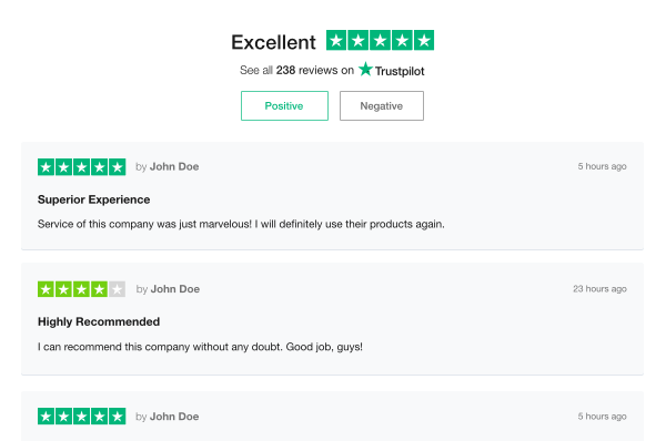
* Boost customer confidence with an honest TrustBox.
*
* Shows positive and negative reviews. Shows your replies too!
*
* ---
*
* @param height Defines the widget height in `px` or `%`. Supports `min` and `max` for responsive sizing.
* @param width Defines the widget width in `px` or `%`. Supports `min` and `max` for responsive sizing.
* @param locale Overrides the language set in the provider.
* @param theme Defines the widget theme (`light` or `dark`).
* @param fontFamily Defines the font family.
* @param children Custom loading element (default: none).
*
* ⚠️ **Warning:** If you use the next parameter, be sure to inform the customer
* that reviews are being filtered.
*
* @param reviewLanguages Filter review to display by language of the review
*
* @returns The TrustBox ListFiltered widget.
*
* 
*/
ListFiltered: (props: TrustBoxWidgeReviewListFileredAttributesProps) => JSX_2.Element;
/**
* ---
* TrustBox Widget MiniCarousel - Testimonial
* ---
*
* Let consumers know why you get great ratings.
*
* Subtle and compact. Shows 6 latest reviews.
*
* ---
*
* @param height Defines the widget height in `px` or `%`. Supports `min` and `max` for responsive sizing.
* @param width Defines the widget width in `px` or `%`. Supports `min` and `max` for responsive sizing.
* @param locale Overrides the language set in the provider.
* @param theme Defines the widget theme (`light` or `dark`).
* @param fontFamily Defines the font family.
* @param tags Filters reviews by selected tags.
* - `SelectedReview`: Displays only selected reviews.
* @param children Custom loading element (default: none).
*
* ⚠️ **Warning:** If you use one of the two next parameters, be sure to inform the customer
* that reviews are being filtered.
*
* @param stars Filter reviews to display by stars count,
* @param reviewLanguages Filter review to display by language of the review
*
* @returns The TrustBox MiniCarousel widget.
*
* 
*/
MiniCarousel: (props: TrustBoxWidgetBasicReviewAttributesProps) => JSX_2.Element;
/**
* ---
* TrustBox Widget PopUp - Testimonial
* ---
*
* Start small, go big!
*
* Shows your stars discreetly. Clicks to a pop-up with reviews.
*
* ---
*
* @param height Defines the widget height in `px` or `%`. Supports `min` and `max` for responsive sizing.
* @param width Defines the widget width in `px` or `%`. Supports `min` and `max` for responsive sizing.
* @param locale Overrides the language set in the provider.
* @param theme Defines the widget theme (`light` or `dark`).
* @param fontFamily Defines the font family.
* @param tags Filters reviews by selected tags.
* - `SelectedReview`: Displays only selected reviews.
* @param children Custom loading element (default: none).
*
* ⚠️ **Warning:** If you use one of the two next parameters, be sure to inform the customer
* that reviews are being filtered.
*
* @param stars Filter reviews to display by stars count,
* @param reviewLanguages Filter review to display by language of the review
*
* @returns The TrustBox PopUp widget.
*
* 
*/
PopUp: (props: TrustBoxWidgetBasicReviewAttributesProps) => JSX_2.Element;
/**
* ---
* TrustBox Widget Quote - Testimonial
* ---
*
* Quote your customers!
*
* Shows excerpts from reviews. Inspires your shoppers
*
* ---
*
* @param height Defines the widget height in `px` or `%`. Supports `min` and `max` for responsive sizing.
* @param width Defines the widget width in `px` or `%`. Supports `min` and `max` for responsive sizing.
* @param locale Overrides the language set in the provider.
* @param theme Defines the widget theme (`light` or `dark`).
* @param fontFamily Defines the font family.
* @param tags Filters reviews by selected tags.
* - `SelectedReview`: Displays only selected reviews.
* @param children Custom loading element (default: none).
*
* ⚠️ **Warning:** If you use one of the two next parameters, be sure to inform the customer
* that reviews are being filtered.
*
* @param stars Filter reviews to display by stars count,
* @param reviewLanguages Filter review to display by language of the review
*
* @returns The TrustBox Quote widget.
*
* 
*/
Quote: (props: TrustBoxWidgetBasicReviewAttributesProps) => JSX_2.Element;
/**
* ---
* TrustBox Widget Slider - Testimonial
* ---
*
* A clickable testimonial TrustBox that lets consumers explore more.
*
* Focuses on reviews. Shows 15 latest reviews
* ---
*
* @param height Defines the widget height in `px` or `%`. Supports `min` and `max` for responsive sizing.
* @param width Defines the widget width in `px` or `%`. Supports `min` and `max` for responsive sizing.
* @param locale Overrides the language set in the provider.
* @param theme Defines the widget theme (`light` or `dark`).
* @param fontFamily Defines the font family.
* @param tags Filters reviews by selected tags.
* - `SelectedReview`: Displays only selected reviews.
* @param children Custom loading element (default: none).
*
* ⚠️ **Warning:** If you use one of the two next parameters, be sure to inform the customer
* that reviews are being filtered.
*
* @param stars Filter reviews to display by stars count,
* @param reviewLanguages Filter review to display by language of the review
*
* @returns The TrustBox Slider widget.
*
* 
*/
Slider: (props: TrustBoxWidgetBasicReviewAttributesProps) => JSX_2.Element;
};
/**
* Defines the attributes for a mini product review widget.
*/
export declare type TrustBoxWidgeMiniProductReviewsAttributesProps = TrustBoxWidgeProductReviewsWithStarAttributesProps & Pick<TrustBoxWidgetAttributesPropsT, "scrollToList" | "styleAlignment" | "noReviews">;
/**
* Defines the attributes for a product review widget with languages filter.
*/
export declare type TrustBoxWidgeProductReviewsAttributesProps = TrustBoxWidgeProductReviewsWithStarAttributesProps & Pick<TrustBoxWidgetAttributesPropsT, "reviewLanguages" | "noReviews">;
/**
* Defines the attributes for a product reviews carousel widget with star customization.
*/
export declare type TrustBoxWidgeProductReviewsCarouselAttributesProps = TrustBoxWidgeProductReviewsAttributesProps & Pick<TrustBoxWidgetAttributesPropsT, "thirdPartyReviews">;
/**
* Defines the attributes for a product reviews gallery widget with star customization.
*/
export declare type TrustBoxWidgeProductReviewsGalleryAttributesProps = TrustBoxWidgeProductReviewsWithStarAttributesProps & Pick<TrustBoxWidgetAttributesPropsT, "noReviews">;
/**
* Defines the attributes for a multi-source product review widget.
*/
export declare type TrustBoxWidgeProductReviewsMultiSourceAttributesProps = TrustBoxWidgeProductReviewsAttributesProps & Pick<TrustBoxWidgetAttributesPropsT, "linkColor">;
/**
* Defines the attributes for an SEO-optimized product review multi sources widget.
*/
export declare type TrustBoxWidgeProductReviewsMultiSourceSEOAttributesProps = TrustBoxWidgeProductReviewsMultiSourceAttributesProps & Pick<TrustBoxWidgetAttributesPropsT, "name">;
/**
* Defines the attributes for an SEO-optimized product review widget.
*/
export declare type TrustBoxWidgeProductReviewsSEOAttributesProps = TrustBoxWidgeProductReviewsAttributesProps & Pick<TrustBoxWidgetAttributesPropsT, "name">;
/**
* Defines the attributes for a product review widget with star customization.
*/
export declare type TrustBoxWidgeProductReviewsWithStarAttributesProps = TrustBoxWidgetBasicProductAttributesProps & Pick<TrustBoxWidgetAttributesPropsT, "starColor">;
/**
* Defines the attributes for a filtered review list widget.
*/
export declare type TrustBoxWidgeReviewListFileredAttributesProps = Omit<TrustBoxWidgetBasicReviewAttributesProps, "stars" | "tags">;
export declare const TrustBoxWidget: TrustBoxWidgetT;
/**
* Defines the data attributes for TrustBox widget configuration.
*/
export declare type TrustBoxWidgetAttributeKey = `data-${KebabKeys<keyof TrustBoxWidgetAttributesProps>}`;
/**
* Defines the mapping of TrustBox widget attributes to string values.
*/
export declare type TrustBoxWidgetAttributes = Record<TrustBoxWidgetAttributeKey, string>;
/**
* Defines the attributes for configuring a TrustBox widget.
*/
export declare interface TrustBoxWidgetAttributesProps {
/**
* Defines the height of the widget. Can be specified in `px` or `%` for responsive sizing.
*/
styleHeight: DimensionT;
/**
* Defines the width of the widget. Can be specified in `px` or `%` for responsive sizing.
*/
styleWidth: DimensionT;
/**
* Determines whether the widget should scroll to the review list when clicked.
*/
scrollToList: boolean;
/**
* Defines the number of stars to be displayed.
*/
stars: StarsProps;
/**
* Controls the visibility of the "No Review" message.
* - `"hide"`: Do not display when no reviews are available.
* - `"show"`: Display even if no reviews are available.
*/
noReviews: "hide" | "show";
/**
* Defines the font family used in the widget.
*/
fontFamily: FontFamilyProps;
/**
* Overrides the language set in the provider.
*/
locale: LocaleProps;
/**
* Defines the theme of the widget.
* - `"dark"`: Dark mode.
* - `"light"`: Light mode.
*/
theme: "dark" | "light";
/**
* Product SKU(s) associated with the reviews.
* Can be a single string or an array of SKUs.
*/
sku: string | string[];
/**
* Minimum number of reviews required to display the widget.
*/
minReviewCount: number;
/**
* Defines the alignment of the widget's content.
* - `"left"`: Aligns content to the left.
* - `"center"`: Centers the content.
* - `"right"`: Aligns content to the right.
*/
styleAlignment: "left" | "center" | "right";
/**
* Determines whether the widget should take up the full width of its container.
*/
fullwidth: boolean;
/**
* Defines the languages in which reviews should be displayed.
*/
reviewLanguages: ReviewLanguageProps[];
/**
* Defines the border color of the widget.
*/
borderColor: CSSProperties["borderColor"];
/**
* Filters reviews by selected tags.
* - `"SelectedReview"`: Displays only selected reviews.
*/
tags: "SelectedReview";
/**
* Defines the button color used in the widget.
*/
buttonColor: CSSProperties["color"];
/**
* Defines the text color of the button.
*/
buttonTextColor: CSSProperties["color"];
/**
* Defines the color of the stars in the widget.
*/
starColor: CSSProperties["color"];
/**
* Defines the schema type for structured data (SEO).
* - `"Product"`: Indicates that the widget represents a product review.
*/
schemaType: "Product";
/**
* Defines the color of links within the widget.
*/
linkColor: CSSProperties["color"];
/**
* The name of the TrustBox widget.
*/
name: string;
/**
* The template ID used to render the TrustBox widget.
*/
templateId: string;
/**
* The business unit ID associated with Trustpilot.
*/
businessunitId: string;
/**
* Determines whether third-party reviews should be included.
*/
thirdPartyReviews: boolean;
/**
* Defines the color of the text in the widget. ( Not working )
*/
textColor: CSSProperties["color"];
}
/**
* Defines a partial set of TrustBox widget attributes.
*/
export declare type TrustBoxWidgetAttributesPropsT = Partial<TrustBoxWidgetAttributesProps>;
/**
* Defines the basic TrustBox widget attributes.
*/
export declare type TrustBoxWidgetBasicAttributesProps = Pick<TrustBoxWidgetAttributesPropsT, "fontFamily" | "locale" | "theme"> & TrustBoxWidgetResolutionProps & PropsWithChildren;
/**
* Defines the attributes for a TrustBox product widget.
*/
export declare type TrustBoxWidgetBasicProductAttributesProps = TrustBoxWidgetBasicAttributesProps & Pick<TrustBoxWidgetAttributesProps, "sku">;
/**
* Defines the attributes for a basic review widget.
*/
export declare type TrustBoxWidgetBasicReviewAttributesProps = TrustBoxWidgetBasicAttributesProps & Pick<TrustBoxWidgetAttributesPropsT, "stars" | "reviewLanguages" | "tags">;
/**
* Defines the attributes for a micro button widget.
*/
export declare type TrustBoxWidgetMicroButtonAttributesProps = Omit<TrustBoxWidgetBasicAttributesProps, "theme">;
/**
* Defines the attributes for a micro review count widget.
*/
export declare type TrustBoxWidgetMicroReviewCountAttributesProps = TrustBoxWidgetBasicAttributesProps & Pick<TrustBoxWidgetAttributesPropsT, "minReviewCount" | "styleAlignment">;
/**
* Defines the resolution limits (minimum and maximum sizes) for the widget.
*/
export declare type TrustBoxWidgetResolutionLimits = {
max?: TrustBoxWidgetResolutionT;
min?: TrustBoxWidgetResolutionT;
};
/**
* Defines the optional resolution properties for the widget.
*/
export declare type TrustBoxWidgetResolutionProps = Partial<{
height: limitSizeProps;
width: limitSizeProps;
}>;
/**
* Defines the resolution for the TrustBox widget.
*/
export declare type TrustBoxWidgetResolutionT = {
height: DimensionT;
width: DimensionT;
};
/**
* Defines the attributes for a review collector widget.
*/
export declare type TrustBoxWidgetReviewCollectorAttributesProps = Omit<TrustBoxWidgetBasicAttributesProps, "theme"> & Partial<Pick<TrustBoxWidgetAttributesPropsT, "borderColor">>;
declare type TrustBoxWidgetT = typeof EssentialTrustBoxWidgets & typeof CollectReviewTrustBoxWidgets & typeof TestimonialTrustBoxWidget & typeof ProductReviewTrustBoxWidgets;
/**
* ---
* Trustpilot Widget Provider
* ---
*
* This context provider manages the integration of the Trustpilot widget.
* It loads the Trustpilot script, determines the appropriate locale, and provides a function
* to load the widget dynamically.
*
* @component
* @param businessUnitId- The Trustpilot Business Unit ID (BUID). If not provided, the widget will be in preview mode.
* @param websiteUrl - The URL of the website being reviewed. Used to construct the Trustpilot widget URL.
* @param locale - Overrides the browser’s preferred language for the widget.
* @param children - Components that will have access to the Trustpilot context.
*
* @example
* ```tsx
* <TrustpilotProvider businessUnitId="123456" websiteUrl="example.com">
* <MyComponent />
* </TrustpilotProvider>
* ```
*/
export declare const TrustpilotWidgetProvider: FC<TrustpilotWidgetProviderProps>;
declare interface TrustpilotWidgetProviderProps extends PropsWithChildren {
businessUnitId?: string;
websiteUrl?: string;
locale?: LocaleProps;
}
export { }