@monchilin/react-native-dropdown
Version:
Dropdown component for React Native
161 lines (112 loc) • 10.3 kB
Markdown
### This library is rewritten(fork) from [react-native-modal-dropdown](https://github.com/sohobloo/react-native-modal-dropdown),感谢原作者。
[](https://badge.fury.io/js/%40monchilin%2Fcountdown)
> 这个库重写自[react-native-modal-dropdown](https://github.com/sohobloo/react-native-modal-dropdown),原有库长期未维护,并且使用了 React Native 的废弃组件 [ListView](https://reactnative.dev/docs/listview.html),导致无法兼容 React Native For Web,考虑除了兼容 Web 之外,本人还要新增一些功能,改动性比较大,索性不发 PR ,直接重写。
>
> This library is rewritten from [react-native-modal-dropdown](https://github.com/sohobloo/react-native-modal-dropdown), the original library has not been maintained for a long time,and it use React Native deprecated component [ListView](https://reactnative.dev/docs/listview.html), so it can not be compatibility with React Native For Web, Considering that in addition to Web compatibility, I have to add some new feature, which will be changed a lot, so i will directly rewrite it without PR.
# react-native-modal-dropdown
react-native dropdown/picker/selector 组件,支持 Android、IOS、Web.
A react-native dropdown/picker/selector component for Android & iOS & Web.
react-native-modal-dropdown 以下简称为 RNMD
我认为大多数前端开发流程中开发者往往需要使用基础组件来封装符合 UI 风格与业务逻辑的组件,RNMD 就是这么一个非常基础的组件,它仅仅用于定位以及弹出 DropDown,所以使用前你可能需要先进行封装。
I think most Frontend Development process developers often need to use base component encapsulate component that conform to UI style and business logic. RNMD is a very basic component that is only used to locate and popup dorpdown, so before using it that you may need to encapsulate it.
如果你在寻求一个开箱即用的组件,我已经封装了一些案例,你可以直接将源代码复制进你的项目,在线预览:
If you are looking for an out of the box component, I have encapsulated a few cases, you can copy the source code into your project directly, online preview.
https://expo.io/@912305043/monchilin-react-native-dropdown-example
(源代码)(https://github.com/MonchiLin/react-native-dropdown/blob/master/example/src/App.tsx)
## Features
- 100% Typescript 编写提供类型安全 ( compile to JS )
- 100% Typescript writting provider type safety ( compile to JS )
- 交互动画支持
- Interactive animation support
- 兼容 Android & IOS & Web (欢迎贡献 Windows 与 macOS 代码)
- compatible Android & IOS & Web (welcome to contribute Windows & macOS code)
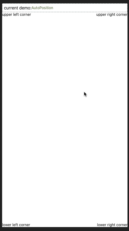
- 自动调整位置,无需担心 dropdown 在屏幕边缘
- Automatically position, without fear of Dorpdown at the edge of the screen
- 一目了然的语义化 API
- A clear semantic API
- 自定义99% 样式与属性
- Customize 99% of styles and attributes
- 命令式 Api 支持 (Show/Hide/Select)
- Imperative Api support (Show/Hide/Select)
## Demo
你可以在 [这里](https://github.com/MonchiLin/react-native-dropdown/tree/master/example) 找到更多的实例。
You can be [here](https://github.com/MonchiLin/react-native-dropdown/tree/master/example) Find more instances.
## Installation
```sh
npm i @monchilin/react-native-dropdown -save
// yarn add @monchilin/react-native-dropdown
```
## 使用
导入模块
```javascript
import ModalDropdown from '@monchilin/react-native-dropdown';
```
### 基础用法
```javascript
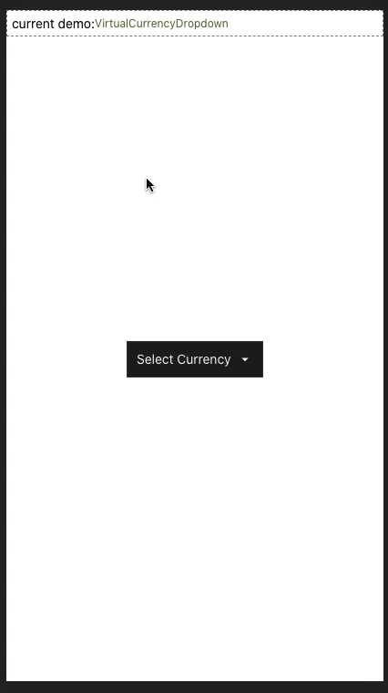
<ModalDropdown options={['option 1', 'option 2']}/>
```
### 自定义 label
```javascript
<ModalDropdown options={['option 1', 'option 2']}>
I'm Label
</ModalDropdown>
```
## API
### Props
Prop | Type | Optional | Default | Description
------------------- | -------- | -------- | --------- | -----------
`disabled` | bool | Yes | false | disable / enable the component.
`defaultIndex` | number | Yes | -1 | Init selected index. `-1`: None is selected. **This only change the highlight of the dropdown row, you have to give a `defaultValue` to change the init text.**
`index` | number | Yes | -1 | Init selected index. `-1`: None is selected.
`defaultLabel` | string | Yes | Please select... | Init label text. **Invalid in custom label.**
`dataSource` | array | No | | dataSource for renderItem.
`animated` | bool | Yes | true | Disable / enable animation.
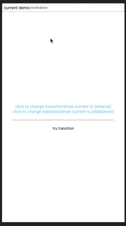
`transitionShow` | string | Yee | flipUp | Expand animation ['flipUp', 'scaleIn', 'fadeIn', 'slideUp']
`transitionHide` | string | Yee | flipDown | Expand animation ['flipDown', 'scaleOut', 'fadeOut', 'slideDown']
`loading` | bool | Yes | false | Enable loading Indicator
`scrollEnabled` | bool | Yes | true | When false, the content does not scroll. The default value is true
`keyExtractor` | func | Yes | (_, index) => index.toString() | Used to extract a unique key for a given item at the specified index. Key is used for caching and as the react key to track item re-ordering. The default extractor checks `item.key`, then falls back to using the index, like React does.
`adjustFrame` | func | Yes | | This is a callback after the frame of the dropdown have been calculated and before showing. You will receive a style object as argument with some of the props like `width` `height` `top` `left` and `right`. Change them to appropriate values that accord with your requirement and **make the new style as the return value of this function**.
`renderItem` | func | Yes | | Customize render dataSource item: `function(option,index,isActive)` **Will render a default row if `null`/`undefined`.**
`renderSeparator` | func | Yes | | Customize render dropdown list separators. **Will render a default thin gray line if `null`/`undefined`.**
`showSeparator` | bool | yes | true | Show split line or not
`renderLabel` | func | Yes | | Use this to extract and return text from dataSource object. This text will show on label after dataSource selected. **Invalid in wrapper mode.**
`onDropdownWillShow`| func | Yes | | Trigger when dropdown will show by touching the button. **Return `false` can cancel the event.**
`onDropdownWillHide`| func | Yes | | Trigger when dropdown will hide by touching the button. **Return `false` can cancel the event.**
`onSelect` | func | Yes | | Trigger when item touched with selected `index` and `value`. **Return `false` can cancel the event.**
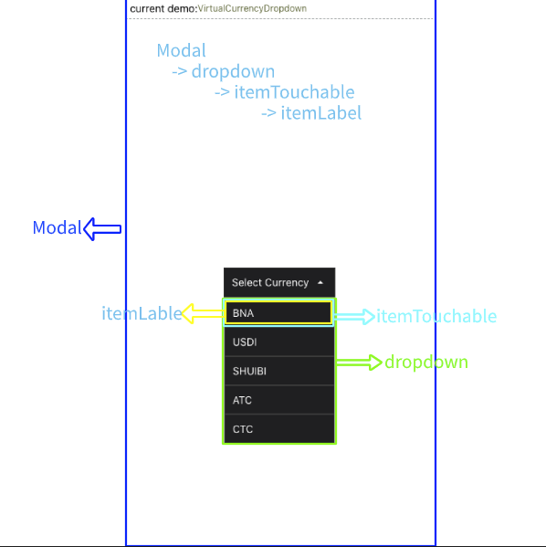
### Customizable properties and styles
见 `自定义任何样式与属性` 章节
| Prop | Type | Optional |
| ----------------------------- | ---------------------------------------- | -------- |
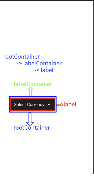
| `rootContainerStyle` | `StyleProp<ViewStyle>` | Yes |
| `rootContainerProps` | `Omit<ViewProps, 'style'>` | Yes |
| `labelContainerDisabledStyle` | `StyleProp<ViewStyle>` | Yes |
| `labelContainerStyle` | `StyleProp<ViewStyle>` | Yes |
| `labelContainerProps` | `Omit<TouchableOpacityProps, 'ref'>` | Yes |
| `labelStyle` | `StyleProp<TextStyle>` | Yes |
| `labelDisabledStyle` | `StyleProp<TextStyle>` | Yes |
| `labelProps` | `Omit<TextProps, 'style'>` | Yes |
| `modalProps` | `Omit<ModalProps, 'visible'>` | Yes |
| `dropdownStyle` | `StyleProp<ViewStyle>` | Yes |
| `dropdownProps` | `Omit<FlatListProps<ItemT>, 'data'>` | Yes |
| `itemTouchableProps` | `Omit<TouchableOpacityProps,'onPress'>` | Yes |
| `itemLabelStyle` | `StyleProp<TextStyle>` | Yes |
| `itemLabelProps` | `Omit<TextProps, 'style'>` | Yes |
| `itemHighlightStyle` | `StyleProp<ViewStyle>` | Yes |
| `itemLabelHighlightStyle` | `StyleProp<TextStyle>` | Yes |
### Methods
Method | Description
--------------- | ------------------------------------------------------------
`show()` | Show the dropdown. **Won't trigger `onDropdownWillShow`.**
`hide()` | Hide the dropdown. **Won't trigger `onDropdownWillHide`.**
`select(index)` | Select the specified dataSource of the `index`. Select `-1` will reset it to display `defaultValue`. **Won't trigger `onSelect`.**
## 自定义任何样式与属性
正如开头所说,RNMD 是一个非常基础的组件,它提供了自定义任何样式与属性的能力,但是在 RN 中我们无法像在浏览器中一样直观的看到 DOM 结构,所以看到 `someStyle, someProp` api 时会感到很困惑,为此,我做了两张图来表示结构。
## 边界问题
### slideUp 与 slideDown 掉帧?
RN 的 Animated 模块提供了 `useNativeDriver` 选项以[提升动画性能](https://reactnative.dev/blog/2017/02/14/using-native-driver-for-animated),但是它只能与 `opacity` 和 `transform` 一起使用,*slideUp* 与 *slideDown* 是使用 `height` 实现的,在开发模式下更为明显,所以,如果对流畅度有要求建议使用其他动画效果。