@mdbootstrap/react-side-navbar
Version:
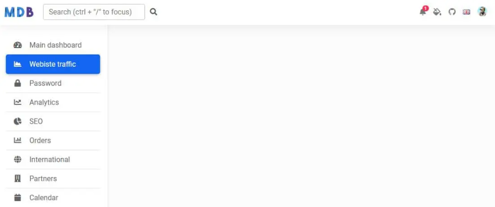
Side Navbar is an additional navigation component that provides extensive support and a clear way for navigating through complex websites with hundreds of links and subpages.
287 lines (241 loc) • 9.26 kB
Markdown
Side Navbar is an additional navigation component that provides extensive support and a clear way for navigating through complex websites with hundreds of links and subpages.
Check out [React Side Navbar Documentation](https://mdbootstrap.com/docs/react/extended/side-navbar/) for detailed instructions & even more examples.
## Basic example
```js
import React, { useState } from 'react';
import {
MDBContainer,
MDBNavbar,
MDBNavbarBrand,
MDBNavbarToggler,
MDBIcon,
MDBNavbarNav,
MDBNavbarItem,
MDBNavbarLink,
MDBDropdown,
MDBDropdownToggle,
MDBDropdownMenu,
MDBDropdownItem,
MDBDropdownLink,
MDBCollapse,
MDBRipple,
MDBBadge,
MDBInput,
MDBListGroup,
MDBListGroupItem
} from 'mdb-react-ui-kit';
export default function Basic() {
const [showShow, setShowShow] = useState(false);
const toggleShow = () => setShowShow(!showShow);
return (
<>
<link
href="https://use.fontawesome.com/releases/v5.15.1/css/all.css"
rel="stylesheet"
/>
<MDBCollapse show={showShow} tag="nav" className="d-lg-block bg-white sidebar">
<div className="position-sticky">
<MDBListGroup flush className="mx-3 mt-4">
<MDBRipple rippleTag='span'>
<MDBListGroupItem tag='a' href='#' action className='border-0 border-bottom rounded rounded'>
<MDBIcon fas icon="tachometer-alt me-3" />
Main Dashboard
</MDBListGroupItem>
</MDBRipple>
<MDBRipple rippleTag='span'>
<MDBListGroupItem tag='a' href='#' action className='border-0 border-bottom rounded' active aria-current='true'>
<MDBIcon fas icon="chart-area me-3" />
Website traffic
</MDBListGroupItem>
</MDBRipple>
<MDBRipple rippleTag='span'>
<MDBListGroupItem tag='a' href='#' action className='border-0 border-bottom rounded'>
<MDBIcon fas icon="lock me-3" />
Password
</MDBListGroupItem>
</MDBRipple>
<MDBRipple rippleTag='span'>
<MDBListGroupItem tag='a' href='#' action className='border-0 border-bottom rounded'>
<MDBIcon fas icon="chart-line me-3" />
Analitics
</MDBListGroupItem>
</MDBRipple>
<MDBRipple rippleTag='span'>
<MDBListGroupItem tag='a' href='#' action className='border-0 border-bottom rounded'>
<MDBIcon fas icon="chart-pie me-3" />
SEO
</MDBListGroupItem>
</MDBRipple>
<MDBRipple rippleTag='span'>
<MDBListGroupItem tag='a' href='#' action className='border-0 border-bottom rounded'>
<MDBIcon far icon="chart-bar me-3" />
Orders
</MDBListGroupItem>
</MDBRipple>
<MDBRipple rippleTag='span'>
<MDBListGroupItem tag='a' href='#' action className='border-0 border-bottom rounded'>
<MDBIcon fas icon="globe me-3" />
International
</MDBListGroupItem>
</MDBRipple>
<MDBRipple rippleTag='span'>
<MDBListGroupItem tag='a' href='#' action className='border-0 border-bottom rounded'>
<MDBIcon fas icon="building me-3" />
Partners
</MDBListGroupItem>
</MDBRipple>
<MDBRipple rippleTag='span'>
<MDBListGroupItem tag='a' href='#' action className='border-0 border-bottom rounded'>
<MDBIcon fas icon="calendar me-3" />
Calendar
</MDBListGroupItem>
</MDBRipple>
<MDBRipple rippleTag='span'>
<MDBListGroupItem tag='a' href='#' action className='border-0 border-bottom rounded'>
<MDBIcon fas icon="users me-3" />
User
</MDBListGroupItem>
</MDBRipple>
<MDBRipple rippleTag='span'>
<MDBListGroupItem tag='a' href='#' action className='border-0 rounded'>
<MDBIcon fas icon="money-bill me-3" />
Sales
</MDBListGroupItem>
</MDBRipple>
</MDBListGroup>
</div>
</MDBCollapse>
<MDBNavbar expand='lg' light bgColor='light'>
<MDBContainer fluid>
<MDBNavbarNav className="d-flex flex-row align-items-center w-auto">
<MDBNavbarToggler
type='button'
aria-label='Toggle navigation'
onClick={toggleShow}
>
<MDBIcon icon='bars' fas />
</MDBNavbarToggler>
<MDBNavbarBrand href='#'>
<img
src='https://mdbootstrap.com/img/logo/mdb-transaprent-noshadows.webp'
height='30'
alt=''
loading='lazy'
/>
</MDBNavbarBrand>
<MDBCollapse navbar>
<MDBNavbarItem className="d-flex align-items-center">
<MDBInput label='Search (ctrl + "/" to focus)' id='form1' type='text' />
<MDBIcon fas icon="search mx-2" />
</MDBNavbarItem>
</MDBCollapse>
</MDBNavbarNav>
<MDBNavbarNav className="d-flex flex-row justify-content-end w-auto">
<MDBNavbarItem className='me-3 me-lg-0 d-flex align-items-center'>
<MDBDropdown>
<MDBDropdownToggle tag="a" href="#!" className="hidden-arrow nav-link">
<MDBIcon fas icon="bell" />
<MDBBadge color='danger' notification pill>
1
</MDBBadge>
</MDBDropdownToggle>
<MDBDropdownMenu>
<MDBDropdownItem>
<MDBDropdownLink href="#">Some news</MDBDropdownLink>
</MDBDropdownItem>
<MDBDropdownItem>
<MDBDropdownLink href="#">Another news</MDBDropdownLink>
</MDBDropdownItem>
<MDBDropdownItem>
<MDBDropdownLink href="#">Something else here</MDBDropdownLink>
</MDBDropdownItem>
</MDBDropdownMenu>
</MDBDropdown>
</MDBNavbarItem>
<MDBNavbarItem className='me-3 me-lg-0'>
<MDBNavbarLink href='#'>
<MDBIcon fas icon='fill-drip' />
</MDBNavbarLink>
</MDBNavbarItem>
<MDBNavbarItem className='me-3 me-lg-0'>
<MDBNavbarLink href='#'>
<MDBIcon fab icon='github' />
</MDBNavbarLink>
</MDBNavbarItem>
<MDBNavbarItem className='me-3 me-lg-0 d-flex align-items-center'>
<MDBDropdown>
<MDBDropdownToggle tag="a" href="#!" className="hidden-arrow nav-link">
<img src="https://mdbootstrap.com/img/Photos/Avatars/img (31).jpg" className="rounded-circle" height="22" alt="" loading="lazy" />
</MDBDropdownToggle>
<MDBDropdownMenu>
<MDBDropdownItem>
<MDBDropdownLink href="#">My profile</MDBDropdownLink>
</MDBDropdownItem>
<MDBDropdownItem>
<MDBDropdownLink href="#">Settings</MDBDropdownLink>
</MDBDropdownItem>
<MDBDropdownItem>
<MDBDropdownLink href="#">Logout</MDBDropdownLink>
</MDBDropdownItem>
</MDBDropdownMenu>
</MDBDropdown>
</MDBNavbarItem>
</MDBNavbarNav>
</MDBContainer>
</MDBNavbar>
</>
);
}
```
```css
body {
background-color: #fbfbfb;
}
@media (min-width: 992px) {
.sidebar {
height: unset!important;
}
}
/* Sidebar */
.sidebar {
position: fixed;
top: 0;
bottom: 0;
left: 0;
padding: 58px 0 0;
/* Height of navbar */
box-shadow: 0 2px 5px 0 rgb(0 0 0 / 5%), 0 2px 10px 0 rgb(0 0 0 / 5%);
width: 240px;
/* z-index: 600; */
}
.sidebar.show {
height: 100vh;
}
@media (max-width: 992px) {
.sidebar {
width: 100%;
}
}
.sidebar .active {
border-radius: 5px;
box-shadow: 0 2px 5px 0 rgb(0 0 0 / 16%), 0 2px 10px 0 rgb(0 0 0 / 12%);
}
.sidebar-sticky {
position: relative;
top: 0;
height: calc(100vh - 48px);
padding-top: 0.5rem;
overflow-x: hidden;
overflow-y: auto;
/* Scrollable contents if viewport is shorter than content. */
}
```
## How to use?
1. Download MDB React - free UI KIT
2. Choose your favourite customized component and click on the image
3. Copy & paste the code into your MDB project
[▶️ Subscribe to YouTube channel for web development tutorials & resources](https://www.youtube.com/MDBootstrap?sub_confirmation=1)
## More examples
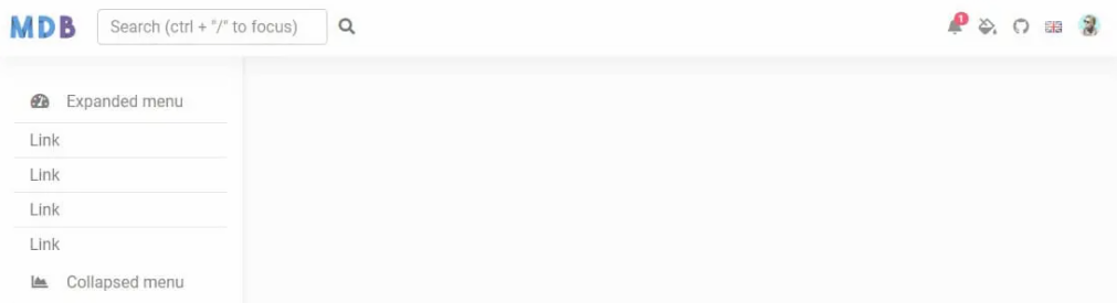
[React Side Navbar Collapse:
](https://mdbootstrap.com/docs/react/extended/side-navbar/#section-collapse)