@kevincuadros/react-code
Version:
> Pin input component for React
87 lines (59 loc) • 2.68 kB
Markdown
# React Pin Code
> Pin input component for React
## Installation
To get started, install and save in your `package.json` dependencies, run:
```bash
npm i @kevincuadros/react-code
```
or
```bash
yarn add @kevincuadros/react-code
```
## Demo
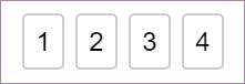
[Documentation and examples](https://cuadros-code.github.io/react-code/?path=/story/pin-code--default)
[Source code](https://github.com/cuadros-code/react-code)
## Importing
You can use the following two ways to import module.
```javascript
import { PinCode } from '@kevincuadros/react-code'
```
## Usage
### Basic Example
```jsx
import { PinCode } from '@kevincuadros/react-code';
const App = () => {
const [value, setValue] = React.useState('');
return (
<PinCode
length={4}
onChange={setValue}
/>
);
};
```
## PinCode input length
`PinCode` expects a number for the `length` prop. The number of input fields rendered is equal to the length of the array.
## Disable focus management
By default, `PinCode` moves focus automatically to the next input once a field is filled. It also transfers focus to a previous input when `Backspace` is pressed with focus on an empty input.
## AutoFocus
`PinCode` offers a way let it focus from the start. Simply set `autoFocus` prop to **true** to focus the first input upon initial mounting of the component.
## Changing the placeholder
By default, `PinCode` placeholder is (''), you can change that if you want.
## Compare value
By default `valueToValidate` is (''), when all the fields are completed the value will be validated
## API
**`PinCode` Props**
| Name(*required) | Type | Default | Description |
| :-------------- | :--- | :------ | :---------- |
| length(*) | number | | Number of rendered elements. |
| autoFocus | boolean | false | If true the input will be focused on the first mount. |
| valueToValidate | string | "" | Value to compare |
| invalidBorderColor | string | rgb(220,53,69) | Let you customize border color when the input is invalid.
| validBorderColor | string | rgb(220,53,69) | Let you customize border color when the input is valid.
| onChange | Dispatch<React.SetStateAction<string>> | | Called when input value is changed. |
| placeholder | string | "" | Displayed when the pin code is not entered yet. |
| inputStyle | object | {} | Lets you customize input element. |
## License
MIT
[](https://luffy84217.github.io/react-input-pin-code/)