@james18/react-native-keyboard-accessory
Version:
A React Native Keyboard Accessory (View, Navigation) Component. Sticky views on keyboard.
165 lines (122 loc) • 8.05 kB
Markdown
# react-native-keyboard-accessory
[](https://www.npmjs.com/package/react-native-keyboard-accessory)
[](https://www.npmjs.com/package/react-native-keyboard-accessory)
[](https://www.npmjs.com/package/react-native-keyboard-accessory)
A React Native Keyboard Accessory (View, Navigation) Component. Sticky views on keyboard.
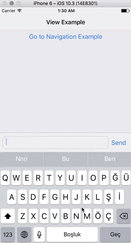 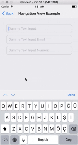
**Expo Snack Playground**
https://snack.expo.io/@ardaogulcan/react-native-keyboard-accessory-playground
## Installation
Via npm:
```shell
npm install react-native-keyboard-accessory --save
```
Via Yarn:
```shell
yarn add react-native-keyboard-accessory
```
## Usage
You can use the ``KeyboardAccessoryView`` or the ``KeyboardAccessoryNavigation``
components.
### Keyboard Accessory View
Import `react-native-keyboard-accessory`
```js
import { KeyboardAccessoryView } from 'react-native-keyboard-accessory'
```
Use it inside your `render()` function:
```jsx
<KeyboardAccessoryView>
<View>
<TextInput />
</View>
</KeyboardAccessoryView>
```
***Important:*** KeyboardAccessoryView should be positioned inside the Root Element which is covering the screen, mostly the top most view styled as ``{ flex: 1 }``.
#### Render Prop
Alternatively, you can also pass a function as the `children` prop of the component. This allows you to access an `isKeyboardVisible` prop which is useful to render things conditionally based on the visibility of the keyboard:
```jsx
<KeyboardAccessoryView>
{({ isKeyboardVisible }) => {
return (
<>
<Text>Always visible</Text>
{!isKeyboardVisible ? (
<Text>Hidden when keyboard is visible</Text>
) : null}
</>
);
}}
</KeyboardAccessoryView>
```
### Keyboard Accessory Navigation
Import ``react-native-keyboard-accessory``
```js
import { KeyboardAccessoryNavigation } from 'react-native-keyboard-accessory'
```
And use it inside your ``render()`` function:
```jsx
<KeyboardAccessoryNavigation />
```
***Important:*** KeyboardAccessoryNavigation should be positioned inside the Root Element which is covering the screen, mostly the top most view styled as ``{ flex: 1 }``.
### For Ejected Apps
For Android, make sure you have set `android:windowSoftInputMode` to `adjustResize` in `android/app/src/main/AndroidManifest.xml`
And set `androidAdjustResize` to `true`. For example,
```jsx
<KeyboardAccessoryView androidAdjustResize />
// or
<KeyboardAccessoryNavigation androidAdjustResize />
```
### To maintain KeyboardAvoidingView behavior
```jsx
<KeyboardAccessoryNavigation avoidKeyboard />
```
## API
### *KeyboardAccessoryView*
| **Prop** | **Type** | **Default** | **Description** |
|----------|----------|-------------|-----------------|
| `style` | `object` | `null` | Style `object` or `StyleSheet` reference which will be applied to Accessory `View` |
| `animateOn` | `enum:string` | `'ios'` | Enables show/hide animation on given platform. Values: `['ios', 'android', 'all', 'none']`. |
| `animationConfig` | `function` or `object` | `null` | For passing custom animations to show/hide. If given prop is function, `duration` and `easing` parameters from `Keyboard` event will be passed to the function, function should return `LayoutAnimation` compatible animation config. Or you can directly pass animation config object. |
| `alwaysVisible` | `boolean` | `false` | When set to `true` Accessory View will be always visible at the bottom of the screen. Good for sticky `TextInput`'s |
| `bumperHeight` | `number` | 15 | Bumper height to prevent visual glitches if animation couldn't keep up with the keyboard animation. |
| `visibleOpacity` | `number` | 1 | Opacity of the Accessory when it is visible. *Note:* Opacity is used for hiding the accessory to prevent render delays. |
| `heightProperty` | `enum:string` | `height` | Control how the component manages its height. The component listens for children changes and automatically adjusts its height, so `height` is usually sufficient. For use with a multiline, autogrowing `TextInput`, `minHeight` is recommended. Values: `['height', 'minHeight']` |
| `hiddenOpacity` | `number` | 0 | Opacity of the Accessory when it is hidden. |
| `hideBorder` | `boolean` | false | Set true if you want to hide top border of the Accessory |
| `inSafeAreaView` | `boolean` | false | Set true if you want to adapt SafeAreaView on iPhone X |
| `androidAdjustResize` | `boolean` | false | Set true in ejected apps to adjust resize |
| `avoidKeyboard` | `boolean` | false | Set true if you want accessory to maintain KeyboardAvoidingView behavior. You shouldn't use any other Keyboard Avoiding library when you set this to `true` |
### *KeyboardAccessoryNavigation*
All the `KeyboardAccessoryView` props will be passed.
| **Prop** | **Type** | **Default** | **Description** |
|----------|----------|-------------|-----------------|
| `doneButtonTitle` | `string` | `'Done'` | Title text to show on the right Button of Navigation View |
| `tintColor` | `string` | `'#007AFF'` | Tint color for the arrows and done button |
| `doneButton` | `node` | `null` | Replace default Done Button. Non-Touchable node should be provided. |
| `nextButton` | `node` | `null` | Replace default Next Button. Non-Touchable node should be provided. |
| `previousButton` | `node` | `null` | Replace default Previous Button. Non-Touchable node should be provided. |
| `doneDisabled` | `boolean` | false | Disables Done Button |
| `nextDisabled` | `boolean` | false | Disables Next Button |
| `previousDisabled` | `boolean` | false | Disables Previous Button |
| `doneHidden` | `boolean` | false | Hides Done Button |
| `nextHidden` | `boolean` | false | Hides Next Button |
| `previousHidden` | `boolean` | false | Hides Previous Button |
| `accessoryStyle` | `object` | null | Style object or StyleSheet reference which will be applied to Navigation Accessory `View`. |
| `doneButtonStyle` | `object` | null | Style object or StyleSheet reference which will be applied to Done Button `View` |
| `doneButtonTitleStyle` | `object` | null | Style object or StyleSheet reference which will be applied to Done Button `Text` |
| `doneButtonHitslop` | `Insets` | { left: 0, top: 0, right: 0, bottom: 0 } | This defines how far your touch can start away from the doneButton |
| `previousButtonStyle` | `object` | 0 | Style object or StyleSheet reference which will be applied to Previous Button `View` |
| `nextButtonStyle` | `object` | 0 | Style object or StyleSheet reference which will be applied to Next Button `View` |
| `nextButtonDirection` | `enum:string` | `'down'` | Arrow direction for the Next Button. Values: `['down', 'up', 'right', 'left']`. |
| `nextButtonHitslop` | `Insets` | { left: 0, top: 0, right: 0, bottom: 0 } | This defines how far your touch can start away from the nextButton |
| `previousButtonDirection` | `enum:string` | `'up'` | Arrow direction for the Previous Button. Values: `['down', 'up', 'right', 'left']`. |
| `previousButtonHitslop` | `Insets` | { left: 0, top: 0, right: 0, bottom: 0 } | This defines how far your touch can start away from the previousButton |
| `onDone` | `function` | null | Triggered on Done Button `press` |
| `onNext` | `function` | null | Triggered on Next Button `press` |
| `onPrevious` | `function` | null | Triggered on Previous Button `press` |
### *KeyboardAwareTabBarComponent*
| **Prop** | **Type** | **Default** | **Description** |
|----------|----------|-------------|-----------------|
| `TabBarComponent` | `node`, `function` | | Provide TabBarComponent to render. Usually from `react-navigation` |
## Known Issues
- Accessory doesn't follow keyboard when closed with drag gesture.