@hugeicons/vue
Version:
Hugeicons Vue Component Library https://hugeicons.com
209 lines (156 loc) • 7.41 kB
Markdown

# @hugeicons/vue
> Hugeicons Vue rendering library for fast, customizable icons with TypeScript and tree-shaking support
## What is Hugeicons?
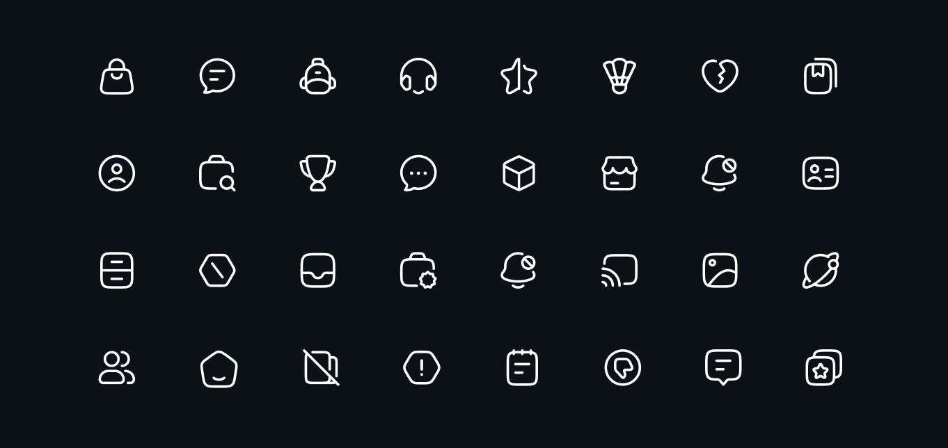
Hugeicons is a large icon set for modern web and mobile apps. The free package includes 5,100+ Stroke Rounded icons. The Pro package provides 51,000+ icons across 10 styles.
## How It Works
This package (`@hugeicons/vue`) is a **rendering library** - it provides the `HugeiconsIcon` component that displays icons in your Vue app. The icons themselves come from separate icon packages:
- **Free icons**: `@hugeicons/core-free-icons` (5,100+ icons)
- **Pro icons**: `@hugeicons-pro/core-*` packages (51,000+ icons, requires license)
### Key Highlights
- **5,100+ Free Icons**: Stroke Rounded set for unlimited personal and commercial projects
- **51,000+ Pro Icons, 10 Styles**: Stroke, Solid, Bulk, Duotone, and Twotone families for sharp, rounded, and standard needs with richer variants
- **Pixel Perfect Grid**: Built on a 24x24 grid for crisp rendering at any size
- **Customizable**: Easily adjust colors, sizes, and styles to match your design needs
- **Tree Shaking Ready**: Named exports keep bundles lean in modern bundlers
- **Regular Updates**: New icons added regularly to keep up with evolving design trends
> **Looking for Pro Icons?** Check out our docs at [hugeicons.com/docs](https://hugeicons.com/docs) for detailed information about pro icons, styles, and advanced usage.
## Table of Contents
- [What is Hugeicons?](#what-is-hugeicons)
- [How It Works](#how-it-works)
- [Features](#features)
- [Installation](#installation)
- [Usage](#usage)
- [Props](#props)
- [Examples](#examples)
- [Basic Usage](#basic-usage)
- [Custom Size and Color](#custom-size-and-color)
- [More examples and patterns](#more-examples-and-patterns)
- [Performance](#performance)
- [Troubleshooting](#troubleshooting)
- [Browser Support](#browser-support)
- [Related Packages](#related-packages)
- [Pro Version](#pro-version)
- [License](#license)
- [Related](#related)
## Features
- Customizable colors, sizes, and stroke width
- TypeScript support with full type definitions
- Tree shakeable for optimal bundle size
- Multiple bundle formats (ESM, CJS, UMD)
- Vue 2 and Vue 3 compatible
- Alternate icon support for dynamic interactions
## Installation
```bash
# Using npm
npm install @hugeicons/vue @hugeicons/core-free-icons
# Using yarn
yarn add @hugeicons/vue @hugeicons/core-free-icons
# Using pnpm
pnpm add @hugeicons/vue @hugeicons/core-free-icons
# Using bun
bun add @hugeicons/vue @hugeicons/core-free-icons
```
## Usage
```vue
<template>
<HugeiconsIcon
:icon="SearchIcon"
:size="24"
color="currentColor"
:stroke-width="1.5"
/>
</template>
<script setup>
import { HugeiconsIcon } from '@hugeicons/vue';
import { SearchIcon } from '@hugeicons/core-free-icons';
</script>
```
## Props
| Prop | Type | Default | Description |
|------|------|---------|-------------|
| `icon` | `IconArray` | Required | The main icon to display |
| `alt-icon` | `IconArray` | - | Alternative icon for states, interactions, or dynamic icon swapping |
| `show-alt` | `boolean` | `false` | When true, displays the altIcon instead of the main icon |
| `size` | `number \| string` | `24` | Icon size in pixels |
| `color` | `string` | `currentColor` | Icon color (CSS color value) |
| `stroke-width` | `number` | - | Width of the icon strokes |
| `absolute-stroke-width` | `boolean` | `false` | When true, the stroke width will be scaled relative to the icon size |
## Examples
### Basic Usage
```vue
<template>
<HugeiconsIcon :icon="Video01Icon" />
</template>
<script setup>
import { HugeiconsIcon } from '@hugeicons/vue';
import { Video01Icon } from '@hugeicons/core-free-icons';
</script>
```
### Custom Size and Color
```vue
<template>
<HugeiconsIcon
:icon="NotificationIcon"
:size="32"
color="#FF5733"
/>
</template>
<script setup>
import { HugeiconsIcon } from '@hugeicons/vue';
import { NotificationIcon } from '@hugeicons/core-free-icons';
</script>
```
### More examples and patterns
- Examples: https://hugeicons.com/docs/integrations/vue/examples
- Best practices: https://hugeicons.com/docs/integrations/vue/best-practices
## Performance
- **Tree-shaking**: The package is fully tree-shakeable, ensuring only the icons you use are included in your final bundle
- **Optimized SVGs**: All icons are optimized for size and performance
- **Code Splitting**: Icons can be easily code-split when using dynamic imports
## Troubleshooting
### Common Issues
1. **Icons not showing up?**
- Make sure you've installed both `@hugeicons/vue` and `@hugeicons/core-free-icons`
- Check that the icon names are correctly imported
2. **TypeScript errors?**
- Ensure your `tsconfig.json` includes the necessary type definitions
- Check that you're using the latest version of the package
3. **Bundle size concerns?**
- Use named imports instead of importing the entire icon set
- Implement code splitting for different sections of your app
## Browser Support
The library supports all modern browsers.
## Related Packages
- [@hugeicons/react](https://www.npmjs.com/package/@hugeicons/react) - React component
- [@hugeicons/angular](https://www.npmjs.com/package/@hugeicons/angular) - Angular component
- [@hugeicons/svelte](https://www.npmjs.com/package/@hugeicons/svelte) - Svelte component
- [@hugeicons/react-native](https://www.npmjs.com/package/@hugeicons/react-native) - React Native component
## Pro Version
> **Want access to 51,000+ icons and 10 unique styles?**
> Check out our [Pro Version](https://hugeicons.com/pricing) and visit our [docs](https://hugeicons.com/docs) for detailed documentation.
### Available Pro Styles
- **Stroke Styles**
- Stroke Rounded (`@hugeicons-pro/core-stroke-rounded`)
- Stroke Sharp (`@hugeicons-pro/core-stroke-sharp`)
- Stroke Standard (`@hugeicons-pro/core-stroke-standard`)
- **Solid Styles**
- Solid Rounded (`@hugeicons-pro/core-solid-rounded`)
- Solid Sharp (`@hugeicons-pro/core-solid-sharp`)
- Solid Standard (`@hugeicons-pro/core-solid-standard`)
- **Special Styles**
- Bulk Rounded (`@hugeicons-pro/core-bulk-rounded`)
- Duotone Rounded (`@hugeicons-pro/core-duotone-rounded`)
- Duotone Standard (`@hugeicons-pro/core-duotone-standard`)
- Twotone Rounded (`@hugeicons-pro/core-twotone-rounded`)
## License
The code in this package (`@hugeicons/vue`) is licensed under the MIT License.
This package only provides rendering utilities. It does not include or grant any rights to Hugeicons icon assets. Using Pro icon styles requires a valid Hugeicons Pro license.
Hugeicons icon packs are licensed separately:
- **Free icon packs**: use the license included with the specific free icon package you install.
- **Pro icon packs (`@hugeicons-pro/*`)**: require a paid Hugeicons Pro license and are governed by the Hugeicons Pro Terms (see [Pro License](PRO-LICENSE.md).).
## Related
- [Changelog](CHANGELOG.md) - Version history and release notes
- [@hugeicons/core-free-icons](https://www.npmjs.com/package/@hugeicons/core-free-icons) - Free icon package
- [Hugeicons Website](https://hugeicons.com) - Browse all available icons