@haraldlons/reactjs-tag-input
Version:
A simple (but fully customizable) react tag input component built using styled components.
168 lines (106 loc) • 5.57 kB
Markdown
# React Tag Input
A simple (but fully customizable) react tag input component built using styled components.
[](https://travis-ci.com/leekevinyg/react-tag-input)
[](https://coveralls.io/github/leekevinyg/react-tag-input?branch=master)
[](https://badge.fury.io/js/reactjs-tag-input)
- <a href="#Demo">Demo</a>
- <a href="#Installation">Installation</a>
- <a href="#Usage">Usage</a>
- <a href="#API">API</a>
<a name="Demo"></a>
# Demo
[](https://leekevinyg.github.io/react-tag-input/)
[Interactive Demo](https://leekevinyg.github.io/react-tag-input/)
<a name="Installation"></a>
# Installation
```npm i reactjs-tag-input --save```
<a name="Usage"></a>
# Usage
```
import { TagInput } from 'reactjs-tag-input'
class Example extends React.Component {
constructor(props) {
super(props);
this.state = {tags: []}
this.onTagsChanged = this.onTagsChanged.bind(this);
}
onTagsChanged(tags) {
this.setState({tags})
}
render() {
return <TagInput tags={this.state.tags} onTagsChanged={this.onTagsChanged} />
}
}
```
An example with pre-rendered tags can be found [here](https://github.com/leekevinyg/react-tag-input/blob/master/src/examples/App.js).
<a name="API"></a>
# API
This component exposes the following props:
* **tags (required)**
An array of tags to be rendered in the input. If not empty, this must be an array of js objects. The objects are required to have a ```displayValue``` property specifying what should be displayed in the tag input to represent the item.
* **onTagsChanged (required)**
A function that gets called when tags are added or deleted in the input. The function gets the new tag array as it's argument.
* **onInputChanged**
A function that gets passed to the internal input ```onChange``` attribute.
* **wrapperStyle**
A js template string to be used to override the default component wrapper styles. The example below will override the wrapper ```background``` and disable the default ```box-shadow```. The template string can be anything that you would normally pass down as a [styled-component](https://www.styled-components.com/docs/basics#getting-started "Styled Component") configuration.
```
<TagInput wrapperStyle={`
background: red;
box-shadow: none;
`}/>
```
* **inputStyle**
A js template string to be used to override the default component input styles. The example below will override the input ```background``` color and override the placeholder text styling in webkit based browsers. The template string can be anything that you would normally pass down as a [styled-component](https://www.styled-components.com/docs/basics#getting-started "Styled Component") configuration.
```
<TagInput inputStyle={`
background: red;
&::-webkit-input-placeholder {
font-weight: 600;
font-style: bold;
color: black;
}
`}/>
```
* **tagStyle**
A js template string to be used to override the default component tag styles. The example below will override the tag ```background``` color. The template string can be anything that you would normally pass down as a [styled-component](https://www.styled-components.com/docs/basics#getting-started "Styled Component") configuration.
```
<TagInput tagStyle={`
background: red;
`}/>
```
* **tagDeleteStyle**
A js template string to be used to override the default component that is rendered next to each tag for deletion purposes. The example below will override the tag ```font-size``` property. The template string can be anything that you would normally pass down as a [styled-component](https://www.styled-components.com/docs/basics#getting-started "Styled Component") configuration.
```
<TagInput tagDeleteStyle={`
font-size: 0.5em;
`}/>
```
* **hideInputPlaceholderTextIfTagsPresent**
A boolean flag to indicate whether the input placeholder text should be hidden if there are tags present. Defaults to true.
* **tagDeleteIcon**
A react component that will be rendered next to each tag to allow for the deletion of it. Defaults to ' x'.
```
import CustomTagDeleteIcon from './assets/TagDeleteIcon.png';
<TagInput tagDeleteIcon={CustomTagDeleteIcon} />
```
* **addTagOnEnterKeyPress**
A boolean flag to control whether hitting the enter will will add a tag into the input. Defaults to true.
```
<TagInput addTagOnEnterKeyPress={false} />
```
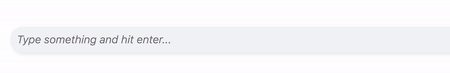
* **placeholder**
Defaults to "Type something and hit enter...", but can be overridden with this prop
```
<TagInput placeholder="Hello world" />
```
# Contributing
To start up a dev env that runs the example react app utilizing the component, checkout the project from the [github homepage](https://github.com/leekevinyg/react-tag-input) and run:
* ``` npm install ```
* ``` npm start ```
To build the example app:
* ``` npm run build-examples ```
The output of the above command is what is running at the [interactive demo](https://leekevinyg.github.io/react-tag-input/).
To build for an npm registry:
* ``` npm run build ```.
When this command is run from ```src/lib```, contents in the ```src/lib``` folder will be bundled and outputted to the ```dist``` folder, which can be deployed to an npm registry of your choice.