@gravity-ui/uikit
Version:
Gravity UI base styling and components
176 lines (120 loc) • 9.46 kB
Markdown
# UIKit · [](https://www.npmjs.com/package/@gravity-ui/uikit) [](https://www.npmjs.com/package/@gravity-ui/uikit) [](https://github.com/gravity-ui/uikit/actions/workflows/ci.yml?query=branch:main) [](https://github.com/gravity-ui/uikit/actions/workflows/test-storybook.yml) [](https://preview.gravity-ui.com/uikit/)
[English](README.md) | [Русский](README-ru.md)
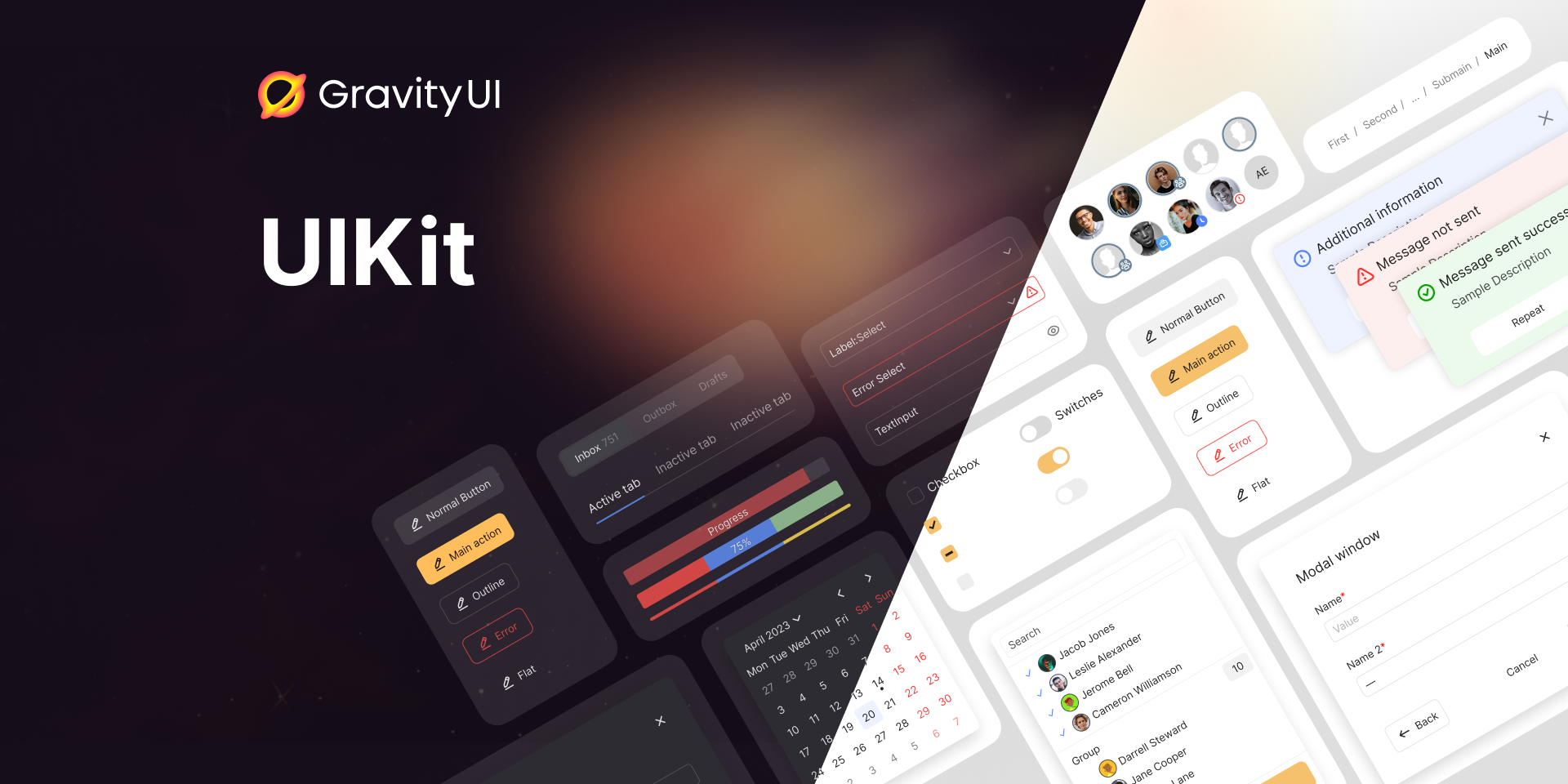
A set of flexible, highly practical, and efficient React components for creating rich web applications. Part of the [Gravity UI](https://gravity-ui.com) design system.
<!--GITHUB_BLOCK-->
###   [Website](https://gravity-ui.com)   [Documentation](https://gravity-ui.com/components/uikit/alert)   [Figma](<https://www.figma.com/community/file/1271150067798118027/Gravity-UI-Design-System-(Beta)>)   [Themer](https://gravity-ui.com/themer)   [Storybook](https://preview.gravity-ui.com/uikit/)   [Community](https://t.me/gravity_ui)
<!--/GITHUB_BLOCK-->
## About
UIKit is the foundational package of the [Gravity UI](https://gravity-ui.com) design system — a battle-tested set of 70+ React components built for production web applications. It handles the hard parts: theming, accessibility, RTL layout, server-side rendering, and internationalization, so you can focus on building your product.
Key features:
- **70+ components** — inputs, overlays, data display, layout primitives, feedback, and more
- **Built-in theming** — light, dark, and high-contrast variants with a live [Themer](https://gravity-ui.com/themer) tool to customize tokens
- **RTL support** — full right-to-left layout direction
Browse the full component catalog in [Storybook](https://preview.gravity-ui.com/uikit/) or the [documentation](https://gravity-ui.com/components/uikit/alert).
## Getting Started
### Prerequisites
React 16.14, 17, 18, or 19 must be installed in your project.
### Installation
```shell
npm install @gravity-ui/uikit
```
## Usage
Import components directly from the package:
```jsx
import {Button} from '@gravity-ui/uikit';
const SubmitButton = (
<Button view="action" size="l">
Submit
</Button>
);
```
### Styles
Include the base styles and fonts once at the top of your app entry point:
```js
// index.js
import '@gravity-ui/uikit/styles/fonts.css';
import '@gravity-ui/uikit/styles/styles.css';
```
A SCSS [mixins](styles/mixins.scss) file with useful helpers is also available for use in your own stylesheets.
### Guides
Read more:
- [Theming](docs/theming.md) — enable light, dark, and high-contrast themes
- [Server-side rendering](docs/server-side-rendering.md) — generate the root CSS class on the server
- [Internationalization](docs/i18n.md) — set the built-in component language
## Development
```shell
git clone git@github.com:gravity-ui/uikit.git
cd uikit
npm ci
npm run start # launches Storybook at http://localhost:7007
```
Other useful commands:
```shell
npm test # run unit tests
npm run lint # lint JS, SCSS, and Markdown
npm run typecheck # TypeScript type-check
npm run playwright # run visual regression tests
```
## Maintainers
<table>
<tr>
<td align="center">
<a href="https://github.com/amje">
<img src="https://github.com/amje.png?size=100" width="100" alt="amje" /><br />
<sub><b>@amje</b></sub>
</a>
</td>
<td align="center">
<a href="https://github.com/ValeraS">
<img src="https://github.com/ValeraS.png?size=100" width="100" alt="ValeraS" /><br />
<sub><b>@ValeraS</b></sub>
</a>
</td>
<td align="center">
<a href="https://github.com/korvin89">
<img src="https://github.com/korvin89.png?size=100" width="100" alt="korvin89" /><br />
<sub><b>@korvin89</b></sub>
</a>
</td>
</tr>
</table>
## Contributing
Contributions are welcome! Please read [CONTRIBUTING.md](CONTRIBUTING.md) before submitting a pull request. For detailed PR guidelines see [contribute/pull-request.md](contribute/pull-request.md).
We have [](https://github.com/gravity-ui/uikit/graphs/contributors) contributors and counting — join us!
Join the community on [Telegram](https://t.me/gravity_ui) for questions and discussion.
## License
Distributed under the MIT License. See [LICENSE](LICENSE) for details.
## For AI agents
The base React component and design-token library for Gravity UI apps — controls, inputs, overlays, layout, and theming that every other @gravity-ui package builds on.
### When to use
- Standard application UI: buttons, form controls, modals and popups, menus, tabs, labels, typography, and layout primitives.
- The theming foundation of a Gravity UI app: `ThemeProvider`, design tokens, and CSS variables the rest of the `@gravity-ui/*` ecosystem expects to be present.
- Simple tabular data via the built-in `Table` component (selection, sorting, row actions).
### When not to use
- Feature-rich data grids (virtualization, column resizing, grouping, reordering) — use [`@gravity-ui/table`](https://github.com/gravity-ui/table), a separate headless package. It is **not** the same as uikit's `Table` component.
- Charts and data visualization — use [`@gravity-ui/charts`](https://github.com/gravity-ui/charts) (`@gravity-ui/chartkit` is the legacy wrapper).
- Application navigation shells (aside header, footer, logo) — use [`@gravity-ui/navigation`](https://github.com/gravity-ui/navigation).
- Date pickers, calendars, and range controls — use [`@gravity-ui/date-components`](https://github.com/gravity-ui/date-components).
- The SVG icon set itself — use [`@gravity-ui/icons`](https://github.com/gravity-ui/icons); uikit only ships the `Icon` renderer.
### Common pitfalls
- `Button` styling prop is `view`, not `variant` or `color`
- **Components render unstyled without setup.** Wrap the app in `ThemeProvider` **and** import `@gravity-ui/uikit/styles/styles.css` (plus `fonts.css`) once at the entry point — both are required.
- **`Icon` has no `name` prop.** Pass an imported icon component through `data`: `import {Gear} from '@gravity-ui/icons'; <Icon data={Gear} size={16} />`.
- **`theme` values are `light | dark | light-hc | dark-hc`.** There is no `theme="default"`.
### Useful docs
- [Layout components and spacings](./docs/layout.md)
- [Theming, Colors & Branding](./docs/theming.md)
- [Typography](./docs/typography.md)
## Documentation for AI agents
Agent-readable documentation for the installed version is located in `node_modules/@gravity-ui/uikit/build/docs/INDEX.md`.
## Star History
<div align="center">
<picture>
<source media="(prefers-color-scheme: dark)" srcset="https://api.star-history.com/svg?repos=gravity-ui/uikit&type=Timeline&theme=dark" />
<source media="(prefers-color-scheme: light)" srcset="https://api.star-history.com/svg?repos=gravity-ui/uikit&type=Timeline" />
<img alt="Star History Chart" width="600" src="https://api.star-history.com/svg?repos=gravity-ui/uikit&type=Timeline" />
</picture>
</div>
---
If you find UIKit useful, please consider giving it a ⭐ on [GitHub](https://github.com/gravity-ui/uikit) — it helps others discover the project.