@googleapis/chat
Version:
872 lines (863 loc) • 485 kB
text/typescript
// Copyright 2020 Google LLC
// Licensed under the Apache License, Version 2.0 (the "License");
// you may not use this file except in compliance with the License.
// You may obtain a copy of the License at
//
// http://www.apache.org/licenses/LICENSE-2.0
//
// Unless required by applicable law or agreed to in writing, software
// distributed under the License is distributed on an "AS IS" BASIS,
// WITHOUT WARRANTIES OR CONDITIONS OF ANY KIND, either express or implied.
// See the License for the specific language governing permissions and
// limitations under the License.
/* eslint-disable @typescript-eslint/no-explicit-any */
/* eslint-disable @typescript-eslint/no-unused-vars */
/* eslint-disable @typescript-eslint/no-empty-interface */
/* eslint-disable @typescript-eslint/no-namespace */
/* eslint-disable no-irregular-whitespace */
import {
OAuth2Client,
JWT,
Compute,
UserRefreshClient,
BaseExternalAccountClient,
GaxiosResponseWithHTTP2,
GoogleConfigurable,
createAPIRequest,
MethodOptions,
StreamMethodOptions,
GlobalOptions,
GoogleAuth,
BodyResponseCallback,
APIRequestContext,
} from 'googleapis-common';
import {Readable} from 'stream';
export namespace chat_v1 {
export interface Options extends GlobalOptions {
version: 'v1';
}
interface StandardParameters {
/**
* Auth client or API Key for the request
*/
auth?:
| string
| OAuth2Client
| JWT
| Compute
| UserRefreshClient
| BaseExternalAccountClient
| GoogleAuth;
/**
* V1 error format.
*/
'$.xgafv'?: string;
/**
* OAuth access token.
*/
access_token?: string;
/**
* Data format for response.
*/
alt?: string;
/**
* JSONP
*/
callback?: string;
/**
* Selector specifying which fields to include in a partial response.
*/
fields?: string;
/**
* API key. Your API key identifies your project and provides you with API access, quota, and reports. Required unless you provide an OAuth 2.0 token.
*/
key?: string;
/**
* OAuth 2.0 token for the current user.
*/
oauth_token?: string;
/**
* Returns response with indentations and line breaks.
*/
prettyPrint?: boolean;
/**
* Available to use for quota purposes for server-side applications. Can be any arbitrary string assigned to a user, but should not exceed 40 characters.
*/
quotaUser?: string;
/**
* Legacy upload protocol for media (e.g. "media", "multipart").
*/
uploadType?: string;
/**
* Upload protocol for media (e.g. "raw", "multipart").
*/
upload_protocol?: string;
}
/**
* Google Chat API
*
* The Google Chat API lets you build Chat apps to integrate your services with Google Chat and manage Chat resources such as spaces, members, and messages.
*
* @example
* ```js
* const {google} = require('googleapis');
* const chat = google.chat('v1');
* ```
*/
export class Chat {
context: APIRequestContext;
customEmojis: Resource$Customemojis;
media: Resource$Media;
spaces: Resource$Spaces;
users: Resource$Users;
constructor(options: GlobalOptions, google?: GoogleConfigurable) {
this.context = {
_options: options || {},
google,
};
this.customEmojis = new Resource$Customemojis(this.context);
this.media = new Resource$Media(this.context);
this.spaces = new Resource$Spaces(this.context);
this.users = new Resource$Users(this.context);
}
}
/**
* One or more interactive widgets that appear at the bottom of a message. For details, see [Add interactive widgets at the bottom of a message](https://developers.google.com/workspace/chat/create-messages#add-accessory-widgets).
*/
export interface Schema$AccessoryWidget {
/**
* A list of buttons.
*/
buttonList?: Schema$GoogleAppsCardV1ButtonList;
}
/**
* Represents the [access setting](https://support.google.com/chat/answer/11971020) of the space.
*/
export interface Schema$AccessSettings {
/**
* Output only. Indicates the access state of the space.
*/
accessState?: string | null;
/**
* Optional. The resource name of the [target audience](https://support.google.com/a/answer/9934697) who can discover the space, join the space, and preview the messages in the space. If unset, only users or Google Groups who have been individually invited or added to the space can access it. For details, see [Make a space discoverable to a target audience](https://developers.google.com/workspace/chat/space-target-audience). Format: `audiences/{audience\}` To use the default target audience for the Google Workspace organization, set to `audiences/default`. Reading the target audience supports: - [User authentication](https://developers.google.com/workspace/chat/authenticate-authorize-chat-user) - [App authentication](https://developers.google.com/workspace/chat/authenticate-authorize-chat-app) with [administrator approval](https://support.google.com/a?p=chat-app-auth) with the `chat.app.spaces` scope. This field is not populated when using the `chat.bot` scope with [app authentication](https://developers.google.com/workspace/chat/authenticate-authorize-chat-app). Setting the target audience requires [user authentication](https://developers.google.com/workspace/chat/authenticate-authorize-chat-user).
*/
audience?: string | null;
}
/**
* List of string parameters to supply when the action method is invoked. For example, consider three snooze buttons: snooze now, snooze one day, snooze next week. You might use `action method = snooze()`, passing the snooze type and snooze time in the list of string parameters.
*/
export interface Schema$ActionParameter {
/**
* The name of the parameter for the action script.
*/
key?: string | null;
/**
* The value of the parameter.
*/
value?: string | null;
}
/**
* Parameters that a Chat app can use to configure how its response is posted.
*/
export interface Schema$ActionResponse {
/**
* Input only. A response to an interaction event related to a [dialog](https://developers.google.com/workspace/chat/dialogs). Must be accompanied by `ResponseType.Dialog`.
*/
dialogAction?: Schema$DialogAction;
/**
* Input only. The type of Chat app response.
*/
type?: string | null;
/**
* Input only. The response of the updated widget.
*/
updatedWidget?: Schema$UpdatedWidget;
/**
* Input only. URL for users to authenticate or configure. (Only for `REQUEST_CONFIG` response types.)
*/
url?: string | null;
}
/**
* Represents the status for a request to either invoke or submit a [dialog](https://developers.google.com/workspace/chat/dialogs).
*/
export interface Schema$ActionStatus {
/**
* The status code.
*/
statusCode?: string | null;
/**
* The message to send users about the status of their request. If unset, a generic message based on the `status_code` is sent.
*/
userFacingMessage?: string | null;
}
/**
* Output only. Annotations can be associated with the plain-text body of the message or with chips that link to Google Workspace resources like Google Docs or Sheets with `start_index` and `length` of 0. To add basic formatting to a text message, see [Format text messages](https://developers.google.com/workspace/chat/format-messages). Example plain-text message body: ``` Hello @FooBot how are you!" ``` The corresponding annotations metadata: ``` "annotations":[{ "type":"USER_MENTION", "startIndex":6, "length":7, "userMention": { "user": { "name":"users/{user\}", "displayName":"FooBot", "avatarUrl":"https://goo.gl/aeDtrS", "type":"BOT" \}, "type":"MENTION" \} \}] ```
*/
export interface Schema$Annotation {
/**
* The metadata for a custom emoji.
*/
customEmojiMetadata?: Schema$CustomEmojiMetadata;
/**
* Length of the substring in the plain-text message body this annotation corresponds to. If not present, indicates a length of 0.
*/
length?: number | null;
/**
* The metadata for a rich link.
*/
richLinkMetadata?: Schema$RichLinkMetadata;
/**
* The metadata for a slash command.
*/
slashCommand?: Schema$SlashCommandMetadata;
/**
* Start index (0-based, inclusive) in the plain-text message body this annotation corresponds to.
*/
startIndex?: number | null;
/**
* The type of this annotation.
*/
type?: string | null;
/**
* The metadata of user mention.
*/
userMention?: Schema$UserMentionMetadata;
}
/**
* Metadata about a [Chat app command](https://developers.google.com/workspace/chat/commands).
*/
export interface Schema$AppCommandMetadata {
/**
* The ID for the command specified in the Chat API configuration.
*/
appCommandId?: number | null;
/**
* The type of Chat app command.
*/
appCommandType?: string | null;
}
/**
* A GIF image that's specified by a URL.
*/
export interface Schema$AttachedGif {
/**
* Output only. The URL that hosts the GIF image.
*/
uri?: string | null;
}
/**
* An attachment in Google Chat.
*/
export interface Schema$Attachment {
/**
* Optional. A reference to the attachment data. This field is used to create or update messages with attachments, or with the media API to download the attachment data.
*/
attachmentDataRef?: Schema$AttachmentDataRef;
/**
* Output only. The original file name for the content, not the full path.
*/
contentName?: string | null;
/**
* Output only. The content type (MIME type) of the file.
*/
contentType?: string | null;
/**
* Output only. The download URL which should be used to allow a human user to download the attachment. Chat apps shouldn't use this URL to download attachment content.
*/
downloadUri?: string | null;
/**
* Output only. A reference to the Google Drive attachment. This field is used with the Google Drive API.
*/
driveDataRef?: Schema$DriveDataRef;
/**
* Identifier. Resource name of the attachment. Format: `spaces/{space\}/messages/{message\}/attachments/{attachment\}`.
*/
name?: string | null;
/**
* Output only. The source of the attachment.
*/
source?: string | null;
/**
* Output only. The thumbnail URL which should be used to preview the attachment to a human user. Chat apps shouldn't use this URL to download attachment content.
*/
thumbnailUri?: string | null;
}
/**
* A reference to the attachment data.
*/
export interface Schema$AttachmentDataRef {
/**
* Optional. Opaque token containing a reference to an uploaded attachment. Treated by clients as an opaque string and used to create or update Chat messages with attachments.
*/
attachmentUploadToken?: string | null;
/**
* Optional. The resource name of the attachment data. This field is used with the media API to download the attachment data.
*/
resourceName?: string | null;
}
/**
* A button. Can be a text button or an image button.
*/
export interface Schema$Button {
/**
* A button with image and `onclick` action.
*/
imageButton?: Schema$ImageButton;
/**
* A button with text and `onclick` action.
*/
textButton?: Schema$TextButton;
}
/**
* Data for Calendar event links.
*/
export interface Schema$CalendarEventLinkData {
/**
* The [Calendar identifier](https://developers.google.com/workspace/calendar/api/v3/reference/calendars) of the linked Calendar.
*/
calendarId?: string | null;
/**
* The [Event identifier](https://developers.google.com/workspace/calendar/api/v3/reference/events) of the linked Calendar event.
*/
eventId?: string | null;
}
/**
* A card is a UI element that can contain UI widgets such as text and images.
*/
export interface Schema$Card {
/**
* The actions of this card.
*/
cardActions?: Schema$CardAction[];
/**
* The header of the card. A header usually contains a title and an image.
*/
header?: Schema$CardHeader;
/**
* Name of the card.
*/
name?: string | null;
/**
* Sections are separated by a line divider.
*/
sections?: Schema$Section[];
}
/**
* A card action is the action associated with the card. For an invoice card, a typical action would be: delete invoice, email invoice or open the invoice in browser. Not supported by Google Chat apps.
*/
export interface Schema$CardAction {
/**
* The label used to be displayed in the action menu item.
*/
actionLabel?: string | null;
/**
* The onclick action for this action item.
*/
onClick?: Schema$OnClick;
}
export interface Schema$CardHeader {
/**
* The image's type (for example, square border or circular border).
*/
imageStyle?: string | null;
/**
* The URL of the image in the card header.
*/
imageUrl?: string | null;
/**
* The subtitle of the card header.
*/
subtitle?: string | null;
/**
* The title must be specified. The header has a fixed height: if both a title and subtitle is specified, each takes up one line. If only the title is specified, it takes up both lines.
*/
title?: string | null;
}
/**
* A [card](https://developers.google.com/workspace/chat/api/reference/rest/v1/cards) in a Google Chat message. Only Chat apps can create cards. If your Chat app [authenticates as a user](https://developers.google.com/workspace/chat/authenticate-authorize-chat-user), the message can't contain cards. [Card builder](https://addons.gsuite.google.com/uikit/builder)
*/
export interface Schema$CardWithId {
/**
* A card. Maximum size is 32 KB.
*/
card?: Schema$GoogleAppsCardV1Card;
/**
* Required if the message contains multiple cards. A unique identifier for a card in a message.
*/
cardId?: string | null;
}
/**
* JSON payload of error messages. If the Cloud Logging API is enabled, these error messages are logged to [Google Cloud Logging](https://cloud.google.com/logging/docs).
*/
export interface Schema$ChatAppLogEntry {
/**
* The deployment that caused the error. For Chat apps built in Apps Script, this is the deployment ID defined by Apps Script.
*/
deployment?: string | null;
/**
* The unencrypted `callback_method` name that was running when the error was encountered.
*/
deploymentFunction?: string | null;
/**
* The error code and message.
*/
error?: Schema$Status;
}
/**
* For a `SelectionInput` widget that uses a multiselect menu, a data source from Google Chat. The data source populates selection items for the multiselect menu. For example, a user can select Google Chat spaces that they're a member of. [Google Chat apps](https://developers.google.com/workspace/chat):
*/
export interface Schema$ChatClientDataSourceMarkup {
/**
* Google Chat spaces that the user is a member of.
*/
spaceDataSource?: Schema$SpaceDataSource;
}
/**
* Data for Chat space links.
*/
export interface Schema$ChatSpaceLinkData {
/**
* The message of the linked Chat space resource. Format: `spaces/{space\}/messages/{message\}`
*/
message?: string | null;
/**
* The space of the linked Chat space resource. Format: `spaces/{space\}`
*/
space?: string | null;
/**
* The thread of the linked Chat space resource. Format: `spaces/{space\}/threads/{thread\}`
*/
thread?: string | null;
}
/**
* Represents a color in the RGBA color space. This representation is designed for simplicity of conversion to and from color representations in various languages over compactness. For example, the fields of this representation can be trivially provided to the constructor of `java.awt.Color` in Java; it can also be trivially provided to UIColor's `+colorWithRed:green:blue:alpha` method in iOS; and, with just a little work, it can be easily formatted into a CSS `rgba()` string in JavaScript. This reference page doesn't have information about the absolute color space that should be used to interpret the RGB value—for example, sRGB, Adobe RGB, DCI-P3, and BT.2020. By default, applications should assume the sRGB color space. When color equality needs to be decided, implementations, unless documented otherwise, treat two colors as equal if all their red, green, blue, and alpha values each differ by at most `1e-5`. Example (Java): import com.google.type.Color; // ... public static java.awt.Color fromProto(Color protocolor) { float alpha = protocolor.hasAlpha() ? protocolor.getAlpha().getValue() : 1.0; return new java.awt.Color( protocolor.getRed(), protocolor.getGreen(), protocolor.getBlue(), alpha); \} public static Color toProto(java.awt.Color color) { float red = (float) color.getRed(); float green = (float) color.getGreen(); float blue = (float) color.getBlue(); float denominator = 255.0; Color.Builder resultBuilder = Color .newBuilder() .setRed(red / denominator) .setGreen(green / denominator) .setBlue(blue / denominator); int alpha = color.getAlpha(); if (alpha != 255) { result.setAlpha( FloatValue .newBuilder() .setValue(((float) alpha) / denominator) .build()); \} return resultBuilder.build(); \} // ... Example (iOS / Obj-C): // ... static UIColor* fromProto(Color* protocolor) { float red = [protocolor red]; float green = [protocolor green]; float blue = [protocolor blue]; FloatValue* alpha_wrapper = [protocolor alpha]; float alpha = 1.0; if (alpha_wrapper != nil) { alpha = [alpha_wrapper value]; \} return [UIColor colorWithRed:red green:green blue:blue alpha:alpha]; \} static Color* toProto(UIColor* color) { CGFloat red, green, blue, alpha; if (![color getRed:&red green:&green blue:&blue alpha:&alpha]) { return nil; \} Color* result = [[Color alloc] init]; [result setRed:red]; [result setGreen:green]; [result setBlue:blue]; if (alpha <= 0.9999) { [result setAlpha:floatWrapperWithValue(alpha)]; \} [result autorelease]; return result; \} // ... Example (JavaScript): // ... var protoToCssColor = function(rgb_color) { var redFrac = rgb_color.red || 0.0; var greenFrac = rgb_color.green || 0.0; var blueFrac = rgb_color.blue || 0.0; var red = Math.floor(redFrac * 255); var green = Math.floor(greenFrac * 255); var blue = Math.floor(blueFrac * 255); if (!('alpha' in rgb_color)) { return rgbToCssColor(red, green, blue); \} var alphaFrac = rgb_color.alpha.value || 0.0; var rgbParams = [red, green, blue].join(','); return ['rgba(', rgbParams, ',', alphaFrac, ')'].join(''); \}; var rgbToCssColor = function(red, green, blue) { var rgbNumber = new Number((red << 16) | (green << 8) | blue); var hexString = rgbNumber.toString(16); var missingZeros = 6 - hexString.length; var resultBuilder = ['#']; for (var i = 0; i < missingZeros; i++) { resultBuilder.push('0'); \} resultBuilder.push(hexString); return resultBuilder.join(''); \}; // ...
*/
export interface Schema$Color {
/**
* The fraction of this color that should be applied to the pixel. That is, the final pixel color is defined by the equation: `pixel color = alpha * (this color) + (1.0 - alpha) * (background color)` This means that a value of 1.0 corresponds to a solid color, whereas a value of 0.0 corresponds to a completely transparent color. This uses a wrapper message rather than a simple float scalar so that it is possible to distinguish between a default value and the value being unset. If omitted, this color object is rendered as a solid color (as if the alpha value had been explicitly given a value of 1.0).
*/
alpha?: number | null;
/**
* The amount of blue in the color as a value in the interval [0, 1].
*/
blue?: number | null;
/**
* The amount of green in the color as a value in the interval [0, 1].
*/
green?: number | null;
/**
* The amount of red in the color as a value in the interval [0, 1].
*/
red?: number | null;
}
/**
* The common event object is the portion of the overall event object that carries general, host-independent information to the add-on from the user's client. This information includes details such as the user's locale, host app, and platform. In addition to homepage and contextual triggers, add-ons construct and pass event objects to [action callback functions](https://developers.google.com/workspace/add-ons/concepts/actions#callback_functions) when the user interacts with widgets. Your add-on's callback function can query the common event object to determine the contents of open widgets in the user's client. For example, your add-on can locate the text a user has entered into a [TextInput](https://developers.google.com/apps-script/reference/card-service/text-input) widget in the `eventObject.commentEventObject.formInputs` object. For Chat apps, the name of the function that the user invoked when interacting with a widget.
*/
export interface Schema$CommonEventObject {
/**
* A map containing the current values of the widgets in the displayed card. The map keys are the string IDs assigned with each widget. The structure of the map value object is dependent on the widget type: **Note**: The following examples are formatted for Apps Script's V8 runtime. If you're using Rhino runtime, you must add `[""]` after the value. For example, instead of `e.commonEventObject.formInputs.employeeName.stringInputs.value[0]`, format the event object as `e.commonEventObject.formInputs.employeeName[""].stringInputs.value[0]`. To learn more about runtimes in Apps Script, see the [V8 Runtime Overview](https://developers.google.com/apps-script/guides/v8-runtime). * Single-valued widgets (for example, a text box): a list of strings (only one element). **Example**: for a text input widget with `employeeName` as its ID, access the text input value with: `e.commonEventObject.formInputs.employeeName.stringInputs.value[0]`. * Multi-valued widgets (for example, checkbox groups): a list of strings. **Example**: for a multi-value widget with `participants` as its ID, access the value array with: `e.commonEventObject.formInputs.participants.stringInputs.value`. * **A date-time picker**: a [`DateTimeInput object`](https://developers.google.com/workspace/add-ons/concepts/event-objects#date-time-input). **Example**: For a picker with an ID of `myDTPicker`, access the [`DateTimeInput`](https://developers.google.com/workspace/add-ons/concepts/event-objects#date-time-input) object using `e.commonEventObject.formInputs.myDTPicker.dateTimeInput`. * **A date-only picker**: a [`DateInput object`](https://developers.google.com/workspace/add-ons/concepts/event-objects#date-input). **Example**: For a picker with an ID of `myDatePicker`, access the [`DateInput`](https://developers.google.com/workspace/add-ons/concepts/event-objects#date-input) object using `e.commonEventObject.formInputs.myDatePicker.dateInput`. * **A time-only picker**: a [`TimeInput object`](https://developers.google.com/workspace/add-ons/concepts/event-objects#time-input). **Example**: For a picker with an ID of `myTimePicker`, access the [`TimeInput`](https://developers.google.com/workspace/add-ons/concepts/event-objects#time-input) object using `e.commonEventObject.formInputs.myTimePicker.timeInput`.
*/
formInputs?: {[key: string]: Schema$Inputs} | null;
/**
* Indicates the host app the add-on is active in when the event object is generated. Possible values include the following: * `GMAIL` * `CALENDAR` * `DRIVE` * `DOCS` * `SHEETS` * `SLIDES` * `CHAT`
*/
hostApp?: string | null;
/**
* Name of the function to invoke. This field doesn't populate for Google Workspace Add-ons that extend Google Chat. Instead, to receive function data like identifiers, add-ons that extend Chat should use the `parameters` field. See [Build interactive interfaces for Chat apps](https://developers.google.com/workspace/add-ons/chat/build).
*/
invokedFunction?: string | null;
/**
* Any additional parameters you supply to an action using [`actionParameters`](https://developers.google.com/workspace/add-ons/reference/rpc/google.apps.card.v1#google.apps.card.v1.Action.ActionParameter) or [`Action.setParameters()`](https://developers.google.com/apps-script/reference/card-service/action#setparametersparameters). **Developer Preview:** For [add-ons that extend Google Chat](https://developers.google.com/workspace/add-ons/chat), to suggest items based on what the users type in multiselect menus, use the value of the `"autocomplete_widget_query"` key (`event.commonEventObject.parameters["autocomplete_widget_query"]`). You can use this value to query a database and suggest selectable items to users as they type. For details, see [Collect and process information from Google Chat users](https://developers.google.com/workspace/add-ons/chat/collect-information).
*/
parameters?: {[key: string]: string} | null;
/**
* The platform enum which indicates the platform where the event originates (`WEB`, `IOS`, or `ANDROID`). Not supported by Chat apps.
*/
platform?: string | null;
/**
* **Disabled by default.** The timezone ID and offset from Coordinated Universal Time (UTC). To turn on this field, you must set `addOns.common.useLocaleFromApp` to `true` in your add-on's manifest. Your add-on's scope list must also include `https://www.googleapis.com/auth/script.locale`. See [Accessing user locale and timezone](https://developers.google.com/workspace/add-ons/how-tos/access-user-locale) for more details. Only supported for the event types [`CARD_CLICKED`](https://developers.google.com/chat/api/reference/rest/v1/EventType#ENUM_VALUES.CARD_CLICKED) and [`SUBMIT_DIALOG`](https://developers.google.com/chat/api/reference/rest/v1/DialogEventType#ENUM_VALUES.SUBMIT_DIALOG).
*/
timeZone?: Schema$TimeZone;
/**
* **Disabled by default.** The user's language and country/region identifier in the format of [ISO 639](https://wikipedia.org/wiki/ISO_639_macrolanguage) language code-[ISO 3166](https://wikipedia.org/wiki/ISO_3166) country/region code. For example, `en-US`. To turn on this field, you must set `addOns.common.useLocaleFromApp` to `true` in your add-on's manifest. Your add-on's scope list must also include `https://www.googleapis.com/auth/script.locale`. See [Accessing user locale and timezone](https://developers.google.com/workspace/add-ons/how-tos/access-user-locale) for more details.
*/
userLocale?: string | null;
}
/**
* Request message for completing the import process for a space.
*/
export interface Schema$CompleteImportSpaceRequest {}
/**
* Response message for completing the import process for a space.
*/
export interface Schema$CompleteImportSpaceResponse {
/**
* The import mode space.
*/
space?: Schema$Space;
}
/**
* Represents a [custom emoji](https://support.google.com/chat/answer/12800149).
*/
export interface Schema$CustomEmoji {
/**
* Optional. Immutable. User-provided name for the custom emoji, which is unique within the organization. Required when the custom emoji is created, output only otherwise. Emoji names must start and end with colons, must be lowercase and can only contain alphanumeric characters, hyphens, and underscores. Hyphens and underscores should be used to separate words and cannot be used consecutively. Example: `:valid-emoji-name:`
*/
emojiName?: string | null;
/**
* Identifier. The resource name of the custom emoji, assigned by the server. Format: `customEmojis/{customEmoji\}`
*/
name?: string | null;
/**
* Optional. Input only. Payload data. Required when the custom emoji is created.
*/
payload?: Schema$CustomEmojiPayload;
/**
* Output only. A temporary image URL for the custom emoji, valid for at least 10 minutes. Note that this is not populated in the response when the custom emoji is created.
*/
temporaryImageUri?: string | null;
/**
* Output only. Unique key for the custom emoji resource.
*/
uid?: string | null;
}
/**
* Annotation metadata for custom emoji.
*/
export interface Schema$CustomEmojiMetadata {
/**
* The custom emoji.
*/
customEmoji?: Schema$CustomEmoji;
}
/**
* Payload data for the custom emoji.
*/
export interface Schema$CustomEmojiPayload {
/**
* Required. Input only. The image used for the custom emoji. The payload must be under 256 KB and the dimension of the image must be square and between 64 and 500 pixels. The restrictions are subject to change.
*/
fileContent?: string | null;
/**
* Required. Input only. The image file name. Supported file extensions: `.png`, `.jpg`, `.gif`.
*/
filename?: string | null;
}
/**
* Date input values.
*/
export interface Schema$DateInput {
/**
* Time since epoch time, in milliseconds.
*/
msSinceEpoch?: string | null;
}
/**
* Date and time input values.
*/
export interface Schema$DateTimeInput {
/**
* Whether the `datetime` input includes a calendar date.
*/
hasDate?: boolean | null;
/**
* Whether the `datetime` input includes a timestamp.
*/
hasTime?: boolean | null;
/**
* Time since epoch time, in milliseconds.
*/
msSinceEpoch?: string | null;
}
/**
* Information about a deleted message. A message is deleted when `delete_time` is set.
*/
export interface Schema$DeletionMetadata {
/**
* Indicates who deleted the message.
*/
deletionType?: string | null;
}
/**
* A Google Chat app interaction event that represents and contains data about a user's interaction with a Chat app. To configure your Chat app to receive interaction events, see [Receive and respond to user interactions](https://developers.google.com/workspace/chat/receive-respond-interactions). In addition to receiving events from user interactions, Chat apps can receive events about changes to spaces, such as when a new member is added to a space. To learn about space events, see [Work with events from Google Chat](https://developers.google.com/workspace/chat/events-overview). Note: This event is only used for [Chat interaction events](https://developers.google.com/workspace/chat/receive-respond-interactions). If your Chat app is built as a [Google Workspace add-on](https://developers.google.com/workspace/add-ons/chat/build), see [Chat event objects](https://developers.google.com/workspace/add-ons/concepts/event-objects#chat-event-object) in the add-ons documentation.
*/
export interface Schema$DeprecatedEvent {
/**
* For `CARD_CLICKED` interaction events, the form action data associated when a user clicks a card or dialog. To learn more, see [Read form data input by users on cards](https://developers.google.com/workspace/chat/read-form-data).
*/
action?: Schema$FormAction;
/**
* Metadata about a Chat app command.
*/
appCommandMetadata?: Schema$AppCommandMetadata;
/**
* Represents information about the user's client, such as locale, host app, and platform. For Chat apps, `CommonEventObject` includes information submitted by users interacting with [dialogs](https://developers.google.com/workspace/chat/dialogs), like data entered on a card.
*/
common?: Schema$CommonEventObject;
/**
* This URL is populated for `MESSAGE`, `ADDED_TO_SPACE`, and `APP_COMMAND` interaction events. After completing an authorization or configuration flow outside of Google Chat, users must be redirected to this URL to signal to Google Chat that the authorization or configuration flow was successful. For more information, see [Connect a Chat app with other services and tools](https://developers.google.com/workspace/chat/connect-web-services-tools).
*/
configCompleteRedirectUrl?: string | null;
/**
* The type of [dialog](https://developers.google.com/workspace/chat/dialogs) interaction event received.
*/
dialogEventType?: string | null;
/**
* The timestamp indicating when the interaction event occurred.
*/
eventTime?: string | null;
/**
* For `CARD_CLICKED` and `MESSAGE` interaction events, whether the user is interacting with or about to interact with a [dialog](https://developers.google.com/workspace/chat/dialogs).
*/
isDialogEvent?: boolean | null;
/**
* For `ADDED_TO_SPACE`, `CARD_CLICKED`, and `MESSAGE` interaction events, the message that triggered the interaction event, if applicable.
*/
message?: Schema$Message;
/**
* The space in which the user interacted with the Chat app.
*/
space?: Schema$Space;
/**
* The thread in which the user interacted with the Chat app. This could be in a new thread created by a newly sent message. This field is populated if the interaction event is associated with a specific message or thread.
*/
thread?: Schema$Thread;
/**
* The Chat app-defined key for the thread related to the interaction event. See [`spaces.messages.thread.threadKey`](/chat/api/reference/rest/v1/spaces.messages#Thread.FIELDS.thread_key) for more information.
*/
threadKey?: string | null;
/**
* A secret value that legacy Chat apps can use to verify if a request is from Google. Google randomly generates the token, and its value remains static. You can obtain, revoke, or regenerate the token from the [Chat API configuration page](https://console.cloud.google.com/apis/api/chat.googleapis.com/hangouts-chat) in the Google Cloud Console. Modern Chat apps don't use this field. It is absent from API responses and the [Chat API configuration page](https://console.cloud.google.com/apis/api/chat.googleapis.com/hangouts-chat).
*/
token?: string | null;
/**
* The [type](/workspace/chat/api/reference/rest/v1/EventType) of user interaction with the Chat app, such as `MESSAGE` or `ADDED_TO_SPACE`.
*/
type?: string | null;
/**
* The user that interacted with the Chat app.
*/
user?: Schema$User;
}
/**
* Wrapper around the card body of the dialog.
*/
export interface Schema$Dialog {
/**
* Input only. Body of the dialog, which is rendered in a modal. Google Chat apps don't support the following card entities: `DateTimePicker`, `OnChangeAction`.
*/
body?: Schema$GoogleAppsCardV1Card;
}
/**
* Contains a [dialog](https://developers.google.com/workspace/chat/dialogs) and request status code.
*/
export interface Schema$DialogAction {
/**
* Input only. Status for a request to either invoke or submit a [dialog](https://developers.google.com/workspace/chat/dialogs). Displays a status and message to users, if necessary. For example, in case of an error or success.
*/
actionStatus?: Schema$ActionStatus;
/**
* Input only. [Dialog](https://developers.google.com/workspace/chat/dialogs) for the request.
*/
dialog?: Schema$Dialog;
}
/**
* A reference to the data of a drive attachment.
*/
export interface Schema$DriveDataRef {
/**
* The ID for the drive file. Use with the Drive API.
*/
driveFileId?: string | null;
}
/**
* Data for Google Drive links.
*/
export interface Schema$DriveLinkData {
/**
* A [DriveDataRef](https://developers.google.com/workspace/chat/api/reference/rest/v1/spaces.messages.attachments#drivedataref) which references a Google Drive file.
*/
driveDataRef?: Schema$DriveDataRef;
/**
* The mime type of the linked Google Drive resource.
*/
mimeType?: string | null;
}
/**
* An emoji that is used as a reaction to a message.
*/
export interface Schema$Emoji {
/**
* A custom emoji.
*/
customEmoji?: Schema$CustomEmoji;
/**
* Optional. A basic emoji represented by a unicode string.
*/
unicode?: string | null;
}
/**
* The number of people who reacted to a message with a specific emoji.
*/
export interface Schema$EmojiReactionSummary {
/**
* Output only. Emoji associated with the reactions.
*/
emoji?: Schema$Emoji;
/**
* Output only. The total number of reactions using the associated emoji.
*/
reactionCount?: number | null;
}
/**
* A generic empty message that you can re-use to avoid defining duplicated empty messages in your APIs. A typical example is to use it as the request or the response type of an API method. For instance: service Foo { rpc Bar(google.protobuf.Empty) returns (google.protobuf.Empty); \}
*/
export interface Schema$Empty {}
/**
* A form action describes the behavior when the form is submitted. For example, you can invoke Apps Script to handle the form.
*/
export interface Schema$FormAction {
/**
* The method name is used to identify which part of the form triggered the form submission. This information is echoed back to the Chat app as part of the card click event. You can use the same method name for several elements that trigger a common behavior.
*/
actionMethodName?: string | null;
/**
* List of action parameters.
*/
parameters?: Schema$ActionParameter[];
}
/**
* An action that describes the behavior when the form is submitted. For example, you can invoke an Apps Script script to handle the form. If the action is triggered, the form values are sent to the server. [Google Workspace add-ons and Chat apps](https://developers.google.com/workspace/extend):
*/
export interface Schema$GoogleAppsCardV1Action {
/**
* Optional. If this is true, then all widgets are considered required by this action. [Google Workspace add-ons and Chat apps](https://developers.google.com/workspace/extend):
*/
allWidgetsAreRequired?: boolean | null;
/**
* A custom function to invoke when the containing element is clicked or otherwise activated. For example usage, see [Read form data](https://developers.google.com/workspace/chat/read-form-data).
*/
function?: string | null;
/**
* Optional. Required when opening a [dialog](https://developers.google.com/workspace/chat/dialogs). What to do in response to an interaction with a user, such as a user clicking a button in a card message. If unspecified, the app responds by executing an `action`—like opening a link or running a function—as normal. By specifying an `interaction`, the app can respond in special interactive ways. For example, by setting `interaction` to `OPEN_DIALOG`, the app can open a [dialog](https://developers.google.com/workspace/chat/dialogs). When specified, a loading indicator isn't shown. If specified for an add-on, the entire card is stripped and nothing is shown in the client. [Google Chat apps](https://developers.google.com/workspace/chat):
*/
interaction?: string | null;
/**
* Specifies the loading indicator that the action displays while making the call to the action.
*/
loadIndicator?: string | null;
/**
* List of action parameters.
*/
parameters?: Schema$GoogleAppsCardV1ActionParameter[];
/**
* Indicates whether form values persist after the action. The default value is `false`. If `true`, form values remain after the action is triggered. To let the user make changes while the action is being processed, set [`LoadIndicator`](https://developers.google.com/workspace/add-ons/reference/rpc/google.apps.card.v1#loadindicator) to `NONE`. For [card messages](https://developers.google.com/workspace/chat/api/guides/v1/messages/create#create) in Chat apps, you must also set the action's [`ResponseType`](https://developers.google.com/workspace/chat/api/reference/rest/v1/spaces.messages#responsetype) to `UPDATE_MESSAGE` and use the same [`card_id`](https://developers.google.com/workspace/chat/api/reference/rest/v1/spaces.messages#CardWithId) from the card that contained the action. If `false`, the form values are cleared when the action is triggered. To prevent the user from making changes while the action is being processed, set [`LoadIndicator`](https://developers.google.com/workspace/add-ons/reference/rpc/google.apps.card.v1#loadindicator) to `SPINNER`.
*/
persistValues?: boolean | null;
/**
* Optional. Fill this list with the names of widgets that this Action needs for a valid submission. If the widgets listed here don't have a value when this Action is invoked, the form submission is aborted. [Google Workspace add-ons and Chat apps](https://developers.google.com/workspace/extend):
*/
requiredWidgets?: string[] | null;
}
/**
* List of string parameters to supply when the action method is invoked. For example, consider three snooze buttons: snooze now, snooze one day, or snooze next week. You might use `action method = snooze()`, passing the snooze type and snooze time in the list of string parameters. To learn more, see [`CommonEventObject`](https://developers.google.com/workspace/chat/api/reference/rest/v1/Event#commoneventobject). [Google Workspace add-ons and Chat apps](https://developers.google.com/workspace/extend):
*/
export interface Schema$GoogleAppsCardV1ActionParameter {
/**
* The name of the parameter for the action script.
*/
key?: string | null;
/**
* The value of the parameter.
*/
value?: string | null;
}
/**
* The style options for the border of a card or widget, including the border type and color. [Google Workspace add-ons and Chat apps](https://developers.google.com/workspace/extend):
*/
export interface Schema$GoogleAppsCardV1BorderStyle {
/**
* The corner radius for the border.
*/
cornerRadius?: number | null;
/**
* The colors to use when the type is `BORDER_TYPE_STROKE`. To set the stroke color, specify a value for the `red`, `green`, and `blue` fields. The value must be a float number between 0 and 1 based on the RGB color value, where `0` (0/255) represents the absence of color and `1` (255/255) represents the maximum intensity of the color. For example, the following sets the color to red at its maximum intensity: ``` "color": { "red": 1, "green": 0, "blue": 0, \} ``` The `alpha` field is unavailable for stroke color. If specified, this field is ignored.
*/
strokeColor?: Schema$Color;
/**
* The border type.
*/
type?: string | null;
}
/**
* A text, icon, or text and icon button that users can click. For an example in Google Chat apps, see [Add a button](https://developers.google.com/workspace/chat/design-interactive-card-dialog#add_a_button). To make an image a clickable button, specify an `Image` (not an `ImageComponent`) and set an `onClick` action. [Google Workspace add-ons and Chat apps](https://developers.google.com/workspace/extend):
*/
export interface Schema$GoogleAppsCardV1Button {
/**
* The alternative text that's used for accessibility. Set descriptive text that lets users know what the button does. For example, if a button opens a hyperlink, you might write: "Opens a new browser tab and navigates to the Google Chat developer documentation at https://developers.google.com/workspace/chat".
*/
altText?: string | null;
/**
* Optional. The color of the button. If set, the button `type` is set to `FILLED` and the color of `text` and `icon` fields are set to a contrasting color for readability. For example, if the button color is set to blue, any text or icons in the button are set to white. To set the button color, specify a value for the `red`, `green`, and `blue` fields. The value must be a float number between 0 and 1 based on the RGB color value, where `0` (0/255) represents the absence of color and `1` (255/255) represents the maximum intensity of the color. For example, the following sets the color to red at its maximum intensity: ``` "color": { "red": 1, "green": 0, "blue": 0, \} ``` The `alpha` field is unavailable for button color. If specified, this field is ignored.
*/
color?: Schema$Color;
/**
* If `true`, the button is displayed in an inactive state and doesn't respond to user actions.
*/
disabled?: boolean | null;
/**
* An icon displayed inside the button. If both `icon` and `text` are set, then the icon appears before the text.
*/
icon?: Schema$GoogleAppsCardV1Icon;
/**
* Required. The action to perform when a user clicks the button, such as opening a hyperlink or running a custom function.
*/
onClick?: Schema$GoogleAppsCardV1OnClick;
/**
* The text displayed inside the button.
*/
text?: string | null;
/**
* Optional. The type of a button. If unset, button type defaults to `OUTLINED`. If the `color` field is set, the button type is forced to `FILLED` and any value set for this field is ignored.
*/
type?: string | null;
}
/**
* A list of buttons layed out horizontally. For an example in Google Chat apps, see [Add a button](https://developers.google.com/workspace/chat/design-interactive-card-dialog#add_a_button). [Google Workspace add-ons and Chat apps](https://developers.google.com/workspace/extend):
*/
export interface Schema$GoogleAppsCardV1ButtonList {
/**
* An array of buttons.
*/
buttons?: Schema$GoogleAppsCardV1Button[];
}
/**
* A card interface displayed in a Google Chat message or Google Workspace add-on. Cards support a defined layout, interactive UI elements like buttons, and rich media like images. Use cards to present detailed information, gather information from users, and guide users to take a next step. [Card builder](https://addons.gsuite.google.com/uikit/builder) To learn how to build cards, see the following documentation: * For Google Chat apps, see [Design the components of a card or dialog](https://developers.google.com/workspace/chat/design-components-card-dialog). * For Google Workspace add-ons, see [Card-based interfaces](https://developers.google.com/apps-script/add-ons/concepts/cards). Note: You can add up to 100 widgets per card. Any widgets beyond this limit are ignored. This limit applies to both card messages and dialogs in Google Chat apps, and to cards in Google Workspace add-ons. **Example: Card message for a Google Chat app** 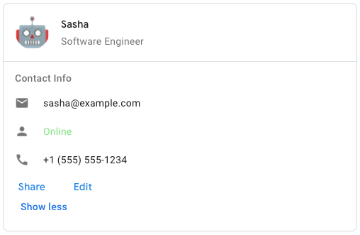 To create the sample card message in Google Chat, use the following JSON: ``` { "cardsV2": [ { "cardId": "unique-card-id", "card": { "header": { "title": "Sasha", "subtitle": "Software Engineer", "imageUrl": "https://developers.google.com/workspace/chat/images/quickstart-app-avatar.png", "imageType": "CIRCLE", "imageAltText": "Avatar for Sasha" \}, "sections": [ { "header": "Contact Info", "collapsible": true, "uncollapsibleWidgetsCount": 1, "widgets": [ { "decoratedText": { "startIcon": { "knownIcon": "EMAIL" \}, "text": "sasha@example.com" \} \}, { "decoratedText": { "startIcon": { "knownIcon": "PERSON" \}, "text": "Online" \} \}, { "decoratedText": { "startIcon": { "knownIcon": "PHONE" \}, "text": "+1 (555) 555-1234" \} \}, { "buttonList": { "buttons": [ { "text": "Share", "onClick": { "openLink": { "url": "https://example.com/share" \} \} \}, { "text": "Edit", "onClick": { "action": { "function": "goToView", "parameters": [ { "key": "viewType", "value": "EDIT" \} ] \} \} \} ] \} \} ] \} ] \} \} ] \} ```
*/
export interface Schema$GoogleAppsCardV1Card {
/**
* The card's actions. Actions are added to the card's toolbar menu. [Google Workspace add-ons](https://developers.google.com/workspace/add-ons): For example, the following JSON constructs a card action menu with `Settings` and `Send Feedback` options: ``` "card_actions": [ { "actionLabel": "Settings", "onClick": { "action": { "functionName": "goToView", "parameters": [ { "key": "viewType", "value": "SETTING" \} ], "loadIndicator": "LoadIndicator.SPINNER" \} \} \}, { "actionLabel": "Send Feedback", "onClick": { "openLink": { "url": "https://example.com/feedback" \} \} \} ] ```
*/
cardActions?: Schema$GoogleAppsCardV1CardAction[];
/**
* In Google Workspace add-ons, sets the display properties of the `peekCardHeader`. [Google Workspace add-ons](https://developers.google.com/workspace/add-ons):
*/
displayStyle?: string | null;
/**
* The expression data for the card. Available for Google Workspace add-ons that extend Google Workspace Studio. Unavailable for Google Chat apps.
*/
expressionData?: Schema$GoogleAppsCardV1ExpressionData[];
/**
* The fixed footer shown at the bottom of this card. Setting `fixedFooter` without specifying a `primaryButton` or a `secondaryButton` causes an error. For Chat apps, you can use fixed footers in [dialogs](https://developers.google.com/workspace/chat/dialogs), but not [card messages](https://developers.google.com/workspace/chat/create-messages#create). [Google Workspace add-ons and Chat apps](https://developers.google.com/workspace/extend):
*/
fixedFooter?: Schema$GoogleAppsCardV1CardFixedFooter;
/**
* The header of the card. A header usually contains a leading image and a title. Headers always appear at the top of a card.
*/
header?: Schema$GoogleAppsCardV1CardHeader;
/**
* Name of the card. Used as a card identifier in card navigation. [Google Workspace add-ons](https://developers.google.com/workspace/add-ons):
*/
name?: string | null;
/**
* When displaying contextual content, the peek card