@farango/calendar_library
Version:
The **Event Calendar** is a simple and responsive React component that displays a **monthly calendar** with support for events. This component is built with React and SCSS and can be easily integrated into your React applications.
292 lines (229 loc) • 9.56 kB
Markdown
# Event Calendar Component
The **Event Calendar** is a simple and responsive React component that displays a **monthly calendar** with support for events. This component is built with React and SCSS and can be easily integrated into your React applications.
## Overview
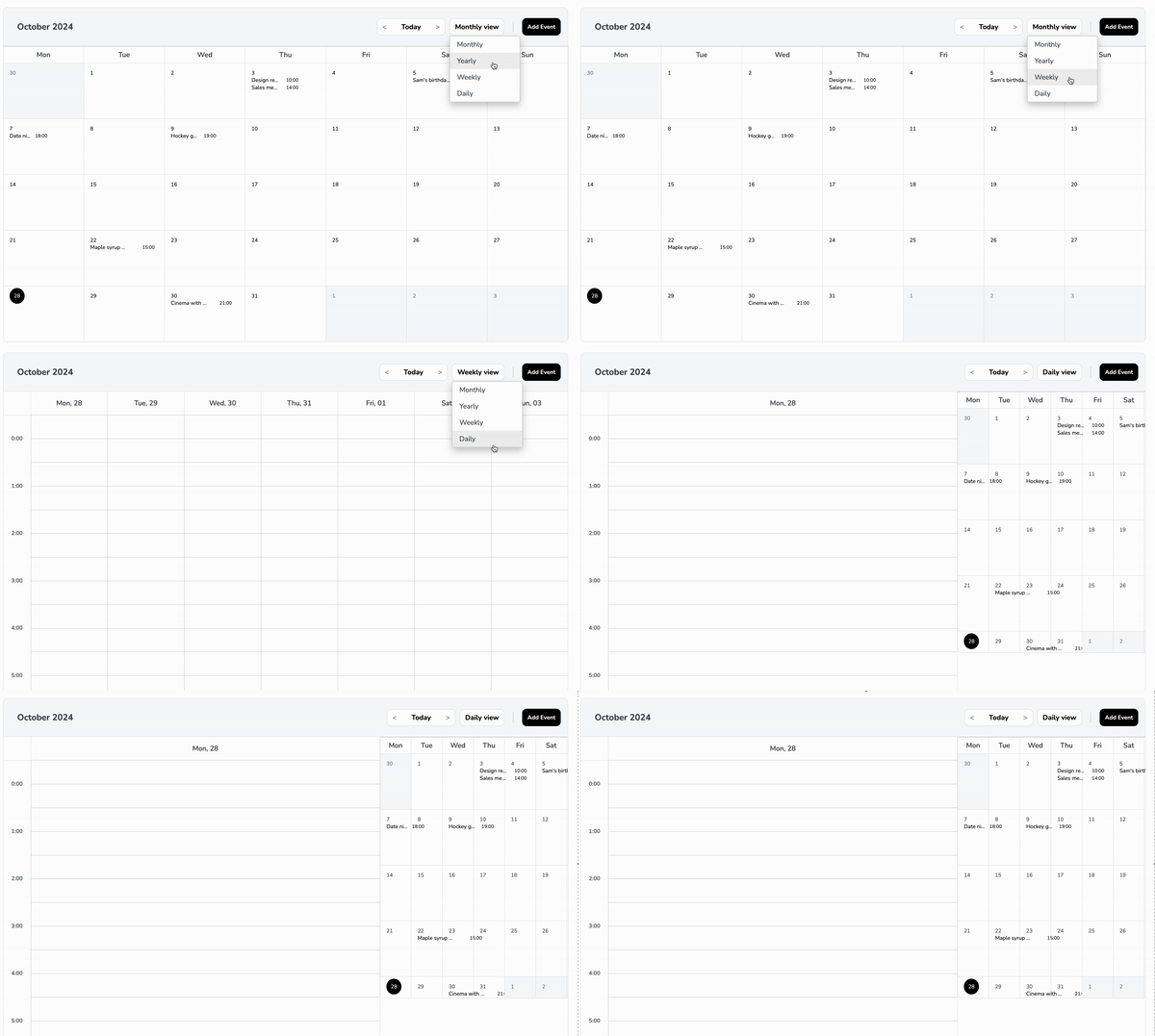
The **Event Calendar** component provides a visual representation of a calendar month, where users can see events for each day. It highlights the current day, handles long event titles by truncating them, and separates event times to ensure a clean layout.
## Preview
### Key Features
- **Monthly View**: Displays a complete month with days and events.
- **Current Day Highlighting**: Highlights the current day with a circular background.
- **Event Handling**:
- Events are displayed under each day.
- Event titles are truncated with ellipses to prevent overflow.
- Each event occupies a single line, with the title taking up **60%** of the width and the time taking up **40%**.
- **Responsive Design**: Adjusts the layout and font size based on screen size to maintain readability and usability.
- **Customizable Title and Button**: Allows setting custom titles for the calendar and the "Add Event" button.
## Table of Contents
- [Installation](#installation)
- [Usage](#usage)
- [Basic Usage](#basic-usage)
- [Customizing Styles](#customizing-styles)
- [Visibility Options](#visibility-options)
- [Additional Props](#additional-props)
- [Props](#props)
- [eventsData](#eventsdata)
- [styles](#styles)
- [title](#title)
- [titleButton](#titlebutton)
- [onSelectedEvent](#onselectedevent)
- [addEvent](#addevent)
- [Examples](#examples)
## Installation
Install the `@farango/calendar_library` package:
```bash
npm install @farango/calendar_library
```
### Basic Usage
Here's how to use the `EventCalendar` component with default settings:
```jsx
import React from 'react';
import { EventCalendar } from '@farango/calendar_library';
const App = () => {
const events = [
{ date: '2024-10-21', title: 'Meeting', time: '10:00 AM' },
{ date: '2024-10-22', title: 'Workshop', time: '2:00 PM' },
{ date: '2024-10-23', title: 'Webinar', time: '11:00 AM' },
];
return (
<div>
<EventCalendar eventsData={events} />
</div>
);
};
export default App;
```
## Customizing Styles
| **Property** | **Description** | **Default** |
|---------------------------|-----------------------------------------------------------|-----------------------|
| `colorActualDay` | Sets the background color of the current day. | `#FFC107` |
| `colorFontTitle` | Changes the font color of the calendar title. | `#1E90FF` |
| `colorFontButtons` | Changes the font color of buttons. | `#2ECC71` |
| `colorFontNameDays` | Changes the font color of the day names (Mon, Tue, etc.). | `#34495E` |
| `colorFontDays` | Changes the font color of the calendar days. | `#000` |
| `sizeFontAppointment` | Adjusts the font size of event titles. | `1rem` |
| `sizeFontButtons` | Adjusts the font size of buttons. | `0.9rem` |
| `sizeFontNameDays` | Adjusts the font size of the day names. | `0.8rem` |
| `sizeFontDays` | Adjusts the font size of the calendar days. | `0.85rem` |
| `bgHeader` | Sets the background color of the header. | `#E0E0E0` |
| `bgDaysNames` | Sets the background color of the day names row. | `#F8F8F8` |
| `bgCells` | Sets the background color of the calendar cells. | `#FFFFFF` |
| `bgActualDay` | Sets the background color of the current day. | `#FFC107` |
| `eventNumberBackground` | Sets the background color of the number of events. | `#FFC107` |
| `eventTitleSpacing` | Adjusts spacing between event titles and their times. | `''` (default) |
| `eventTimeColor` | Sets the font color of event times. | `#000` |
| `eventTitleColor` | Sets the font color of event titles. | `#000` |
You can customize the appearance of the calendar by passing a `styles` object as a prop:
```jsx
const customStyles = {
colorActualDay: '#FF5733',
colorFontTitle: '#1E90FF',
colorFontButtons: '#2ECC71',
colorFontNameDays: '#34495E',
colorFontDays: '#000',
sizeFontAppointment: '1rem',
sizeFontButtons: '0.9rem',
sizeFontNameDays: '0.8rem',
sizeFontDays: '0.85rem',
bgHeader: '#E0E0E0',
bgDaysNames: '#F8F8F8',
bgCells: '#FFFFFF',
bgActualDay: '#FFC107',
visibilityOptions: {
todayButton: true,
dropdownFilter: true,
addEventButton: false,
header: true,
daysNames: true,
},
};
<EventCalendar eventsData={events} styles={customStyles} />
```
## Visibility Options
The component allows you to toggle visibility for specific elements:
- **todayButton**: Shows/hides the "Today" button.
- **dropdownFilter**: Shows/hides the filter dropdown.
- **addEventButton**: Shows/hides the "Add Event" button.
- **header**: Shows/hides the calendar header.
- **daysNames**: Shows/hides the row of day names.
## Additional Props
### `title`
- **Type**: String
- **Default**: `"Event Calendar"`
- **Description**: Sets a custom title for the calendar.
- **Example**:
```jsx
<EventCalendar title="My Custom Calendar" />
```
### `titleButton`
- **Type**: String
- **Default**: `"Add Event"`
- **Description**: Sets a custom label for the "Add Event" button.
- **Example**:
```jsx
<EventCalendar titleButton="Create New Event" />
```
### `onSelectedEvent`
- **Type**: Function
- **Default**: `() => {}`
- **Description**: Callback function triggered when an event is selected.
- **Example**:
```jsx
const handleEventSelection = (event) => {
console.log('Selected Event:', event);
};
<EventCalendar onSelectedEvent={handleEventSelection} />
```
### `addEvent`
- **Type**: Function
- **Default**: `() => {}`
- **Description**: Callback function triggered when the "Add Event" button is clicked.
- **Example**:
```jsx
const handleAddEvent = () => {
console.log('Add Event clicked');
};
<EventCalendar addEvent={handleAddEvent} />
```
## Props
### `eventsData`
- **Type**: Array
- **Default**: `[]`
- **Description**: An array of event objects. Each event should have:
- `date` (in YYYY-MM-DD format)
- `title` (string)
- `time` (string)
- **Example**:
```javascript
const events = [
{ date: '2024-10-21', title: 'Meeting', time: '10:00 AM', numberEvents:2 },
{ date: '2024-10-22', title: 'Workshop', time: '2:00 PM' },
];
```
### `styles`
- **Type**: Object
- **Default**: See `defaultStyles` in the component
- **Description**: An object to customize the appearance of the calendar. It contains properties for colors, font sizes, background colors, and visibility options.
## Examples
### Example 1: Simple Calendar with Default Styles
```jsx
<EventCalendar eventsData={events} />
```
### Example 2: Calendar with Custom Styles
```jsx
<EventCalendar eventsData={events} styles={customStyles} />
```
### Example 3: Custom Title and Add Event Callback
```jsx
<EventCalendar
title="Team Calendar"
titleButton="Schedule Event"
addEvent={() => alert('Add Event clicked')}
/>
```
# `AvailabilityView` Component Documentation
## Overview
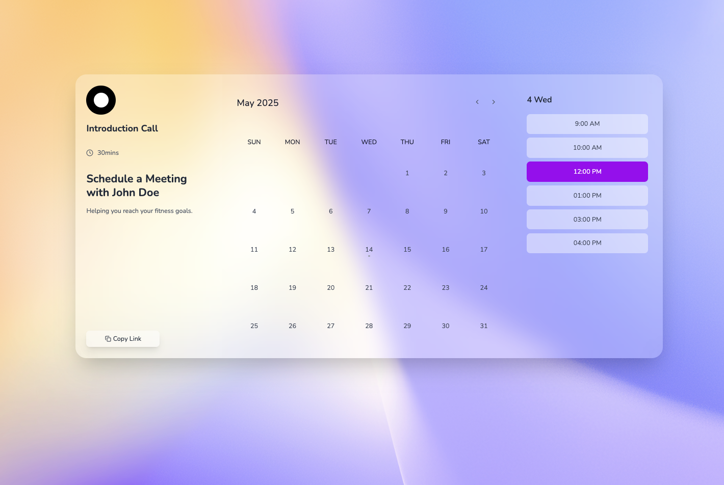
The `AvailabilityView` component is a React-based weekly calendar interface designed to display availability, allow time slot selection, and showcase user profile information. It integrates with an `EventCalendar` for managing appointments.
## Props
- **`availability`**: *(Array)*
Default: `availabilityList`
A list of available time slots, each with a `time` and `available` status.
- **`profileInfo`**: *(Object)*
Default: `defaultProfileInfo`
Contains user profile details: `image` (URL), `name`, `subtitle`, and `shortText`.
- **`onDailyEvent`**: *(Function)*
Default: `() => {}`
Callback triggered when a daily event is selected.
- **`handleTimeSlotSelect`**: *(Function)*
Default: `(timeSlot) => alert('You selected: ' + timeSlot.time)`
Callback triggered when a time slot is clicked.
## Usage
### Basic Example
```jsx
import React from 'react';
import AvailabilityView from './AvailabilityView';
const profile = {
image: 'https://via.placeholder.com/150',
name: 'John Doe',
subtitle: 'Personal Trainer',
shortText: 'Helping you reach your fitness goals.',
};
const availability = [
{ time: '9:00 AM', available: true },
{ time: '10:00 AM', available: false },
{ time: '11:00 AM', available: true },
];
const App = () => (
<AvailabilityView
profileInfo={profile}
availability={availability}
onDailyEvent={(event) => console.log('Selected Event:', event)}
/>
);
export default App;
```
## License and Author Information
### License
- **Type**: MIT Lic
### Author
- **Name**: Andrés Arango