@esteemapp/react-native-multi-slider
Version:
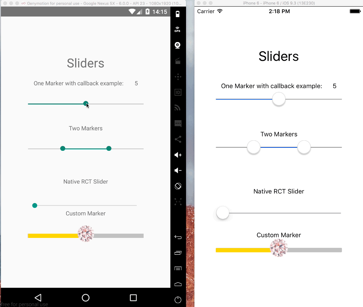
Android and iOS supported pure JS slider component with multiple markers for React Native
99 lines (77 loc) • 3.73 kB
Markdown
# react-native-multi-slider
Pure JS react native slider component with one or two markers.
Options to customize track, touch area and provide customer markers and callbacks for touch events and value changes.
## Examples
```
cd example/Basic
npm install
react-native run-ios
react-native run-android
```
## Getting Started
- [Installation](#installation)
### Installation
```bash
$ npm install --save @ptomasroos/react-native-multi-slider
```
### Usage in a ScrollView
```
enableScroll = () => this.setState({ scrollEnabled: true });
disableScroll = () => this.setState({ scrollEnabled: false });
render() {
return (
<ScrollView scrollEnabled={this.state.scrollEnabled}>
<MultiSlider
...
onValuesChangeStart={this.disableScroll}
onValuesChangeFinish={this.enableScroll}
/>
</ScrollView>
);
```
### shape up CustomMarker as left and right
In order to make different styles on markers you can set isMarkersSeparated to true, define customMarkerLeft and customMarkerRight in MultiSlider. for example:
```
<MultiSlider
...
isMarkersSeparated={true}
customMarkerLeft={(e) => {
return (<CustomSliderMarkerLeft
currentValue={e.currentValue}/>)
}}
customMarkerRight={(e) => {
return (<CustomSliderMarkerRight
currentValue={e.currentValue}/>)
}}
/>
```
### Partial report of the props
Feel free to contribute to this part of the documentation.
| Prop name | Default value | Type | Purpouse |
|:---------------------------------------------------------------------------------:|:-------------------------------------------------------------:|:-----------------:|:---------------------------------------:|
| values | [0] | array of numbers | Prefixed values of the slider. |
| onValuesChangeStart | () => {} | function | Callback when the value starts changing |
| onValuesChange | () => {} | function | Callback when the value changes |
| onValuesChangeFinish | (values) => {} | function | Callback when the value stops changing |
| sliderLength | 280 | number | Length of the slider (?) |
| touchDimensions | {height: 50,width: 50,borderRadius: 15,slipDisplacement: 200} | object | (?) |
| customMarker | | function | Component used for the cursor. |
| customMarkerLeft | | function | Component used for the left cursor. |
| customMarkerRight | | function | Component used for the right cursor. |
| isMarkersSeparated | | boolean | (?) |
| min | 0 | number | Minimum value available in the slider. |
| max | 10 | number | Maximum value available in the slider. |
| step | 1 | number | Step value of the slider. |
| optionsArray | | array of numbers | Possible values of the slider. Ignores min and max. |
| {container/track/selected/unselected/ markerContainer/marker/pressedMarker} Style | | style object | Styles for the slider |
| valuePrefix | | string | Prefix added to the value. |
| valueSuffix | | string | Suffix added to the value. |
| enabledOne | true | boolean | Enables the first cursor |
| enabledTwo | true | boolean | Enables the second cursor |
| onToggleOne | undefined | function callback | Listener when first cursor toggles. |
| onToggleTwo | undefined | function callback | Listener when second cursor toggles. |
| allowOverlap | false | boolean | Allow the overlap within the cursors. |
| snapped | false | boolean | Use this when you want a fixed position for your markers, this will split the slider in N specific positions |
| markerOffsetX | 0 | number | Offset first cursor. |
| markerOffsetY | 0 | number | Offset second cursor. |