@dynamix-layout/react
Version:
A powerful React component for creating dynamic, resizable, and draggable layouts.
216 lines (158 loc) • 10.2 kB
Markdown
<div align="center">
[](https://www.patreon.com/akashaman)
[](https://www.buymeacoffee.com/akashaman)
[](mailto:sir.akashaman@gmail.com)
</div>
## 🚀 @dynamix-layout/react
### The official React wrapper for `@dynamix-layout/core`
## Overview
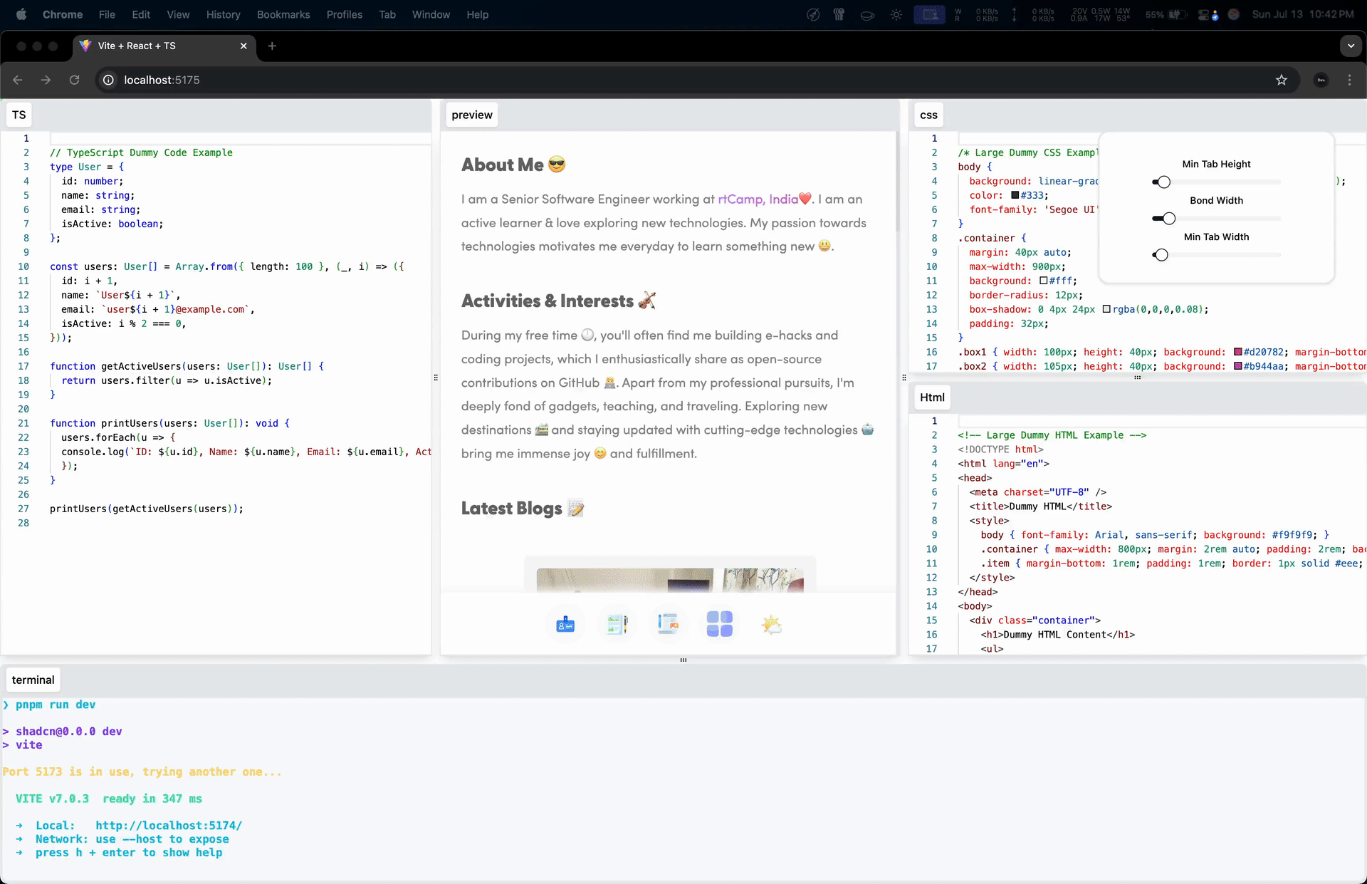
**@dynamix-layout/react** brings the power of the `@dynamix-layout/core` engine to React applications. It provides a flexible `<DynamixLayout />` component and an advanced `useDynamixLayout` hook to create fully dynamic, resizable, and draggable tab-based layouts with ease. Build complex UIs like VS Code or JSFiddle in minutes.
---
### Made with ❤️ by [Akash Aman](https://linktr.ee/akash_aman)
---
---
## 📦 Installation
```bash
npm install @dynamix-layout/react @dynamix-layout/core
```
---
## 🏁 Getting Started
The easiest way to get started is by using the `<DynamixLayout />` component. Provide it with an array of `[id, component]` tuples.
```jsx
import React from 'react'
import { DynamixLayout } from '@dynamix-layout/react'
import '@dynamix-layout/react/dist/layout.css' // Don't forget to import the default styles
function App() {
// 1. Define your tabs as an array of [id, component] tuples
const myTabs = [
['editor', <div>This is my editor!</div>],
['terminal', <div>This is the terminal.</div>],
['preview', <div>Live preview here.</div>],
]
return (
<div
style={{
width: '100vw',
height: '100vh',
}}
>
{/* 2. Render the DynamixLayout component with your tabs */}
<DynamixLayout tabs={myTabs} />
</div>
)
}
export default App
```
---
## 🧩 `<DynamixLayout />` Component API
The `<DynamixLayout />` component is the primary way to use this package. It's highly configurable through its props.
### Core Functionality
| Prop | Type | Description | Default |
| ---------------------- | ----------------------- | ------------------------------------------------------------------------------------- | ---------------------------- |
| **`tabs`** (required) | `[string, ReactNode][]` | An array of `[id, component]` tuples for your tabs. | ` ` |
| `layoutTree` | `LayoutTree` | A serialized layout object from a previous session to restore a saved layout. | `null` |
| `tabNames` | `Map<string, string>` | An optional map to provide friendly display names for your tabs in the tab bar. | `new Map()` |
| `enableTabbar` | `boolean` | If `true`, renders the draggable tab bar on top of each tab panel. | `true` |
| `tabHeadHeight` | `number` | The height of the tab bar in pixels. | `40` |
| `pad` | `{ t, b, l, r }` | Padding for the root layout container in pixels. | `{ t: 0, b: 0, l: 0, r: 0 }` |
| `minTabWidth` | `number` | Minimum width of a tab panel in pixels. | `40` |
| `minTabHeight` | `number` | Minimum height of a tab panel in pixels. | `40` |
| `bondWidth` | `number` | The width/height of the draggable slider between panels in pixels. | `10` |
| `rootId` | `string` | The HTML `id` for the root `<div>` element of the layout. | `"dynamix-layout-root"` |
| `disableResizeTimeout` | `boolean` | Disables debounce on window resize for faster updates. Can impact performance. | `true` |
| `disableSliderTimeout` | `boolean` | Disables debounce when dragging a slider. | `true` |
| `windowResizeTimeout` | `number` | Debounce timeout in milliseconds for window resize events. | `2` |
| `sliderUpdateTimeout` | `number` | Debounce timeout in milliseconds for slider drag events. | `2` |
| `...props` | `HTMLAttributes` | Standard HTML attributes like `style` and `className` are passed to the root `<div>`. | ` ` |
### 🎨 Customization with Wrapper Components
You can completely change the look and feel of the layout by providing your own React components for rendering different parts of the UI.
| Prop | Description |
| --------------- | ----------------------------------------------------------------------------- |
| `WrapTabPanel` | A component to wrap the entire tab panel (tab bar + tab content area). |
| `WrapTabHead` | A component to wrap the tab bar that contains the tab labels. |
| `WrapTabLabel` | A component for an individual, clickable tab label in the tab bar. |
| `WrapTabBody` | A component to wrap the content of a single tab. |
| `SliderElement` | A component for the draggable slider used to resize panels. |
| `HoverElement` | A component that displays the visual drop zone indicator when dragging a tab. |
**Example: Custom Slider**
```jsx
import { DynamixLayout } from '@dynamix-layout/react'
import React from 'react'
const MyCustomSlider = React.forwardRef((props, ref) => (
<div
ref={ref}
{...props}
style={{
...props.style,
background: 'rgba(255, 0, 0, 0.5)',
border: '1px dashed red',
zIndex: 100, // Ensure it's on top
}}
/>
))
function App() {
// ... (myTabs definition)
return <DynamixLayout tabs={myTabs} SliderElement={MyCustomSlider} />
}
```
### Styling Props
For finer-grained control, you can pass `style` objects or `className` strings to the default wrapper components without replacing them entirely.
| Prop | Type | Target Element |
| --------------------------- | --------------------- | -------------------- |
| `tabPanelElementStyles` | `React.CSSProperties` | `WrapTabPanel` |
| `tabPanelElementClass` | `string` | `WrapTabPanel` |
| `tabHeadElementStyles` | `React.CSSProperties` | `WrapTabHead` |
| `tabHeadElementClass` | `string` | `WrapTabHead` |
| `tabLabelElementStyles` | `React.CSSProperties` | `WrapTabLabel` |
| `tabLabelElementClass` | `string` | `WrapTabLabel` |
| `tabBodyElementStyles` | `React.CSSProperties` | `WrapTabBody` |
| `tabBodyElementClass` | `string` | `WrapTabBody` |
| `sliderElementStyles` | `React.CSSProperties` | `SliderElement` |
| `sliderElementClass` | `string` | `SliderElement` |
| `hoverElementStyles` | `React.CSSProperties` | `HoverElement` |
| `hoverElementClass` | `string` | `HoverElement` |
| `RootSplitterHoverElStyles` | `React.CSSProperties` | Root edge drop zones |
| `RootSplitterHoverElClass` | `string` | Root edge drop zones |
---
## ⚙️ Advanced Usage: The `useDynamixLayout` Hook
For ultimate control, you can use the `useDynamixLayout` hook to build your own layout renderer from scratch. It contains all the state, refs, and event handlers needed to power the layout.
### Options
The hook accepts an object with the same props as the `<DynamixLayout />` component, with two key differences:
1. It requires a `tabOutput` prop, generated from your `tabs` array.
2. It requires a `dimensions` function that returns the layout container's size and position.
### Return Value
The hook returns an object with everything you need to build your UI, including:
- **State**: `tabsets` and `sliders` (Maps containing the layout data to render).
- **Refs**: `tabsetsRef`, `slidersRef`, `hoverElementRef`, etc., to connect to your DOM elements.
- **Event Handlers**: `onDragStart`, `onDragEnd`, `onDragOver`, `onPointerDown`, `updateActiveTab`, etc.
- **Instance**: `layoutInstance` (The raw instance of `@dynamix-layout/core` for advanced actions like saving state).
### Example: Saving a Layout
- `updateJSON`: A callback function that receives the complete layout state object (LayoutTree) every time a change occurs (like dragging a tab or resizing a panel). You can use this to save the state to localStorage, a database, or anywhere else.
```jsx
import { tabs } from './comp'
import { DynamixLayout } from '@dynamix-layout/react'
import type { LayoutTree } from '@dynamix-layout/core'
import '@dynamix-layout/solid/style.css'
function App() {
const UpdateJSON = (layoutTree: LayoutTree) => {
console.log(layoutTree);
};
return (
<>
<DynamixLayout
updateJSON={UpdateJSON}
tabs={tabs}
/>
</>
)
}
export default App
```
---
<div align="center">
[](https://www.patreon.com/akashaman)
[](https://www.buymeacoffee.com/akashaman)
[](mailto:sir.akashaman@gmail.com)
### Made with ❤️ by [Akash Aman](https://linktr.ee/akash_aman)
</div>