@douyinfe/semi-ui
Version:
A modern, comprehensive, flexible design system and UI library. Connect DesignOps & DevOps. Quickly build beautiful React apps. Maintained by Douyin-fe team.
224 lines (166 loc) • 6.72 kB
Markdown
---
category: Design Collaboration
title: Customized Themes
icon: doc-theme
localeCode: en-US
order: 4
---
Semi provides a complete theme configuration process, which not only maintains the uniformity and coherence of colors, fonts, rounded corners, shadows, layouts, etc. in the visual language, but also meets the diversified visual needs of the business and the brand.
You can go to [Semi Design System Management Site](https://semi.design/dsm/) (also known as DSM) to choose or create a theme style that meets your needs.
Currently DSM supports global and component-level style customization, and keeps synchronization between Figma and online code. **Use DSM to adapt Semi Design to Any Design**
- 🎨 Global style variable management
Supports visual editing and previewing of color wheels, rounded corners, font layout, strokes, and shadows
- 🔁 Two-way synchronization of design variables
Design variables can be synchronized in real time in both directions on the Web side and the Figma plug-in side.
- 🧩 In-depth component style customization
In-depth customization of the style of a single component, such as the style customization of the height/spacing of the component.
You can also start from a published theme, or choose **Create Now** to create a new theme, or you can update a published theme. After selecting the main color, our color algorithm will generate a set of highly available color wheels for you. On this basis, you can modify common variables and produce corresponding theme packages. One-click publishing can be pushed to npm.
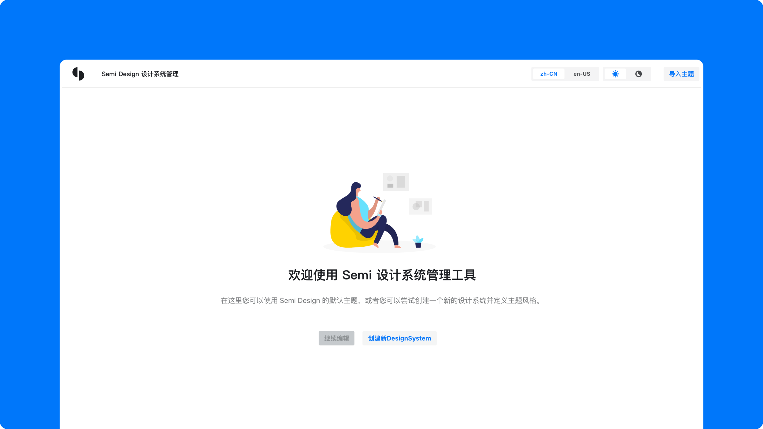
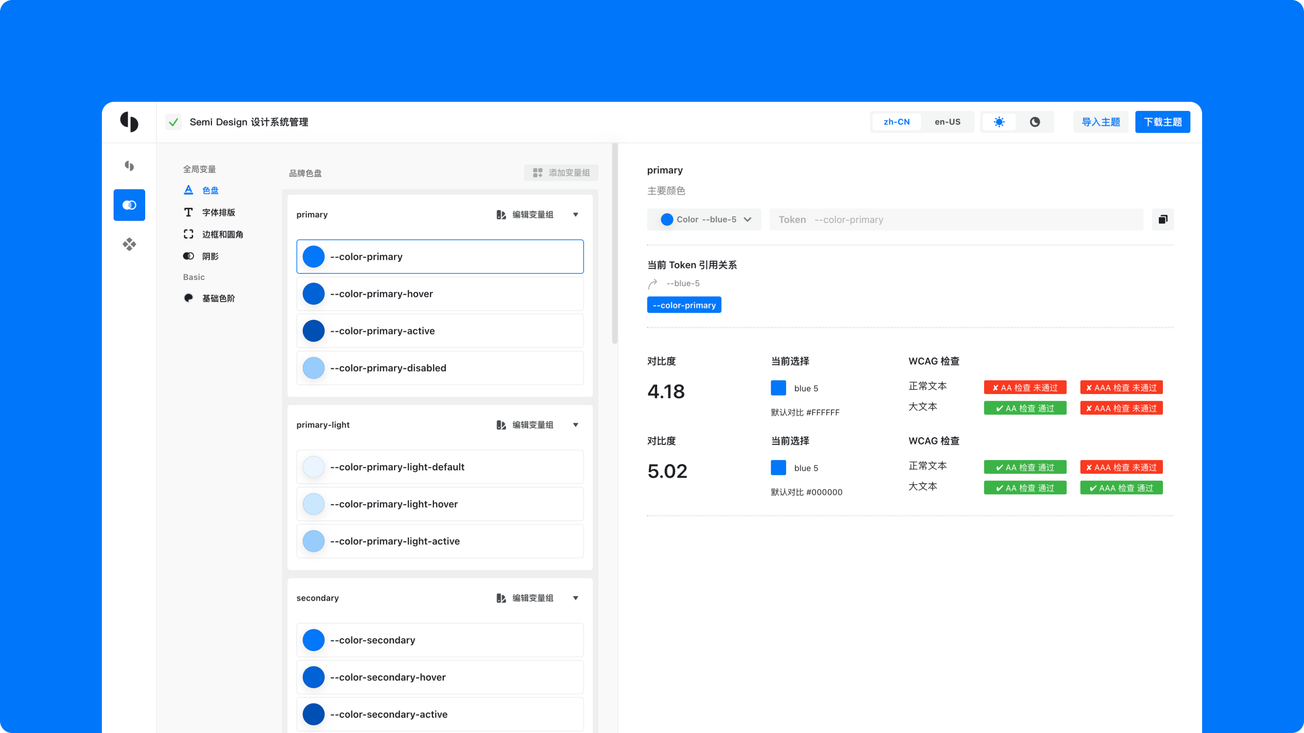
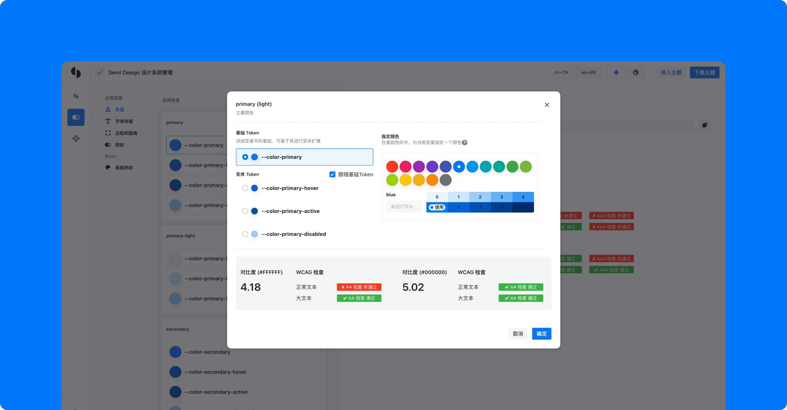
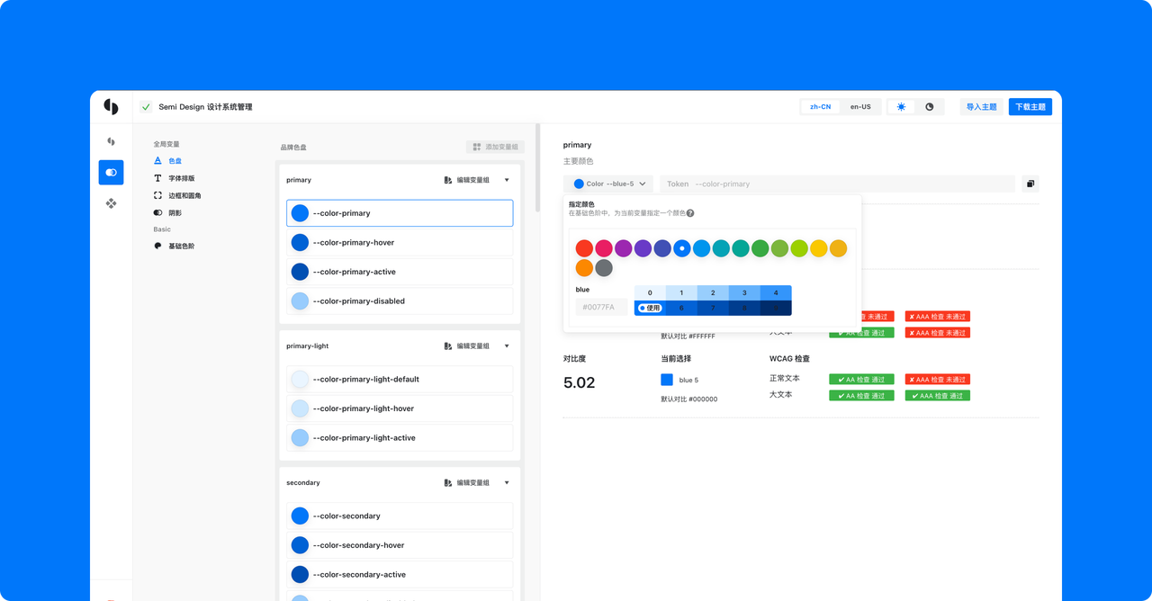
After the theme is created and downloaded, the Semi plug-in can be used to quickly access the selected theme. For every build tool below, you can customize the theme in three ways, **listed from lowest to highest priority**:
1. Through the npm theme package generated by DSM
2. Through a local Scss file in your project
3. Through key-value variables passed to the plugin
For users who use webpack, the SemiWebpackPlugin can be used to apply a customized theme.
Install: `yarn add -D @douyinfe/semi-webpack-plugin` or `npm i -D @douyinfe/semi-webpack-plugin`
```js
// webpack.config.js
const SemiWebpackPlugin = require('@douyinfe/semi-webpack-plugin').default;
module.exports = {
// ...
plugins: [
new SemiWebpackPlugin({
theme: 'Your theme npm package name'
})
]
};
```
```scss
// local.scss
$font-size-small: 16px;
```
```js
// webpack.config.js
const path = require('path');
const SemiWebpackPlugin = require('@douyinfe/semi-webpack-plugin').default;
module.exports = {
plugins: [
new SemiWebpackPlugin({
include: path.join(__dirname, 'local.scss')
})
]
};
```
```js
// webpack.config.js
const SemiWebpackPlugin = require('@douyinfe/semi-webpack-plugin').default;
module.exports = {
plugins: [
new SemiWebpackPlugin({
variables: {
'$font-size-small': '16px'
}
})
]
};
```
The CSS selectors used by Semi Design are prefixed with `semi` by default (e.g. `.semi-button`). You can replace the prefix through `prefixCls`:
```js
// webpack.config.js
const SemiWebpackPlugin = require('@douyinfe/semi-webpack-plugin').default;
module.exports = {
plugins: [
new SemiWebpackPlugin({
prefixCls: 'custom'
})
]
};
```
The selectors then become `.custom-button`.
For users who use Vite, the SemiVitePlugin can be used to apply a customized theme.
Install: `yarn add -D @douyinfe/semi-vite-plugin` or `npm i -D @douyinfe/semi-vite-plugin`
```ts
// vite.config.ts
import { defineConfig } from 'vite';
import semiTheming from '@douyinfe/semi-vite-plugin';
export default defineConfig({
plugins: [
semiTheming({
theme: 'Your theme npm package name'
})
]
});
```
```scss
// local.scss
$font-size-small: 16px;
```
```ts
// vite.config.ts
import path from 'path';
import { defineConfig } from 'vite';
import semiTheming from '@douyinfe/semi-vite-plugin';
export default defineConfig({
plugins: [
semiTheming({
include: path.resolve(__dirname, 'local.scss')
})
]
});
```
```ts
// vite.config.ts
import { defineConfig } from 'vite';
import semiTheming from '@douyinfe/semi-vite-plugin';
export default defineConfig({
plugins: [
semiTheming({
variables: {
'$font-size-small': '16px'
}
})
]
});
```
```ts
// vite.config.ts
import { defineConfig } from 'vite';
import semiTheming from '@douyinfe/semi-vite-plugin';
export default defineConfig({
plugins: [
semiTheming({
prefixCls: 'custom'
})
]
});
```
The selectors then become `.custom-button`.
> `cssLayer: true` is also supported (wrapping the compiled output in `@layer semi { ... }`), as is `omitCss: true` (comments out `.css` imports inside semi packages, useful in scenarios like Next.js where global CSS cannot be imported from `node_modules`).
For more engineering setups (such as Next.js), see the [DSM documentation](https://semi.design/dsm_manual/en-US/web/use#dsm_How%20to%20consume%20themes).
### Make changes to component-level variables take effect
If you modify the component-level variables in the process of customizing the theme, the `theme` field needs to be configured with the following configuration to make the changes take effect:
```js
{
theme: {
name: 'Your theme npm package name',
include: '~Your theme npm package name/scss/local.scss'
}
}
```
During the development of Semi, it is possible to update or add some common variables for design considerations. If you are using a customized theme, when Semi has released a new universal variable (we will mark it in the update log), we recommend that you go to [DSM](https://semi.design/dsm/) to regenerate the theme.