@derockdev/discord-components-react
Version:
React bindings for @derockdev/discord-components-core
292 lines (210 loc) • 11.7 kB
Markdown
# `@derockdev/discord-components-react`
A fork of [@skyra/discord-components-react](https://github.com/skyra-project/discord-components) designed for use in [discord-html-transcripts](https://github.com/itzderock/discord-html-transcripts)
## Changes
- Adds all the new components in `@derockdev/discord-components-core`
## Original README
<div align="center">
# @skyra/discord-components-react
**React bindings for [@skyra/discord-components-core](https://github.com/skyra-project/discord-components/tree/main/packages/core)**
[](https://github.com/skyra-project/discord-components/blob/main/LICENSE.md)
[](https://donate.skyra.pw/patreon)
[](https://www.npmjs.com/package/@skyra/discord-components-react)
[](https://www.npmjs.com/package/@skyra/discord-components-react)
[](https://bundlephobia.com/result?p=@skyra/discord-components-react)
[](https://stenciljs.com)
[](https://join.skyra.pw)
</div>
---
**_Table of Contents_**
- [@skyra/discord-components-react](#skyradiscord-components-react)
- [Description](#description)
- [Features](#features)
- [Installation](#installation)
- [Usage](#usage)
- [Live Demo (Create React App)](#live-demo-create-react-app)
- [Live Demo (NextJS)](#live-demo-nextjs)
* [Sample code](#sample-code)
- [Notes](#notes)
- [TypeScript module augments](#typescript-module-augments)
- [Avatar shortcuts](#avatar-shortcuts)
- [Profile shortcuts](#profile-shortcuts)
- [Theming](#theming)
- [Components notes](#components-notes)
- [DiscordMessages component](#discordmessages-component)
- [DiscordMention component](#discordmention-component)
- [DiscordEmbed component](#discordembed-component)
- [EmbedFields component](#embedfields-component)
- [EmbedField component](#embedfield-component)
- [Screenshots](#screenshots)
- [Dark Mode](#dark-mode)
- [Light Mode](#light-mode)
- [Contributors](#contributors)
## Description
Discord message components to easily build and display fake Discord messages on your webpage.
**This is an adaptation of [wc-discord-message] from [Danktuary]**
## Features
- Design modelled after [Discord](https://discord.com/) itself
- Comfy and compact mode support
- Dark and light themes support
- Set the message author's username, avatar (use defaults or provide your own), role color, and "bot" tag status
- Display fake user, role, and channel mentions
- Complete embed support
- Simple syntax!
## Installation
```bash
yarn add @skyra/discord-components-core @skyra/discord-components-react
# or npm install @skyra/discord-components-core @skyra/discord-components-react
```
## Usage
#### Live Demo (Create React App)
[](https://codesandbox.io/s/discord-components-create-react-app-64k90)
#### Live Demo (NextJS)
[](https://codesandbox.io/s/discord-components-nextjs-ovqfu)
### Sample code
The syntax is kept fairly simple. Here's a basic example of a regular conversation:
```tsx
<DiscordMessages>
<DiscordMessage>Hey guys, I'm new here! Glad to be able to join you all!</DiscordMessage>
<DiscordMessage author="Dawn" avatar="red">
Hi, I'm new here too!
</DiscordMessage>
<DiscordMessage author="Sanctuary" avatar="https://i.imgur.com/0TeacfY.png" roleColor="#0099ff">
Hey, <DiscordMention>User</DiscordMention> and <DiscordMention>Dawn</DiscordMention>. Welcome to our server!
</DiscordMessage>
</DiscordMessages>
```
## Notes
### TypeScript module augments
This module uses a custom object on the browser `window` for configuration. In order to this you will need to include the following snippet in your source code when working in TypeScript:
```ts
import type { DiscordMessageOptions } from '@skyra/discord-components-core/dist/types/options';
declare global {
interface Window {
$discordMessage: DiscordMessageOptions;
}
}
```
### Avatar shortcuts
The current avatar shortcut strings available are "blue" (default), "gray", "green", "orange", and "red". These shortcuts map to the following image links:
```json
{
"blue": "https://cdn.discordapp.com/attachments/654503812593090602/665721745466195978/blue.png",
"gray": "https://cdn.discordapp.com/attachments/654503812593090602/665721746569166849/gray.png",
"green": "https://cdn.discordapp.com/attachments/654503812593090602/665721748431306753/green.png",
"orange": "https://cdn.discordapp.com/attachments/654503812593090602/665721750201434138/orange.png",
"red": "https://cdn.discordapp.com/attachments/654503812593090602/665721752277483540/red.png"
}
```
If you want to add to or override the shortcuts, you can set them via `window.$discordMessage.avatars`.
```ts
window.$discordMessage = {
avatars: {
default: 'blue',
skyra: 'https://github.com/NM-EEA-Y.png',
djs: require('./assets/discord-avatar-djs.png') // You can use require syntax as well
}
};
```
### Profile shortcuts
Sometimes you'll want to use the same message data across multiple messages. You can do so by providing an object of profiles in `window.$discordMessage.profiles`.
```ts
window.$discordMessage = {
profiles: {
skyra: {
author: 'Skyra',
avatar: 'https://github.com/NM-EEA-Y.png',
bot: true,
verified: true,
roleColor: '#1e88e5'
},
favna: {
author: 'Favna',
avatar: 'https://github.com/favna.png',
roleColor: '#ff0000'
}
}
};
```
And then in your React code:
```tsx
<DiscordMessages>
<DiscordMessage profile="skyra">
Welcome to our server, <DiscordMention>Favna</DiscordMention>!
</DiscordMessage>
<DiscordMessage profile="favna">Hey, glad to be here!</DiscordMessage>
</DiscordMessages>
```
### Theming
Each of the components accepts the standard HTML properties for passing styling, such as `className` for passing CSS classes (JSS / CSS / SCSS etc.) or `style` to pass inline style.
You can also pass your own custom HTML tags, for example set a `data-qa` to be able to navigate to the component in your unit tests / end-to-end tests
### Components notes
Below are notes for a few certain components. If you want to see what props each component has, check their readme.md file in [the respective folder].
#### DiscordMessages component
This is a wrapper for any child `<DiscordMessage>` component. It must be used in order for messages to display properly.
#### DiscordMention component
If the default slot is left empty, the mention will be rendered as `'User'`, `'Role'`, or `'channel`', depending on the `type` prop given.
#### DiscordEmbed component
An embed that can be attached to the end of your messages. The default slot is used for the embed's description. The `footer` slot is used for the footer text.
To ensure the embed gets displayed correctly inside your message, be sure to give it the proper `slot` attribute.
```tsx
<DiscordMessage>
Hi, I'm part of the normal message content.
<DiscordEmbed slot="embeds" color="#0099ff">
Hi, I'm part of the embed message content.
</DiscordEmbed>
</DiscordMessage>
```
#### EmbedFields component
A wrapper for any child `<DiscordEmbedField>` components. Must be used in order for fields to display properly. To ensure the embed fields gets displayed correctly inside your embed, be sure to give it the proper `slot` attribute.
```tsx
<DiscordMessage>
<DiscordEmbed slot="embeds">
Hi, I'm part of the embed message content.
<DiscordEmbedFields slot="fields">
<!-- Embed fields go here -->
</DiscordEmbedFields>
</DiscordEmbed>
</DiscordMessage>
```
#### EmbedField component
At least 2 consecutive fields need to be marked as inline in order for them to actually display next to each other. The maximum amount of inline fields is 3, and drops to 2 if an embed thumbnail is used.
```tsx
<DiscordMessage>
<DiscordEmbed slot="embeds">
Hi, I'm part of the embed message content.
<DiscordEmbedFields slot="fields">
<DiscordEmbedField fieldTitle="Inline field" inline>
Field content.
</DiscordEmbedField>
<DiscordEmbedField fieldTitle="Inline field" inline>
Field content.
</DiscordEmbedField>
</DiscordEmbedFields>
</DiscordEmbed>
</DiscordMessage>
```
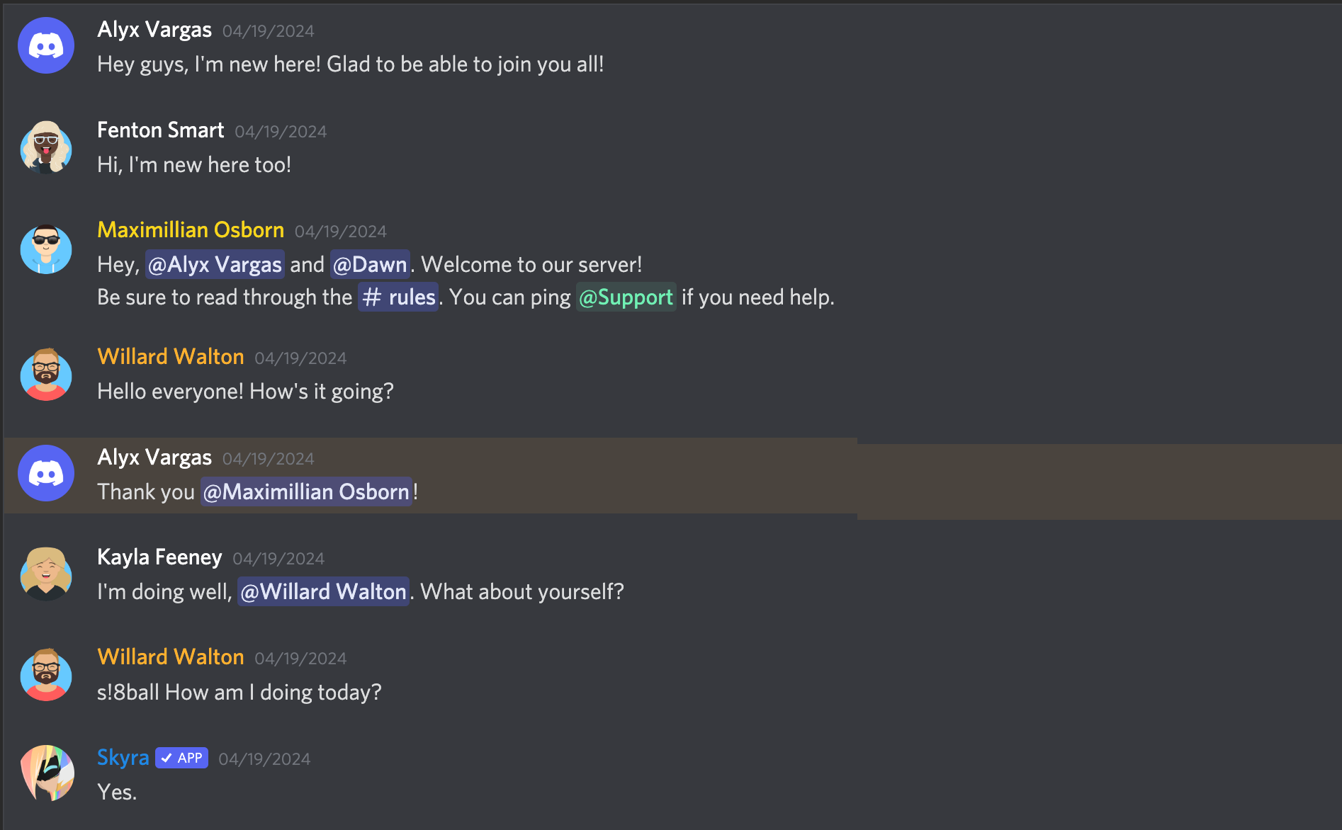
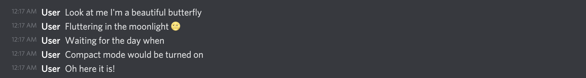
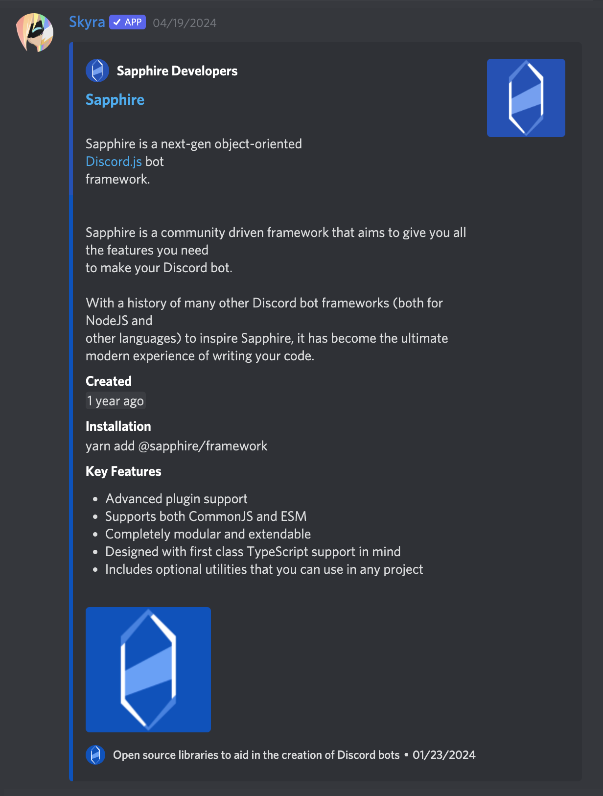
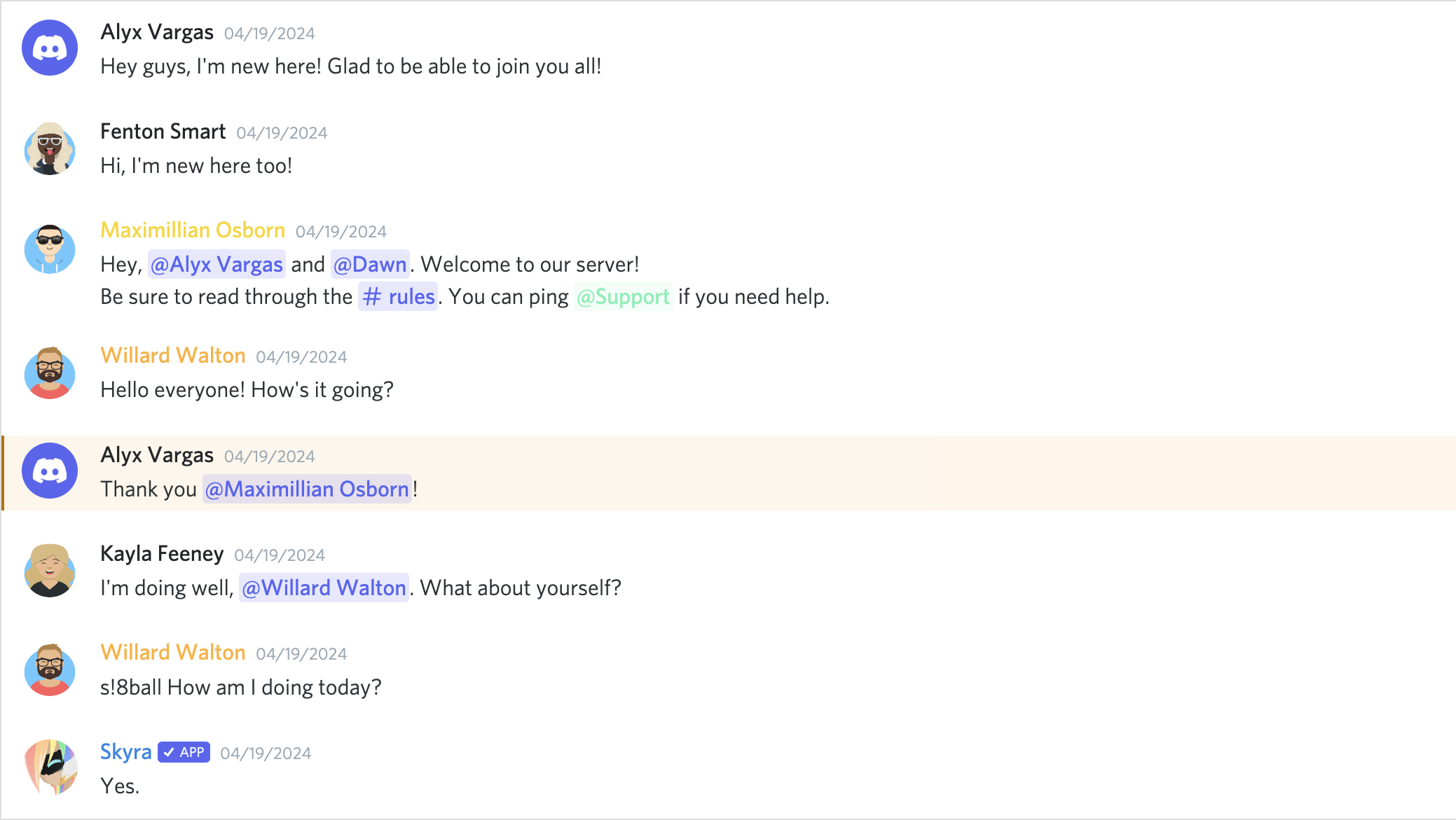
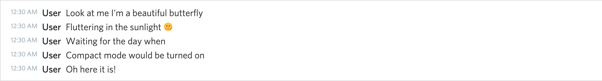
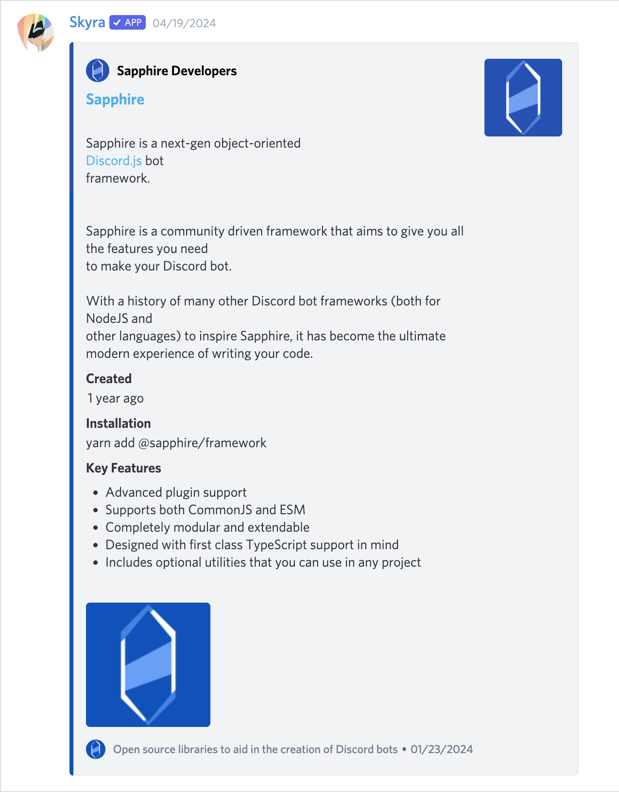
## Screenshots
### Dark Mode
**_A normal conversation_**
**_Compact mode_**
**_With an embed_**
### Light Mode
**_A normal conversation_**
**_Compact mode_**
**_With an embed_**
## Contributors
Please make sure to read the [Contributing Guide][contributing] before making a pull request.
Thank you to all the people who already contributed to Skyra Project!
<a href="https://github.com/skyra-project/discord-components/graphs/contributors">
<img src="https://contrib.rocks/image?repo=skyra-project/discord-components" />
</a>
[contributing]: https://github.com/skyra-project/.github/blob/main/.github/CONTRIBUTING.md
[wc-discord-message]: https://github.com/Danktuary/wc-discord-message
[danktuary]: https://github.com/Danktuary
[the respective folder]: (https://github.com/skyra-project/discord-components/blob/main/packages/core/src/components/)