@derockdev/discord-components-core
Version:
Web components to easily build and display fake Discord messages on your webpages.
434 lines (311 loc) • 16.6 kB
Markdown
# `@derockdev/discord-components-core`
A fork of [@skyra/discord-components-core](https://github.com/skyra-project/discord-components) designed for use in [discord-html-transcripts](https://github.com/itzderock/discord-html-transcripts)
## Changes
- Adds `<discord-code-block>`
- Adds `<discord-header>`
- Adds better support in `<discord-time>`
- Automatically updating based on timestamp and format option
- Adds better support in `<discord-attachment>`
- Adds support for generic attachments, videos, and audio
- Adds option to do server-side hydration
## Original README:
<div align="center">
**Web components to easily build and display fake Discord messages on your webpages**
[](https://github.com/skyra-project/discord-components/blob/main/LICENSE.md)
[](https://donate.skyra.pw/patreon)
[](https://www.npmjs.com/package/@skyra/discord-components-core)
[](https://www.npmjs.com/package/@skyra/discord-components-core)
[](https://bundlephobia.com/result?p=@skyra/discord-components-core)
[](https://stenciljs.com)
[](https://join.skyra.pw)
</div>
---
**_Table of Contents_**
- [@skyra/discord-components-core](#skyradiscord-components-core)
- [Description](#description)
- [Features](#features)
- [Installation](#installation)
- [Usage](#usage)
- [Framework Integration](#framework-integration)
- [Angular](#angular)
- [Live Demo](#live-demo)
- [Sample code](#sample-code)
- [Including the Custom Element Schema](#including-the-custom-element-schema)
- [Calling defineCustomElements](#calling-definecustomelements)
- [Edge (Chakra Core) and IE11 polyfills](#edge-chakra-core-and-ie11-polyfills)
- [React](#react)
- [Live Demo (Create React App)](#live-demo-create-react-app)
- [Live Demo (NextJS)](#live-demo-nextjs)
- [Sample code](#sample-code-1)
- [Vue](#vue)
- [Live Demo](#live-demo-1)
- [Sample code](#sample-code-2)
- [No Framework](#no-framework)
- [Live Demo](#live-demo-2)
- [Sample Code](#sample-code)
- [Notes](#notes)
- [TypeScript module augments](#typescript-module-augments)
- [Avatar shortcuts](#avatar-shortcuts)
- [Profile shortcuts](#profile-shortcuts)
- [Theming](#theming)
- [Components notes](#components-notes)
- [discord-messages component](#discord-messages-component)
- [discord-mention component](#discord-mention-component)
- [DiscordEmbed component](#discordembed-component)
- [EmbedFields component](#embedfields-component)
- [EmbedField component](#embedfield-component)
- [Screenshots](#screenshots)
- [Dark Mode](#dark-mode)
- [Light Mode](#light-mode)
- [Contributors](#contributors)
## Description
Discord message components to easily build and display fake Discord messages on your webpage.
**This is an adaptation of [wc-discord-message] from [Danktuary]**
## Features
- Design modelled after [Discord](https://discord.com/) itself
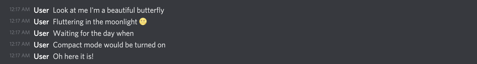
- Comfy and compact mode support
- Dark and light themes support
- Set the message author's username, avatar (use defaults or provide your own), role color, and "bot" tag status
- Display fake user, role, and channel mentions
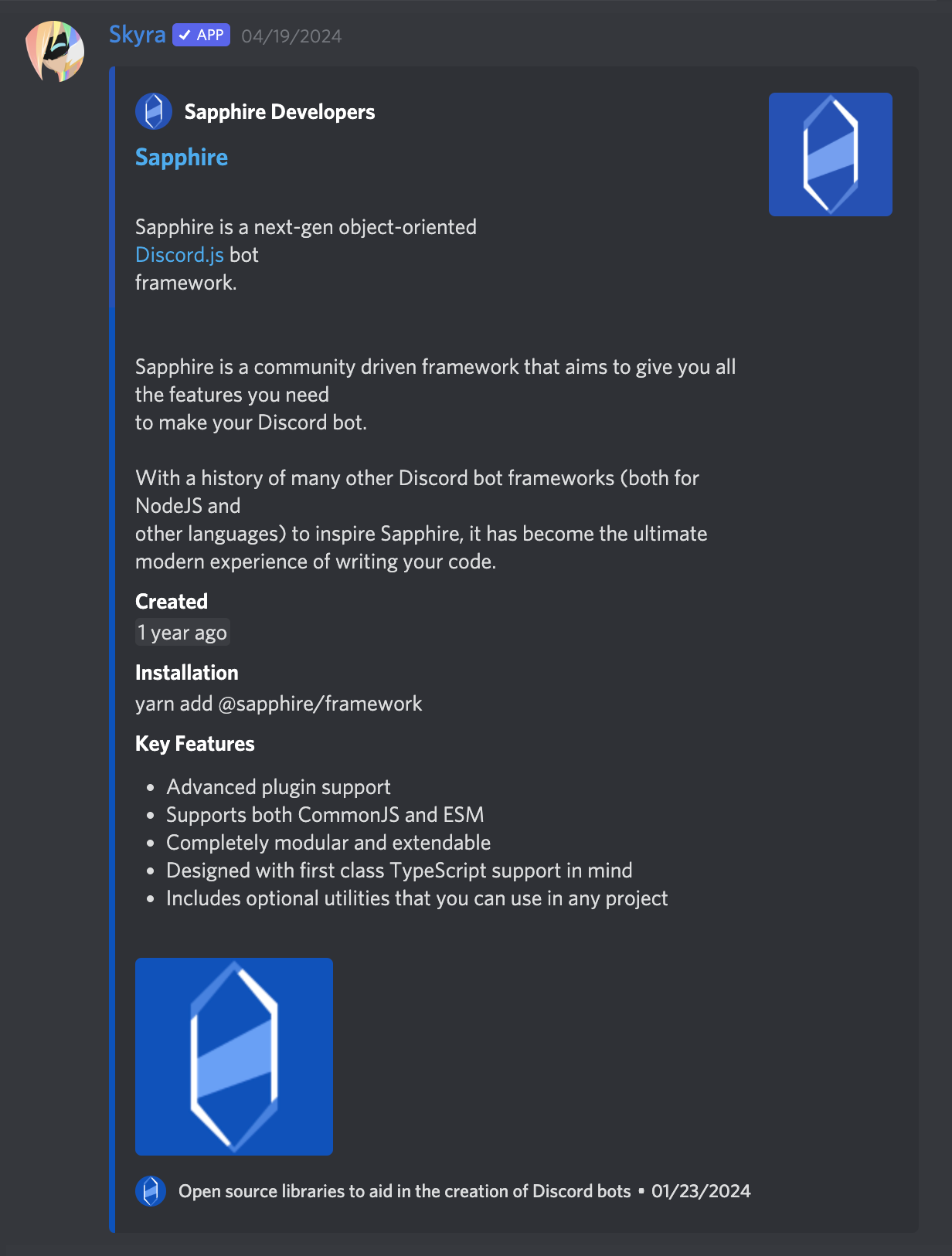
- Complete embed support
- Simple syntax!
## Installation
```bash
yarn add @skyra/discord-components-core @skyra/discord-components-react
# or npm install @skyra/discord-components-core @skyra/discord-components-react
```
## Usage
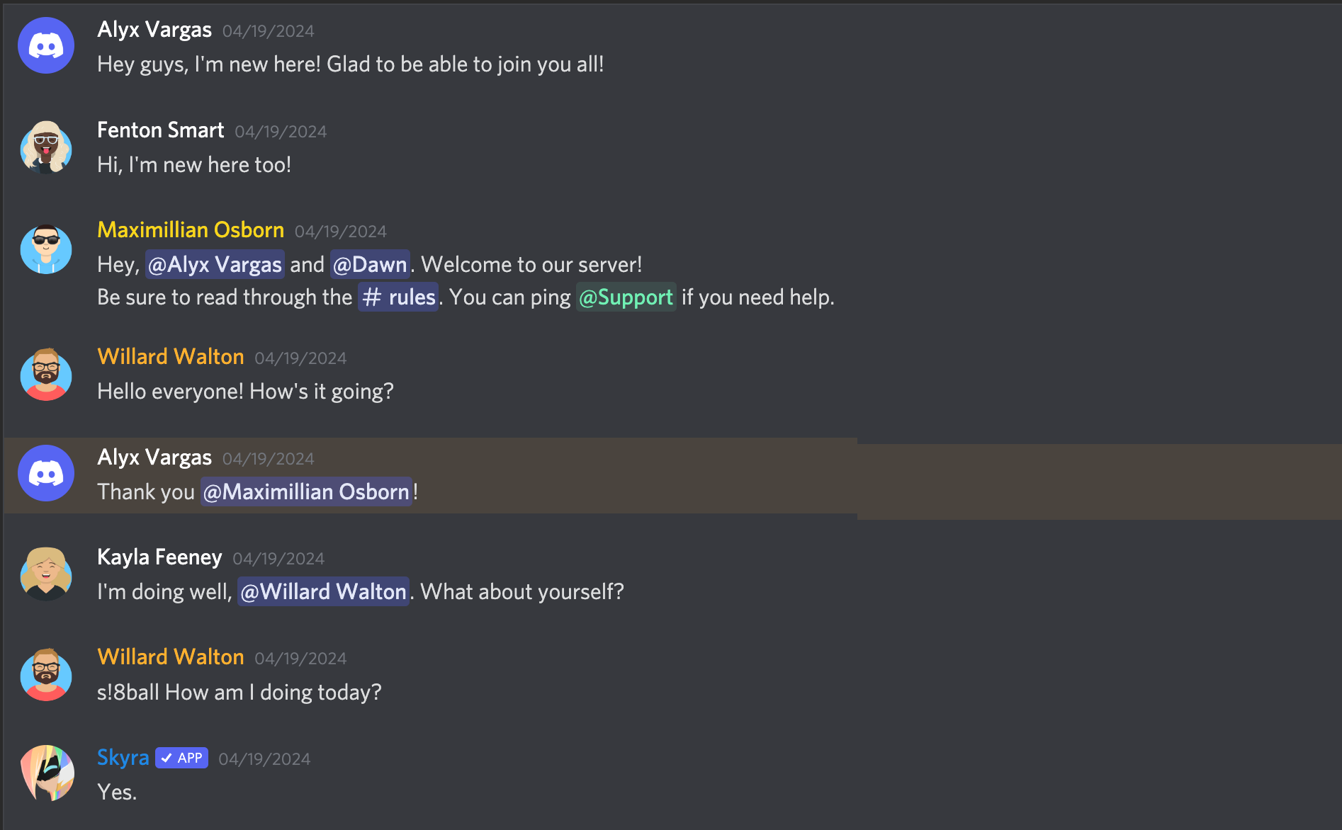
The syntax is kept fairly simple. Here's a basic example of a regular conversation:
```html
<discord-messages>
<discord-message>Hey guys, I'm new here! Glad to be able to join you all!</discord-message>
<discord-message author="Dawn" avatar="red"> Hi, I'm new here too! </discord-message>
<discord-message author="Favna" avatar="https://github.com/favna.png" roleColor="#ff0000">
Hey, <discord-mention>User</discord-mention> and <discord-mention>Dawn</discord-mention>. Welcome to our server!
</discord-message>
</discord-messages>
```
## Framework Integration
### Angular
### Live Demo
[](https://codesandbox.io/s/discord-components-angular-0xz0z)
### Sample code
#### Including the Custom Element Schema
Including the `CUSTOM_ELEMENTS_SCHEMA` in the module allows the use of the web components in the HTML markup without the compiler producing errors. This code should be added into the `AppModule` and in every other modules that use your custom elements. Here is an example of adding it to `AppModule`:
```ts
import { CUSTOM_ELEMENTS_SCHEMA, NgModule } from '@angular/core';
import { BrowserModule } from '@angular/platform-browser';
import { AppComponent } from './app.component';
@NgModule({
declarations: [AppComponent],
imports: [BrowserModule],
providers: [],
bootstrap: [AppComponent],
schemas: [CUSTOM_ELEMENTS_SCHEMA]
})
export class AppModule {}
```
The `CUSTOM_ELEMENTS_SCHEMA` needs to be included in any module that uses custom elements.
#### Calling defineCustomElements
A component collection built with Stencil includes a main function that is used to load the components in the collection. That function is called `defineCustomElements()` and it needs to be called once during the bootstrapping of your application. One convenient place to do this is in `main.ts` as such:
```ts
import { enableProdMode } from '@angular/core';
import { platformBrowserDynamic } from '@angular/platform-browser-dynamic';
import { defineCustomElements } from '@skyra/discord-components-core/loader';
import { AppModule } from './app/app.module';
import { environment } from './environments/environment';
if (environment.production) {
enableProdMode();
}
platformBrowserDynamic()
.bootstrapModule(AppModule)
.catch((err) => console.error(err));
// Loading @skyra/discord-components-core
defineCustomElements();
```
##### Edge (Chakra Core) and IE11 polyfills
If you want your custom elements to be able to work on older browsers, you should add the `applyPolyfills()` that surround the `defineCustomElements()` function.
```ts
import { applyPolyfills, defineCustomElements } from '@skyra/discord-components-core/loader';
applyPolyfills().then(() => {
defineCustomElements();
});
```
### React
#### Live Demo (Create React App)
[](https://codesandbox.io/s/discord-components-create-react-app-64k90)
#### Live Demo (NextJS)
[](https://codesandbox.io/s/discord-components-nextjs-ovqfu)
#### Sample code
See [@skyra/discord-components-react](https://github.com/skyra-project/discord-components/tree/main/packages/react)
### Vue
#### Live Demo
[](https://codesandbox.io/s/discord-components-vue-g1w48)
#### Sample code
In order to use the custom element library within the Vue app, the application must be modified to define the custom elements and to inform the Vue compiler which elements to ignore during compilation. This can all be done within the `main.js` file. For example:
```tsx
import Vue from 'vue';
import App from './App.vue';
import { applyPolyfills, defineCustomElements } from '@skyra/discord-components-core/loader';
Vue.config.productionTip = false;
// Tell Vue to ignore all components defined in the @skyra/discord-components-core package.
Vue.config.ignoredElements = [/discord-\w*/];
// Bind the custom elements to the window object
applyPolyfills().then(() => {
defineCustomElements();
});
new Vue({
render: (h) => h(App)
}).$mount('#app');
```
The components should then be available in any of the Vue templates
```html
<template>
<discord-messages>
<discord-message author="Sample User"> Hello World! </discord-message>
</discord-messages>
</template>
<script>
export default {
name: 'App'
};
</script>
```
### No Framework
#### Live Demo
[](https://codesandbox.io/s/discord-components-static-nhwkl)
#### Sample Code
If you're want to use the browser build, you can pull it in via unpkg.
```html
<script type="module" src="https://unpkg.com/@skyra/discord-components-core"></script>
```
## Notes
### TypeScript module augments
This module uses a custom object on the browser `window` for configuration. In order to this you will need to include the following snippet in your source code when working in TypeScript:
```ts
import type { DiscordMessageOptions } from '@skyra/discord-components-core/dist/types/options';
declare global {
interface Window {
$discordMessage: DiscordMessageOptions;
}
}
```
### Avatar shortcuts
The current avatar shortcut strings available are "blue" (default), "gray", "green", "orange", and "red". These shortcuts map to the following image links:
```json
{
"blue": "https://cdn.discordapp.com/attachments/654503812593090602/665721745466195978/blue.png",
"gray": "https://cdn.discordapp.com/attachments/654503812593090602/665721746569166849/gray.png",
"green": "https://cdn.discordapp.com/attachments/654503812593090602/665721748431306753/green.png",
"orange": "https://cdn.discordapp.com/attachments/654503812593090602/665721750201434138/orange.png",
"red": "https://cdn.discordapp.com/attachments/654503812593090602/665721752277483540/red.png"
}
```
If you want to add to or override the shortcuts, you can set them via `window.$discordMessage.avatars`.
```ts
window.$discordMessage = {
avatars: {
default: 'blue',
skyra: 'https://github.com/NM-EEA-Y.png',
djs: require('./assets/discord-avatar-djs.png') // You can use require syntax as well
}
};
```
### Profile shortcuts
Sometimes you'll want to use the same message data across multiple messages. You can do so by providing an object of profiles in `window.$discordMessage.profiles`.
```ts
window.$discordMessage = {
profiles: {
skyra: {
author: 'Skyra',
avatar: 'https://github.com/NM-EEA-Y.png',
bot: true,
verified: true,
roleColor: '#1e88e5'
},
favna: {
author: 'Favna',
avatar: 'https://github.com/favna.png',
roleColor: '#ff0000'
}
}
};
```
And then in your React code:
```tsx
<DiscordMessages>
<DiscordMessage profile="skyra">
Welcome to our server, <mention>Favna</mention>!
</DiscordMessage>
<DiscordMessage profile="favna">Hey, glad to be here!</DiscordMessage>
</DiscordMessages>
```
### Theming
Each of the components accepts the standard HTML properties for passing styling, such as `className` for passing CSS classes (JSS / CSS / SCSS etc.) or `style` to pass inline style.
You can also pass your own custom HTML tags, for example set a `data-qa` to be able to navigate to the component in your unit tests / end-to-end tests
### Components notes
Below are notes for a few certain components. If you want to see what props each component has, check their readme.md file in [the respective folder].
#### discord-messages component
This is a wrapper for any child `<discord-message>` component. It must be used in order for messages to display properly.
#### discord-mention component
If the default slot is left empty, the mention will be rendered as `'User'`, `'Role'`, or `'channel`', depending on the `type` prop given.
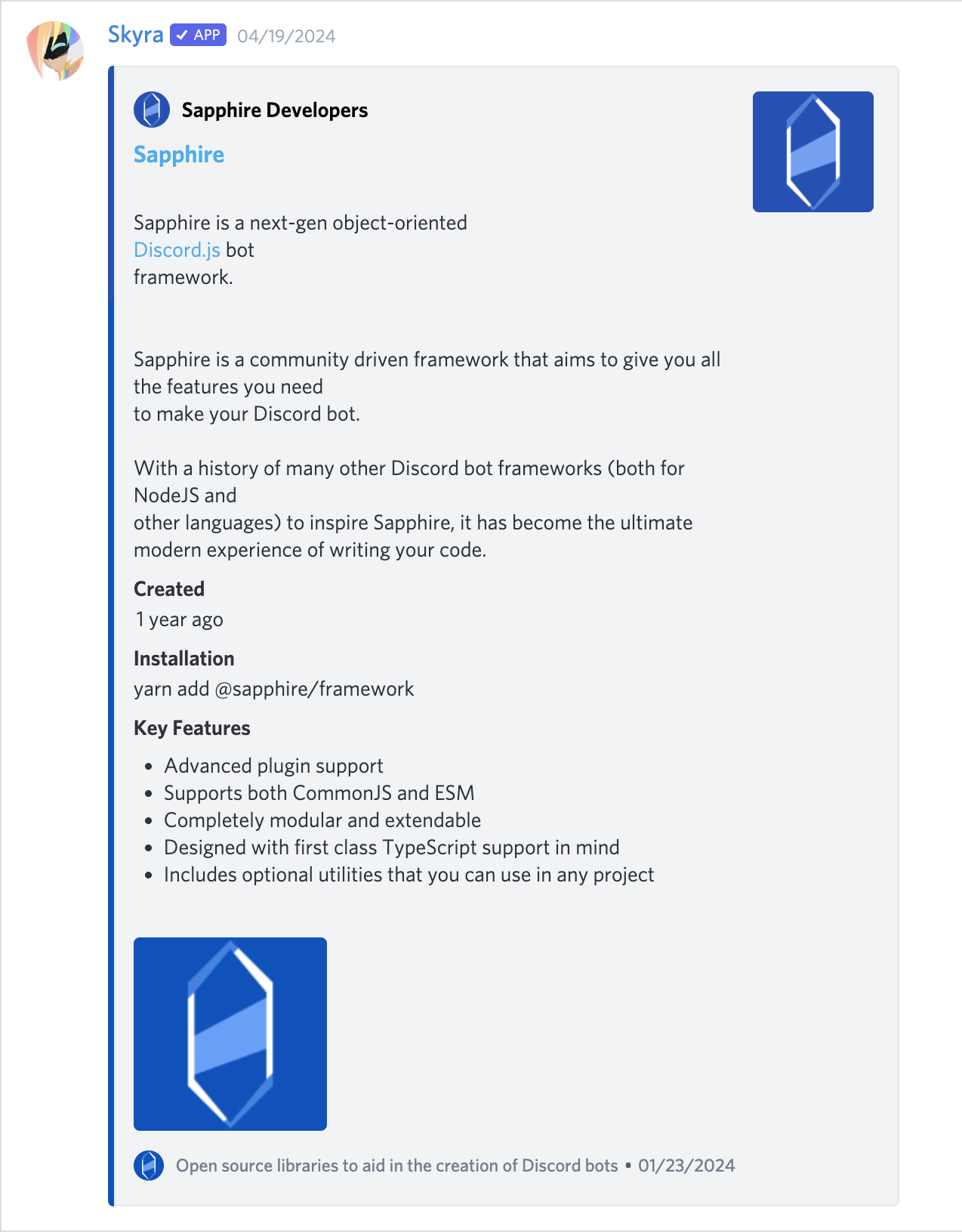
#### DiscordEmbed component
An embed that can be attached to the end of your messages. The default slot is used for the embed's description. The `footer` slot is used for the footer text.
To ensure the embed gets displayed correctly inside your message, be sure to give it the proper `slot` attribute.
```html
<discord-message>
Hi, I'm part of the normal message content.
<DiscordEmbed slot="embeds" color="#ff0000"> Hi, I'm part of the embed message content. </DiscordEmbed>
</discord-message>
```
#### EmbedFields component
A wrapper for any child `<DiscordEmbedField>` components. Must be used in order for fields to display properly. To ensure the embed fields gets displayed correctly inside your embed, be sure to give it the proper `slot` attribute.
```html
<discord-message>
<DiscordEmbed slot="embeds">
Hi, I'm part of the embed message content.
<DiscordEmbedFields slot="fields">
<!-- Embed fields go here -->
</DiscordEmbedFields>
</DiscordEmbed>
</discord-message>
```
#### EmbedField component
At least 2 consecutive fields need to be marked as inline in order for them to actually display next to each other. The maximum amount of inline fields is 3, and drops to 2 if an embed thumbnail is used.
```html
<discord-message>
<DiscordEmbed slot="embeds">
Hi, I'm part of the embed message content.
<DiscordEmbedFields slot="fields">
<DiscordEmbedField fieldTitle="Inline field" inline> Field content. </DiscordEmbedField>
<DiscordEmbedField fieldTitle="Inline field" inline> Field content. </DiscordEmbedField>
</DiscordEmbedFields>
</DiscordEmbed>
</discord-message>
```
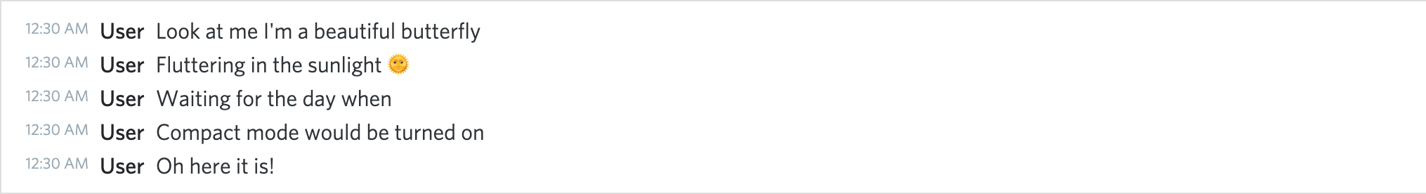
## Screenshots
### Dark Mode
**_A normal conversation_**
**_Compact mode_**
**_With an embed_**
### Light Mode
**_A normal conversation_**
**_Compact mode_**
**_With an embed_**
## Contributors
Please make sure to read the [Contributing Guide][contributing] before making a pull request.
Thank you to all the people who already contributed to Skyra Project!
<a href="https://github.com/skyra-project/discord-components/graphs/contributors">
<img src="https://contrib.rocks/image?repo=skyra-project/discord-components" />
</a>
[contributing]: https://github.com/skyra-project/.github/blob/main/.github/CONTRIBUTING.md
[wc-discord-message]: https://github.com/Danktuary/wc-discord-message
[danktuary]: https://github.com/Danktuary
[@stencil/react-output-target]: https://www.npmjs.com/package/@stencil/react-output-target
[the respective folder]: (https://github.com/skyra-project/discord-components/blob/main/packages/core/src/components/)