@data-cafe/datagrid
Version:
A very generic datagrid component for data-café applications
84 lines (54 loc) • 3.63 kB
Markdown
# Datagrid
This datagrid is a simple, flexible, and extensible datagrid component, made for data·café applications.
However, it is designed to be used in any [Angular](https://angular.io/) +
[Clarity](https://clarity.design/) project.
If you are interested in using this component with another tech stack using WebComponent, please consider contribution
or [contact us](https://www.data-terrae.fr/contact).
## Demo
Youtube video:
[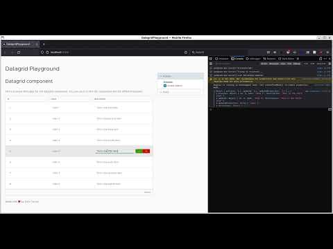](https://www.youtube.com/watch?v=9oa_URV5NvE)
## Features
Here some handy features:
- Display simple [items](#items)
- [Edit](#edit) in-cell
- Localize [texts](#texts)
Future features in our roadmap:
- pagination
- OpenAPI structure and data driven
### Items
The datagrid consumes simple list of items, yet.
```html
<dt-datagrid [items]="[ ... ]"></dt-datagrid>
```
The structure of the grid (aka the columns) is defined by the properties of the first item.
### Edit
The datagrid allows you to edit the items in-cell.
```html
<dt-datagrid (edit)="onEdit($event)" editable></dt-datagrid>
```
Note: the `editable` property could be used sandalone or with a boolean `[editable]="true"`.
Available properties for edit event:
| Property | Type | Description |
| ----------------- | ---------------- | ---------------------------- |
| previous | your `Item` type | An item with previous values |
| updated | your `Item` type | An item with updated values |
| updatedProperties | string[] | List of updated properties |
### Texts
You can customise the component texts for i18n purposes.
```html
<dt-datagrid [texts]="{ ... }"></dt-datagrid>
```
Available text properties:
| Property | Type | Required | Description |
| ------------- | --------------------- | -------- | --------------------------------------------------------------------------------------------------- |
| h1 | `string` | no | Header title level 1 |
| h2 | `string` | no | Header title level 2 |
| h3 | `string` | no | Header title level 3 |
| top | `string` | no | Top text paragraph |
| placeholder | `string` | no | Grid placeholder if the grid is empty |
| fallbackLabel | `string` | no | Cell fallback is a value is missing<br>Note: could be overriden within `Structure` for each column. |
| counter | `(number?) => string` | no | Function that produce the item count for grid footer |
| bottom | `string` | no | Bottom text paragraph |
## Development
This library was generated with [Angular CLI](https://github.com/angular/angular-cli) version 13.1.0.
Please read the [README](https://gitlab.com/data-cafe/talafsa/-/tree/main/datagrid#datagrid) of the project.