@component-book/react
Version:
## Description
157 lines (111 loc) • 6.81 kB
Markdown
# @component-book/react
## Description
`@component-book/react` is a library designed to simplify the rendering of all frontend components in a React application. Eliminate complexity in building interfaces by easily visualizing all components in your application. This library provides a streamlined alternative to Storybook. With `@component-book/react`, you don't need to worry about complex configurations or waste time waiting for another project to run to view your application components.
## Package Information
[](https://www.npmjs.com/package/@component-book/react)
[](https://opensource.org/licenses/MIT)
## Installation
To start using `@component-book/react` in your project, install it via npm:
```bash
npm install @component-book/react
```
Note: If you are using Next.js 14, make sure to add the 'use client' directive to ensure proper compatibility.
## Usage
Import the necessary components in your files and start using them in your code.
```javascript
import { ComponentBook } from "@component-book/react";
```
```css
import '@component-book/react/dist/index.css';
```
Now let's display it on the screen:
```javascript
const items = [
{
name: "Button Red",
component: Component,
props: props,
group: "Buttons",
scope: "Components",
options: {
key: {
description: "its description here",
types: [
{ label: "Description 1", value: "Button description 1" },
{ label: "Description 2", value: "Button description 2" },
],
},
},
},
];
return <ComponentBook items={items} defaultTheme="dark" />;
```
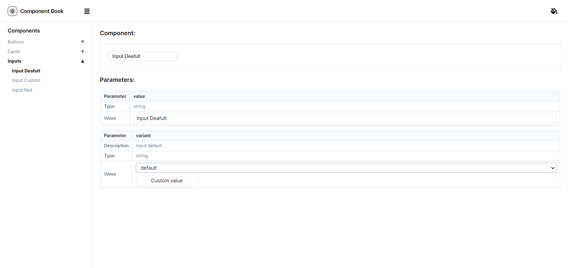
The `item` object receives the following properties:
- **name**: Receives the name of the component.
- **component**: Receives the component.
- **props**: Receives a mock of the props to initialize the component.
- **group**: Receives the group to which the component belongs.
- **scope**: Receives the scope to which the component belongs.
The **options** property of the `item` object is special and associates keys with the keys received in the props.
- **description**: For each key in `options`, like `options.[key].description`, displays the description associated with the `[key]` property in the `props` object.
- **types**: For each key in `options`, like `options.[key].types[]`, maps each option within the associated `types` array to the `[key]` property and creates an `<option>` element for each one.
- **label**: Each `options.[key].types[].label` will be displayed in the `<select>` shown on the screen.
- **value**: Each `options.[key].types[].value` will be the value assigned to the property.
This structure provides dynamic configuration, allowing customization of options based on the keys received in the `props`. This is particularly useful when creating reusable and configurable components.
The `defaultTheme` variable provides the ability to set the default theme for displaying components, allowing users to easily choose between "light" and "dark" themes, adapting the appearance of components according to individual preferences.
**Coming Soon:** The library will receive a new styling, providing an enhanced visual experience.
# Tradução para português BR
## Descrição
O `@component-book/react` é uma biblioteca projetada para simplificar a renderização de todos os componentes frontend em uma aplicação React. Elimine a complexidade na construção de interfaces visualizando facilmente todos os componentes da sua aplicação. Esta biblioteca oferece uma alternativa simplificada ao Storybook. Com o `@component-book/react`, você não precisa se preocupar com configurações complexas ou perder tempo aguardando a execução de outro projeto para visualizar os componentes da sua aplicação.

## Instalação
Para começar a usar o `@component-book/react` em seu projeto, instale-o via npm:
```bash
npm install @component-book/react
```
Observação: Se estiver utilizando o Next.js 14, certifique-se de adicionar a diretiva 'use cliente' para garantir a compatibilidade adequada
## Uso
Importe os componentes necessários em seus arquivos e comece a usá-los em seu código.
```javascript
import { ComponentBook } from "@component-book/react";
```
```css
import '@component-book/react/dist/index.css';
```
agora vamos exibi-lo em tela:
```javascript
const items = [
{
name: "Button Red",
component: Component,
props: props,
group: "Buttons",
scope: "Components",
options: {
key: {
description: "its description here",
types: [
{ label: "Description 1", value: "Button description 1" },
{ label: "Description 2", value: "Button description 2" },
],
},
},
},
];
return <ComponentBook items={items} defaultTheme="dark" />;
```
O objeto `item` recebe as seguintes propriedades:
- **name**: Recebe o nome do componente.
- **component**: Recebe o componente.
- **props**: Recebe um mock das props para iniciar o componente.
- **group**: Recebe o grupo ao qual o componente pertence.
- **scope**: Recebe o escopo ao qual o componente pertence.
A propriedade **options** do objeto `item` é especial e associa as chaves às chaves recebidas nas props.
- **description**: Para cada chave em `options`, como `options.[key].description`, exibe a descrição associada à propriedade `[key]` no objeto `props`.
- **types**: Para cada chave em `options`, como `options.[key].types[]`, mapeia cada opção dentro do array `types` associado à propriedade `[key]` e cria um elemento `<option>` para cada uma.
- **label**: Cada `options.[key].types[].label` será exibido no `<select>` que será mostrado em tela.
- **value**: Cada `options.[key].types[].value` será o valor atribuído à propriedade.
Essa estrutura oferece uma configuração dinâmica, permitindo a personalização de opções com base nas chaves recebidas nas `props`. Isso é particularmente útil ao criar componentes reutilizáveis e configuráveis.
A variável `defaultTheme` oferece a capacidade de definir o tema padrão para a exibição dos componentes. permitindo que escolham entre temas "light" e "dark" com facilidade, adaptando a aparência dos componentes de acordo com as preferências individuais.
**Em Breve:** A biblioteca receberá uma nova estilização, proporcionando uma experiência visual aprimorada.