@candoa/chatbot
Version:
Headless React chatbot widget with TypeScript, TailwindCSS support. Customizable AI chat component with hooks for modern React applications.
474 lines (385 loc) • 16 kB
Markdown
# @candoa/chatbot
🚀 **Headless React Chatbot Widget with TypeScript & TailwindCSS Support**
A powerful, customizable React chatbot component that provides headless architecture with built-in hooks for modern chat experiences. Perfect for developers who want full control over their AI chatbot UI while leveraging robust state management.
## 🔍 **Perfect for developers searching for:**
- React chatbot component
- Headless chatbot widget
- TypeScript chatbot library
- TailwindCSS chat widget
- Customizable AI chat interface
- React hooks for chat functionality
## ✨ Features
### 🎯 **Headless Architecture**
- Complete UI flexibility while handling complex state management
- Build your own chat interface with any CSS framework (TailwindCSS, styled-components, etc.)
- Zero UI assumptions - you control every pixel
### 💻 **Developer Experience**
- **TypeScript Support**: Full type safety and IntelliSense
- **React Hooks**: Modern React patterns with `useChatbot` hook
- **TailwindCSS Ready**: Pre-built examples with TailwindCSS classes
- **SSR Compatible**: Works with Next.js, Remix, and other SSR frameworks
- **Minimal Dependencies**: Lightweight bundle size
### 🚀 **Chat Features**
- 💾 **Conversation Persistence**: Automatic saving and loading of conversation history
- ✉️ **Greeting Messages**: Support for initial bot messages when starting a new chat
- 🔄 **Conversation Management**: Load, clear, and manage chat sessions with ease
- ⚠️ **Error Handling**: Built-in error state management
- 🔄 **Real-time Updates**: Smooth typing indicators and message updates
---
## 🎯 **Why Choose This React Chatbot?**
### vs. Other React Chat Libraries
- ✅ **Truly Headless**: Unlike other chatbot widgets, we don't force any UI decisions
- ✅ **TypeScript First**: Built with TypeScript for better developer experience
- ✅ **Modern React**: Uses latest React patterns and hooks
- ✅ **Framework Agnostic**: Works with Next.js, Vite, Create React App, Remix
- ✅ **Styling Freedom**: Use TailwindCSS, CSS Modules, styled-components, or any CSS solution
### Common Use Cases
- 🏢 **Customer Support Chatbots** - Add AI support to your SaaS
- 📚 **Documentation Assistants** - Help users navigate your docs
- 🛒 **E-commerce Chat** - Product recommendations and support
- 🎓 **Educational Platforms** - Interactive learning assistants
- 💼 **Internal Tools** - Employee help desks and knowledge bases
---
⭐ **If this package helps you, please consider giving it a star on GitHub!** ⭐
---
## Installation
```bash
# npm
npm install @candoa/chatbot
# yarn
yarn add @candoa/chatbot
# pnpm
pnpm add @candoa/chatbot
```
## Get Started
### Option 1: Complete AI Solution ❤️
For a complete AI chatbot solution with knowledge base training, analytics, and conversation management:
- **Learn more**: [candoa.app](https://candoa.app)
Features include:
- Train your AI on your own data
- Get your project ID
- Access conversation analytics
- Manage customer interactions
### Option 2: Fork & Connect Your Backend
This package is open source! Feel free to fork it and connect to your own backend infrastructure.
## Usage
```tsx
import { useChatbot } from '@candoa/chatbot'
function MyChatbot() {
const { state, actions } = useChatbot('your-project-id', {
greetings: ['Hello! How can I assist you today?'],
})
return (
<div>
{/* Your custom chat UI using state and actions */}
{state.messages.map((message) => (
<div key={message.id}>{message.text}</div>
))}
<button onClick={() => actions.sendMessage('Hello')}>Send Message</button>
</div>
)
}
```
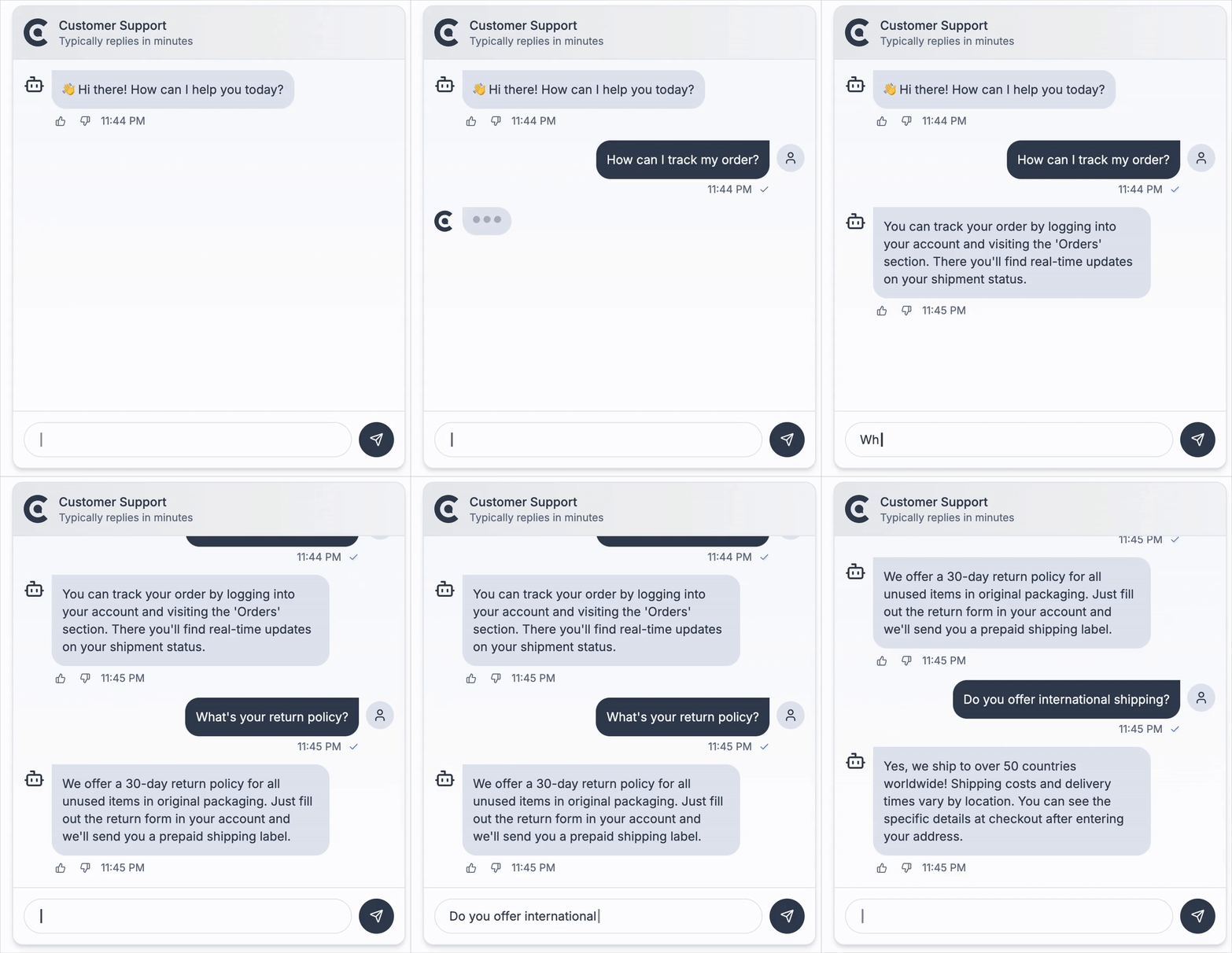
### shadcn/ui Example
Here's a complete example using **shadcn/ui** components for a modern, accessible chat interface:
> **Note**: This is a styling example using shadcn/ui components. Make sure you have shadcn/ui installed and configured in your project.
```tsx
'use client'
import { ChatbotWidget } from '@candoa/chatbot'
import {
Popover,
PopoverContent,
PopoverTrigger,
} from '@/components/ui/popover'
import { Button } from '@/components/ui/button'
import { Input } from '@/components/ui/input'
import { ScrollArea } from '@/components/ui/scroll-area'
import { MessageSquare, RefreshCw, Send, X } from 'lucide-react'
import { cn } from '@/lib/utils'
import { useEffect, useRef } from 'react'
export function ClientChatbot() {
return (
<ChatbotWidget
projectId="your-project-id"
greetings={['Hello! How can I assist you today?']}
>
{({
isOpen,
messages,
error,
isTyping,
onSendMessage,
onToggleOpen,
onClose,
onClearError,
onClearMessages,
}) => {
const messagesEndRef = useRef<HTMLDivElement>(null)
const previousMessageCount = useRef(messages.length)
// Auto-scroll to bottom when messages change or when chat opens
useEffect(() => {
if (isOpen) {
// Check if this is a new message being added
const isNewMessage = messages.length > previousMessageCount.current
if (isNewMessage || isTyping) {
setTimeout(() => {
if (messagesEndRef.current) {
messagesEndRef.current.scrollIntoView({
behavior: 'auto',
block: 'end',
})
}
}, 50)
}
previousMessageCount.current = messages.length
}
}, [messages.length, isTyping, isOpen])
return (
<Popover
open={isOpen}
onOpenChange={onToggleOpen}
>
<PopoverTrigger asChild>
<Button
size="icon"
className="fixed bottom-6 right-6 z-40 h-14 w-14 rounded-full shadow-lg"
>
<MessageSquare className="scale-150" />
</Button>
</PopoverTrigger>
<PopoverContent
align="end"
sideOffset={16}
alignOffset={0}
className="w-96 p-0 mr-2 rounded-xl shadow-lg border bg-background text-foreground"
side="top"
>
{/* Chat Header */}
<div className="flex items-center justify-between border-b p-3">
<div className="flex items-center gap-2">
<div className="h-8 w-8 rounded-full bg-primary flex items-center justify-center">
<MessageSquare className="h-4 w-4 text-primary-foreground" />
</div>
<div>
<h3 className="font-semibold text-sm">Customer Support</h3>
<p className="text-xs text-muted-foreground">
Typically replies in minutes
</p>
</div>
</div>
<div className="flex items-center gap-1">
<Button
variant="ghost"
size="icon"
className="h-7 w-7"
onClick={onClearMessages}
title="Clear chat history"
>
<RefreshCw className="h-4 w-4" />
<span className="sr-only">Clear Chat</span>
</Button>
<Button
variant="ghost"
size="icon"
className="h-7 w-7"
onClick={onClose}
>
<X className="h-4 w-4" />
<span className="sr-only">Close</span>
</Button>
</div>
</div>
{/* Chat Messages */}
<div className="h-[400px] space-y-4 overflow-y-auto p-4">
{messages.map((message) => (
<div
key={message.id}
className={cn('flex', {
'justify-end': message.isUser,
'justify-start': !message.isUser,
})}
>
<div
className={cn(
'max-w-[75%] rounded-lg px-3 py-2 text-sm',
{
'bg-primary text-primary-foreground': message.isUser,
'bg-muted text-muted-foreground': !message.isUser,
},
)}
>
{message.text}
</div>
</div>
))}
{isTyping && (
<div className="flex justify-start">
<div className="rounded-lg bg-muted p-3">
<div className="flex space-x-1">
<div className="w-2 h-2 rounded-full bg-foreground/30 animate-bounce"></div>
<div className="w-2 h-2 rounded-full bg-foreground/30 animate-bounce delay-150"></div>
<div className="w-2 h-2 rounded-full bg-foreground/30 animate-bounce delay-300"></div>
</div>
</div>
</div>
)}
{/* Invisible element to scroll to */}
<div ref={messagesEndRef} />
</div>
{/* Error message */}
{error && (
<div className="text-xs text-destructive m-3 p-2 bg-destructive/10 rounded-md flex justify-between items-center">
<span>{error}</span>
<Button
variant="ghost"
size="sm"
onClick={onClearError}
className="h-auto py-1 px-1.5 text-xs"
>
Dismiss
</Button>
</div>
)}
{/* Chat Input */}
<div className="p-3 border-t">
<form
className="flex w-full gap-2"
onSubmit={(e) => {
e.preventDefault()
const input = e.currentTarget.elements.namedItem(
'message',
) as HTMLInputElement
if (input.value) {
onSendMessage(input.value)
input.value = ''
}
}}
>
<Input
type="text"
autoFocus
name="message"
placeholder="Ask me anything..."
className="flex-1 h-9 text-sm text-foreground placeholder:text-muted-foreground focus:outline-none focus:ring-2 focus:ring-ring focus:ring-offset-2 selection:bg-primary selection:text-primary-foreground"
autoComplete="off"
/>
<Button
type="submit"
size="icon"
className="h-9 w-9 rounded-full"
>
<Send className="h-4 w-4" />
<span className="sr-only">Send</span>
</Button>
</form>
</div>
</PopoverContent>
</Popover>
)
}}
</ChatbotWidget>
)
}
```
This example demonstrates:
- **shadcn/ui Integration**: Uses Popover, Button, Input, and other shadcn/ui components
- **Auto-scroll Functionality**: Automatically scrolls to the bottom when new messages arrive or chat opens
- **Theme Awareness**: Automatically adapts to light/dark themes using CSS variables
- **Accessibility**: Proper ARIA labels and keyboard navigation
- **Modern Design**: Clean, professional interface with proper spacing and typography
- **Responsive Layout**: Works well on different screen sizes
- **Conversation Persistence**: Maintains chat history across page refreshes
## Getting Your Project ID
To use the chatbot with Candoa's AI solution, get your project ID from [candoa.app](https://candoa.app):
1. Sign up or log in to your Candoa CRM
2. Click on your **profile name** in the top navigation
3. In the profile dropdown, you'll see a **Projects** tab
4. Under the Projects tab, you'll find your **Project ID**
The project ID connects your chatbot to your trained AI model and knowledge base.
## Using Your Own Backend (Optional)
By default, the chatbot connects to Candoa's hosted AI service. If you prefer to use your own backend implementation, you can specify a custom API URL:
**With the `useChatbot` hook:**
```tsx
const { state, actions } = useChatbot('your-project-id', {
greetings: ['Hello! How can I assist you today?'],
})
```
**With the `ChatbotWidget` component:**
```tsx
<ChatbotWidget
projectId="your-project-id"
greetings={['Hello! How can I assist you today?']}
>
{/* Your render prop content */}
</ChatbotWidget>
```
Your backend needs to implement the chatbot API endpoints (`/api/chatbot` and `/api/messages`) to handle chat requests and conversation history.
## API Reference
### `useChatbot` Hook
The core hook that powers the chatbot functionality.
```tsx
const { state, actions } = useChatbot(projectId, options)
```
#### Parameters
- `projectId` (string): Unique identifier for the project
- `options` (object):
- `title` (string, optional): Chat title
- `greetings` (string[], optional): Initial greeting messages
- `icon` (React component, optional): Icon component for the chat
- `initialConversationId` (string, optional): Load a specific conversation initially
- `apiUrl` (string, optional): Base URL for API calls to your backend (e.g., 'https://your-api-domain.com').
#### Returns
An object with two properties:
- `state` (object):
- `isOpen` (boolean): Whether the chat is open
- `messages` (Message[]): Current chat messages
- `error` (string | null): Error message, if any
- `isTyping` (boolean): Whether the bot is "typing"
- `hasActiveConversation` (boolean): Whether there is an active conversation
- `actions` (object):
- `setIsOpen` (function): Open or close the chat
- `sendMessage` (function): Send a message to the bot
- `clearMessages` (function): Clear the conversation history
- `clearError` (function): Clear any error messages
- `loadConversation` (function): Load a conversation by ID
### `ChatbotWidget` Component
A render prop component that provides a complete chatbot interface.
```tsx
<ChatbotWidget projectId={projectId} {...options}>
{(renderProps) => (
// Your custom UI using renderProps
)}
</ChatbotWidget>
```
#### Props
- `projectId` (string): Unique identifier for the project
- `title` (string, optional): Chat title
- `greetings` (string[], optional): Initial greeting messages
- `icon` (React component, optional): Icon component for the chat
- `apiUrl` (string, optional)
- `children` (function): Render prop function that receives the chatbot state and actions
#### Render Props
The render prop function receives an object with the following properties:
- `isOpen` (boolean): Whether the chat is open
- `messages` (Message[]): Current chat messages
- `error` (string | null): Error message, if any
- `isTyping` (boolean): Whether the bot is "typing"
- `hasActiveConversation` (boolean): Whether there is an active conversation
- `onSendMessage` (function): Send a message to the bot
- `onToggleOpen` (function): Toggle the chat open/closed state
- `onClose` (function): Close the chat
- `onClearMessages` (function): Clear the conversation history
- `onClearError` (function): Clear any error messages
- `onLoadConversation` (function): Load a conversation by ID
### Types
```typescript
type Message = {
id: string
text: string
isUser: boolean
timestamp: Date
}
```
## License
MIT © Candoa