@brendonhudnell/react-hexgrid
Version:
Interactive hexagon grids with React bindings
107 lines (80 loc) • 4.64 kB
Markdown
# react-hexgrid
[](https://travis-ci.org/Hellenic/react-hexgrid)


[](https://david-dm.org/Hellenic/react-hexgrid)
[](https://david-dm.org/Hellenic/react-hexgrid?type=dev)
[](https://hellenic.github.io/react-hexgrid/examples/)

React components to build interactive hexagons grids. It uses SVG which makes it fast, scalable and easy to apply custom styles. You can easily customize the layout of the grid just by configuration.
Component-based approach allows you to customize the grid shape to suit your needs or even apply your own components / SVG elements to it. You can use pre-defined generator to create certain shape grid or you may build totally your own grid to the shape you wish, while still keeping it under control and interactive.
You could easily use this library to build (just to name a few) a nice portfolio, image library or even a game!
> With inspiration from
> [http://www.redblobgames.com/grids/hexagons](http://www.redblobgames.com/grids/hexagons).
## Pre-requisites
You should be familiar with Node + NPM, React and ES6 to use this library.
Library also depends heavily on HTML5 features (mostly SVG) which all might not be supported by every browser yet.
For example [Drag & Drop](http://caniuse.com/#search=drag%20and) is still quite heavily under work.
## Getting Started
Install it via npm:
```shell
npm install --save react-hexgrid
```
More documentation in the [Wiki](https://github.com/Hellenic/react-hexgrid/wiki).
## Example
```html
import { HexGrid, Layout, Hexagon, Text, Pattern, Path, Hex } from 'react-hexgrid';
import './App.css';
class App extends Component {
render() {
return (
<div className="App">
<HexGrid width={1200} height={800} viewBox="-50 -50 100 100">
{/* Grid with manually inserted hexagons */}
<Layout size={{ x: 10, y: 10 }} flat={true} spacing={1.1} origin={{ x: 0, y: 0 }}>
<Hexagon q={0} r={0} s={0} />
{/* Using pattern (defined below) to fill the hexagon */}
<Hexagon q={0} r={-1} s={1} fill="pat-1" />
<Hexagon q={0} r={1} s={-1} />
<Hexagon q={1} r={-1} s={0}>
<Text>1, -1, 0</Text>
</Hexagon>
<Hexagon q={1} r={0} s={-1}>
<Text>1, 0, -1</Text>
</Hexagon>
{/* Pattern and text */}
<Hexagon q={-1} r={1} s={0} fill="pat-2">
<Text>-1, 1, 0</Text>
</Hexagon>
<Hexagon q={-1} r={0} s={1} />
<Hexagon q={-2} r={0} s={1} />
<Path start={new Hex(0, 0, 0)} end={new Hex(-2, 0, 1)} />
</Layout>
<Pattern id="pat-1" link="http://cat-picture" />
<Pattern id="pat-2" link="http://cat-picture2" />
</HexGrid>
</div>
);
}
}
```
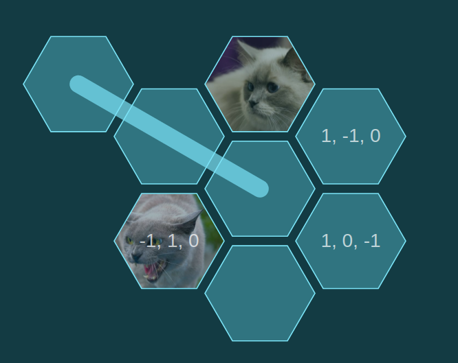
Will look something like this (custom CSS applied):
## Examples
See examples folder.
### Basics
1. [basic-board](https://github.com/Hellenic/react-hexgrid/tree/master/examples/basic-board) - Basic usage of react-hexgrid
2. [custom-grid](https://github.com/Hellenic/react-hexgrid/tree/master/examples/custom-grid) - Simple custom grid
3. [templates](https://github.com/Hellenic/react-hexgrid/tree/master/examples/templates) - Ready-made grid templates
### Advanced
1. [pathfinding](https://github.com/Hellenic/react-hexgrid/tree/master/examples/pathfinding) - Pathfinding
2. [drag & drop](https://github.com/Hellenic/react-hexgrid/tree/master/examples/drag-and-drop) - Drag & drop with two grids
3. [animations](https://github.com/Hellenic/react-hexgrid/tree/master/examples/animations) - Animations & effects
## Testing changes locally
You can test changes by importing the library directly from a folder:
1. Do changes to the library
2. On your test project: `npm install /path/to/your/react-hexgrid/ --save`
3. For easy development, you can `npm link react-hexgrid` on your application
4. And finally `npm run compile` the react-hexgrid to have the changes in your application
## License
MIT