@asafarim/simple-md-viewer
Version:
A professional markdown viewer with file tree navigation, directory content browsing, and advanced YAML front matter support
1,470 lines (1,161 loc) • 43.6 kB
Markdown
# @asafarim/simple-md-viewer
A professional, responsive markdown viewer library for React applications that displays markdown files from a specified folder structure with an elegant file tree navigation and advanced YAML front matter support.
[](https://www.npmjs.com/package/@asafarim/simple-md-viewer)
[](https://alisafari-it.github.io/simple-md-viewer/#/README.md)
[](https://github.com/AliSafari-IT/simple-md-viewer)
[](https://opensource.org/licenses/MIT)
[](https://github.com/AliSafari-IT/demo-simple-md-viewer)
[Click here to view Working Demo along with a how-to document to employ the package.](https://github.com/alisafari-it/demo-simple-md-viewer)
## ✨ Features
- 🎨 **Modern UI with Theming**: Built-in light/dark themes with glassmorphism effects and smooth animations
- 📱 **Fully Responsive**: Professional mobile-first design that works perfectly on all devices
- 🌳 **Interactive File Tree**: Collapsible folder navigation with persistent state and smooth transitions
- � **Directory Content Browser**: Advanced directory viewing with list, grid, and detailed table views including file sizes
- 📊 **File Information Display**: Real-time file sizes, modification dates, and comprehensive metadata
- �📖 **Advanced Markdown Rendering**: Complete GitHub Flavored Markdown support with tables, syntax highlighting, and custom styling
- 📄 **YAML Front Matter Support**: Professional front matter parsing and display with multiple modes and supporting Belgian date formatting
- 🚀 **Zero Configuration**: Works out of the box with minimal setup required
- 🔧 **Highly Customizable**: Flexible theming system and component composition
- 🎯 **URL-based Navigation**: Direct linking to specific markdown files with browser history support
- ⚡ **High Performance**: Built with React 18, Vite, and optimized for speed
- 🔗 **Package Integration**: Built-in support for npm package links and GitHub repository links
- 📐 **Flexible Layout**: Optional file tree hiding for full-width content display
- 🎛️ **Minimalistic UI Options**: Hide header and footer for clean embedding
- ♿ **Accessibility**: WCAG compliant with keyboard navigation and screen reader support
## 📄 What's New in v1.5.1
### 🔗 Customizable Package Links
Fully customizable package links in the header with comprehensive configuration options:
- **Custom Package Name**: Set your own npm package name for the header links
- **Custom GitHub Path**: Configure your own GitHub repository path
- **Custom Demo URL**: Set a custom demo site URL
- **Toggle Visibility**: Show or hide the package links section entirely
- **Default Fallbacks**: Sensible defaults if partial configuration is provided
```tsx
// Example usage with custom package links
<MarkdownContent
apiBaseUrl="http://localhost:3300"
packageLinks={{
packageName: "your-app-or-package-name",
githubPath: "your-github-repo",
demoPath: "https://your-live-demo-site.com",
show: true // Set to false to hide package links
}}
/>
```
## 📄 What's New in v1.5.0
### 📂 Enhanced Directory Browsing
Professional directory content viewing with comprehensive file information:
- **Multiple View Styles**: Switch between list, grid, and detailed table views
- **File Size Display**: Real-time calculation and display of file and folder sizes
- **Sorting & Filtering**: Sort by name, type, size, or modification date with search filtering
- **Responsive Design**: Optimized layouts for desktop and mobile devices
- **Breadcrumb Navigation**: Easy navigation through directory hierarchies
- **Loading States**: Smooth loading indicators while fetching directory details
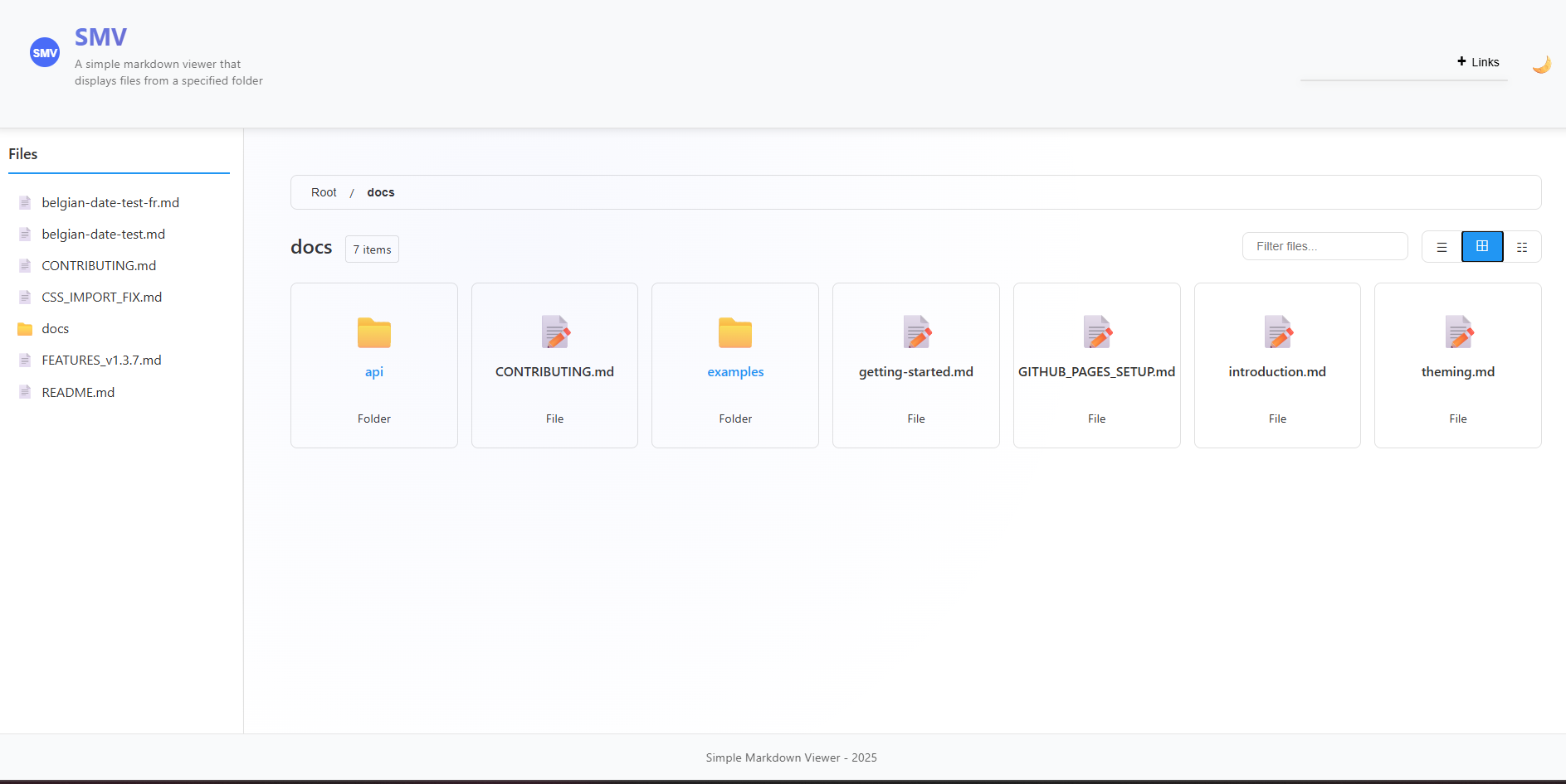
*Desktop directory view showing grid and detailed table layouts*
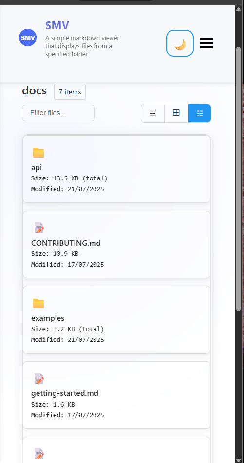
*Mobile-optimized directory view with touch-friendly interface*
#### Directory View Features
- **List View**: Clean, compact file listing with icons
- **Grid View**: Visual grid layout with larger icons and file types
- **Detailed View**: Comprehensive table with file sizes, modification dates, and metadata
- **Smart Sorting**: Intelligent sorting with folders prioritized over files
- **Real-time Search**: Instant filtering of directory contents
- **Size Calculation**: Automatic calculation of folder sizes and file counts
## 📄 What's New in v1.4.0
### 🎯 YAML Front Matter Support
Professional YAML front matter parsing and display with comprehensive metadata support:
- **Multiple Display Modes**: Choose from `full`, `minimal`, `header-only`, or `hidden` display modes
- **Rich Metadata Support**: Title, description, author, dates, categories, tags, keywords, and more
- **International Date Formatting**: Built-in support for Belgian date formats (`nl-BE`, `fr-BE`)
- **Navigation Integration**: Automatic breadcrumbs and related page links from front matter
- **Professional Styling**: Clean, organized display with theme-aware styling
- **GitHub Flavored Markdown**: Enhanced table support and complete GFM compatibility
#### Example Front Matter
```yaml
---
title: "API Documentation"
description: "Complete API reference guide"
author: "Your Name"
lastModified: "2025-01-20"
locale: "nl-BE" # Belgian Dutch date formatting
category: "Documentation"
tags:
- api
- reference
breadcrumbs:
- name: "Home"
path: "/"
- name: "API"
path: "/api"
---
```
This will be beautifully rendered with proper styling, showing formatted dates, organized metadata, and navigation elements.
## 🎪 Live Demo
Experience the viewer in action: **[Live Demo](https://alisafari-it.github.io/simple-md-viewer/#/README.md)**
### Demo Repository
Check out our **[Demo Repository](https://github.com/AliSafari-IT/demo-simple-md-viewer)** for complete examples of how to integrate and use the Simple Markdown Viewer in your projects. This repository contains working examples with different configuration options and implementation patterns.
## 📦 Installation
```bash
npm install @asafarim/simple-md-viewer
```
### Import Styles
The package requires CSS styles to be imported. Choose one of these methods:
```tsx
// Method 1: Import from dist (recommended)
import '@asafarim/simple-md-viewer/dist/style.css';
// Method 2: Alternative import path
import '@asafarim/simple-md-viewer/style.css';
```
### TypeScript Support
If you encounter TypeScript errors with CSS imports, add this to your project's type declarations:
```typescript
// In your global.d.ts or vite-env.d.ts
declare module '@asafarim/simple-md-viewer/dist/style.css';
declare module '@asafarim/simple-md-viewer/style.css';
```
## 🚀 Quick Start
### Option 1: Complete Markdown Viewer (Recommended)
The easiest way to get started - includes everything you need:
```tsx
import React, { useState, useEffect } from 'react';
import { HashRouter } from 'react-router-dom';
import { MarkdownContent, ThemeProvider } from '@asafarim/simple-md-viewer';
import '@asafarim/simple-md-viewer/dist/style.css';
function App() {
const [theme, setTheme] = useState(() => {
// Check localStorage for saved theme preference
const savedTheme = localStorage.getItem('smv-theme');
return savedTheme || 'light';
});
const toggleTheme = () => {
setTheme(prevTheme => {
const newTheme = prevTheme === 'light' ? 'dark' : 'light';
localStorage.setItem('smv-theme', newTheme);
return newTheme;
});
};
// Apply theme to document root for global styling
useEffect(() => {
document.documentElement.setAttribute('data-theme', theme);
}, [theme]);
return (
<ThemeProvider theme={theme} toggleTheme={toggleTheme}>
<div className={`app ${theme}`}>
<HashRouter>
<MarkdownContent
apiBaseUrl="http://localhost:3300"
showHomePage={true}
hideFileTree={false}
packageLinks={{
packageName: "@asafarim/simple-md-viewer",
githubPath: "simple-md-viewer",
demoPath: "https://alisafari-it.github.io/simple-md-viewer/#/README.md",
show: true
}}
/>
</HashRouter>
</div>
</ThemeProvider>
);
}
export default App;
```
### Option 2: Individual Components
For more control, use individual components:
```tsx
import React, { useState, useEffect } from 'react';
import {
MarkdownViewer,
FileTree,
ThemeProvider
} from '@asafarim/simple-md-viewer';
import '@asafarim/simple-md-viewer/dist/style.css';
function CustomApp() {
const [content, setContent] = useState('# Hello World\nYour markdown here...');
const [theme, setTheme] = useState(() => {
return localStorage.getItem('smv-theme') || 'light';
});
const toggleTheme = () => {
setTheme(prevTheme => {
const newTheme = prevTheme === 'light' ? 'dark' : 'light';
localStorage.setItem('smv-theme', newTheme);
return newTheme;
});
};
// Apply theme globally
useEffect(() => {
document.documentElement.setAttribute('data-theme', theme);
}, [theme]);
return (
<ThemeProvider theme={theme} toggleTheme={toggleTheme}>
<div className={`app ${theme}`}>
<MarkdownViewer content={content} />
</div>
</ThemeProvider>
);
}
```
### Option 3: Full-Width Content Viewer (No File Tree)
Perfect for embedded documentation, single-document viewing, or mobile-optimized reading:
```tsx
import React, { useState, useEffect } from 'react';
import { HashRouter } from 'react-router-dom';
import { MarkdownContent, ThemeProvider } from '@asafarim/simple-md-viewer';
import '@asafarim/simple-md-viewer/dist/style.css';
function FullWidthViewer() {
const [theme, setTheme] = useState('light');
return (
<ThemeProvider theme={theme} toggleTheme={() => setTheme(theme === 'light' ? 'dark' : 'light')}>
<div className="full-width-container">
<HashRouter>
<MarkdownContent
apiBaseUrl="http://localhost:3300"
showHomePage={true}
hideFileTree={true} // 🎯 This hides the file tree for full-width content
packageLinks={{
show: false // 🎯 Hide package links for cleaner interface
}}
/>
</HashRouter>
</div>
</ThemeProvider>
);
}
```
**Perfect for:**
- 📱 **Mobile-first applications** - Maximum content space
- 🎯 **Single document focus** - Remove navigation distractions
- 🔧 **Embedded viewers** - Integrate into existing dashboards
- 📖 **Blog post display** - Clean, distraction-free reading
- 🎪 **Presentation mode** - Full-screen document viewing
### Option 4: Minimalistic Embedded Viewer
Perfect for embedding in other applications with minimal UI chrome:
```tsx
import React from 'react';
import { HashRouter } from 'react-router-dom';
import { MarkdownContent, ThemeProvider } from '@asafarim/simple-md-viewer';
import '@asafarim/simple-md-viewer/dist/style.css';
function MinimalViewer() {
return (
<ThemeProvider theme="light">
<div className="embedded-viewer">
<HashRouter>
<MarkdownContent
apiBaseUrl="http://localhost:3300"
showHomePage={false}
hideFileTree={true} // 🎯 Hide file tree for clean layout
hideHeader={true} // 🎯 Hide header for minimal chrome
hideFooter={true} // 🎯 Hide footer for clean integration
packageLinks={{
show: false // 🎯 Hide package links (though header is already hidden)
}}
/>
</HashRouter>
</div>
</ThemeProvider>
);
}
```
**Perfect for:**
- 🔗 **API documentation widgets** - Embed docs in admin panels
- 📱 **Mobile apps** - Ultra-clean content display
- 🎛️ **Dashboard integration** - Content without competing UI elements
- 📖 **Help systems** - Context-sensitive documentation
- 🎯 **Content-only views** - Maximum focus on the markdown content
## 📚 Usage Examples
Here are some common usage examples (also available in our [Demo Repository](https://github.com/AliSafari-IT/demo-simple-md-viewer)): showcasing the advanced YAML front matter capabilities:
### Full-Featured Documentation with Front Matter
```tsx
import React, { useState, useEffect } from 'react';
import { HashRouter } from 'react-router-dom';
import { MarkdownContent, MarkdownViewer, ThemeProvider } from '@asafarim/simple-md-viewer';
import '@asafarim/simple-md-viewer/dist/style.css';
function DocumentationSite() {
const [theme, setTheme] = useState('light');
// Complete setup with all front matter features enabled
return (
<ThemeProvider theme={theme} toggleTheme={() => setTheme(theme === 'light' ? 'dark' : 'light')}>
<div className={`app ${theme}`}>
<HashRouter>
<MarkdownContent
apiBaseUrl="http://localhost:3300"
showHomePage={true}
hideFileTree={false}
hideHeader={false}
hideFooter={false}
// Front matter is automatically handled by MarkdownViewer inside MarkdownContent
/>
</HashRouter>
</div>
</ThemeProvider>
);
}
```
### Direct MarkdownViewer with Front Matter Control
```tsx
import React from 'react';
import { MarkdownViewer, ThemeProvider } from '@asafarim/simple-md-viewer';
import '@asafarim/simple-md-viewer/dist/style.css';
function CustomDocumentViewer() {
const markdownWithFrontMatter = `---
title: "Advanced API Documentation"
description: "Complete guide to our REST API with authentication, rate limiting, and examples"
author: "Dev Team"
lastModified: "2025-01-20"
version: "2.1.0"
locale: "nl-BE" # Belgian Dutch formatting
category: "API Documentation"
section: "Backend"
order: 1
tags:
- api
- rest
- authentication
- backend
keywords: ["API", "REST", "documentation", "guide"]
toc: true
sidebar: true
breadcrumbs:
- name: "Home"
path: "/"
- name: "Documentation"
path: "/docs"
- name: "API"
path: "/docs/api"
related:
- title: "Authentication Guide"
path: "/docs/auth"
- title: "Rate Limiting"
path: "/docs/rate-limits"
---
# API Documentation
This is your markdown content with professional front matter display above...
## Authentication
All API requests require authentication...
| Method | Endpoint | Description |
|--------|----------|-------------|
| GET | /api/users | Get all users |
| POST | /api/users | Create user |
`;
return (
<ThemeProvider theme="light">
<div className="custom-viewer">
{/* Full front matter display - shows everything */}
<MarkdownViewer
content={markdownWithFrontMatter}
showFrontMatter={true}
frontMatterMode="full"
/>
</div>
</ThemeProvider>
);
}
```
### Front Matter Display Mode Examples
```tsx
// Minimal mode - shows only essential info
<MarkdownViewer
content={markdownWithFrontMatter}
showFrontMatter={true}
frontMatterMode="minimal" // Shows: author, date, version only
/>
// Header-only mode - shows title and description
<MarkdownViewer
content={markdownWithFrontMatter}
showFrontMatter={true}
frontMatterMode="header-only" // Shows: title, description only
/>
// Hidden mode - parses but doesn't display front matter
<MarkdownViewer
content={markdownWithFrontMatter}
showFrontMatter={false}
frontMatterMode="hidden" // Front matter parsed but not shown
/>
// Full mode (default) - shows all metadata in organized sections
<MarkdownViewer
content={markdownWithFrontMatter}
showFrontMatter={true}
frontMatterMode="full" // Shows: all metadata in sections
/>
```
### Belgian Date Formatting Example
```tsx
const belgianContentNL = `---
title: "Nederlandse Documentatie"
author: "Team België"
date: "2025-01-20"
lastModified: "2025-01-20T14:30:00Z"
locale: "nl-BE" # Belgian Dutch
category: "Documentatie"
---
# Welkom bij onze documentatie!
`;
const belgianContentFR = `---
title: "Documentation Française"
author: "Équipe Belge"
date: "2025-01-20"
lastModified: "2025-01-20T14:30:00Z"
locale: "fr-BE" # Belgian French
category: "Documentation"
---
# Bienvenue dans notre documentation!
`;
// Dates will be formatted according to Belgian conventions
<MarkdownViewer content={belgianContentNL} showFrontMatter={true} frontMatterMode="full" />
<MarkdownViewer content={belgianContentFR} showFrontMatter={true} frontMatterMode="full" />
```
### Directory View Configuration Examples
```tsx
// Enable directory browsing with detailed view by default
<MarkdownContent
apiBaseUrl="http://localhost:3300"
directoryViewEnabled={true}
directoryViewStyle="detailed" // Shows file sizes, dates, metadata
showDirectoryBreadcrumbs={true}
enableDirectorySorting={true}
/>
// Grid view for visual file browsing
<MarkdownContent
apiBaseUrl="http://localhost:3300"
directoryViewStyle="grid" // Visual grid layout
showDirectoryBreadcrumbs={true}
enableDirectorySorting={true}
/>
// Minimal list view without breadcrumbs
<MarkdownContent
apiBaseUrl="http://localhost:3300"
directoryViewStyle="list" // Clean, compact listing
showDirectoryBreadcrumbs={false}
enableDirectorySorting={false}
/>
// Disable directory view entirely (files only)
<MarkdownContent
apiBaseUrl="http://localhost:3300"
directoryViewEnabled={false} // Directories won't show content
/>
```
**Directory View Features Demonstrated:**
- 📊 **File size calculation**: Real-time size display for files and folders
- 📅 **Modification dates**: Last modified timestamps with localized formatting
- 🔍 **Search and filtering**: Instant search through directory contents
- 🎯 **Smart sorting**: Sort by name, type, size, or date with folder prioritization
- 📱 **Responsive layouts**: Touch-friendly mobile interface with optimized views
- 🧭 **Navigation**: Breadcrumbs and related page links
```
**Front Matter Features Demonstrated:**
- 🏷️ **Rich Metadata**: Title, description, author, dates, version, categories, tags
- 🗓️ **Date Formatting**: Automatic Belgian locale support (`nl-BE`, `fr-BE`)
- 🧭 **Navigation**: Breadcrumbs and related page links
- 📊 **Organization**: Categories, sections, ordering, and table of contents flags
- 🎨 **Display Modes**: Four modes from full metadata to hidden
- 🔍 **SEO Support**: Keywords and structured data for better discoverability
## �🏗️ Backend Setup
Create a simple Express server to serve your markdown files:
```javascript
const express = require('express');
const fs = require('fs');
const path = require('path');
const cors = require('cors');
const app = express();
const PORT = 3300;
const mdDocsPath = path.join(__dirname, 'md-docs'); // Your markdown folder
app.use(cors({ origin: 'http://localhost:5173' }));
// API to return folder structure
app.get('/api/folder-structure', (req, res) => {
const folderStructure = getFolderStructure(mdDocsPath);
res.json({ nodes: folderStructure });
});
// API to serve markdown files
app.get('/api/file', (req, res) => {
const filePath = path.join(mdDocsPath, req.query.path);
if (fs.existsSync(filePath)) {
const content = fs.readFileSync(filePath, 'utf-8');
res.json({ content });
} else {
res.status(404).json({ error: 'File not found' });
}
});
// API to get directory details with file sizes (NEW in v1.5.0)
app.get('/api/directory-details', (req, res) => {
try {
const directoryPath = req.query.path || '';
const fullPath = path.join(mdDocsPath, directoryPath);
if (!fs.existsSync(fullPath) || !fs.statSync(fullPath).isDirectory()) {
return res.status(404).json({ error: 'Directory not found' });
}
const directoryDetails = getDirectoryDetails(fullPath, directoryPath);
res.json(directoryDetails);
} catch (error) {
res.status(500).json({ error: 'Failed to read directory details' });
}
});
function getFolderStructure(dirPath, relativePath = '') {
const items = fs.readdirSync(dirPath);
const result = [];
for (const item of items) {
const itemPath = path.join(dirPath, item);
const stats = fs.statSync(itemPath);
const itemRelativePath = path.join(relativePath, item).replace(/\\/g, '/');
if (stats.isDirectory()) {
result.push({
name: item,
path: itemRelativePath,
type: 'folder',
children: getFolderStructure(itemPath, itemRelativePath)
});
} else if (item.endsWith('.md')) {
result.push({
name: item,
path: itemRelativePath,
type: 'file'
});
}
}
return result;
}
// Helper functions for directory details (NEW in v1.5.0)
function getDirectoryDetails(dirPath, relativePath = '') {
const items = fs.readdirSync(dirPath);
const children = [];
for (const item of items) {
const itemPath = path.join(dirPath, item);
const stats = fs.statSync(itemPath);
const itemRelativePath = path.join(relativePath, item).replace(/\\/g, '/');
if (stats.isDirectory()) {
const folderSize = calculateFolderSize(itemPath);
const itemCount = countItemsInFolder(itemPath);
children.push({
name: item,
path: itemRelativePath,
type: 'folder',
size: folderSize,
lastModified: stats.mtime.toISOString(),
itemCount: itemCount
});
} else if (item.endsWith('.md')) {
children.push({
name: item,
path: itemRelativePath,
type: 'file',
size: stats.size,
lastModified: stats.mtime.toISOString(),
extension: path.extname(item).substring(1)
});
}
}
return {
name: path.basename(dirPath) || 'root',
path: relativePath,
type: 'folder',
children: children
};
}
function calculateFolderSize(folderPath) {
let totalSize = 0;
function traverse(currentPath) {
const items = fs.readdirSync(currentPath);
for (const item of items) {
const itemPath = path.join(currentPath, item);
const stats = fs.statSync(itemPath);
if (stats.isDirectory()) {
traverse(itemPath);
} else {
totalSize += stats.size;
}
}
}
traverse(folderPath);
return totalSize;
}
function countItemsInFolder(folderPath) {
let count = 0;
function traverse(currentPath) {
const items = fs.readdirSync(currentPath);
count += items.length;
for (const item of items) {
const itemPath = path.join(currentPath, item);
const stats = fs.statSync(itemPath);
if (stats.isDirectory()) {
traverse(itemPath);
}
}
}
traverse(folderPath);
return count;
}
app.listen(PORT, () => {
console.log(`🚀 Server running at http://localhost:${PORT}`);
});
```
## 🎨 Styling & Theming
### Import Required Styles
```tsx
import '@asafarim/simple-md-viewer/dist/style.css';
```
### Theme Customization
Override CSS custom properties to customize the appearance:
```css
:root {
/* Light theme colors */
--bg-color-light: #ffffff;
--text-color-light: #333333;
--accent-primary-light: #2196f3;
--header-bg-light: #f8f9fa;
/* Dark theme colors */
--bg-color-dark: #1e1e1e;
--text-color-dark: #e0e0e0;
--accent-primary-dark: #64b5f6;
--header-bg-dark: #252526;
/* Typography */
--font-family-primary: 'Inter', -apple-system, sans-serif;
/* Spacing */
--spacing-xs: 0.25rem;
--spacing-sm: 0.5rem;
--spacing-md: 1rem;
--spacing-lg: 1.5rem;
--spacing-xl: 2rem;
}
```
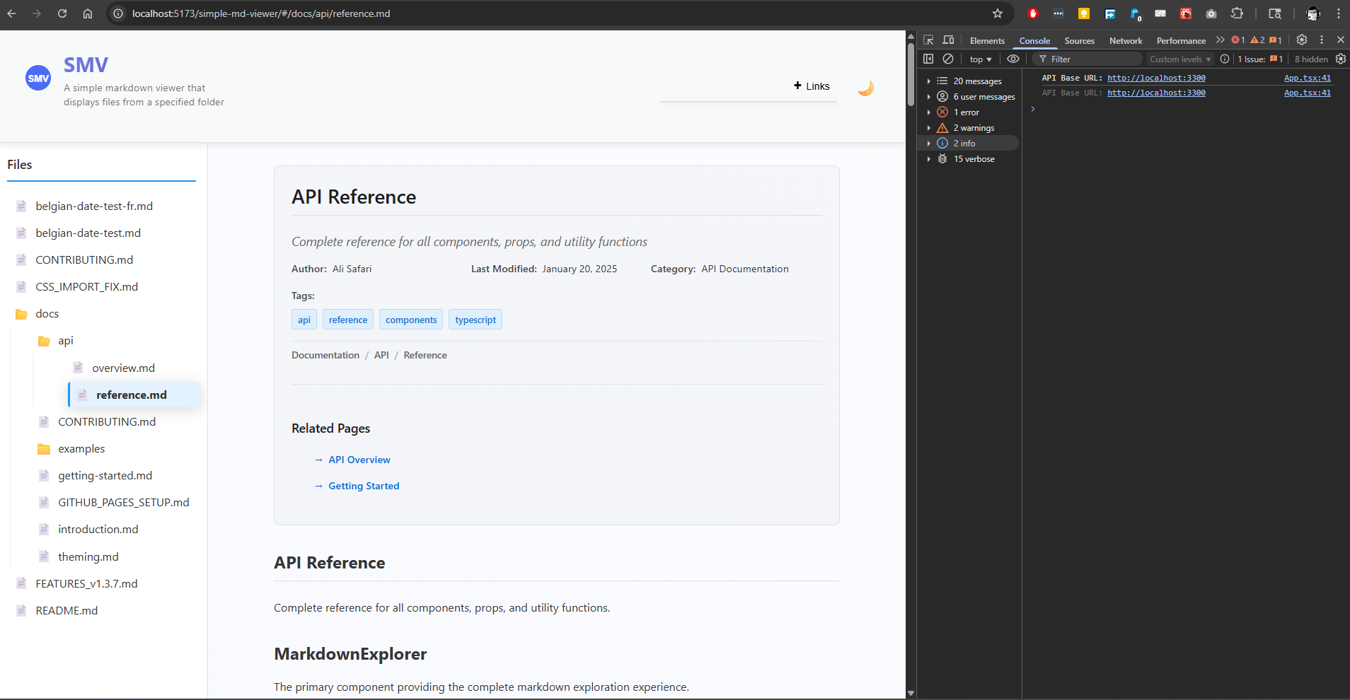
## 📚 API Reference
### Components
#### `MarkdownContent`
The main component providing a complete markdown viewer experience.
```tsx
<MarkdownContent
apiBaseUrl="http://localhost:3300"
showHomePage={true}
hideFileTree={false}
hideHeader={false}
hideFooter={false}
showFrontMatter={true}
frontMatterMode="full"
directoryViewEnabled={true}
directoryViewStyle="list"
showDirectoryBreadcrumbs={true}
enableDirectorySorting={true}
/>
```
**Props:**
- `apiBaseUrl?` (string): Base URL for API endpoints (default: "<http://localhost:3300>")
- `showHomePage?` (boolean): Whether to show homepage when no file is selected (default: true)
- `hideFileTree?` (boolean): Hide the file tree sidebar and expand content to full width (default: false)
- `hideHeader?` (boolean): Hide the header section including logo, theme toggle, and menu (default: false)
- `hideFooter?` (boolean): Hide the footer section for a more minimalistic view (default: false)
- `showFrontMatter?` (boolean): Whether to show YAML front matter in markdown files (default: true)
- `frontMatterMode?` ('full' | 'minimal' | 'header-only' | 'hidden'): How to display YAML front matter (default: 'full')
- `directoryViewEnabled?` (boolean): Enable directory content view when folders are selected (default: true)
- `directoryViewStyle?` ('list' | 'grid' | 'detailed'): Default view style for directory content (default: 'list')
- `showDirectoryBreadcrumbs?` (boolean): Show breadcrumbs navigation in directory view (default: true)
- `enableDirectorySorting?` (boolean): Enable sorting and filtering in directory view (default: true)
#### `ThemeProvider`
Provides theme context to all child components.
```tsx
<ThemeProvider theme="light" toggleTheme={() => setTheme('dark')}>
{children}
</ThemeProvider>
```
**Props:**
- `theme` ("light" | "dark"): Current theme
- `toggleTheme?` (function): Optional theme toggle function
- `children` (ReactNode): Child components
#### `MarkdownViewer`
Renders markdown content with syntax highlighting and YAML front matter support.
```tsx
<MarkdownViewer
content="# Hello World\nYour markdown content here..."
showFrontMatter={true}
frontMatterMode="full"
/>
```
**Props:**
- `content` (string): Markdown content to render (required)
- `showFrontMatter?` (boolean): Whether to display YAML front matter (default: true)
- `frontMatterMode?` ('full' | 'minimal' | 'header-only' | 'hidden'): Front matter display mode (default: 'full')
**Front Matter Display Modes:**
- `'full'`: Shows all front matter metadata in organized sections
- `'minimal'`: Shows only basic info (author, date, version)
- `'header-only'`: Shows only title and description
- `'hidden'`: Hides front matter display entirely
#### `FileTree`
Interactive file tree navigation component.
```tsx
<FileTree
fileTree={fileTreeData}
onFileSelect={(path) => handleFileSelect(path)}
selectedFile="/current/file.md"
/>
```
**Props:**
- `fileTree` (FileNode | null): File tree data structure
- `onFileSelect` (function): Callback when a file is selected
- `selectedFile` (string | null): Currently selected file path
#### `DirectoryView`
Advanced directory content browser with multiple view styles and file information.
```tsx
<DirectoryView
directory={directoryNode}
onFileSelect={(path) => handleFileSelect(path)}
onDirectorySelect={(path) => handleDirectorySelect(path)}
viewStyle="detailed"
showBreadcrumbs={true}
enableSorting={true}
enableFiltering={true}
loading={false}
/>
```
**Props:**
- `directory` (FileNode): Directory node with children to display (required)
- `onFileSelect` (function): Callback when a file is selected (required)
- `onDirectorySelect?` (function): Callback when a directory is selected
- `viewStyle?` ('list' | 'grid' | 'detailed'): View style for displaying directory contents (default: 'list')
- `showBreadcrumbs?` (boolean): Show breadcrumb navigation (default: true)
- `enableSorting?` (boolean): Enable sorting controls (default: true)
- `enableFiltering?` (boolean): Enable search filtering (default: true)
- `loading?` (boolean): Show loading state (default: false)
- `className?` (string): Additional CSS classes
**View Styles:**
- `'list'`: Compact list view with file icons and names
- `'grid'`: Grid layout with larger icons and file type labels
- `'detailed'`: Table view with file sizes, modification dates, and comprehensive metadata
#### `HomePage`
Landing page component showing available documentation.
```tsx
<HomePage
fileTree={fileTreeData}
findReadmeNode={findReadmeFunction}
loading={false}
/>
```
**Props:**
- `fileTree` (FileNode | null): File tree data
- `findReadmeNode` (function): Function to find README file
- `loading` (boolean): Loading state
#### `FrontMatterDisplay`
Displays parsed YAML front matter with professional styling.
```tsx
<FrontMatterDisplay
frontMatter={parsedFrontMatter}
mode="full"
/>
```
**Props:**
- `frontMatter` (FrontMatter): Parsed front matter object (required)
- `mode?` ('full' | 'minimal' | 'header-only'): Display mode (default: 'full')
**Example Usage:**
```tsx
import { parseFrontMatter, FrontMatterDisplay } from '@asafarim/simple-md-viewer';
const markdownWithFrontMatter = `---
title: "My Document"
author: "John Doe"
lastModified: "2025-01-20"
locale: "nl-BE"
---
# My Content
`;
const { frontMatter, content } = parseFrontMatter(markdownWithFrontMatter);
<FrontMatterDisplay frontMatter={frontMatter} mode="full" />
```
### Types
#### `FileNode`
```typescript
interface FileNode {
name: string;
path: string;
type: 'file' | 'folder';
children?: FileNode[];
}
```
#### `ThemeContextType`
```typescript
interface ThemeContextType {
theme: 'light' | 'dark';
toggleTheme?: () => void;
}
```
#### `FrontMatter`
```typescript
interface FrontMatter {
title?: string;
description?: string;
author?: string;
date?: string;
lastModified?: string;
version?: string;
category?: string;
section?: string;
order?: number;
tags?: string[];
keywords?: string[];
toc?: boolean;
sidebar?: boolean;
locale?: string; // Date formatting locale (e.g., 'en-US', 'nl-BE', 'fr-BE')
breadcrumbs?: Array<{
name: string;
path: string;
}>;
related?: Array<{
title: string;
path: string;
}>;
[key: string]: any; // Allow additional custom properties
}
```
#### `ParsedMarkdown`
```typescript
interface ParsedMarkdown {
frontMatter: FrontMatter | null;
content: string;
}
```
## 🔧 Complete Project Setup
### 1. Create Your Documentation Project
```bash
mkdir my-docs-site
cd my-docs-site
npm init -y
```
### 2. Install Dependencies
```bash
npm install @asafarim/simple-md-viewer react react-dom react-router-dom
npm install --save-dev vite @vitejs/plugin-react typescript
npm install express cors concurrently
```
### 3. Create Project Structure
```
my-docs-site/
├── package.json
├── vite.config.ts
├── server.js
├── src/
│ ├── main.tsx
│ ├── App.tsx
│ └── vite-env.d.ts
├── public/
│ └── index.html
└── md-docs/ # Your markdown files
├── README.md
├── getting-started.md
└── api/
└── reference.md
```
### 4. Configure Vite
```typescript
// vite.config.ts
import { defineConfig } from 'vite';
import react from '@vitejs/plugin-react';
export default defineConfig({
plugins: [react()],
server: {
port: 5173,
},
});
```
### 5. Setup Scripts
```json
{
"scripts": {
"dev": "vite",
"build": "vite build",
"serve": "node server.js",
"start": "concurrently \"npm run dev\" \"npm run serve\""
}
}
```
### 6. Create Your App
```tsx
// src/App.tsx
import React, { useState, useEffect } from 'react';
import { HashRouter } from 'react-router-dom';
import { MarkdownContent, ThemeProvider } from '@asafarim/simple-md-viewer';
import '@asafarim/simple-md-viewer/dist/style.css';
function App() {
const [theme, setTheme] = useState(() => {
return localStorage.getItem('smv-theme') || 'light';
});
const toggleTheme = () => {
setTheme(prevTheme => {
const newTheme = prevTheme === 'light' ? 'dark' : 'light';
localStorage.setItem('smv-theme', newTheme);
return newTheme;
});
};
useEffect(() => {
document.documentElement.setAttribute('data-theme', theme);
}, [theme]);
return (
<ThemeProvider theme={theme} toggleTheme={toggleTheme}>
<div className={`app ${theme}`}>
<HashRouter>
<MarkdownContent
apiBaseUrl="http://localhost:3300"
showHomePage={true}
/>
</HashRouter>
</div>
</ThemeProvider>
);
}
export default App;
```
```tsx
// src/main.tsx
import React from 'react';
import ReactDOM from 'react-dom/client';
import App from './App';
ReactDOM.createRoot(document.getElementById('root')!).render(
<React.StrictMode>
<App />
</React.StrictMode>
);
```
### 7. Run Your Documentation Site
```bash
npm start
```
Your documentation site will be available at `http://localhost:5173`
## 📱 Mobile Responsiveness
The viewer is fully responsive with:
- **Mobile (< 768px)**: Collapsible sidebar overlay with touch-friendly navigation
- **Tablet (768px - 1024px)**: Optimized layout with compressed sidebar
- **Desktop (> 1024px)**: Full sidebar and content layout
### Mobile-Specific Features
- Touch-friendly navigation
- Collapsible sidebar with backdrop overlay
- Optimized typography scaling
- Gesture-friendly interface elements
- Proper viewport handling
## 🎯 Use Cases
### 1. 📖 Project Documentation
Perfect for API documentation, user guides, and technical specifications.
### 2. 🏢 Team Knowledge Base
Organize team processes, onboarding materials, and internal documentation.
### 3. 📝 Blog & Articles
Create a clean, navigable blog or article collection.
### 4. 🎓 Educational Content
Build course materials, tutorials, and learning resources.
### 5. 📋 Specification Documents
Document project requirements, architecture, and technical specifications.
### 6. 🎯 Full-Width Content Display (`hideFileTree={true}`)
When you want to display markdown content without file navigation, perfect for:
#### **Single Document Viewer**
```tsx
<MarkdownContent
showHomePage={false}
apiBaseUrl="http://localhost:3300"
hideFileTree={true}
/>
```
- **Blog post viewer**: Display a single article without navigation clutter
- **Embedded documentation**: Integrate into existing dashboards or applications
- **Mobile-optimized reading**: Maximize content space on small screens
- **Presentation mode**: Full-width display for presentations or demos
### 7. 🎨 Minimalistic UI (`hideHeader={true}`, `hideFooter={true}`)
For ultra-clean integration into existing applications:
#### **Embedded Widget Mode**
```tsx
<MarkdownContent
showHomePage={false}
apiBaseUrl="/api/docs"
hideFileTree={true}
hideHeader={true}
hideFooter={true}
/>
```
- **API documentation widgets**: Clean docs in admin panels
- **Help system integration**: Context-sensitive help without UI conflicts
- **Mobile app embedding**: Ultra-minimal chrome for mobile apps
- **Dashboard content**: Documentation that blends with existing UI
- **White-label solutions**: Remove branding for third-party integrations
- **Mobile-optimized reading**: Maximize content space on small screens
- **Presentation mode**: Full-width display for presentations or demos
#### **Content-First Applications**
```tsx
// Perfect for applications where content is king
function DocumentReader() {
return (
<div className="full-screen-reader">
<MarkdownContent
showHomePage={true}
apiBaseUrl="/api/docs"
hideFileTree={true}
/>
</div>
);
}
```
#### **When to Use `hideFileTree={true}`:**
- ✅ **Single document focus**: When users should focus on one piece of content
- ✅ **Embedded viewers**: Integrating into existing applications with their own navigation
- ✅ **Mobile-first experience**: Maximizing content space on smaller screens
- ✅ **Clean presentation**: When file tree navigation would be distracting
- ✅ **Dashboard integration**: Embedding docs into admin panels or dashboards
## 🔧 Advanced Configuration
### Environment Variables
```env
# .env
VITE_API_BASE_URL=http://localhost:3300
VITE_DEFAULT_THEME=light
```
### Custom Package Links
The viewer includes built-in support for package links:
```tsx
import { CollapsiblePackageLinks } from '@asafarim/simple-md-viewer';
<CollapsiblePackageLinks
packageName="@asafarim/simple-md-viewer"
githubPath="AliSafari-IT/simple-md-viewer"
demoPath="https://alisafari-it.github.io/simple-md-viewer/"
/>
```
### Advanced Theme Configuration
```tsx
import { ThemeProvider } from '@asafarim/simple-md-viewer';
function App() {
const [theme, setTheme] = useState(() => {
// Check localStorage and system preference
const savedTheme = localStorage.getItem('smv-theme');
if (savedTheme) return savedTheme;
// Check system preference
if (window.matchMedia && window.matchMedia('(prefers-color-scheme: dark)').matches) {
return 'dark';
}
return 'light';
});
const toggleTheme = () => {
setTheme(prevTheme => {
const newTheme = prevTheme === 'light' ? 'dark' : 'light';
localStorage.setItem('smv-theme', newTheme);
document.documentElement.setAttribute('data-theme', newTheme);
return newTheme;
});
};
// Listen for system theme changes
useEffect(() => {
const mediaQuery = window.matchMedia('(prefers-color-scheme: dark)');
const handleChange = (e) => {
if (!localStorage.getItem('smv-theme')) {
setTheme(e.matches ? 'dark' : 'light');
}
};
mediaQuery.addEventListener('change', handleChange);
return () => mediaQuery.removeEventListener('change', handleChange);
}, []);
return (
<ThemeProvider theme={theme} toggleTheme={toggleTheme}>
{/* Your app content */}
</ThemeProvider>
);
}
```
### 🎛️ Configuration Examples
Here are common configuration patterns for different use cases:
#### **Full-Featured Documentation Site**
```tsx
<MarkdownContent
apiBaseUrl="http://localhost:3300"
showHomePage={true}
hideFileTree={false}
hideHeader={false}
hideFooter={false}
/>
```
#### **Mobile-Optimized Content Viewer**
```tsx
<MarkdownContent
apiBaseUrl="/api/docs"
showHomePage={true}
hideFileTree={true} // Maximize content space
hideHeader={false} // Keep theme toggle and branding
hideFooter={true} // Remove footer for more space
/>
```
#### **Embedded Widget (Minimal Chrome)**
```tsx
<MarkdownContent
apiBaseUrl="/api/help"
showHomePage={false} // Direct to content
hideFileTree={true} // No navigation needed
hideHeader={true} // Remove all chrome
hideFooter={true} // Ultra-clean integration
/>
```
#### **Dashboard Documentation Panel**
```tsx
<MarkdownContent
apiBaseUrl="/api/docs"
showHomePage={false}
hideFileTree={true} // Clean layout
hideHeader={true} // Integrate with dashboard header
hideFooter={false} // Keep footer for branding
/>
```
#### **Blog Post Reader**
```tsx
<MarkdownContent
apiBaseUrl="/api/blog"
showHomePage={true}
hideFileTree={true} // Focus on content
hideHeader={false} // Keep navigation
hideFooter={false} // Keep branding
/>
```
## 🚀 Deployment
### GitHub Pages
```bash
# Build your project
npm run build
# Deploy to GitHub Pages
npm run deploy
```
### Netlify/Vercel
Simply connect your repository and deploy the `dist` folder.
### Docker
```dockerfile
FROM node:18-alpine
WORKDIR /app
COPY package*.json ./
RUN npm install
COPY . .
RUN npm run build
EXPOSE 5173
CMD ["npm", "start"]
```
## 🛠️ Development
### Local Development
```bash
git clone https://github.com/AliSafari-IT/simple-md-viewer.git
cd simple-md-viewer
npm install
npm start
```
### Building the Library
```bash
npm run build:lib # Build library for npm
npm run build # Build demo application
```
## 🤝 Contributing
We welcome contributions! Please see our [Contributing Guide](https://github.com/AliSafari-IT/simple-md-viewer/blob/main/CONTRIBUTING.md).
### Development Workflow
1. Fork the repository
2. Create your feature branch: `git checkout -b feature/amazing-feature`
3. Commit your changes: `git commit -m 'Add amazing feature'`
4. Push to the branch: `git push origin feature/amazing-feature`
5. Open a Pull Request
## 📄 License
This project is licensed under the MIT License - see the [LICENSE](https://github.com/AliSafari-IT/simple-md-viewer/blob/main/LICENSE) file for details.
## 🙏 Acknowledgments
- Built with [React](https://reactjs.org/) and [Vite](https://vitejs.dev/)
- Powered by [react-markdown](https://github.com/remarkjs/react-markdown) with [remark-gfm](https://github.com/remarkjs/remark-gfm)
- YAML parsing by [js-yaml](https://github.com/nodeca/js-yaml)
- Syntax highlighting by [react-syntax-highlighter](https://github.com/react-syntax-highlighter/react-syntax-highlighter)
- Package links from [@asafarim/shared](https://www.npmjs.com/package/@asafarim/shared)
## 📞 Support & Links
- 📦 **NPM Package**: [npmjs.com/package/@asafarim/simple-md-viewer](https://www.npmjs.com/package/@asafarim/simple-md-viewer)
- 🌐 **Live Demo**: [alisafari-it.github.io/simple-md-viewer](https://alisafari-it.github.io/simple-md-viewer/#/)
- 📂 **GitHub Repository**: [github.com/AliSafari-IT/simple-md-viewer](https://github.com/AliSafari-IT/simple-md-viewer)
- 🐛 **Issues**: [GitHub Issues](https://github.com/AliSafari-IT/simple-md-viewer/issues)
- 💬 **Discussions**: [GitHub Discussions](https://github.com/AliSafari-IT/simple-md-viewer/discussions)
---
**Made with ❤️ by [Ali Safari](https://github.com/AliSafari-IT)**
*Transform your markdown files into a beautiful, professional documentation site! 📖✨*