@arcgis/map-components
Version:
ArcGIS Map Components
8,699 lines • 414 kB
JSON
{
"$schema": "https://raw.githubusercontent.com/microsoft/vscode-html-languageservice/main/docs/customData.schema.json",
"version": 1.1,
"tags": [
{
"name": "arcgis-area-measurement-2d",
"description": "The Area Measurement 2D component calculates and displays the area and perimeter of a polygon only in a [MapView](https://developers.arcgis.com/javascript/latest/api-reference/esri-views-MapView.html).\n--\n\n### Events\n- **arcgisPropertyChange** - Emitted when the value of a property is changed. Use this to listen to changes to properties.\n- **arcgisReady** - Emitted when the component associated with a map or scene view is is ready to be interacted with.\n\n### Methods\n- `clear(): Promise<void>` - Clear the current measurement.\n- `componentOnReady(): Promise<void>` - Create a promise that resolves once component is fully loaded.\n- `destroy(): Promise<void>` - Permanently destroy the component.\n- `start(): Promise<void>` - Starts a new measurement.",
"attributes": [
{
"name": "auto-destroy-disabled",
"description": "If true, the component will not be destroyed automatically when it is\ndisconnected from the document. This is useful when you want to move the\ncomponent to a different place on the page, or temporarily hide it. If this\nis set, make sure to call the [destroy](https://developers.arcgis.com/javascript/latest/references/map-components/arcgis-area-measurement-2d/#destroy) method when you are done to\nprevent memory leaks.",
"values": []
},
{
"name": "icon",
"description": "Icon which represents the component.\nTypically used when the component is controlled by another component (e.g. by the Expand component).",
"values": []
},
{
"name": "label",
"description": "The widget's default label.\n\n[Read more...](https://developers.arcgis.com/javascript/latest/api-reference/esri-widgets-AreaMeasurement2D.html#label)",
"values": []
},
{
"name": "position",
"values": [
{
"name": "bottom-leading"
},
{
"name": "bottom-left"
},
{
"name": "bottom-right"
},
{
"name": "bottom-trailing"
},
{
"name": "manual"
},
{
"name": "top-leading"
},
{
"name": "top-left"
},
{
"name": "top-right"
},
{
"name": "top-trailing"
}
]
},
{
"name": "reference-element",
"description": "By assigning the `id` attribute of the Map or Scene component to this property, you can position a child component anywhere in the DOM while still maintaining a connection to the Map or Scene.",
"values": []
},
{
"name": "state",
"description": "The current state of the component.",
"values": [
{
"name": "disabled"
},
{
"name": "measured"
},
{
"name": "measuring"
},
{
"name": "ready"
}
]
},
{
"name": "unit",
"description": "Unit system (imperial, metric) or specific unit used for displaying the area values.\n\n[Read more...](https://developers.arcgis.com/javascript/latest/api-reference/esri-widgets-AreaMeasurement2D.html#unit)",
"values": [
{
"name": "acres"
},
{
"name": "ares"
},
{
"name": "hectares"
},
{
"name": "imperial"
},
{
"name": "metric"
},
{
"name": "square-centimeters"
},
{
"name": "square-decimeters"
},
{
"name": "square-feet"
},
{
"name": "square-inches"
},
{
"name": "square-kilometers"
},
{
"name": "square-meters"
},
{
"name": "square-miles"
},
{
"name": "square-millimeters"
},
{
"name": "square-nautical-miles"
},
{
"name": "square-us-feet"
},
{
"name": "square-yards"
}
]
}
],
"references": [
{
"name": "Docs",
"url": "https://developers.arcgis.com/javascript/latest/references/map-components/arcgis-area-measurement-2d/"
},
{
"name": "Area Measurement 2D",
"url": "https://developers.arcgis.com/javascript/latest/storybook/map-components/?path=/story/arcgis-area-measurement-2d--demo&singleStory=true"
}
]
},
{
"name": "arcgis-area-measurement-3d",
"description": "The Area Measurement 3D component can be added to a [Scene](https://developers.arcgis.com/javascript/latest/references/map-components/arcgis-scene/)\ncomponent to calculate and display area and perimeter of polygons.\n\n[](https://developers.arcgis.com/javascript/latest/sample-code/measurement-3d/)\n\nHow the area and perimeter are computed depends on the scene's spatial reference and the length of the measured perimeter.\n\nIn **geographic coordinate systems** (GCS) and in **Web Mercator**:\n- If the measurement's perimeter is below 100 km, they are computed in a Euclidean manner,\n in an [ECEF](https://en.wikipedia.org/wiki/ECEF) coordinate system (or equivalent on other planets).\n- If the perimeter is above 100 km, they are computed geodetically, and the visualization takes\n the curvature of the planet into consideration.\n\nIn **projected coordinate systems** (PCS), apart from Web Mercator, the area and perimeter\nare always calculated in a Euclidean manner (in their respective PCS).\n\nThe area may be visualized and calculated in two ways:\n1. If all the vertices are mostly coplanar (lying on the same plane),\n the measurement polygon is formed on that plane, and area and perimeter are calculated from its geometry.\n2. If the vertices don't form a planar surface, the measurement polygon\n is projected to a horizontal plane, and area and perimeter are calculated from its geometry.\n\n\n\nWhen the component is active, a horizontal \"laser\" line is drawn which indicates the height at the current mouse position.\nThis line can help in analyzing the heights of objects relative to each other and the terrain.\n\n**Things to consider**\n\n* Area Measurement 3D is designed to work in the Scene component. For measurements in the [Map](https://developers.arcgis.com/javascript/latest/references/map-components/arcgis-map/)\ncomponent, use [Area Measurement 2D](https://developers.arcgis.com/javascript/latest/references/map-components/arcgis-area-measurement-2d/).\n* Snapping is enabled by default. Holding the `CTRL` key disables it.\n* Layer types currently supported for snapping are:\n[FeatureLayer](https://developers.arcgis.com/javascript/latest/api-reference/esri-layers-FeatureLayer.html),\n[GraphicsLayer](https://developers.arcgis.com/javascript/latest/api-reference/esri-layers-GraphicsLayer.html) (except Mesh geometries),\n[GeoJSONLayer](https://developers.arcgis.com/javascript/latest/api-reference/esri-layers-GeoJSONLayer.html),\n[WFSLayer](https://developers.arcgis.com/javascript/latest/api-reference/esri-layers-WFSLayer.html),\n[CSVLayer](https://developers.arcgis.com/javascript/latest/api-reference/esri-layers-CSVLayer.html),\n[3D Object SceneLayer](https://developers.arcgis.com/javascript/latest/api-reference/esri-layers-SceneLayer.html),\nand [BuildingSceneLayer](https://developers.arcgis.com/javascript/latest/api-reference/esri-layers-BuildingSceneLayer.html).\n\n**See also**\n\n- [AreaMeasurementAnalysis](https://developers.arcgis.com/javascript/latest/api-reference/esri-analysis-AreaMeasurementAnalysis.html)\n- [Sample - Measurement in 3D](https://developers.arcgis.com/javascript/latest/sample-code/measurement-3d/)\n- [Sample - Analysis objects](https://developers.arcgis.com/javascript/latest/sample-code/analysis-objects/)\n--\n\n### Events\n- **arcgisPropertyChange** - Emitted when the value of a property is changed. Use this to listen to changes to properties.\n- **arcgisReady** - Emitted when the component associated with a map or scene view is is ready to be interacted with.\n\n### Methods\n- `clear(): Promise<void>` - Clears the current measurement.\n- `componentOnReady(): Promise<void>` - Create a promise that resolves once component is fully loaded.\n- `destroy(): Promise<void>` - Permanently destroy the component.\n- `start(): Promise<void>` - Starts a new measurement.",
"attributes": [
{
"name": "auto-destroy-disabled",
"description": "If true, the component will not be destroyed automatically when it is\ndisconnected from the document. This is useful when you want to move the\ncomponent to a different place on the page, or temporarily hide it. If this\nis set, make sure to call the [destroy](https://developers.arcgis.com/javascript/latest/references/map-components/arcgis-area-measurement-3d/#destroy) method when you are done to\nprevent memory leaks.",
"values": []
},
{
"name": "icon",
"description": "Icon which represents the component.\nTypically used when the component is controlled by another component (e.g. by the Expand component).",
"values": []
},
{
"name": "label",
"description": "The component's default label.",
"values": []
},
{
"name": "position",
"values": [
{
"name": "bottom-leading"
},
{
"name": "bottom-left"
},
{
"name": "bottom-right"
},
{
"name": "bottom-trailing"
},
{
"name": "manual"
},
{
"name": "top-leading"
},
{
"name": "top-left"
},
{
"name": "top-right"
},
{
"name": "top-trailing"
}
]
},
{
"name": "reference-element",
"description": "By assigning the `id` attribute of the Map or Scene component to this property, you can position a child component anywhere in the DOM while still maintaining a connection to the Map or Scene.",
"values": []
},
{
"name": "state",
"description": "The component's state. The values mean the following:\n\n* `disabled` - not ready yet\n* `ready` - ready for measuring\n* `measuring` - currently measuring\n* `measured` - measuring has finished",
"values": [
{
"name": "disabled"
},
{
"name": "measured"
},
{
"name": "measuring"
},
{
"name": "ready"
}
]
},
{
"name": "unit",
"description": "Unit system (imperial, metric) or specific unit used for displaying the area values. Possible values are listed in\n[unitOptions](#unitOptions).",
"values": [
{
"name": "acres"
},
{
"name": "ares"
},
{
"name": "hectares"
},
{
"name": "imperial"
},
{
"name": "metric"
},
{
"name": "square-centimeters"
},
{
"name": "square-decimeters"
},
{
"name": "square-feet"
},
{
"name": "square-inches"
},
{
"name": "square-kilometers"
},
{
"name": "square-meters"
},
{
"name": "square-miles"
},
{
"name": "square-millimeters"
},
{
"name": "square-nautical-miles"
},
{
"name": "square-us-feet"
},
{
"name": "square-yards"
}
]
}
],
"references": [
{
"name": "Docs",
"url": "https://developers.arcgis.com/javascript/latest/references/map-components/arcgis-area-measurement-3d/"
},
{
"name": "Area Measurement 3D",
"url": "https://developers.arcgis.com/javascript/latest/storybook/map-components/?path=/story/arcgis-area-measurement-3d--demo&singleStory=true"
}
]
},
{
"name": "arcgis-attachments",
"description": "### Events\n- **arcgisPropertyChange** - Emitted when the value of a property is changed. Use this to listen to changes to properties.\n- **arcgisReady** - Emitted when the component associated with a map or scene view is is ready to be interacted with.\n\n### Methods\n- `componentOnReady(): Promise<void>` - Create a promise that resolves once component is fully loaded.\n- `destroy(): Promise<void>` - Permanently destroy the component.",
"attributes": [
{
"name": "auto-destroy-disabled",
"description": "If true, the component will not be destroyed automatically when it is\ndisconnected from the document. This is useful when you want to move the\ncomponent to a different place on the page, or temporarily hide it. If this\nis set, make sure to call the [destroy](https://developers.arcgis.com/javascript/latest/references/map-components/arcgis-attachments/#destroy) method when you are done to\nprevent memory leaks.",
"values": []
},
{
"name": "display-type",
"description": "A string value indicating how to display an attachment.",
"values": [
{
"name": "auto"
},
{
"name": "list"
},
{
"name": "preview"
}
]
},
{
"name": "hide-add-button",
"values": []
},
{
"name": "hide-add-submit-button",
"values": []
},
{
"name": "hide-cancel-add-button",
"values": []
},
{
"name": "hide-cancel-update-button",
"values": []
},
{
"name": "hide-delete-button",
"values": []
},
{
"name": "hide-error-message",
"values": []
},
{
"name": "hide-progress-bar",
"values": []
},
{
"name": "hide-update-button",
"values": []
},
{
"name": "icon",
"description": "Icon which represents the component.\nTypically used when the component is controlled by another component (e.g. by the Expand component).",
"values": []
},
{
"name": "label",
"description": "The widget's label.\n\n[Read more...](https://developers.arcgis.com/javascript/latest/api-reference/esri-widgets-Widget.html#label)",
"values": []
},
{
"name": "position",
"values": [
{
"name": "bottom-leading"
},
{
"name": "bottom-left"
},
{
"name": "bottom-right"
},
{
"name": "bottom-trailing"
},
{
"name": "manual"
},
{
"name": "top-leading"
},
{
"name": "top-left"
},
{
"name": "top-right"
},
{
"name": "top-trailing"
}
]
},
{
"name": "reference-element",
"description": "By assigning the `id` attribute of the Map or Scene component to this property, you can position a child component anywhere in the DOM while still maintaining a connection to the Map or Scene.",
"values": []
},
{
"name": "state",
"description": "The current state of the component.",
"values": [
{
"name": "disabled"
},
{
"name": "loading"
},
{
"name": "ready"
}
]
}
],
"references": [
{
"name": "Docs",
"url": "https://developers.arcgis.com/javascript/latest/references/map-components/arcgis-attachments/"
}
]
},
{
"name": "arcgis-basemap-gallery",
"description": "The Basemap Gallery component displays a collection images representing basemaps from [ArcGIS.com](https://www.arcgis.com/index.html) or a user-defined set of map or image services. When a new basemap is selected from the Basemap Gallery, the map's basemap layers are removed and replaced with the basemap layers of the associated basemap selected in the gallery.\n--\n\n### Events\n- **arcgisPropertyChange** - Emitted when the value of a property is changed. Use this to listen to changes to properties.\n- **arcgisReady** - Emitted when the component associated with a map or scene view is is ready to be interacted with.\n\n### Methods\n- `componentOnReady(): Promise<void>` - Create a promise that resolves once component is fully loaded.\n- `destroy(): Promise<void>` - Permanently destroy the component.",
"attributes": [
{
"name": "active-basemap",
"description": "The map's current [basemap](https://developers.arcgis.com/javascript/latest/api-reference/esri-Map.html#basemap).",
"values": []
},
{
"name": "auto-destroy-disabled",
"description": "If true, the component will not be destroyed automatically when it is\ndisconnected from the document. This is useful when you want to move the\ncomponent to a different place on the page, or temporarily hide it. If this\nis set, make sure to call the [destroy](https://developers.arcgis.com/javascript/latest/references/map-components/arcgis-basemap-gallery/#destroy) method when you are done to\nprevent memory leaks.",
"values": []
},
{
"name": "disabled",
"description": "When `true`, sets the component to a disabled state so the user cannot interact with it.",
"values": []
},
{
"name": "heading-level",
"description": "Indicates the heading level to use for the message \"No basemaps available\"\nwhen no basemaps are available in the Basemap Gallery.",
"values": [
{
"name": "1"
},
{
"name": "2"
},
{
"name": "3"
},
{
"name": "4"
},
{
"name": "5"
},
{
"name": "6"
}
]
},
{
"name": "icon",
"description": "Icon which represents the component.\nTypically used when the component is controlled by another component (e.g. by the Expand component).",
"values": []
},
{
"name": "label",
"description": "The component's default label.",
"values": []
},
{
"name": "position",
"values": [
{
"name": "bottom-leading"
},
{
"name": "bottom-left"
},
{
"name": "bottom-right"
},
{
"name": "bottom-trailing"
},
{
"name": "manual"
},
{
"name": "top-leading"
},
{
"name": "top-left"
},
{
"name": "top-right"
},
{
"name": "top-trailing"
}
]
},
{
"name": "reference-element",
"description": "By assigning the `id` attribute of the Map or Scene component to this property, you can position a child component anywhere in the DOM while still maintaining a connection to the Map or Scene.",
"values": []
},
{
"name": "state",
"description": "The current state of the component.",
"values": [
{
"name": "disabled"
},
{
"name": "loading"
},
{
"name": "ready"
},
{
"name": "unsupported"
}
]
}
],
"references": [
{
"name": "Docs",
"url": "https://developers.arcgis.com/javascript/latest/references/map-components/arcgis-basemap-gallery/"
},
{
"name": "Basemap Gallery",
"url": "https://developers.arcgis.com/javascript/latest/storybook/map-components/?path=/story/arcgis-basemap-gallery--demo&singleStory=true"
}
]
},
{
"name": "arcgis-basemap-layer-list",
"description": "The Basemap Layer List component provides a way to display a list of [Basemap](https://developers.arcgis.com/javascript/latest/api-reference/esri-Basemap.html) layers and switch on/off their visibility. [Base layers](https://developers.arcgis.com/javascript/latest/api-reference/esri-Basemap.html#baseLayers) and [reference layers](https://developers.arcgis.com/javascript/latest/api-reference/esri-Basemap.html#referenceLayers) are divided into separate sections. When editing is enabled, layers can be reordered by dragging and dropping between the lists and the title can be edited.\n--\n\n### Events\n- **arcgisClose** - Emitted when the component's close button is clicked.\n- **arcgisPropertyChange** - Emitted when the value of a property is changed. Use this to listen to changes to properties.\n- **arcgisReady** - Emitted when the component associated with a map or scene view is is ready to be interacted with.\n- **arcgisTriggerAction** - Emitted when an action is triggered on the component.\n\n### Methods\n- `componentOnReady(): Promise<void>` - Create a promise that resolves once component is fully loaded.\n- `destroy(): Promise<void>` - Permanently destroy the component.",
"attributes": [
{
"name": "auto-destroy-disabled",
"description": "If true, the component will not be destroyed automatically when it is\ndisconnected from the document. This is useful when you want to move the\ncomponent to a different place on the page, or temporarily hide it. If this\nis set, make sure to call the [destroy](https://developers.arcgis.com/javascript/latest/references/map-components/arcgis-basemap-layer-list/#destroy) method when you are done to\nprevent memory leaks.",
"values": []
},
{
"name": "base-filter-text",
"description": "The value of the filter input text string if [visibleElements.filter](https://developers.arcgis.com/javascript/latest/api-reference/esri-widgets-BasemapLayerList.html#visibleElements) is true.",
"values": []
},
{
"name": "basemap-title",
"description": "The current basemap's title.\n\n[Read more...](https://developers.arcgis.com/javascript/latest/api-reference/esri-widgets-BasemapLayerList.html#basemapTitle)",
"values": []
},
{
"name": "closed",
"description": "Indicates whether a component is closed. When `true`, the component will be hidden.",
"values": []
},
{
"name": "collapsed",
"description": "Indicates whether the widget is collapsed.",
"values": []
},
{
"name": "drag-enabled",
"description": "Indicates whether [list items](https://developers.arcgis.com/javascript/latest/api-reference/esri-widgets-LayerList-ListItem.html) may be reordered within the list by dragging and dropping.",
"values": []
},
{
"name": "editing-title",
"description": "Indicates whether the form to edit the basemap's title is currently visible.",
"values": []
},
{
"name": "filter-placeholder",
"description": "Placeholder text used in the filter input if [visibleElements.filter](https://developers.arcgis.com/javascript/latest/api-reference/esri-widgets-BasemapLayerList.html#visibleElements) is true.",
"values": []
},
{
"name": "heading-level",
"description": "Indicates the heading level to use for the widget title (i.e.",
"values": []
},
{
"name": "hide-base-layers",
"values": []
},
{
"name": "hide-flow",
"values": []
},
{
"name": "hide-heading",
"values": []
},
{
"name": "hide-reference-layers",
"values": []
},
{
"name": "hide-status-indicators",
"values": []
},
{
"name": "icon",
"description": "Icon which represents the component.\nTypically used when the component is controlled by another component (e.g. by the Expand component).",
"values": []
},
{
"name": "label",
"description": "The widget's default label.\n\n[Read more...](https://developers.arcgis.com/javascript/latest/api-reference/esri-widgets-BasemapLayerList.html#label)",
"values": []
},
{
"name": "min-filter-items",
"description": "The minimum number of list items required to display the visibleElements.filter input box.",
"values": []
},
{
"name": "position",
"values": [
{
"name": "bottom-leading"
},
{
"name": "bottom-left"
},
{
"name": "bottom-right"
},
{
"name": "bottom-trailing"
},
{
"name": "manual"
},
{
"name": "top-leading"
},
{
"name": "top-left"
},
{
"name": "top-right"
},
{
"name": "top-trailing"
}
]
},
{
"name": "reference-element",
"description": "By assigning the `id` attribute of the Map or Scene component to this property, you can position a child component anywhere in the DOM while still maintaining a connection to the Map or Scene.",
"values": []
},
{
"name": "reference-filter-text",
"description": "The value of the filter input text string if [visibleElements.filter](https://developers.arcgis.com/javascript/latest/api-reference/esri-widgets-BasemapLayerList.html#visibleElements) is true.",
"values": []
},
{
"name": "selection-mode",
"description": "Specifies the selection mode.",
"values": [
{
"name": "multiple"
},
{
"name": "none"
},
{
"name": "single"
},
{
"name": "single-persist"
}
]
},
{
"name": "show-close-button",
"values": []
},
{
"name": "show-collapse-button",
"values": []
},
{
"name": "show-edit-title-button",
"values": []
},
{
"name": "show-errors",
"values": []
},
{
"name": "show-filter",
"values": []
},
{
"name": "show-temporary-layer-indicators",
"values": []
},
{
"name": "state",
"description": "The current state of the component.",
"values": [
{
"name": "disabled"
},
{
"name": "loading"
},
{
"name": "ready"
}
]
},
{
"name": "visibility-appearance",
"description": "Determines the icons used to indicate visibility.",
"values": [
{
"name": "checkbox"
},
{
"name": "default"
}
]
}
],
"references": [
{
"name": "Docs",
"url": "https://developers.arcgis.com/javascript/latest/references/map-components/arcgis-basemap-layer-list/"
},
{
"name": "Basemap Layer List",
"url": "https://developers.arcgis.com/javascript/latest/storybook/map-components/?path=/story/arcgis-basemap-layer-list--demo&singleStory=true"
}
]
},
{
"name": "arcgis-basemap-toggle",
"description": "The Basemap Toggle component allows an end-user to switch between two basemaps.\n\nThe basemaps can have different spatial references.\n--\n\n### Events\n- **arcgisPropertyChange** - Emitted when the value of a property is changed. Use this to listen to changes to properties.\n- **arcgisReady** - Emitted when the component associated with a map or scene view is is ready to be interacted with.\n\n### Methods\n- `componentOnReady(): Promise<void>` - Create a promise that resolves once component is fully loaded.\n- `destroy(): Promise<void>` - Permanently destroy the component.\n- `toggle(): Promise<any>` - Toggles to the [next basemap](#nextBasemap).",
"attributes": [
{
"name": "auto-destroy-disabled",
"description": "If true, the component will not be destroyed automatically when it is\ndisconnected from the document. This is useful when you want to move the\ncomponent to a different place on the page, or temporarily hide it. If this\nis set, make sure to call the [destroy](https://developers.arcgis.com/javascript/latest/references/map-components/arcgis-basemap-toggle/#destroy) method when you are done to\nprevent memory leaks.",
"values": []
},
{
"name": "icon",
"description": "Icon which represents the component.\nTypically used when the component is controlled by another component (e.g. by the Expand component).",
"values": []
},
{
"name": "label",
"description": "The component's default label.",
"values": []
},
{
"name": "next-basemap",
"description": "The next basemap for toggling.",
"values": []
},
{
"name": "position",
"values": [
{
"name": "bottom-leading"
},
{
"name": "bottom-left"
},
{
"name": "bottom-right"
},
{
"name": "bottom-trailing"
},
{
"name": "manual"
},
{
"name": "top-leading"
},
{
"name": "top-left"
},
{
"name": "top-right"
},
{
"name": "top-trailing"
}
]
},
{
"name": "reference-element",
"description": "By assigning the `id` attribute of the Map or Scene component to this property, you can position a child component anywhere in the DOM while still maintaining a connection to the Map or Scene.",
"values": []
},
{
"name": "show-title",
"description": "Indicates if the Basemap title is displayed.",
"values": []
},
{
"name": "state",
"description": "The current state of the component.",
"values": [
{
"name": "disabled"
},
{
"name": "incompatible-next-basemap"
},
{
"name": "loading"
},
{
"name": "ready"
}
]
}
],
"references": [
{
"name": "Docs",
"url": "https://developers.arcgis.com/javascript/latest/references/map-components/arcgis-basemap-toggle/"
},
{
"name": "Basemap Toggle",
"url": "https://developers.arcgis.com/javascript/latest/storybook/map-components/?path=/story/arcgis-basemap-toggle--demo&singleStory=true"
}
]
},
{
"name": "arcgis-bookmarks",
"description": "The Bookmarks component allow end users to quickly navigate to a particular area of interest. It displays a list of [bookmarks](https://developers.arcgis.com/javascript/latest/api-reference/esri-webmap-Bookmark.html), which are typically defined inside the [WebMap](https://developers.arcgis.com/javascript/latest/api-reference/esri-WebMap.html#bookmarks).\n--\n\n### Events\n- **arcgisClose** - Emitted when the component's close button is clicked.\n- **arcgisEdit**\n- **arcgisPropertyChange** - Emitted when the value of a property is changed. Use this to listen to changes to properties.\n- **arcgisReady** - Emitted when the component associated with a map or scene view is is ready to be interacted with.\n- **arcgisSelect**\n\n### Methods\n- `componentOnReady(): Promise<void>` - Create a promise that resolves once component is fully loaded.\n- `destroy(): Promise<void>` - Permanently destroy the component.",
"attributes": [
{
"name": "auto-destroy-disabled",
"description": "If true, the component will not be destroyed automatically when it is\ndisconnected from the document. This is useful when you want to move the\ncomponent to a different place on the page, or temporarily hide it. If this\nis set, make sure to call the [destroy](https://developers.arcgis.com/javascript/latest/references/map-components/arcgis-bookmarks/#destroy) method when you are done to\nprevent memory leaks.",
"values": []
},
{
"name": "closed",
"description": "Indicates whether a component is closed. When `true`, the component will be hidden.",
"values": []
},
{
"name": "disabled",
"description": "When true, the widget is visually withdrawn and cannot be interacted with.",
"values": []
},
{
"name": "drag-enabled",
"description": "Indicates if a Bookmark is able to be dragged in order to update its position in the list.",
"values": []
},
{
"name": "filter-placeholder",
"description": "Defines the text used as a placeholder when visibleElements.filter is set to `true`.\n\n[Read more...](https://developers.arcgis.com/javascript/latest/api-reference/esri-widgets-Bookmarks.html#filterPlaceholder)",
"values": []
},
{
"name": "filter-text",
"description": "Defines the text used to filter the bookmarks when visibleElements.filter is set to `true`.\n\n[Read more...](https://developers.arcgis.com/javascript/latest/api-reference/esri-widgets-Bookmarks.html#filterText)",
"values": []
},
{
"name": "hide-flow",
"values": []
},
{
"name": "hide-thumbnail",
"values": []
},
{
"name": "hide-time",
"values": []
},
{
"name": "icon",
"description": "Icon which represents the component.\nTypically used when the component is controlled by another component (e.g. by the Expand component).",
"values": []
},
{
"name": "label",
"description": "The widget's default label.\n\n[Read more...](https://developers.arcgis.com/javascript/latest/api-reference/esri-widgets-Bookmarks.html#label)",
"values": []
},
{
"name": "position",
"values": [
{
"name": "bottom-leading"
},
{
"name": "bottom-left"
},
{
"name": "bottom-right"
},
{
"name": "bottom-trailing"
},
{
"name": "manual"
},
{
"name": "top-leading"
},
{
"name": "top-left"
},
{
"name": "top-right"
},
{
"name": "top-trailing"
}
]
},
{
"name": "reference-element",
"description": "By assigning the `id` attribute of the Map or Scene component to this property, you can position a child component anywhere in the DOM while still maintaining a connection to the Map or Scene.",
"values": []
},
{
"name": "show-add-bookmark-button",
"values": []
},
{
"name": "show-close-button",
"values": []
},
{
"name": "show-collapse-button",
"values": []
},
{
"name": "show-edit-bookmark-button",
"values": []
},
{
"name": "show-filter",
"values": []
},
{
"name": "show-heading",
"values": []
},
{
"name": "state",
"description": "The current state of the component.",
"values": [
{
"name": "loading"
},
{
"name": "ready"
}
]
}
],
"references": [
{
"name": "Docs",
"url": "https://developers.arcgis.com/javascript/latest/references/map-components/arcgis-bookmarks/"
},
{
"name": "Bookmarks",
"url": "https://developers.arcgis.com/javascript/latest/storybook/map-components/?path=/story/arcgis-bookmarks--demo&singleStory=true"
}
]
},
{
"name": "arcgis-building-explorer",
"description": "The Building Explorer component is used to filter and explore the various components of [BuildingSceneLayers](https://developers.arcgis.com/javascript/latest/api-reference/esri-layers-BuildingSceneLayer.html). BuildingSceneLayers are complex digital models of buildings and interiors and can contain thousands of components grouped in sublayers. Using this component, buildings can be filtered by level, construction phase or by disciplines and categories.\n\n**Known limitations**\n\nBuilding Explorer is only supported in a 3D [Scene](https://developers.arcgis.com/javascript/latest/references/map-components/arcgis-scene/) component.\n--\n\n### Events\n- **arcgisPropertyChange** - Emitted when the value of a property is changed. Use this to listen to changes to properties.\n- **arcgisReady** - Emitted when the component associated with a map or scene view is is ready to be interacted with.\n\n### Methods\n- `componentOnReady(): Promise<void>` - Create a promise that resolves once component is fully loaded.\n- `destroy(): Promise<void>` - Permanently destroy the component.",
"attributes": [
{
"name": "auto-destroy-disabled",
"description": "If true, the component will not be destroyed automatically when it is\ndisconnected from the document. This is useful when you want to move the\ncomponent to a different place on the page, or temporarily hide it. If this\nis set, make sure to call the [destroy](https://developers.arcgis.com/javascript/latest/references/map-components/arcgis-building-explorer/#destroy) method when you are done to\nprevent memory leaks.",
"values": []
},
{
"name": "heading-level",
"description": "Indicates the heading level to use for the component title.",
"values": []
},
{
"name": "hide-disciplines",
"values": []
},
{
"name": "hide-levels",
"values": []
},
{
"name": "hide-phases",
"values": []
},
{
"name": "icon",
"description": "Icon which represents the component. Typically used when the component is controlled by another component (e.g. by the Expand component).\n\nSee also: [Calcite Icons](https://developers.arcgis.com/calcite-design-system/icons/)",
"values": []
},
{
"name": "label",
"description": "The component's default label.",
"values": []
},
{
"name": "position",
"values": [
{
"name": "bottom-leading"
},
{
"name": "bottom-left"
},
{
"name": "bottom-right"
},
{
"name": "bottom-trailing"
},
{
"name": "manual"
},
{
"name": "top-leading"
},
{
"name": "top-left"
},
{
"name": "top-right"
},
{
"name": "top-trailing"
}
]
},
{
"name": "reference-element",
"description": "By assigning the `id` attribute of the Map or Scene component to this property, you can position a child component anywhere in the DOM while still maintaining a connection to the Map or Scene.",
"values": []
},
{
"name": "state",
"description": "The component's state. The values mean the following:\n\n* `disabled` - \tcomponent is being created\n* `loading` - layers and statistics are loading\n* `ready` - component is ready\n* `failed` - component failed to load data",
"values": [
{
"name": "disabled"
},
{
"name": "failed"
},
{
"name": "loading"
},
{
"name": "ready"
}
]
}
],
"references": [
{
"name": "Docs",
"url": "https://developers.arcgis.com/javascript/latest/references/map-components/arcgis-building-explorer/"
},
{
"name": "Building Explorer",
"url": "https://developers.arcgis.com/javascript/latest/storybook/map-components/?path=/story/arcgis-building-explorer--demo&singleStory=true"
}
]
},
{
"name": "arcgis-catalog-layer-list",
"description": "The Catalog Layer List component provides a way to display and interact with CatalogLayers.\n--\n\n### Events\n- **arcgisClose** - Emitted when the component's close button is clicked.\n- **arcgisPropertyChange** - Emitted when the value of a property is changed. Use this to listen to changes to properties.\n- **arcgisReady** - Emitted when the component associated with a map or scene view is is ready to be interacted with.\n- **arcgisTriggerAction** - Emitted when an action is triggered on the component.\n\n### Methods\n- `componentOnReady(): Promise<void>` - Create a promise that resolves once component is fully loaded.\n- `destroy(): Promise<void>` - Permanently destroy the component.",
"attributes": [
{
"name": "auto-destroy-disabled",
"description": "If true, the component will not be destroyed automatically when it is\ndisconnected from the document. This is useful when you want to move the\ncomponent to a different place on the page, or temporarily hide it. If this\nis set, make sure to call the [destroy](https://developers.arcgis.com/javascript/latest/references/map-components/arcgis-catalog-layer-list/#destroy) method when you are done to\nprevent memory leaks.",
"values": []
},
{
"name": "closed",
"description": "Indicates whether a component is closed. When `true`, the component will be hidden.",
"values": []
},
{
"name": "collapsed",
"description": "Indicates whether the widget is collapsed.",
"values": []
},
{
"name": "filter-placeholder",
"description": "Placeholder text used in the filter input if [visibleElements.filter](https://developers.arcgis.com/javascript/latest/api-reference/esri-widgets-CatalogLayerList.html#visibleElements) is true.",
"values": []
},
{
"name": "filter-text",
"description": "The value of the filter input if [visibleElements.filter](https://developers.arcgis.com/javascript/latest/api-reference/esri-widgets-CatalogLayerList.html#visibleElements) is true.",
"values": []
},
{
"name": "heading-level",
"description": "Indicates the heading level to use for the heading of the widget.",
"values": []
},
{
"name": "hide-flow",
"values": []
},
{
"name": "hide-status-indicators",
"values": []
},
{
"name": "icon",
"description": "Icon which represents the component.\nTypically used when the component is controlled by another component (e.g. by the Expand component).",
"values": []
},
{
"name": "label",
"description": "The widget's default label.\n\n[Read more...](https://developers.arcgis.com/javascript/latest/api-reference/esri-widgets-CatalogLayerList.html#label)",
"values": []
},
{
"name": "min-filter-items",
"description": "The minimum number of list items required to display the visibleElements.filter input box.",
"values": []
},
{
"name": "position",
"values": [
{
"name": "bottom-leading"
},
{
"name": "bottom-left"
},
{
"name": "bottom-right"
},
{
"name": "bottom-trailing"
},
{
"name": "manual"
},
{
"name": "top-leading"
},
{
"name": "top-left"
},
{
"name": "top-right"
},
{
"name": "top-trailing"
}
]
},
{
"name": "reference-element",
"description": "By assigning the `id` attribute of the Map or Scene component to this property, you can position a child component anywhere in the DOM while still maintaining a connection to the Map or Scene.",
"values": []
},
{
"name": "selection-mode",
"description": "Specifies the selection mode.",
"values": [
{
"name": "multiple"
},
{
"name": "none"
},
{
"name": "single"
},
{
"name": "single-persist"
}
]
},
{
"name": "show-close-button",
"values": []
},
{
"name": "show-collapse-button",
"values": []
},
{
"name": "show-errors",
"values": []
},
{
"name": "show-filter",
"values": []
},
{
"name": "show-heading",
"values": []
},
{
"name": "show-temporary-layer-indicators",
"values": []
},
{
"name": "state",
"description": "The current state of the component.",
"values": [
{
"name": "disabled"
},
{
"name": "loading"
},
{
"name": "ready"
}
]
},
{
"name": "visibility-appearance",
"description": "Determines the icons used to indicate visibility.",
"values": [
{
"name": "checkbox"
},
{
"name": "default"
}
]
}
],
"references": [
{
"name": "Docs",
"url": "https://developers.arcgis.com/javascript/latest/references/map-components/arcgis-catalog-layer-list/"
},
{
"name": "Catalog Layer List",
"url": "https://developers.arcgis.com/javascript/latest/storybook/map-components/?path=/story/arcgis-catalog-layer-list--demo&singleStory=true"
}
]
},
{
"name": "arcgis-compass",
"description": "The Compass component indicates where north is in relation to the current view [rotation](https://developers.arcgis.com/javascript/latest/api-reference/esri-views-MapView.html#rotation) or [camera heading](https://developers.arcgis.com/javascript/latest/api-reference/esri-Camera.html#heading).\n--\n\n### Events\n- **arcgisPropertyChange** - Emitted when the value of a property is changed. Use this to listen to changes to properties.\n- **arcgisReady** - Emitted when the component associated with a map or scene view is is ready to be interacted with.\n\n### Methods\n- `componentOnReady(): Promise<void>` - Create a promise that resolves once component is fully loaded.\n- `destroy(): Promise<void>`\n- `reset(): Promise<void>`",
"attributes": [
{
"name": "auto-destroy-disabled",
"description": "If true, the component will not be destroyed automatically when it is\ndisconnected from the document. This is useful when you want to move the\ncomponent to a different place on the page, or temporarily hide it. If this\nis set, make sure to call the [destroy](https://developers.arcgis.com/javascript/latest/references/map-components/arcgis-compass/#destroy) method when you are done to\nprevent memory leaks.",
"values": []
},
{
"name": "icon",
"description": "Icon which represents the component.\nTypically used when the component is controlled by another component (e.g. by the Expand component).",
"values": []
},
{
"name": "label",
"description": "The component's default label.",
"values": []
},
{
"name": "position",
"values": [
{
"name": "bottom-leading"
},
{
"name": "bottom-left"
},
{
"name": "bottom-right"
},
{
"name": "bottom-trailing"
},
{
"name": "manual"
},
{
"name": "top-leading"
},
{
"name": "top-left"
},
{
"name": "top-right"
},
{
"name": "top-trailing"
}
]
},
{
"name": "reference-element",
"description": "By assigning the `id` attribute of the Map or Scene component to this property, you can position a child component anywhere in the DOM while still maintaining a connection to the Map or Scene.",
"values": []
},
{
"name": "state",
"description": "The current state of the component.",
"values": [
{
"name": "compass"
},
{
"name": "disabled"
},
{
"name": "rotation"
}
]
}
],
"references": [
{
"name": "Docs",
"url": "https://developers.arcgis.com/javascript/latest/references/map-components/arcgis-compass/"
},
{
"name": "Compass",
"url": "https://developers.arcgis.com/javascript/latest/storybook/map-components/?path=/story/arcgis-compass--demo&singleStory=true"
}
]
},
{
"name": "arcgis-coordinate-conversion",
"description": "The Coordinate Conversion component provides a way to display user cursor position either as map coordinates or as any of several popular coordinate notations. Additionally, the component provides a way to convert user input coordinates into a [Point](https://developers.arcgis.com/javascript/latest/api-reference/esri-geometry-Point.html).\n--\n\n### Events\n- **arcgisPropertyChange** - Emitted when the value of a property is changed. Use this to listen to changes to properties.\n- **arcgisReady** - Emitted when the component associated with a map or scene view is is ready to be interacted with.\n\n### Methods\n- `componentOnReady(): Promise<void>` - Create a promise that resolves once component is fully loaded.\n- `destroy(): Promise<void>` - Permanently destroy the component.\n- `reverseConvert(coordinate: string, format: __esri.Format): Promise<__esri.Point | nullish>`",
"attributes": [
{
"name": "auto-destroy-disabled",
"description": "If true, the component will not be destroyed automatically when it is\ndisconnected from the document. This is useful when you want to move the\ncomponent to a different place on the page, or temporarily hide it. If this\nis set, make sure to call the [destroy](https://developers.arcgis.com/javascript/latest/references/map-components/arcgis-coordinate-conversion/#destroy) method when you are done to\nprevent memory leaks.",
"values": []
},
{
"name": "heading-level",
"description": "Indicates the heading level to use for the coordinate input and coordinate settings headings.",
"values": []
},
{
"name": "hide-capture-button",
"values": []
},
{
"name": "hide-expand-button",
"values": []
},
{
"name": "hide-input-button",
"values": []
},
{
"name": "hide-settings-button",
"values": []
},
{
"name": "icon",
"description": "Icon which represents the component.\nTypically used when the component is controlled by another component (e.g. by the Expand component).",
"values": []
},
{
"name": "label",
"description": "The widget's default label.\n\n[Read more...](https://developers.arcgis.com/javascript/latest/api-reference/esri-widgets-CoordinateConversion.html#label)",
"values": []
},
{
"name": "mode",
"description": "Describes the current mode of the widget.",
"values": [
{
"name": "capture"
},
{
"name": "live"
}
]
},
{
"name": "multiple-conversions-disabled",
"description": "If this property is set to `false`, multiple conversions cannot be displayed.",
"values": []
},
{
"name": "orientation",
"description": "Determines whether the widget should expand up or down.",
"values": [
{
"name": "auto"
},
{
"name": "expand-down"
},
{
"name": "expand-up"
}
]
},
{
"name": "position",
"values": [
{
"name": "bottom-leading"
},
{
"name": "bottom-left"
},
{
"name": "bottom-right"
},
{
"name": "bottom-trailing"
},
{
"name": "manual"
},
{
"name": "top-leading"
},
{
"name": "top-left"
},
{
"name": "top-right"
},
{
"name": "top-trailing"
}
]
},
{
"name": "reference-element",
"description": "By assigning the `id` attribute of the Map or Scene component to this property, you can position a child component anywhere in the DOM while still maintaining a connection to the Map or Scene.",
"values": []
},
{
"name": "state",
"description": "The current state of the component.",
"values": [
{
"name": "disabled"
},
{
"name": "loading"
},
{
"name": "ready"
}
]
},
{
"name": "storage-disabled",
"description": "Unless this property is set to `false`, sessionStorage or localStorage (depending on [storageType](https://developers.arcgis.com/javascript/latest/api-reference/esri-widgets-CoordinateConversion.html#storageType))\nwill be used to hydrate and persist the Coordinate Conversion component's state.",
"values": []
},
{
"name": "storage-type",
"description": "This property determines whether sessionStorage or localStorage will be used to store widget state.",
"values": [
{
"name": "local"
},
{
"name": "session"
}
]
}
],
"references": [
{
"name": "Docs",
"url": "https://developers.arcgis.com/javascript/latest/references/map-components/arcgis-coordinate-conversion/"
},
{
"name": "Coordinate Conversion",
"url": "https://developers.arcgis.com/javascript/latest/storybook/map-components/?path=/story/arcgis-coordinate-conversion--demo&singleStory=true"
}
]
},
{
"name": "arcgis-daylight",
"description": "The Daylight component can be used to manipulate the lighting conditions of a [Scene](https://developers.arcgis.com/javascript/latest/references/map-components/arcgis-scene/).\n\n**Known limitations**\n\nDaylight is only supported in a 3D [Scene](https://developers.arcgis.com/javascript/latest/references/map-components/arcgis-scene/) component.\n\n**See also**\n\n- [Environment](https://developers.arcgis.com/javascript/latest/references/map-components/arcgis-scene/#environment)\n- [Sample - Daylight component](https://developers.arcgis.com/javascript/latest/sample-code/daylight/)\n--\n\n### Events\n- **arcgisReady** - Emitted when the component associated with a map or scene view is is ready to be interacted with.\n- **arcgisUserDateTimeChange** - Fires when the user changes the date or time in the component by interacting with the slider, the date picker, the\nseason selector or the play buttons.\n\n### Methods\n- `componentOnReady(): Promise<void>` - Create a promise that resolves once component is fully loaded.\n- `destroy(): Promise<void>` - Permanently destroy the component.",
"attributes": [
{
"name": "auto-destroy-disabled",
"description": "If true, the component will not be destroyed automatically when it is\ndisconnected from the document. This is useful when you want to move the\ncomponent to a different place on the page, or temporarily hide it. If this\nis set, make sure to call the [destroy](https://developers.arcgis.com/javascript/latest/references/map-components/arcgis-daylight/#destroy) method when you are done to\nprevent memory leaks.",
"values": []
},
{
"name": "current-season",
"description": "A season can be set instead of a date.\n\n[Read more...](https://developers.arcgis.com/javascript/latest/api-reference/esri-widgets-Daylight-DaylightViewModel.html#currentSeason)",
"values": [
{
"name": "fall"
},
{
"name": "spring"
},
{
"name": "summer"
},
{
"name": "winter"
}
]
},
{
"name": "date-or-season",
"description": "Controls whether the component displays a date or a season picker.\n\n[Read more](https://developers.arcgis.com/javascript/latest/api-reference/esri-widgets-Daylight.html#dateOrSeason)",
"values": [
{
"name": "date"
},
{
"name": "season"
}
]
},
{
"name": "day-playing",
"description": "Starts or pauses the daytime animation cycling through the minutes of the day.\n\n[Read more...](https://developers.arcgis.com/javascript/latest/api-reference/esri-widgets-Daylight-DaylightViewModel.html#dayPlaying)",
"values": []
},
{
"name": "heading-level",
"description": "Indicates the heading level to use for the component title.",
"values": []
},
{
"name": "hide-date-picker",
"values": []
},
{
"name": "hide-header",
"values": []
},
{
"name": "hide-play-buttons",
"values": []
},
{
"name": "hide-shadows-toggle",
"values": []
},
{
"name": "hide-sun-lighting-toggle",
"values": []
},
{
"name": "hide-timezone",
"values": []
},
{
"name": "icon",
"description": "Icon which represents the component. Typically used when the component is controlled by another component (e.g. by the Expand component).\n\nSee also: [Calcite Icons](https://developers.arcgis.com/calcite-design-system/icons/)",
"values": []
},
{
"name": "label",
"description": "The component's default label.",
"values": []
},
{
"name": "play-speed-multiplier",
"description": "Controls the speed of the daytime and date animation.",
"values": []
},
{
"name": "position",
"values": [
{
"name": "bottom-leading"
},
{
"name": "bottom-left"
},
{
"name": "bottom-right"
},
{
"name": "bottom-trailing"
},
{
"name": "manual"
},
{
"name": "top-leading"
},
{
"name": "top-left"
},
{
"name": "top-right"
},
{
"name": "top-trailing"
}
]
},
{
"name": "reference-element",
"description": "By assigning the `id` attribute of the Map or Scene component to this property, you can position a child component anywhere in the DOM while still maintaining a connection to the Map or Scene.",
"values": []
},
{
"name": "time-slider-steps",
"description": "Sets steps, or intervals, on the time slider to restrict the times of the day that can be selected when dragging the thumb.\n\n[Read more](https://developers.arcgis.com/javascript/latest/api-reference/esri-widgets-Daylight.html#timeSliderSteps)",
"values": []
},
{
"name": "year-playing",
"description": "Starts or pauses the date animation cycling through the months of the year.\n\n[Read more...](https://developers.arcgis.com/javascript/latest/api-reference/esri-widgets-Daylight-DaylightViewModel.html#yearPlaying)",
"values": []
}
],
"references": [
{
"name": "Docs",
"url": "https://developers.arcgis.com/javascript/latest/references/map-components/arcgis-daylight/"
},
{
"name": "Daylight",
"url": "https://developers.arcgis.com/javascript/latest/storybook/map-components/?path=/story/arcgis-daylight--demo&singleStory=true"
}
]
},
{
"name": "arcgis-directional-pad",
"description": "A directional pad (D-Pad) component can be used to control the position and\nrotation of the map. The D-Pad provides eight directions of movement, a small\ncompass which indicates the current orientation of the map and a slider for\nrotating the map.\n\nIt is also possible to disable the map's rotation controls or change the size\nof the component.\n\nThe Directional Pad component is not supported in 3D.\n--\n\n### Events\n- **arcgisPropertyChange** - Emitted when the value of a property is changed. Use this to listen to changes to properties.\n- **arcgisReady** - Emitted when the component associated with a map or scene view is is ready to be interacted with.\n\n### Methods\n- `componentOnReady(): Promise<void>` - Create a promise that resolves once component is fully loaded.\n- `destroy(): Promise<void>` - Permanently destroy the component.",
"attributes": [
{
"name": "auto-destroy-disabled",
"description": "If true, the component will not be destroyed automatically when it is\ndisconnected from the document. This is useful when you want to move the\ncomponent to a different place on the page, or temporarily hide it. If this\nis set, make sure to call the [destroy](https://developers.arcgis.com/javascript/latest/references/map-components/arcgis-directional-pad/#destroy) method when you are done to\nprevent memory leaks.",
"values": []
},
{
"name": "disabled",
"description": "Indicates whether interaction is allowed on the component. When `true`,\nthis property sets the component to a disabled state to disable any user\ninteraction.",
"values": []
},
{
"name": "hide-directional-buttons",
"description": "Whether to hide directional pad buttons.",
"values": []
},
{
"name": "icon",
"description": "Icon which represents the component.\nTypically used when the component is controlled by another component (e.g. by the Expand component).",
"values": []
},
{
"name": "label",
"description": "The component's default label.",
"values": []
},
{
"name": "position",
"values": [
{
"name": "bottom-leading"
},
{
"name": "bottom-left"
},
{
"name": "bottom-right"
},
{
"name": "bottom-trailing"
},
{
"name": "manual"
},
{
"name": "top-leading"
},
{
"name": "top-left"
},
{
"name": "top-right"
},
{
"name": "top-trailing"
}
]
},
{
"name": "reference-element",
"description": "By assigning the `id` attribute of the Map or Scene component to this property, you can position a child component anywhere in the DOM while still maintaining a connection to the Map or Scene.",
"values": []
},
{
"name": "show-rotation-reset-button",
"description": "Whether to display the button to reset the rotation angle. This only takes\neffect if showRotationSlider is true.",
"values": []
},
{
"name": "show-rotation-slider",
"description": "Whether to display the map rotation slider.",
"values": []
},
{
"name": "state",
"description": "The current state of the component.",
"values": [
{
"name": "disabled"
},
{
"name": "moving"
},
{
"name": "ready"
}
]
},
{
"name": "visual-scale",
"description": "Determines the size of directional pad buttons and the slider.\n\nIn addition to this parameter, you can set the width on the component\ncontainer to dictate directional pad size.",
"values": [
{
"name": "l"
},
{
"name": "m"
},
{
"name": "s"
}
]
}
],
"references": [
{
"name": "Docs",
"url": "https://developers.arcgis.com/javascript/latest/references/map-components/arcgis-directional-pad/"
},
{
"name": "Directional Pad",
"url": "https://developers.arcgis.com/javascript/latest/storybook/map-components/?path=/story/arcgis-directional-pad--demo&singleStory=true"
}
]
},
{
"name": "arcgis-directions",
"description": "The Directions component provides a way to calculate directions, between two or more input locations with a [RouteLayer](https://developers.arcgis.com/javascript/latest/api-reference/esri-layers-RouteLayer.html), using ArcGIS Online and custom Network Analysis Route services.\n--\n\n### Events\n- **arcgisPropertyChange** - Emitted when the value of a property is changed. Use this to listen to changes to properties.\n- **arcgisReady** - Emitted when the component associated with a map or scene view is is ready to be interacted with.\n\n### Methods\n- `componentOnReady(): Promise<void>` - Create a promise that resolves once component is fully loaded.\n- `destroy(): Promise<void>` - Permanently destroy the component.\n- `getDirections(): Promise<__esri.RouteLayerSolveResult>`\n- `save(): Promise<__esri.PortalItem>`\n- `saveAs(portalItem: __esri.PortalItem, options: { folder: __esri.PortalFolder; }): Promise<__esri.PortalItem>`\n- `zoomToRoute(): Promise<void>`",
"attributes": [
{
"name": "api-key",
"description": "An authorization string used to access a resource or service.\n\n[Read more...](https://developers.arcgis.com/javascript/latest/api-reference/esri-widgets-Directions.html#apiKey)",
"values": []
},
{
"name": "auto-destroy-disabled",
"description": "If true, the component will not be destroyed automatically when it is\ndisconnected from the document. This is useful when you want to move the\ncomponent to a different place on the page, or temporarily hide it. If this\nis set, make sure to call the [destroy](https://developers.arcgis.com/javascript/latest/references/map-components/arcgis-directions/#destroy) method when you are done to\nprevent memory leaks.",
"values": []
},
{
"name": "heading-level",
"description": "Indicates the heading level to use for the origin and destination addresses (i.e.",
"values": []
},
{
"name": "hide-layer-details",
"values": []
},
{
"name": "hide-save-as-button",
"values": []
},
{
"name": "hide-save-button",
"values": []
},
{
"name": "icon",
"description": "Icon which represents the component.\nTypically used when the component is controlled by another component (e.g. by the Expand component).",
"values": []
},
{
"name": "label",
"description": "The widget's default label.\n\n[Read more...](https://developers.arcgis.com/javascript/latest/api-reference/esri-widgets-Directions.html#label)",
"values": []
},
{
"name": "max-stops",
"description": "The maximum number of stops allowed for routing.",
"values": []
},
{
"name": "position",
"values": [
{
"name": "bottom-leading"
},
{
"name": "bottom-left"
},
{
"name": "bottom-right"
},
{
"name": "bottom-trailing"
},
{
"name": "manual"
},
{
"name": "top-leading"
},
{
"name": "top-left"
},
{
"name": "top-right"
},
{
"name": "top-trailing"
}
]
},
{
"name": "reference-element",
"description": "By assigning the `id` attribute of the Map or Scene component to this property, you can position a child component anywhere in the DOM while still maintaining a connection to the Map or Scene.",
"values": []
},
{
"name": "route-layer-item-id",
"values": []
},
{
"name": "state",
"description": "The current state of the component.",
"values": [
{
"name": "disabled"
},
{
"name": "error"
},
{
"name": "initializing"
},
{
"name": "ready"
},
{
"name": "routing"
},
{
"name": "unauthenticated"
}
]
},
{
"name": "unit",
"description": "Unit system (imperial, metric) or specific unit used for displaying the distance values.\n\n[Read more...](https://developers.arcgis.com/javascript/latest/api-reference/esri-widgets-Directions.html#unit)",
"values": [
{
"name": "centimeters"
},
{
"name": "decimeters"
},
{
"name": "feet"
},
{
"name": "imperial"
},
{
"name": "inches"
},
{
"name": "kilometers"
},
{
"name": "meters"
},
{
"name": "metric"
},
{
"name": "miles"
},
{
"name": "millimeters"
},
{
"name": "nautical-miles"
},
{
"name": "us-feet"
},
{
"name": "yards"
}
]
},
{
"name": "use-default-route-layer",
"values": []
}
],
"references": [
{
"name": "Docs",
"url": "https://developers.arcgis.com/javascript/latest/references/map-components/arcgis-directions/"
},
{
"name": "Directions",
"url": "https://developers.arcgis.com/javascript/latest/storybook/map-components/?path=/story/arcgis-directions--demo&singleStory=true"
}
]
},
{
"name": "arcgis-direct-line-measurement-3d",
"description": "The Direct Line Measurement 3D component can be added to a [Scene](https://developers.arcgis.com/javascript/latest/references/map-components/arcgis-scene/)\ncomponent to calculate and display vertical, horizontal, and direct distances between two points.\n\n[](https://developers.arcgis.com/javascript/latest/sample-code/measurement-3d/)\n\nHow distances are computed depends on the scene's spatial reference.\n\nIn **geographic coordinate systems** (GCS) and in **Web Mercator**:\n- Direct distance is computed in a Euclidean manner, in an [ECEF](https://en.wikipedia.org/wiki/ECEF) coordinate system (or equivalent on other planets);\n- Horizontal distance is computed geodetically, taking into consideration the curvature of the planet;\n- Vertical distance is computed as an elevation difference.\n\nIn **projected coordinate systems** (PCS), apart from Web Mercator, all three distances (direct, horizontal, and vertical)\n are computed in a Euclidean manner (in their respective PCS).\n\nDirect Line Measurement 3D component visualizes and labels the direct, horizontal, and vertical distances and displays the same values\nin the UI panel. When the distance between the points is greater than 100 kilometers,\nthe measurement visualization is simplified, and only the horizontal and vertical distances are calculated.\nThe direct distance option becomes unavailable.\n\n\n\nWhen the component is active, a horizontal \"laser\" line is drawn which indicates the height at the current mouse position.\nThis line can help in analyzing the heights of objects relative to each other and the terrain.\nA second laser line shows the intersection of the scene with the vertical plane that passes through the checkered line.\n\n**Things to consider**\n\n* Direct Line Measurement 3D is designed to work in the Scene component. For measurements in the [Map](https://developers.arcgis.com/javascript/latest/references/map-components/arcgis-map/)\ncomponent, use [Distance Measurement 2D](https://developers.arcgis.com/javascript/latest/references/map-components/arcgis-distance-measurement-2d/).\n* Snapping is enabled by default. This can be temporarily disabled by holding the `CTRL` key.\n* Layer types currently supported for snapping are:\n[FeatureLayer](https://developers.arcgis.com/javascript/latest/api-reference/esri-layers-FeatureLayer.html),\n[GraphicsLayer](https://developers.arcgis.com/javascript/latest/api-reference/esri-layers-GraphicsLayer.html) (except Mesh geometries),\n[GeoJSONLayer](https://developers.arcgis.com/javascript/latest/api-reference/esri-layers-GeoJSONLayer.html),\n[WFSLayer](https://developers.arcgis.com/javascript/latest/api-reference/esri-layers-WFSLayer.html),\n[CSVLayer](https://developers.arcgis.com/javascript/latest/api-reference/esri-layers-CSVLayer.html),\n[3D Object SceneLayer](https://developers.arcgis.com/javascript/latest/api-reference/esri-layers-SceneLayer.html),\nand [BuildingSceneLayer](https://developers.arcgis.com/javascript/latest/api-reference/esri-layers-BuildingSceneLayer.html).\n\n**See also**\n\n- [DirectLineMeasurementAnalysis](https://developers.arcgis.com/javascript/latest/api-reference/esri-analysis-DirectLineMeasurementAnalysis.html)\n- [Sample - Measurement in 3D](https://developers.arcgis.com/javascript/latest/sample-code/measurement-3d/)\n- [Sample - Analysis objects](https://developers.arcgis.com/javascript/latest/sample-code/analysis-objects/)\n- [Sample - Color theming for interactive tools](https://developers.arcgis.com/javascript/latest/sample-code/view-theme/)\n--\n\n### Events\n- **arcgisPropertyChange** - Emitted when the value of a property is changed. Use this to listen to changes to properties.\n- **arcgisReady** - Emitted when the component associated with a map or scene view is is ready to be interacted with.\n\n### Methods\n- `clear(): Promise<void>` - Clears the current measurement.\n- `componentOnReady(): Promise<void>` - Create a promise that resolves once component is fully loaded.\n- `destroy(): Promise<void>` - Permanently destroy the component.\n- `start(): Promise<void>` - Starts a new measurement.",
"attributes": [
{
"name": "auto-destroy-disabled",
"description": "If true, the component will not be destroyed automatically when it is\ndisconnected from the document. This is useful when you want to move the\ncomponent to a different place on the page, or temporarily hide it. If this\nis set, make sure to call the [destroy](https://developers.arcgis.com/javascript/latest/references/map-components/arcgis-direct-line-measurement-3d/#destroy) method when you are done to\nprevent memory leaks.",
"values": []
},
{
"name": "icon",
"description": "Icon which represents the component.\nTypically used when the component is controlled by another component (e.g. by the Expand component).",
"values": []
},
{
"name": "label",
"description": "The component's default label.",
"values": []
},
{
"name": "position",
"values": [
{
"name": "bottom-leading"
},
{
"name": "bottom-left"
},
{
"name": "bottom-right"
},
{
"name": "bottom-trailing"
},
{
"name": "manual"
},
{
"name": "top-leading"
},
{
"name": "top-left"
},
{
"name": "top-right"
},
{
"name": "top-trailing"
}
]
},
{
"name": "reference-element",
"description": "By assigning the `id` attribute of the Map or Scene component to this property, you can position a child component anywhere in the DOM while still maintaining a connection to the Map or Scene.",
"values": []
},
{
"name": "state",
"description": "The component's state. The values mean the following:\n\n* `disabled` - not ready yet\n* `ready` - ready for measuring\n* `measuring` - currently measuring\n* `measured` - measuring has finished",
"values": [
{
"name": "disabled"
},
{
"name": "measured"
},
{
"name": "measuring"
},
{
"name": "ready"
}
]
},
{
"name": "unit",
"description": "Unit system (imperial, metric) or specific unit used for displaying the distance values. Possible values are listed in\n[unitOptions](#unitOptions).",
"values": [
{
"name": "centimeters"
},
{
"name": "decimeters"
},
{
"name": "feet"
},
{
"name": "imperial"
},
{
"name": "inches"
},
{
"name": "kilometers"
},
{
"name": "meters"
},
{
"name": "metric"
},
{
"name": "miles"
},
{
"name": "millimeters"
},
{
"name": "nautical-miles"
},
{
"name": "us-feet"
},
{
"name": "yards"
}
]
}
],
"references": [
{
"name": "Docs",
"url": "https://developers.arcgis.com/javascript/latest/references/map-components/arcgis-direct-line-measurement-3d/"
},
{
"name": "Direct Line Measurement 3D",
"url": "https://developers.arcgis.com/javascript/latest/storybook/map-components/?path=/story/arcgis-direct-line-measurement-3d--demo&singleStory=true"
}
]
},
{
"name": "arcgis-directline-measurement-3d",
"description": "**Deprecated**. The Directline Measurement 3D component calculates and displays the 3D distance between two points. It can be used in a [Scene](https://developers.arcgis.com/javascript/latest/references/map-components/arcgis-scene/) component to measure the vertical, horizontal, and direct distance between two points.\n--\n\n### Events\n- **arcgisPropertyChange** - Emitted when the value of a property is changed. Use this to listen to changes to properties.\n- **arcgisReady** - Emitted when the component associated with a map or scene view is is ready to be interacted with.\n\n### Methods\n- `clear(): Promise<void>` - Clears the current measurement.\n- `componentOnReady(): Promise<void>` - Create a promise that resolves once component is fully loaded.\n- `destroy(): Promise<void>` - Permanently destroy the component.\n- `start(): Promise<void>` - Starts a new measurement.",
"attributes": [
{
"name": "auto-destroy-disabled",
"description": "If true, the component will not be destroyed automatically when it is\ndisconnected from the document. This is useful when you want to move the\ncomponent to a different place on the page, or temporarily hide it. If this\nis set, make sure to call the [destroy](https://developers.arcgis.com/javascript/latest/references/map-components/arcgis-direct-line-measurement-3d/#destroy) method when you are done to\nprevent memory leaks.",
"values": []
},
{
"name": "icon",
"description": "Icon which represents the component.\nTypically used when the component is controlled by another component (e.g. by the Expand component).",
"values": []
},
{
"name": "label",
"description": "The component's default label.",
"values": []
},
{
"name": "position",
"values": [
{
"name": "bottom-leading"
},
{
"name": "bottom-left"
},
{
"name": "bottom-right"
},
{
"name": "bottom-trailing"
},
{
"name": "manual"
},
{
"name": "top-leading"
},
{
"name": "top-left"
},
{
"name": "top-right"
},
{
"name": "top-trailing"
}
]
},
{
"name": "reference-element",
"description": "By assigning the `id` attribute of the Map or Scene component to this property, you can position a child component anywhere in the DOM while still maintaining a connection to the Map or Scene.",
"values": []
},
{
"name": "state",
"description": "The component's state. The values mean the following:\n\n* `disabled` - not ready yet\n* `ready` - ready for measuring\n* `measuring` - currently measuring\n* `measured` - measuring has finished",
"values": [
{
"name": "disabled"
},
{
"name": "measured"
},
{
"name": "measuring"
},
{
"name": "ready"
}
]
},
{
"name": "unit",
"description": "Unit system (imperial, metric) or specific unit used for displaying the distance values. Possible values are listed in\n[unitOptions](#unitOptions).",
"values": [
{
"name": "centimeters"
},
{
"name": "decimeters"
},
{
"name": "feet"
},
{
"name": "imperial"
},
{
"name": "inches"
},
{
"name": "kilometers"
},
{
"name": "meters"
},
{
"name": "metric"
},
{
"name": "miles"
},
{
"name": "millimeters"
},
{
"name": "nautical-miles"
},
{
"name": "us-feet"
},
{
"name": "yards"
}
]
}
],
"references": [
{
"name": "Docs",
"url": "https://developers.arcgis.com/javascript/latest/references/map-components/arcgis-directline-measurement-3d/"
}
]
},
{
"name": "arcgis-distance-measurement-2d",
"description": "The Distance Measurement 2D component calculates and displays the distance between two or more points in a [MapView](https://developers.arcgis.com/javascript/latest/api-reference/esri-views-MapView.html).\n--\n\n### Events\n- **arcgisPropertyChange** - Emitted when the value of a property is changed. Use this to listen to changes to properties.\n- **arcgisReady** - Emitted when the component associated with a map or scene view is is ready to be interacted with.\n\n### Methods\n- `clear(): Promise<void>` - Clear the current measurement.\n- `componentOnReady(): Promise<void>` - Create a promise that resolves once component is fully loaded.\n- `destroy(): Promise<void>` - Permanently destroy the component.\n- `start(): Promise<void>` - Starts a new measurement.",
"attributes": [
{
"name": "auto-destroy-disabled",
"description": "If true, the component will not be destroyed automatically when it is\ndisconnected from the document. This is useful when you want to move the\ncomponent to a different place on the page, or temporarily hide it. If this\nis set, make sure to call the [destroy](https://developers.arcgis.com/javascript/latest/references/map-components/arcgis-distance-measurement-2d/#destroy) method when you are done to\nprevent memory leaks.",
"values": []
},
{
"name": "icon",
"description": "Icon which represents the component.\nTypically used when the component is controlled by another component (e.g. by the Expand component).",
"values": []
},
{
"name": "label",
"description": "The widget's default label.\n\n[Read more...](https://developers.arcgis.com/javascript/latest/api-reference/esri-widgets-DistanceMeasurement2D.html#label)",
"values": []
},
{
"name": "position",
"values": [
{
"name": "bottom-leading"
},
{
"name": "bottom-left"
},
{
"name": "bottom-right"
},
{
"name": "bottom-trailing"
},
{
"name": "manual"
},
{
"name": "top-leading"
},
{
"name": "top-left"
},
{
"name": "top-right"
},
{
"name": "top-trailing"
}
]
},
{
"name": "reference-element",
"description": "By assigning the `id` attribute of the Map or Scene component to this property, you can position a child component anywhere in the DOM while still maintaining a connection to the Map or Scene.",
"values": []
},
{
"name": "state",
"description": "The current state of the component.",
"values": [
{
"name": "disabled"
},
{
"name": "measured"
},
{
"name": "measuring"
},
{
"name": "ready"
}
]
},
{
"name": "unit",
"description": "Unit system (imperial, metric) or specific unit used for displaying the distance values.\n\n[Read more...](https://developers.arcgis.com/javascript/latest/api-reference/esri-widgets-DistanceMeasurement2D.html#unit)",
"values": [
{
"name": "centimeters"
},
{
"name": "decimeters"
},
{
"name": "feet"
},
{
"name": "imperial"
},
{
"name": "inches"
},
{
"name": "kilometers"
},
{
"name": "meters"
},
{
"name": "metric"
},
{
"name": "miles"
},
{
"name": "millimeters"
},
{
"name": "nautical-miles"
},
{
"name": "us-feet"
},
{
"name": "yards"
}
]
}
],
"references": [
{
"name": "Docs",
"url": "https://developers.arcgis.com/javascript/latest/references/map-components/arcgis-distance-measurement-2d/"
},
{
"name": "Distance Measurement 2D",
"url": "https://developers.arcgis.com/javascript/latest/storybook/map-components/?path=/story/arcgis-distance-measurement-2d--demo&singleStory=true"
}
]
},
{
"name": "arcgis-editor",
"description": "The Editor component provides an out-of-the-box editing experience to help streamline editing within a web application.\n--\n\n### Events\n- **arcgisPropertyChange** - Emitted when the value of a property is changed. Use this to listen to changes to properties.\n- **arcgisReady** - Emitted when the component associated with a map or scene view is is ready to be interacted with.\n\n### Methods\n- `cancelWorkflow(): Promise<void>`\n- `componentOnReady(): Promise<void>` - Create a promise that resolves once component is fully loaded.\n- `deleteFeatureFromWorkflow(): Promise<void>`\n- `destroy(): Promise<void>` - Permanently destroy the component.\n- `startCreateFeaturesWorkflowAtFeatureCreation(info: __esri.CreateFeaturesCreationInfo): Promise<void>`\n- `startCreateFeaturesWorkflowAtFeatureTypeSelection(): Promise<void>`\n- `startUpdateWorkflowAtFeatureEdit(feature: __esri.Graphic): Promise<void>`\n- `startUpdateWorkflowAtFeatureSelection(): Promise<void>`\n- `startUpdateWorkflowAtMultipleFeatureSelection(candidates: __esri.Graphic[]): Promise<void>`",
"attributes": [
{
"name": "auto-destroy-disabled",
"description": "If true, the component will not be destroyed automatically when it is\ndisconnected from the document. This is useful when you want to move the\ncomponent to a different place on the page, or temporarily hide it. If this\nis set, make sure to call the [destroy](https://developers.arcgis.com/javascript/latest/references/map-components/arcgis-editor/#destroy) method when you are done to\nprevent memory leaks.",
"values": []
},
{
"name": "heading-level",
"description": "Indicates the heading level to use for title of the widget.",
"values": []
},
{
"name": "hide-create-features-section",
"values": []
},
{
"name": "hide-edit-features-section",
"values": []
},
{
"name": "hide-labels-toggle",
"values": []
},
{
"name": "hide-snapping-controls-elements-enabled-toggle",
"values": []
},
{
"name": "hide-snapping-controls-elements-feature-enabled-toggle",
"values": []
},
{
"name": "hide-snapping-controls-elements-layer-list",
"values": []
},
{
"name": "hide-snapping-controls-elements-self-enabled-toggle",
"values": []
},
{
"name": "hide-tooltips-toggle",
"values": []
},
{
"name": "icon",
"description": "Icon which represents the component.\nTypically used when the component is controlled by another component (e.g. by the Expand component).",
"values": []
},
{
"name": "label",
"description": "The widget's default label.\n\n[Read more...](https://developers.arcgis.com/javascript/latest/api-reference/esri-widgets-Editor.html#label)",
"values": []
},
{
"name": "position",
"values": [
{
"name": "bottom-leading"
},
{
"name": "bottom-left"
},
{
"name": "bottom-right"
},
{
"name": "bottom-trailing"
},
{
"name": "manual"
},
{
"name": "top-leading"
},
{
"name": "top-left"
},
{
"name": "top-right"
},
{
"name": "top-trailing"
}
]
},
{
"name": "reference-element",
"description": "By assigning the `id` attribute of the Map or Scene component to this property, you can position a child component anywhere in the DOM while still maintaining a connection to the Map or Scene.",
"values": []
},
{
"name": "show-snapping-controls-elements-header",
"values": []
},
{
"name": "state",
"description": "The current state of the component.",
"values": [
{
"name": "add-association-create-association"
},
{
"name": "add-association-select-feature"
},
{
"name": "add-association-select-layer"
},
{
"name": "adding-attachment"
},
{
"name": "awaiting-feature-creation-info"
},
{
"name": "awaiting-feature-to-create"
},
{
"name": "awaiting-feature-to-update"
},
{
"name": "awaiting-update-feature-candidate"
},
{
"name": "creating-features"
},
{
"name": "disabled"
},
{
"name": "editing-attachment"
},
{
"name": "editing-attributes"
},
{
"name": "editing-existing-feature"
},
{
"name": "editing-features"
},
{
"name": "ready"
},
{
"name": "viewing-selection-list"
}
]
}
],
"references": [
{
"name": "Docs",
"url": "https://developers.arcgis.com/javascript/latest/references/map-components/arcgis-editor/"
},
{
"name": "Editor",
"url": "https://developers.arcgis.com/javascript/latest/storybook/map-components/?path=/story/arcgis-editor--demo&singleStory=true"
}
]
},
{
"name": "arcgis-elevation-profile",
"description": "The Elevation Profile component is used to generate and display an elevation profile from an [input line graphic](https://developers.arcgis.com/javascript/latest/api-reference/esri-widgets-ElevationProfile.html#input).\n\n**See also**\n\n- [Sample - Elevation Profile component](https://developers.arcgis.com/javascript/latest/sample-code/elevation-profile/)\n--\n\n### Events\n- **arcgisPropertyChange** - Emitted when the value of a property is changed. Use this to listen to changes to properties.\n- **arcgisReady** - Emitted when the component associated with a map or scene view is is ready to be interacted with.\n\n### Methods\n- `componentOnReady(): Promise<void>` - Create a promise that resolves once component is fully loaded.\n- `destroy(): Promise<void>` - Permanently destroy the component.\n- `start(): Promise<void>` - Switches to the \"creating\" state in which the user can draw a new line.\n- `stop(): Promise<void>` - Stops the creation operation.",
"attributes": [
{
"name": "auto-destroy-disabled",
"description": "If true, the component will not be destroyed automatically when it is\ndisconnected from the document. This is useful when you want to move the\ncomponent to a different place on the page, or temporarily hide it. If this\nis set, make sure to call the [destroy](https://developers.arcgis.com/javascript/latest/references/map-components/arcgis-elevation-profile/#destroy) method when you are done to\nprevent memory leaks.",
"values": []
},
{
"name": "hide-chart",
"values": []
},
{
"name": "hide-clear-button",
"values": []
},
{
"name": "hide-legend",
"values": []
},
{
"name": "hide-select-button",
"values": []
},
{
"name": "hide-settings-button",
"values": []
},
{
"name": "hide-sketch-button",
"values": []
},
{
"name": "hide-uniform-chart-scaling-toggle",
"values": []
},
{
"name": "hide-unit-selector",
"values": []
},
{
"name": "highlight-enabled",
"description": "Whether the graphic used as [input](https://developers.arcgis.com/javascript/latest/api-reference/esri-widgets-ElevationProfile.html#input)\nis highlighted.\n\n[Read more...](https://developers.arcgis.com/javascript/latest/api-reference/esri-widgets-ElevationProfile-ElevationProfileViewModel.html#highlightEnabled)",
"values": []
},
{
"name": "hovered-chart-position",
"description": "The position, in the range [0, 1], being hovered in the graph.\n\n[Read more...](https://developers.arcgis.com/javascript/latest/api-reference/esri-widgets-ElevationProfile-ElevationProfileViewModel.html#hoveredChartPosition)",
"values": []
},
{
"name": "icon",
"description": "Icon which represents the component. Typically used when the component is controlled by another component (e.g. by the Expand component).\n\nSee also: [Calcite Icons](https://developers.arcgis.com/calcite-design-system/icons/)",
"values": []
},
{
"name": "label",
"description": "The component's default label.",
"values": []
},
{
"name": "position",
"values": [
{
"name": "bottom-leading"
},
{
"name": "bottom-left"
},
{
"name": "bottom-right"
},
{
"name": "bottom-trailing"
},
{
"name": "manual"
},
{
"name": "top-leading"
},
{
"name": "top-left"
},
{
"name": "top-right"
},
{
"name": "top-trailing"
}
]
},
{
"name": "reference-element",
"description": "By assigning the `id` attribute of the Map or Scene component to this property, you can position a child component anywhere in the DOM while still maintaining a connection to the Map or Scene.",
"values": []
},
{
"name": "state",
"description": "The component's state. The values mean the following:\n\n* `disabled` - component is being created\n* `ready` - component is ready; no path configured and no interactive operation ongoing\n* `creating` - user is creating a new input path\n* `created` - input path is configured but no interactive operation is ongoing\n* `selecting` - user is selecting an existing input path\n* `selected` - user selected an existing input path",
"values": [
{
"name": "created"
},
{
"name": "creating"
},
{
"name": "disabled"
},
{
"name": "ready"
},
{
"name": "selected"
},
{
"name": "selecting"
}
]
},
{
"name": "uniform-chart-scaling",
"description": "Whether the chart should use a uniform scale for the X and Y axes.\n\n[Read more...](https://developers.arcgis.com/javascript/latest/api-reference/esri-widgets-ElevationProfile-ElevationProfileViewModel.html#uniformChartScaling)",
"values": []
},
{
"name": "unit",
"description": "Unit system (imperial, metric) or specific unit used for displaying the elevation and distance values.\n\n[Read more...](https://developers.arcgis.com/javascript/latest/api-reference/esri-widgets-ElevationProfile.html#unit)",
"values": [
{
"name": "centimeters"
},
{
"name": "decimeters"
},
{
"name": "feet"
},
{
"name": "imperial"
},
{
"name": "inches"
},
{
"name": "kilometers"
},
{
"name": "meters"
},
{
"name": "metric"
},
{
"name": "miles"
},
{
"name": "millimeters"
},
{
"name": "nautical-miles"
},
{
"name": "us-feet"
},
{
"name": "yards"
}
]
}
],
"references": [
{
"name": "Docs",
"url": "https://developers.arcgis.com/javascript/latest/references/map-components/arcgis-elevation-profile/"
},
{
"name": "Elevation Profile",
"url": "https://developers.arcgis.com/javascript/latest/storybook/map-components/?path=/story/arcgis-elevation-profile--demo&singleStory=true"
}
]
},
{
"name": "arcgis-expand",
"description": "The Expand component acts as a clickable button for displaying interactive content, most commonly other components.\n--\n\n### Events\n- **arcgisReady** - Emitted when the component associated with a map or scene view is is ready to be interacted with.\n\n### Methods\n- `collapse(): Promise<void>`\n- `componentOnReady(): Promise<void>` - Create a promise that resolves once component is fully loaded.\n- `destroy(): Promise<void>` - Permanently destroy the component.\n- `expand(): Promise<void>`\n- `toggle(): Promise<void>`",
"attributes": [
{
"name": "auto-collapse",
"description": "Automatically collapses the expand widget instance when the view's\nviewpoint updates.",
"values": []
},
{
"name": "auto-destroy-disabled",
"description": "If true, the component will not be destroyed automatically when it is\ndisconnected from the document. This is useful when you want to move the\ncomponent to a different place on the page, or temporarily hide it. If this\nis set, make sure to call the [destroy](https://developers.arcgis.com/javascript/latest/references/map-components/arcgis-expand/#destroy) method when you are done to\nprevent memory leaks.",
"values": []
},
{
"name": "close-on-esc",
"description": "When true, the Expand widget will close after the Escape key is pressed when the keyboard focus is within its content.",
"values": []
},
{
"name": "collapse-icon",
"description": "Calcite icon used to style the Expand button when the [content](https://developers.arcgis.com/javascript/latest/api-reference/esri-widgets-Expand.html#content) can be collapsed.",
"values": []
},
{
"name": "collapse-tooltip",
"description": "Tooltip to display to indicate Expand widget can be collapsed.",
"values": []
},
{
"name": "expand-icon",
"description": "Calcite icon used when the widget is collapsed.",
"values": []
},
{
"name": "expand-tooltip",
"description": "Tooltip to display to indicate Expand widget can be expanded.",
"values": []
},
{
"name": "expanded",
"description": "Indicates whether the widget is currently expanded or not.",
"values": []
},
{
"name": "focus-trap-disabled",
"description": "Disables focus trapping within the expand component.",
"values": []
},
{
"name": "focus-trap-enabled",
"description": "**Deprecated**: since 4.33, use [`focusTrapDisabled`](#focusTrapDisabled) instead.. Disables focus trapping within the expand widget.\n\n[Read more...](https://developers.arcgis.com/javascript/latest/api-reference/esri-widgets-Expand.html#focusTrapDisabled)",
"values": []
},
{
"name": "group",
"description": "This value associates two or more Expand widget instances with each other, allowing one\ninstance to auto collapse when another instance in the same group is expanded.\n\n[Read more...](https://developers.arcgis.com/javascript/latest/api-reference/esri-widgets-Expand.html#group)",
"values": []
},
{
"name": "icon-number",
"description": "A number to display at the corner of the widget to indicate the number of, for example, open issues or unread notices.\n\n[Read more...](https://developers.arcgis.com/javascript/latest/api-reference/esri-widgets-Expand.html#iconNumber)",
"values": []
},
{
"name": "label",
"description": "The widget's default label.\n\n[Read more...](https://developers.arcgis.com/javascript/latest/api-reference/esri-widgets-Expand.html#label)",
"values": []
},
{
"name": "mode",
"description": "The mode in which the widget displays.",
"values": [
{
"name": "auto"
},
{
"name": "drawer"
},
{
"name": "floating"
}
]
},
{
"name": "placement",
"description": "The placement used by the [calcite popover](https://developers.arcgis.com/calcite-design-system/components/popover/) when the widget is expanded.",
"values": [
{
"name": "auto"
},
{
"name": "auto-end"
},
{
"name": "auto-start"
},
{
"name": "bottom"
},
{
"name": "bottom-end"
},
{
"name": "bottom-start"
},
{
"name": "leading"
},
{
"name": "leading-end"
},
{
"name": "leading-start"
},
{
"name": "left"
},
{
"name": "left-end"
},
{
"name": "left-start"
},
{
"name": "right"
},
{
"name": "right-end"
},
{
"name": "right-start"
},
{
"name": "top"
},
{
"name": "top-end"
},
{
"name": "top-start"
},
{
"name": "trailing"
},
{
"name": "trailing-end"
},
{
"name": "trailing-start"
}
]
},
{
"name": "position",
"values": [
{
"name": "bottom-leading"
},
{
"name": "bottom-left"
},
{
"name": "bottom-right"
},
{
"name": "bottom-trailing"
},
{
"name": "manual"
},
{
"name": "top-leading"
},
{
"name": "top-left"
},
{
"name": "top-right"
},
{
"name": "top-trailing"
}
]
},
{
"name": "reference-element",
"description": "By assigning the `id` attribute of the Map or Scene component to this property, you can position a child component anywhere in the DOM while still maintaining a connection to the Map or Scene.",
"values": []
}
],
"references": [
{
"name": "Docs",
"url": "https://developers.arcgis.com/javascript/latest/references/map-components/arcgis-expand/"
},
{
"name": "Expand with Custom Content\nThe Expand component with custom content. The content must be wrapped in a [Placement](https://developers.arcgis.com/javascript/latest/references/map-components/arcgis-placement/) component.",
"url": "https://developers.arcgis.com/javascript/latest/storybook/map-components/?path=/story/arcgis-expand--custom-content&singleStory=true"
},
{
"name": "Expand with Component Content\nThe Expand component with the [Basemap Gallery](https://developers.arcgis.com/javascript/latest/references/map-components/arcgis-basemap-gallery/) component.",
"url": "https://developers.arcgis.com/javascript/latest/storybook/map-components/?path=/story/arcgis-expand--component-content&singleStory=true"
}
]
},
{
"name": "arcgis-feature",
"description": "The Feature component displays a graphic according to its [PopupTemplate](https://developers.arcgis.com/javascript/latest/api-reference/esri-PopupTemplate.html). This component is useful in instances where you want to display information about a feature but without the use of a [Popup](https://developers.arcgis.com/javascript/latest/api-reference/esri-widgets-Popup.html).\n--\n\n### Events\n- **arcgisPropertyChange** - Emitted when the value of a property is changed. Use this to listen to changes to properties.\n- **arcgisReady** - Emitted when the component associated with a map or scene view is is ready to be interacted with.\n\n### Methods\n- `componentOnReady(): Promise<void>` - Create a promise that resolves once component is fully loaded.\n- `destroy(): Promise<void>` - Permanently destroy the component.\n- `nextMedia(contentElementIndex: number): Promise<void>` - Paginates to the next [media info](https://developers.arcgis.com/javascript/latest/api-reference/esri-popup-content-MediaContent.html#mediaInfos).\n- `previousMedia(contentElementIndex: number): Promise<void>` - Paginates to the previous [media info](https://developers.arcgis.com/javascript/latest/api-reference/esri-popup-content-MediaContent.html#mediaInfos).\n- `setActiveMedia(contentElementIndex: number, mediaInfoIndex: number): Promise<void>` - Paginates to a specified [media info](https://developers.arcgis.com/javascript/latest/api-reference/esri-popup-content-MediaContent.html#mediaInfos) object.\nFor example, you may have [media content](https://developers.arcgis.com/javascript/latest/api-reference/esri-popup-content-MediaContent.html#mediaInfos) which contains multiple mediaInfos.\nThis method allows you to specify the index of the mediaInfos you wish to display.",
"attributes": [
{
"name": "auto-destroy-disabled",
"description": "If true, the component will not be destroyed automatically when it is\ndisconnected from the document. This is useful when you want to move the\ncomponent to a different place on the page, or temporarily hide it. If this\nis set, make sure to call the [destroy](https://developers.arcgis.com/javascript/latest/references/map-components/arcgis-feature/#destroy) method when you are done to\nprevent memory leaks.",
"values": []
},
{
"name": "default-popup-template-enabled",
"description": "Enables automatic creation of a popup template for layers that have popups enabled but no\npopupTemplate defined.",
"values": []
},
{
"name": "heading-level",
"description": "Indicates the heading level to use for the [title](https://developers.arcgis.com/javascript/latest/api-reference/esri-widgets-Feature.html#title) of the feature widget.",
"values": []
},
{
"name": "hide-content-attachments",
"description": "Indicates whether to hide all [AttachmentsContent](https://developers.arcgis.com/javascript/latest/api-reference/esri-popup-content-AttachmentsContent.html).",
"values": []
},
{
"name": "hide-content-expression",
"description": "Indicates whether to hide all [ExpressionContent](https://developers.arcgis.com/javascript/latest/api-reference/esri-popup-content-ExpressionContent.html).",
"values": []
},
{
"name": "hide-content-fields",
"description": "Indicates whether to hide all [FieldsContent](https://developers.arcgis.com/javascript/latest/api-reference/esri-popup-content-FieldsContent.html).",
"values": []
},
{
"name": "hide-content-media",
"description": "Indicates whether to hide all [MediaContent](https://developers.arcgis.com/javascript/latest/api-reference/esri-popup-content-MediaContent.html).",
"values": []
},
{
"name": "hide-content-text",
"description": "Indicates whether to hide all [TextContent](https://developers.arcgis.com/javascript/latest/api-reference/esri-popup-content-TextContent.html).",
"values": []
},
{
"name": "hide-last-edit-info",
"description": "**Deprecated**: since 4.33, use [hideLastEditedInfo](#hideLastEditedInfo) instead.. ",
"values": []
},
{
"name": "hide-last-edited-info",
"description": "Indicates whether to hide the [lastEditInfo](https://developers.arcgis.com/javascript/latest/api-reference/esri-widgets-Feature-FeatureViewModel.html#lastEditInfo).",
"values": []
},
{
"name": "hide-title",
"description": "Indicates whether to hide the title associated with the feature.",
"values": []
},
{
"name": "icon",
"description": "Icon which represents the component.\nTypically used when the component is controlled by another component (e.g. by the Expand component).",
"values": []
},
{
"name": "label",
"description": "The widget's default label.\n\n[Read more...](https://developers.arcgis.com/javascript/latest/api-reference/esri-widgets-Feature.html#label)",
"values": []
},
{
"name": "position",
"values": [
{
"name": "bottom-leading"
},
{
"name": "bottom-left"
},
{
"name": "bottom-right"
},
{
"name": "bottom-trailing"
},
{
"name": "manual"
},
{
"name": "top-leading"
},
{
"name": "top-left"
},
{
"name": "top-right"
},
{
"name": "top-trailing"
}
]
},
{
"name": "reference-element",
"description": "By assigning the `id` attribute of the Map or Scene component to this property, you can position a child component anywhere in the DOM while still maintaining a connection to the Map or Scene.",
"values": []
},
{
"name": "state",
"description": "The current state of the component.",
"values": [
{
"name": "disabled"
},
{
"name": "error"
},
{
"name": "loading"
},
{
"name": "ready"
}
]
},
{
"name": "time-zone",
"description": "Dates and times displayed in the widget will be displayed in this time zone.\n\n[Read more...](https://developers.arcgis.com/javascript/latest/api-reference/esri-widgets-Feature.html#timeZone)",
"values": []
}
],
"references": [
{
"name": "Docs",
"url": "https://developers.arcgis.com/javascript/latest/references/map-components/arcgis-feature/"
},
{
"name": "Feature",
"url": "https://developers.arcgis.com/javascript/latest/storybook/map-components/?path=/story/arcgis-feature--demo&singleStory=true"
}
]
},
{
"name": "arcgis-feature-form",
"description": "### Events\n- **arcgisPropertyChange** - Emitted when the value of a property is changed. Use this to listen to changes to properties.\n- **arcgisReady** - Emitted when the component associated with a map or scene view is is ready to be interacted with.\n- **arcgisSubmit**\n- **arcgisValueChange** - Fires when a field value is updated.\n\n### Methods\n- `componentOnReady(): Promise<void>` - Create a promise that resolves once component is fully loaded.\n- `destroy(): Promise<void>` - Permanently destroy the component.\n- `getValues(): Promise<any>` - Returns all of the field values, regardless of update status.\n- `submit(): Promise<void>` - Fires the submit event.",
"attributes": [
{
"name": "auto-destroy-disabled",
"description": "If true, the component will not be destroyed automatically when it is\ndisconnected from the document. This is useful when you want to move the\ncomponent to a different place on the page, or temporarily hide it. If this\nis set, make sure to call the [destroy](https://developers.arcgis.com/javascript/latest/references/map-components/arcgis-feature-form/#destroy) method when you are done to\nprevent memory leaks.",
"values": []
},
{
"name": "group-display",
"description": "Defines how groups will be displayed to the user.",
"values": [
{
"name": "all"
},
{
"name": "sequential"
}
]
},
{
"name": "heading-level",
"description": "Indicates the heading level to use for the [title](https://developers.arcgis.com/javascript/latest/api-reference/esri-widgets-FeatureForm.html#title) of the form.",
"values": []
},
{
"name": "icon",
"description": "Icon which represents the component.\nTypically used when the component is controlled by another component (e.g. by the Expand component).",
"values": []
},
{
"name": "label",
"description": "The widget's default label.\n\n[Read more...](https://developers.arcgis.com/javascript/latest/api-reference/esri-widgets-FeatureForm.html#label)",
"values": []
},
{
"name": "position",
"values": [
{
"name": "bottom-leading"
},
{
"name": "bottom-left"
},
{
"name": "bottom-right"
},
{
"name": "bottom-trailing"
},
{
"name": "manual"
},
{
"name": "top-leading"
},
{
"name": "top-left"
},
{
"name": "top-right"
},
{
"name": "top-trailing"
}
]
},
{
"name": "reference-element",
"description": "By assigning the `id` attribute of the Map or Scene component to this property, you can position a child component anywhere in the DOM while still maintaining a connection to the Map or Scene.",
"values": []
},
{
"name": "state",
"description": "The current state of the component.",
"values": [
{
"name": "disabled"
},
{
"name": "ready"
}
]
},
{
"name": "time-zone",
"description": "The timezone displayed within the form.\n\n[Read more...](https://developers.arcgis.com/javascript/latest/api-reference/esri-widgets-FeatureForm.html#timeZone)",
"values": []
}
],
"references": [
{
"name": "Docs",
"url": "https://developers.arcgis.com/javascript/latest/references/map-components/arcgis-feature-form/"
},
{
"name": "Feature Form",
"url": "https://developers.arcgis.com/javascript/latest/storybook/map-components/?path=/story/arcgis-feature-form--demo&singleStory=true"
}
]
},
{
"name": "arcgis-feature-table",
"description": "The Feature Table component provides an interactive tabular view of each feature's attributes in a feature layer.\n--\n\n### Events\n- **arcgisCellClick**\n- **arcgisCellKeydown**\n- **arcgisCellPointerout**\n- **arcgisCellPointerover**\n- **arcgisColumnReorder**\n- **arcgisPropertyChange** - Emitted when the value of a property is changed. Use this to listen to changes to properties.\n- **arcgisReady** - Emitted when the component associated with a map or scene view is is ready to be interacted with.\n- **arcgisSelectionChange**\n\n### Methods\n- `componentOnReady(): Promise<void>` - Create a promise that resolves once component is fully loaded.\n- `deleteSelection(showWarningPrompt?: boolean): Promise<void>`\n- `destroy(): Promise<void>` - Permanently destroy the component.\n- `exportSelectionToCSV(includeGeometry?: boolean): Promise<void>`\n- `findColumn(fieldName: string): Promise<__esri.ActionColumn | __esri.AttachmentsColumn | __esri.Column | __esri.GroupColumn | __esri.RelationshipColumn | nullish>`\n- `goToPage(index: number): Promise<void>`\n- `hideColumn(fieldName: string): Promise<void>`\n- `nextPage(): Promise<void>`\n- `previousPage(): Promise<void>`\n- `refresh(): Promise<void>`\n- `scrollToBottom(): Promise<void>`\n- `scrollToIndex(index: number): Promise<void>`\n- `scrollToLeft(): Promise<void>`\n- `scrollToRow(objectId: number): Promise<void>`\n- `scrollToTop(): Promise<void>`\n- `showAllColumns(): Promise<void>`\n- `showColumn(fieldName: string): Promise<void>`\n- `sortColumn(path: string, direction: \"asc\" | \"desc\"): Promise<void>`\n- `zoomToSelection(): Promise<void>`",
"attributes": [
{
"name": "attachments-enabled",
"description": "Indicates whether to display the `Attachments` field in the table.",
"values": []
},
{
"name": "auto-destroy-disabled",
"description": "If true, the component will not be destroyed automatically when it is\ndisconnected from the document. This is useful when you want to move the\ncomponent to a different place on the page, or temporarily hide it. If this\nis set, make sure to call the [destroy](https://developers.arcgis.com/javascript/latest/references/map-components/arcgis-feature-table/#destroy) method when you are done to\nprevent memory leaks.",
"values": []
},
{
"name": "auto-refresh-disabled",
"description": "Indicates whether the table should automatically refresh when the underlying data changes",
"values": []
},
{
"name": "column-performance-mode-disabled",
"description": "Indicates whether to enable the table's column performance mode.\nThis mode is designed to improve the performance of the table when working with a large number of columns.",
"values": []
},
{
"name": "column-reordering-disabled",
"description": "Indicates whether the table should allow reordering of columns.",
"values": []
},
{
"name": "definition-expression",
"description": "The SQL where clause used to filter features visible in the table.\n\n[Read more...](https://developers.arcgis.com/javascript/latest/api-reference/esri-widgets-FeatureTable.html#definitionExpression)",
"values": []
},
{
"name": "description",
"description": "Text displayed in the table header, under the title.\n\n[Read more...](https://developers.arcgis.com/javascript/latest/api-reference/esri-widgets-FeatureTable.html#description)",
"values": []
},
{
"name": "editing-enabled",
"description": "Indicates whether [editing](https://developers.arcgis.com/javascript/latest/api-reference/esri-widgets-FeatureTable.html#editing-in-featuretable) is enabled on the data within the feature table.",
"values": []
},
{
"name": "filter-by-selection-enabled",
"description": "Indicates whether the table only displays rows that are considered selected.",
"values": []
},
{
"name": "hide-column-descriptions",
"description": "Indicates whether to display descriptions in the header cells of individual columns.",
"values": []
},
{
"name": "hide-column-menu-items-sort-ascending",
"description": "Indicates whether to display the Sort Ascending menu item.",
"values": []
},
{
"name": "hide-column-menu-items-sort-descending",
"description": "Indicates whether to display the Sort Descending menu item.",
"values": []
},
{
"name": "hide-column-menus",
"description": "Indicates whether to display the menu items within the individual columns",
"values": []
},
{
"name": "hide-header",
"description": "Indicates whether to display the feature table's header information.",
"values": []
},
{
"name": "hide-layer-dropdown-icons",
"description": "Indicates whether to display layer-specific icons in the layer drop down menu.",
"values": []
},
{
"name": "hide-menu",
"description": "Indicates whether to display the feature table's menu.",
"values": []
},
{
"name": "hide-menu-items-clear-selection",
"description": "Indicates whether to display the Clear selection menu item.",
"values": []
},
{
"name": "hide-menu-items-delete-selection",
"description": "Indicates whether to display the Delete Selection menu item.",
"values": []
},
{
"name": "hide-menu-items-export-selection-to-csv",
"description": "Indicates whether to display the Export selection to CSV menu item.",
"values": []
},
{
"name": "hide-menu-items-refresh-data",
"description": "Indicates whether to display the Refresh data menu item.",
"values": []
},
{
"name": "hide-menu-items-selected-records-show-all-toggle",
"description": "Indicates whether to toggle between showing only selected records in the table to showing all of the records.",
"values": []
},
{
"name": "hide-menu-items-selected-records-show-selected-toggle",
"description": "Indicates whether to display the Show selected records menu item.",
"values": []
},
{
"name": "hide-menu-items-toggle-columns",
"description": "Indicates whether to enable toggling column visibility within the menu.",
"values": []
},
{
"name": "hide-menu-items-zoom-to-selection",
"description": "Indicates whether to display the Zoom to selected menu item.",
"values": []
},
{
"name": "hide-progress",
"description": "Indicates whether to display the progress indicator when the table is querying or syncing data.",
"values": []
},
{
"name": "hide-selection-column",
"description": "Indicates whether to display the selection column in the table.\nEach row has a checkbox that selects its corresponding feature.",
"values": []
},
{
"name": "hide-tooltips",
"description": "Indicates whether to display the tooltip for the Show/hide columns button.",
"values": []
},
{
"name": "highlight-disabled",
"description": "Indicates whether to highlight the associated feature when a row is selected by checking the corresponding checkbox.\n\n[Read more...](https://developers.arcgis.com/javascript/latest/api-reference/esri-widgets-FeatureTable.html#highlightEnabled)",
"values": []
},
{
"name": "icon",
"description": "Icon which represents the component.\nTypically used when the component is controlled by another component (e.g. by the Expand component).",
"values": []
},
{
"name": "initial-size",
"description": "The user-provided number of total features accessed from the data source.\n\n[Read more...](https://developers.arcgis.com/javascript/latest/api-reference/esri-widgets-FeatureTable.html#initialSize)",
"values": []
},
{
"name": "label",
"description": "The components label.",
"values": []
},
{
"name": "layer-item-id",
"description": "Portal Item Id for a layer to load. You can set, `layer`, `layerUrl`, or `itemId`,\nbut not more than one.",
"values": []
},
{
"name": "layer-url",
"description": "Url for a layer to load. You can set, `layer`, `layerUrl`, or `itemId`,\nbut not more than one.",
"values": []
},
{
"name": "max-size",
"description": "This property is applicable when working with layers that contain a large number of features, as it provides the ability to limit the displayed total feature count.\n\n[Read more...](https://developers.arcgis.com/javascript/latest/api-reference/esri-widgets-FeatureTable.html#maxSize)",
"values": []
},
{
"name": "multiple-selection-disabled",
"description": "Controls whether the table allows multiple selected rows.\n\n[Read more...](https://developers.arcgis.com/javascript/latest/api-reference/esri-widgets-FeatureTable.html#multipleSelectionEnabled)",
"values": []
},
{
"name": "multiple-sort-enabled",
"description": "Indicates whether sorting multiple columns is supported within the table.",
"values": []
},
{
"name": "multiple-sort-priority",
"description": "This property can be used to determine how newly sorted columns are prioritized.",
"values": [
{
"name": "append"
},
{
"name": "prepend"
}
]
},
{
"name": "navigation-scale",
"description": "This property controls the scale of all components in the navigation bar displayed when\nviewing attachments or related records.\n\n[Read more...](https://developers.arcgis.com/javascript/latest/api-reference/esri-widgets-FeatureTable.html#navigationScale)",
"values": [
{
"name": "l"
},
{
"name": "m"
},
{
"name": "s"
}
]
},
{
"name": "no-data-message",
"description": "This property can be used to override the text displayed when the table is fully loaded but no rows are available.\n\n[Read more...](https://developers.arcgis.com/javascript/latest/api-reference/esri-widgets-FeatureTable.html#noDataMessage)",
"values": []
},
{
"name": "page-index",
"description": "Represents the index of the page of the feature currently being displayed.\n\n[Read more...](https://developers.arcgis.com/javascript/latest/api-reference/esri-widgets-FeatureTable.html#pageIndex)",
"values": []
},
{
"name": "page-size",
"description": "The default page size used when displaying features within the table.",
"values": []
},
{
"name": "pagination-enabled",
"description": "Controls whether the table should only display a single page of features at any time.",
"values": []
},
{
"name": "position",
"values": [
{
"name": "bottom-leading"
},
{
"name": "bottom-left"
},
{
"name": "bottom-right"
},
{
"name": "bottom-trailing"
},
{
"name": "manual"
},
{
"name": "top-leading"
},
{
"name": "top-left"
},
{
"name": "top-right"
},
{
"name": "top-trailing"
}
]
},
{
"name": "reference-element",
"description": "By assigning the `id` attribute of the Map or Scene component to this property, you can position a child component anywhere in the DOM while still maintaining a connection to the Map or Scene.",
"values": []
},
{
"name": "related-records-enabled",
"description": "Indicates whether to display any related records associated with rows within the table.",
"values": []
},
{
"name": "return-geometry-enabled",
"description": "Indicates whether to fetch geometries for the corresponding features displayed in the table.",
"values": []
},
{
"name": "return-m-enabled",
"description": "Indicates whether geometries fetched for the corresponding features contain M values, if supported.",
"values": []
},
{
"name": "return-z-enabled",
"description": "Indicates whether the fetched features' geometries contain Z values.",
"values": []
},
{
"name": "show-layer-dropdown",
"description": "Indicates whether to display the feature table's layer switch drop down menu.",
"values": []
},
{
"name": "state",
"description": "The current state of the component.",
"values": [
{
"name": "disabled"
},
{
"name": "error"
},
{
"name": "loaded"
},
{
"name": "loading"
},
{
"name": "ready"
}
]
},
{
"name": "sync-template-on-changes-disabled",
"description": "Indicates whether the table should synchronize the current attributeTableTemplate\nbeing used based on changes made to the table's UI.",
"values": []
},
{
"name": "table-disabled",
"description": "Indicates whether the table is disabled.\n\n[Read more...](https://developers.arcgis.com/javascript/latest/api-reference/esri-widgets-FeatureTable.html#disabled)",
"values": []
},
{
"name": "time-zone",
"description": "Dates and times displayed in the widget will be in terms of this time zone.\n\n[Read more...](https://developers.arcgis.com/javascript/latest/api-reference/esri-widgets-FeatureTable.html#timeZone)",
"values": []
}
],
"references": [
{
"name": "Docs",
"url": "https://developers.arcgis.com/javascript/latest/references/map-components/arcgis-feature-table/"
},
{
"name": "Feature Table",
"url": "https://developers.arcgis.com/javascript/latest/storybook/map-components/?path=/story/arcgis-feature-table--demo&singleStory=true"
}
]
},
{
"name": "arcgis-feature-templates",
"description": "### Events\n- **arcgisPropertyChange** - Emitted when the value of a property is changed. Use this to listen to changes to properties.\n- **arcgisReady** - Emitted when the component associated with a map or scene view is is ready to be interacted with.\n- **arcgisSelect**\n\n### Methods\n- `componentOnReady(): Promise<void>` - Create a promise that resolves once component is fully loaded.\n- `destroy(): Promise<void>` - Permanently destroy the component.",
"attributes": [
{
"name": "auto-destroy-disabled",
"description": "If true, the component will not be destroyed automatically when it is\ndisconnected from the document. This is useful when you want to move the\ncomponent to a different place on the page, or temporarily hide it. If this\nis set, make sure to call the [destroy](https://developers.arcgis.com/javascript/latest/references/map-components/arcgis-feature-templates/#destroy) method when you are done to\nprevent memory leaks.",
"values": []
},
{
"name": "enable-list-scroll",
"description": "Indicates whether the list of available feature [template items](https://developers.arcgis.com/javascript/latest/api-reference/esri-widgets-FeatureTemplates-TemplateItem.html) should scroll within its containing element.",
"values": []
},
{
"name": "filter-text",
"description": "Text used to filter items.\n\n[Read more...](https://developers.arcgis.com/javascript/latest/api-reference/esri-widgets-FeatureTemplates.html#filterText)",
"values": []
},
{
"name": "group-by",
"description": "It is possible to group [template items](https://developers.arcgis.com/javascript/latest/api-reference/esri-widgets-FeatureTemplates-TemplateItem.html).",
"values": []
},
{
"name": "heading-level",
"description": "Indicates the heading level to use for the labels of grouped feature templates.",
"values": []
},
{
"name": "hide-filter",
"values": []
},
{
"name": "icon",
"description": "Icon which represents the component.\nTypically used when the component is controlled by another component (e.g. by the Expand component).",
"values": []
},
{
"name": "label",
"description": "The widget's default label.\n\n[Read more...](https://developers.arcgis.com/javascript/latest/api-reference/esri-widgets-FeatureTemplates.html#label)",
"values": []
},
{
"name": "position",
"values": [
{
"name": "bottom-leading"
},
{
"name": "bottom-left"
},
{
"name": "bottom-right"
},
{
"name": "bottom-trailing"
},
{
"name": "manual"
},
{
"name": "top-leading"
},
{
"name": "top-left"
},
{
"name": "top-right"
},
{
"name": "top-trailing"
}
]
},
{
"name": "reference-element",
"description": "By assigning the `id` attribute of the Map or Scene component to this property, you can position a child component anywhere in the DOM while still maintaining a connection to the Map or Scene.",
"values": []
},
{
"name": "selection-mode",
"description": "Specifies the selection behavior of list items.\n\n[Read more...](https://developers.arcgis.com/javascript/latest/api-reference/esri-widgets-FeatureTemplates.html#selectionMode)",
"values": [
{
"name": "none"
},
{
"name": "single"
}
]
},
{
"name": "state",
"description": "The current state of the component.",
"values": [
{
"name": "disabled"
},
{
"name": "loading"
},
{
"name": "ready"
}
]
}
],
"references": [
{
"name": "Docs",
"url": "https://developers.arcgis.com/javascript/latest/references/map-components/arcgis-feature-templates/"
}
]
},
{
"name": "arcgis-features",
"description": "The Features component allows users to view a feature's popupTemplate content such as attributes, actions, related records, etc., without having to be tied to the [View](https://developers.arcgis.com/javascript/latest/api-reference/esri-views-View.html).\n--\n\n### Events\n- **arcgisClose** - Emitted when the component's close button is clicked.\n- **arcgisPropertyChange** - Emitted when the value of a property is changed. Use this to listen to changes to properties.\n- **arcgisReady** - Emitted when the component associated with a map or scene view is is ready to be interacted with.\n- **arcgisTriggerAction** - Emitted when an action is triggered on the component.\n\n### Methods\n- `clear(): Promise<void>`\n- `close(): Promise<void>` - Closes the component.\n- `componentOnReady(): Promise<void>` - Create a promise that resolves once component is fully loaded.\n- `destroy(): Promise<void>` - Permanently destroy the component.\n- `fetchFeatures(screenPoint: __esri.FeaturesFetchFeaturesScreenPoint, options?: __esri.FetchFeaturesOptions): Promise<__esri.FetchPopupFeaturesResult>` - Use this method to return feature(s) at a given screen location.\nThese features are fetched from all of the [layer views](https://developers.arcgis.com/javascript/latest/api-reference/esri-views-layers-LayerView.html).\nIn order to use this, a layer must already have an associated [PopupTemplate](https://developers.arcgis.com/javascript/latest/api-reference/esri-PopupTemplate.html).\nThis method allows a developer to control how the input location is handled.\n- `next(): Promise<__esri.FeaturesViewModel>`\n- `open(options?: __esri.FeaturesOpenOptions): Promise<void>` - Opens Features with content defined either explicitly or driven from the [PopupTemplate](https://developers.arcgis.com/javascript/latest/api-reference/esri-PopupTemplate.html) of input features.\n- `previous(): Promise<__esri.FeaturesViewModel>`\n- `triggerAction(actionIndex: number): Promise<void>`",
"attributes": [
{
"name": "active",
"description": "Indicates if the widget is active when it is visible and is not [waiting for results](https://developers.arcgis.com/javascript/latest/api-reference/esri-widgets-Features-FeaturesViewModel.html#waitingForResult).\n\n[Read more...](https://developers.arcgis.com/javascript/latest/api-reference/esri-widgets-Features.html#active)",
"values": []
},
{
"name": "auto-destroy-disabled",
"description": "If true, the component will not be destroyed automatically when it is\ndisconnected from the document. This is useful when you want to move the\ncomponent to a different place on the page, or temporarily hide it. If this\nis set, make sure to call the [destroy](https://developers.arcgis.com/javascript/latest/references/map-components/arcgis-features/#destroy) method when you are done to\nprevent memory leaks.",
"values": []
},
{
"name": "closed",
"description": "Indicates whether a component is closed. When `true`, the component will be hidden.",
"values": []
},
{
"name": "collapsed",
"description": "Indicates whether the popup displays its content.",
"values": []
},
{
"name": "content",
"description": "The content of the Features widget.\n\n[Read more...](https://developers.arcgis.com/javascript/latest/api-reference/esri-widgets-Features.html#content)",
"values": []
},
{
"name": "feature-navigation-top",
"description": "Indicates whether the feature navigation arrows are displayed at the top of the widget.",
"values": []
},
{
"name": "features-per-page",
"description": "The number of features to fetch at one time.\n\n[Read more...](https://developers.arcgis.com/javascript/latest/api-reference/esri-widgets-Features-FeaturesViewModel.html#featuresPerPage)",
"values": []
},
{
"name": "features-title",
"description": "The title of the Features widget.\n\n[Read more...](https://developers.arcgis.com/javascript/latest/api-reference/esri-widgets-Features.html#title)",
"values": []
},
{
"name": "heading-level",
"description": "Indicates the heading level to use for the [title](https://developers.arcgis.com/javascript/latest/api-reference/esri-widgets-Features.html#title) of the widget.\n\n[Read more...](https://developers.arcgis.com/javascript/latest/api-reference/esri-widgets-Features.html#headingLevel)",
"values": []
},
{
"name": "hide-action-bar",
"description": "Indicates whether to hide the action bar that holds the feature's [action](https://developers.arcgis.com/javascript/latest/api-reference/esri-widgets-Features-FeaturesViewModel.html#actions).",
"values": []
},
{
"name": "hide-close-button",
"description": "Indicates whether to hide the close button.",
"values": []
},
{
"name": "hide-feature-menu-heading",
"description": "Indicates whether to hide a heading and description on the widget feature menu list.",
"values": []
},
{
"name": "hide-feature-navigation",
"description": "Indicates whether to hide pagination for feature navigation.\nThis allows the user to scroll through various selected features using pagination arrows.",
"values": []
},
{
"name": "hide-flow",
"description": "Determines whether the component should be shown within its built-in [flow component](https://developers.arcgis.com/calcite-design-system/components/flow/) or if the flow component should be excluded.\nThe component will be displayed within its original flow component if `false`.\nThe flow component will be omitted if set to `true`.\nTo place the component into an existing Calcite flow component, set this property to `false`.",
"values": []
},
{
"name": "hide-heading",
"description": "Indicates whether is hide the heading.",
"values": []
},
{
"name": "hide-spinner",
"description": "Indicates whether to hide the loading spinner.",
"values": []
},
{
"name": "icon",
"description": "Icon which represents the component.\nTypically used when the component is controlled by another component (e.g. by the Expand component).",
"values": []
},
{
"name": "include-default-actions",
"description": "Indicates whether or not to include [defaultActions](https://developers.arcgis.com/javascript/latest/api-reference/esri-widgets-Features-FeaturesViewModel.html#defaultActions).\n\n[Read more...](https://developers.arcgis.com/javascript/latest/api-reference/esri-widgets-Features-FeaturesViewModel.html#includeDefaultActions)",
"values": []
},
{
"name": "initial-display-mode",
"description": "Indicates whether to initially display a list of features, or the content for one feature.",
"values": [
{
"name": "feature"
},
{
"name": "list"
}
]
},
{
"name": "label",
"description": "The widget's default label.\n\n[Read more...](https://developers.arcgis.com/javascript/latest/api-reference/esri-widgets-Features.html#label)",
"values": []
},
{
"name": "position",
"values": [
{
"name": "bottom-leading"
},
{
"name": "bottom-left"
},
{
"name": "bottom-right"
},
{
"name": "bottom-trailing"
},
{
"name": "manual"
},
{
"name": "top-leading"
},
{
"name": "top-left"
},
{
"name": "top-right"
},
{
"name": "top-trailing"
}
]
},
{
"name": "reference-element",
"description": "By assigning the `id` attribute of the Map or Scene component to this property, you can position a child component anywhere in the DOM while still maintaining a connection to the Map or Scene.",
"values": []
},
{
"name": "selected-feature-index",
"description": "Index of the feature that is [selected](https://developers.arcgis.com/javascript/latest/api-reference/esri-widgets-Features.html#selectedFeature).\n\n[Read more...](https://developers.arcgis.com/javascript/latest/api-reference/esri-widgets-Features.html#selectedFeatureIndex)",
"values": []
},
{
"name": "show-collapse-button",
"values": []
},
{
"name": "state",
"description": "The current state of the component.",
"values": [
{
"name": "disabled"
},
{
"name": "ready"
}
]
},
{
"name": "time-zone",
"description": "Dates and times displayed in the widget will be displayed in this time zone.\n\n[Read more...](https://developers.arcgis.com/javascript/latest/api-reference/esri-widgets-Features.html#timeZone)",
"values": []
}
],
"references": [
{
"name": "Docs",
"url": "https://developers.arcgis.com/javascript/latest/references/map-components/arcgis-features/"
},
{
"name": "Features",
"url": "https://developers.arcgis.com/javascript/latest/storybook/map-components/?path=/story/arcgis-features--demo&singleStory=true"
}
]
},
{
"name": "arcgis-floor-filter",
"description": "The Floor Filter component simplifies visualization of GIS data for a specific floor of a building in your application.\n--\n\n### Events\n- **arcgisReady** - Emitted when the component associated with a map or scene view is is ready to be interacted with.\n\n### Methods\n- `componentOnReady(): Promise<void>` - Create a promise that resolves once component is fully loaded.\n- `destroy(): Promise<void>` - Permanently destroy the component.\n- `updateWebDocument(webMap: __esri.WebMap): Promise<void>`",
"attributes": [
{
"name": "auto-destroy-disabled",
"description": "If true, the component will not be destroyed automatically when it is\ndisconnected from the document. This is useful when you want to move the\ncomponent to a different place on the page, or temporarily hide it. If this\nis set, make sure to call the [destroy](https://developers.arcgis.com/javascript/latest/references/map-components/arcgis-floor-filter/#destroy) method when you are done to\nprevent memory leaks.",
"values": []
},
{
"name": "facility",
"description": "The currently selected facility.\n\n[Read more...](https://developers.arcgis.com/javascript/latest/api-reference/esri-widgets-FloorFilter.html#facility)",
"values": []
},
{
"name": "heading-level",
"description": "Indicates the heading level to use for the headings separating floors in buildings.",
"values": []
},
{
"name": "icon",
"description": "Icon which represents the component.\nTypically used when the component is controlled by another component (e.g. by the Expand component).",
"values": []
},
{
"name": "label",
"description": "The widget's label.\n\n[Read more...](https://developers.arcgis.com/javascript/latest/api-reference/esri-widgets-Widget.html#label)",
"values": []
},
{
"name": "level",
"description": "The currently selected floor level.\n\n[Read more...](https://developers.arcgis.com/javascript/latest/api-reference/esri-widgets-FloorFilter.html#level)",
"values": []
},
{
"name": "long-names",
"description": "Determines if the widget is expanded or collapsed.\n\n[Read more...](https://developers.arcgis.com/javascript/latest/api-reference/esri-widgets-FloorFilter.html#longNames)",
"values": []
},
{
"name": "position",
"values": [
{
"name": "bottom-leading"
},
{
"name": "bottom-left"
},
{
"name": "bottom-right"
},
{
"name": "bottom-trailing"
},
{
"name": "manual"
},
{
"name": "top-leading"
},
{
"name": "top-left"
},
{
"name": "top-right"
},
{
"name": "top-trailing"
}
]
},
{
"name": "reference-element",
"description": "By assigning the `id` attribute of the Map or Scene component to this property, you can position a child component anywhere in the DOM while still maintaining a connection to the Map or Scene.",
"values": []
},
{
"name": "site",
"description": "The currently selected site.\n\n[Read more...](https://developers.arcgis.com/javascript/latest/api-reference/esri-widgets-FloorFilter.html#site)",
"values": []
}
],
"references": [
{
"name": "Docs",
"url": "https://developers.arcgis.com/javascript/latest/references/map-components/arcgis-floor-filter/"
},
{
"name": "Floor Filter",
"url": "https://developers.arcgis.com/javascript/latest/storybook/map-components/?path=/story/arcgis-floor-filter--demo&singleStory=true"
}
]
},
{
"name": "arcgis-fullscreen",
"description": "The Fullscreen component allows users to toggle the map or scene to fullscreen mode.\nUse the escape key (`esc`) to exit fullscreen mode.\n\n**Known limitations**\n\n* The Fullscreen widget only works with browsers that implement the [Fullscreen](https://developer.mozilla.org/en-US/docs/Web/API/Fullscreen_API) API.\n Thus, iOS Safari is not supported.\n--\n\n### Events\n- **arcgisPropertyChange** - Emitted when the value of a property is changed. Use this to listen to changes to properties.\n- **arcgisReady** - Emitted when the component associated with a map or scene view is is ready to be interacted with.\n\n### Methods\n- `componentOnReady(): Promise<void>` - Create a promise that resolves once component is fully loaded.",
"attributes": [
{
"name": "element",
"description": "The [HTMLElement](https://developer.mozilla.org/en-US/docs/Web/API/HTMLElement) to present in fullscreen mode.",
"values": []
},
{
"name": "label",
"description": "The component's default label.",
"values": []
},
{
"name": "position",
"values": [
{
"name": "bottom-leading"
},
{
"name": "bottom-left"
},
{
"name": "bottom-right"
},
{
"name": "bottom-trailing"
},
{
"name": "manual"
},
{
"name": "top-leading"
},
{
"name": "top-left"
},
{
"name": "top-right"
},
{
"name": "top-trailing"
}
]
},
{
"name": "reference-element",
"description": "By assigning the `id` attribute of the Map or Scene component to this property, you can position a child component anywhere in the DOM while still maintaining a connection to the Map or Scene.",
"values": []
},
{
"name": "state",
"values": [
{
"name": "active"
},
{
"name": "disabled"
},
{
"name": "ready"
},
{
"name": "unsupported"
}
]
}
],
"references": [
{
"name": "Docs",
"url": "https://developers.arcgis.com/javascript/latest/references/map-components/arcgis-fullscreen/"
},
{
"name": "Fullscreen",
"url": "https://developers.arcgis.com/javascript/latest/storybook/map-components/?path=/story/arcgis-fullscreen--demo&singleStory=true"
}
]
},
{
"name": "arcgis-grid-controls",
"description": "The Grid Controls component provides a user interface (UI) for configuring and displaying a two-dimensional grid.\nThe grid displayed provides a network of horizontal and vertical lines used to divide the view into equal cells.\nWith support for snapping, the grid lines can be used as a reference when drawing features.\nNote: grid controls are embedded in snapping controls for Sketch and Editor by default.\n\n**Known limitations**\n\n- Grid Controls is only supported in a 2D Map component.\n- The grid spacing does not correspond to real world measurements. Distortion will be minimized when used in conjunction with an equal area basemap.\n- The grid spacing input will be hidden when working with Web Mercator and Geographic Coordinate Systems.\n--\n\n### Events\n- **arcgisPropertyChange** - Emitted when the value of a property is changed. Use this to listen to changes to properties.\n- **arcgisReady** - Emitted when the component associated with a map or scene view is is ready to be interacted with.\n\n### Methods\n- `componentOnReady(): Promise<void>` - Create a promise that resolves once component is fully loaded.\n- `destroy(): Promise<void>` - Permanently destroy the component.\n- `trySetDisplayEnabled(enabled: boolean): void` - Call this to turn the grid on/off.",
"attributes": [
{
"name": "auto-destroy-disabled",
"description": "If true, the component will not be destroyed automatically when it is\ndisconnected from the document. This is useful when you want to move the\ncomponent to a different place on the page, or temporarily hide it. If this\nis set, make sure to call the [destroy](https://developers.arcgis.com/javascript/latest/references/map-components/arcgis-grid-controls/#destroy) method when you are done to\nprevent memory leaks.",
"values": []
},
{
"name": "custom-color",
"description": "The custom color used for drawing the grid, if any.",
"values": []
},
{
"name": "dynamic-scaling",
"description": "Returns `true` if the grid is set to scale dynamically. When dynamic scaling is enabled,\ngrid cells are added or removed to ensure that grid cells are a reasonable size on screen as the user zooms.\nThe way additional grid lines are shown is controlled by the [majorLineInterval](#majorLineInterval) property.",
"values": []
},
{
"name": "effective-spacing-after-dynamic-scaling",
"description": "Returns the actual spacing of grid lines after dynamic scaling has been applied at the current scale.",
"values": []
},
{
"name": "grid-color",
"description": "Controls the color of the major grid lines. Minor grid lines are a slightly transparent version of this color.",
"values": []
},
{
"name": "grid-out-of-scale",
"description": "True if the grid is currently not displayed (and therefore also not a valid snap target),\nbecause [dynamicScaling](#dynamicScaling) is off and the grid cells are too small\nto render at the current scale.",
"values": []
},
{
"name": "hide-color-selection",
"description": "Controls display of the color and theme selection options.",
"values": []
},
{
"name": "hide-dynamic-scale-toggle",
"description": "Controls display of the dynamic scaling toggle. Dynamic scaling adjusts the size of the grid to work\nwell regardless of view scale.",
"values": []
},
{
"name": "hide-grid-enabled-toggle",
"description": "Controls display of the grid enabled toggle. This toggle controls whether the grid is displayed.",
"values": []
},
{
"name": "hide-grid-snap-enabled-toggle",
"description": "Controls display of the grid snapping enabled toggle. This toggle controls whether snapping is enabled.",
"values": []
},
{
"name": "hide-line-interval-input",
"description": "Controls display of the line interval input field for setting the interval between major grid lines.",
"values": []
},
{
"name": "hide-numeric-inputs",
"description": "Controls display of the numeric input fields for setting grid spacing and rotation.",
"values": []
},
{
"name": "hide-out-of-scale-warning",
"description": "Controls display of the out of scale warning. This warning is displayed when the grid is not shown\nbecause it would be too small at the current scale and dynamic scaling is disabled.",
"values": []
},
{
"name": "hide-placement-buttons",
"description": "Controls display of the grid placement buttons. These buttons allow the user to start interactive\nconfiguration of the grid.",
"values": []
},
{
"name": "hide-rotate-with-map-toggle",
"description": "Controls display of the rotate with map toggle. This toggle controls whether the grid rotates with the map.",
"values": []
},
{
"name": "icon",
"description": "Icon which represents the component.\nTypically used when the component is controlled by another component (e.g. by the Expand component).",
"values": []
},
{
"name": "interactive-placement-state",
"description": "Sets the interactive placement state, either starting or ending a draw operation that implicitly adjusts the grid.\nInteractive placement allows the user to define the center of the grid, then the scale and rotation of the grid by\ndrawing a second point. Setting this to \"place\" allows the user to move the grid center only. Setting this to \"rotate\"\nkeeps the scale and center of the grid constant while rotating the grid by defining a second point.",
"values": [
{
"name": "interactive"
},
{
"name": "place"
},
{
"name": "rotate"
}
]
},
{
"name": "label",
"description": "The component's default label.",
"values": []
},
{
"name": "major-line-interval",
"description": "Controls the number of grid cells shown between major grid lines. Can be anything between 1 and 15.\nNo minor grid lines are shown when this is set to 1.",
"values": []
},
{
"name": "placement-disabled",
"description": "Use this property to disable the interactive grid placement buttons as needed.\nAn example use case might be to block interaction while another interactive operation\n(e.g. sketching) is in progress.",
"values": []
},
{
"name": "position",
"values": [
{
"name": "bottom-leading"
},
{
"name": "bottom-left"
},
{
"name": "bottom-right"
},
{
"name": "bottom-trailing"
},
{
"name": "manual"
},
{
"name": "top-leading"
},
{
"name": "top-left"
},
{
"name": "top-right"
},
{
"name": "top-trailing"
}
]
},
{
"name": "reference-element",
"description": "By assigning the `id` attribute of the Map or Scene component to this property, you can position a child component anywhere in the DOM while still maintaining a connection to the Map or Scene.",
"values": []
},
{
"name": "rotate-with-map",
"description": "Controls whether the grid rotates with the map, or stays fixed to the screen.",
"values": []
},
{
"name": "rotation",
"description": "Rotation of the grid in radians. NOTE: UI controls convert to and from degrees automatically.",
"values": []
},
{
"name": "snapping-enabled",
"description": "Controls snapping behavior if [snappingOptions](#snappingOptions) has been defined.\nIf [snappingOptions](#snappingOptions) have been defined, disabling or enabling grid snapping will\nalso disable or enable grid display.",
"values": []
},
{
"name": "spacing",
"description": "Length of a grid cell. Grid cells are always square. Defined in [unit](#unit).",
"values": []
},
{
"name": "theme",
"description": "The color scheme used to display the grid. This will be light, dark, or custom. When theme is set to custom,\nthe [customColor](#customColor) is shown, otherwise a default light or dark theme color is used.",
"values": [
{
"name": "custom"
},
{
"name": "dark"
},
{
"name": "light"
}
]
},
{
"name": "unit",
"description": "Unit of measure (foot, meter, etc) used when defining the [spacing](#spacing) grid cell.\nNote that units are defined relatively to the map's spatial reference length unit,\nwhich will not correspond to geographic distance unless using a special-purpose basemap\nwithin a supported target area.\n\nWhen using Web Mercator, the projection defines the length of a meter in projection system units;\nthis length is equal to a geographic meter only at the equator. On screen, the size of the grid cells is constant\nfrom the equator to the poles, but the real-world size of the grid cell is much larger further from the equator.\n\nThe length of the grid cells can usefully correspond to a geographic length when the Grid is used with an\nappropriate spatial reference (for example a local system or a State Plane system) within the reference's area of interest.",
"values": [
{
"name": "centimeters"
},
{
"name": "decimeters"
},
{
"name": "feet"
},
{
"name": "inches"
},
{
"name": "kilometers"
},
{
"name": "meters"
},
{
"name": "miles"
},
{
"name": "millimeters"
},
{
"name": "nautical-miles"
},
{
"name": "us-feet"
},
{
"name": "yards"
}
]
}
],
"references": [
{
"name": "Docs",
"url": "https://developers.arcgis.com/javascript/latest/references/map-components/arcgis-grid-controls/"
},
{
"name": "Grid Controls",
"url": "https://developers.arcgis.com/javascript/latest/storybook/map-components/?path=/story/arcgis-grid-controls--demo&singleStory=true"
}
]
},
{
"name": "arcgis-histogram-range-slider",
"description": "### Events\n- **arcgisPropertyChange** - Emitted when the value of a property is changed. Use this to listen to changes to properties.\n- **arcgisReady** - Emitted when the component associated with a map or scene view is is ready to be interacted with.\n\n### Methods\n- `componentOnReady(): Promise<void>` - Create a promise that resolves once component is fully loaded.\n- `destroy(): Promise<void>` - Permanently destroy the component.\n- `generateWhereClause(field: string): Promise<nullish | string>` - Generates a SQL where clause based on a given field and the slider's\nrangeType",
"attributes": [
{
"name": "auto-destroy-disabled",
"description": "If true, the component will not be destroyed automatically when it is\ndisconnected from the document. This is useful when you want to move the\ncomponent to a different place on the page, or temporarily hide it. If this\nis set, make sure to call the [destroy](https://developers.arcgis.com/javascript/latest/references/map-components/arcgis-histogram-range-slider/#destroy) method when you are done to\nprevent memory leaks.",
"values": []
},
{
"name": "average",
"description": "The statistical average of the data in the histogram.\n\n[Read more...](https://developers.arcgis.com/javascript/latest/api-reference/esri-widgets-HistogramRangeSlider.html#average)",
"values": []
},
{
"name": "excluded-bar-color",
"description": "Sets the color of the histogram bars that are excluded based on the specified\n[rangeType](https://developers.arcgis.com/javascript/latest/api-reference/esri-widgets-HistogramRangeSlider.html#rangeType).\n\n[Read more...](https://developers.arcgis.com/javascript/latest/api-reference/esri-widgets-HistogramRangeSlider.html#excludedBarColor)",
"values": []
},
{
"name": "icon",
"description": "Icon which represents the component.\nTypically used when the component is controlled by another component (e.g. by the Expand component).",
"values": []
},
{
"name": "included-bar-color",
"description": "Sets the color of the histogram bars that are included in the specified\n[rangeType](https://developers.arcgis.com/javascript/latest/api-reference/esri-widgets-HistogramRangeSlider.html#rangeType).\n\n[Read more...](https://developers.arcgis.com/javascript/latest/api-reference/esri-widgets-HistogramRangeSlider.html#includedBarColor)",
"values": []
},
{
"name": "label",
"description": "The widget's default label.\n\n[Read more...](https://developers.arcgis.com/javascript/latest/api-reference/esri-widgets-HistogramRangeSlider.html#label)",
"values": []
},
{
"name": "max",
"description": "The maximum value or upper bound of the slider.\n\n[Read more...](https://developers.arcgis.com/javascript/latest/api-reference/esri-widgets-HistogramRangeSlider.html#max)",
"values": []
},
{
"name": "min",
"description": "The minimum value or lower bound of the slider.\n\n[Read more...](https://developers.arcgis.com/javascript/latest/api-reference/esri-widgets-HistogramRangeSlider.html#min)",
"values": []
},
{
"name": "position",
"values": [
{
"name": "bottom-leading"
},
{
"name": "bottom-left"
},
{
"name": "bottom-right"
},
{
"name": "bottom-trailing"
},
{
"name": "manual"
},
{
"name": "top-leading"
},
{
"name": "top-left"
},
{
"name": "top-right"
},
{
"name": "top-trailing"
}
]
},
{
"name": "precision",
"description": "Defines how slider thumb values should be rounded.",
"values": []
},
{
"name": "range-type",
"description": "Indicates how the histogram bins should be rendered as the user slides the thumbs.\n\n[Read more...](https://developers.arcgis.com/javascript/latest/api-reference/esri-widgets-HistogramRangeSlider.html#rangeType)",
"values": [
{
"name": "at-least"
},
{
"name": "at-most"
},
{
"name": "between"
},
{
"name": "equal"
},
{
"name": "greater-than"
},
{
"name": "less-than"
},
{
"name": "not-between"
},
{
"name": "not-equal"
}
]
},
{
"name": "reference-element",
"description": "By assigning the `id` attribute of the Map or Scene component to this property, you can position a child component anywhere in the DOM while still maintaining a connection to the Map or Scene.",
"values": []
},
{
"name": "standard-deviation",
"description": "Indicates the standard deviation of the dataset.\n\n[Read more...](https://developers.arcgis.com/javascript/latest/api-reference/esri-widgets-HistogramRangeSlider.html#standardDeviation)",
"values": []
},
{
"name": "standard-deviation-count",
"description": "Indicates the number of standard deviation lines to render on the histogram\nfrom the [average].",
"values": []
},
{
"name": "state",
"description": "The current state of the component.",
"values": [
{
"name": "disabled"
},
{
"name": "ready"
}
]
}
],
"references": [
{
"name": "Docs",
"url": "https://developers.arcgis.com/javascript/latest/references/map-components/arcgis-histogram-range-slider/"
}
]
},
{
"name": "arcgis-home",
"description": "The Home component is a button that navigates back to the\ninitial [Viewpoint](https://developers.arcgis.com/javascript/latest/api-reference/esri-Viewpoint.html)\nor a previously defined `viewpoint`.\n--\n\n### Events\n- **arcgisGo** - Fires when the go() method is called.\n- **arcgisPropertyChange** - Emitted when the value of a property is changed. Use this to listen to changes to properties.\n- **arcgisReady** - Emitted when the component associated with a map or scene view is is ready to be interacted with.\n\n### Methods\n- `cancelGo(): Promise<void>` - This function provides the ability to interrupt and cancel the process\nof navigating back to the initial extent.\n- `componentOnReady(): Promise<void>` - Create a promise that resolves once component is fully loaded.\n- `destroy(): Promise<void>` - Permanently destroy the component.\n- `go(): Promise<void>` - Animates the map or scene to its initial Viewpoint or the\nvalue of `viewpoint`.",
"attributes": [
{
"name": "auto-destroy-disabled",
"description": "If true, the component will not be destroyed automatically when it is\ndisconnected from the document. This is useful when you want to move the\ncomponent to a different place on the page, or temporarily hide it. If this\nis set, make sure to call the [destroy](https://developers.arcgis.com/javascript/latest/references/map-components/arcgis-home/#destroy) method when you are done to\nprevent memory leaks.",
"values": []
},
{
"name": "icon",
"description": "Icon which represents the component.\nTypically used when the component is controlled by another component (e.g. by the Expand component).",
"values": []
},
{
"name": "label",
"description": "The component's default label.",
"values": []
},
{
"name": "position",
"values": [
{
"name": "bottom-leading"
},
{
"name": "bottom-left"
},
{
"name": "bottom-right"
},
{
"name": "bottom-trailing"
},
{
"name": "manual"
},
{
"name": "top-leading"
},
{
"name": "top-left"
},
{
"name": "top-right"
},
{
"name": "top-trailing"
}
]
},
{
"name": "reference-element",
"description": "By assigning the `id` attribute of the Map or Scene component to this property, you can position a child component anywhere in the DOM while still maintaining a connection to the Map or Scene.",
"values": []
},
{
"name": "state",
"description": "The current state of the component.",
"values": [
{
"name": "disabled"
},
{
"name": "going-home"
},
{
"name": "ready"
}
]
}
],
"references": [
{
"name": "Docs",
"url": "https://developers.arcgis.com/javascript/latest/references/map-components/arcgis-home/"
},
{
"name": "Home",
"url": "https://developers.arcgis.com/javascript/latest/storybook/map-components/?path=/story/arcgis-home--demo&singleStory=true"
}
]
},
{
"name": "arcgis-layer-list",
"description": "The Layer List component provides a way to display a list of layers, and switch on/off their visibility.\n--\n\n### Events\n- **arcgisClose** - Emitted when the component's close button is clicked.\n- **arcgisPropertyChange** - Emitted when the value of a property is changed. Use this to listen to changes to properties.\n- **arcgisReady** - Emitted when the component associated with a map or scene view is is ready to be interacted with.\n- **arcgisTriggerAction** - Emitted when an action is triggered on the component.\n\n### Methods\n- `componentOnReady(): Promise<void>` - Create a promise that resolves once component is fully loaded.\n- `destroy(): Promise<void>` - Permanently destroy the component.\n- `triggerAction(action: __esri.ActionButton | __esri.ActionToggle, item: __esri.ListItem): Promise<void>`",
"attributes": [
{
"name": "auto-destroy-disabled",
"description": "If true, the component will not be destroyed automatically when it is\ndisconnected from the document. This is useful when you want to move the\ncomponent to a different place on the page, or temporarily hide it. If this\nis set, make sure to call the [destroy](https://developers.arcgis.com/javascript/latest/references/map-components/arcgis-layer-list/#destroy) method when you are done to\nprevent memory leaks.",
"values": []
},
{
"name": "closed",
"description": "Indicates whether a component is closed. When `true`, the component will be hidden.",
"values": []
},
{
"name": "collapsed",
"description": "Indicates whether the widget is collapsed.",
"values": []
},
{
"name": "drag-enabled",
"description": "Indicates whether [list items](https://developers.arcgis.com/javascript/latest/api-reference/esri-widgets-LayerList-ListItem.html) may be reordered within the list by dragging and dropping.",
"values": []
},
{
"name": "filter-placeholder",
"description": "Placeholder text used in the filter input if [visibleElements.filter](https://developers.arcgis.com/javascript/latest/api-reference/esri-widgets-LayerList.html#visibleElements) is true.",
"values": []
},
{
"name": "filter-text",
"description": "The value of the filter input if [visibleElements.filter](https://developers.arcgis.com/javascript/latest/api-reference/esri-widgets-LayerList.html#visibleElements) is true.",
"values": []
},
{
"name": "heading-level",
"description": "Indicates the heading level to use for the heading of the widget.",
"values": []
},
{
"name": "hide-catalog-layer-list",
"values": []
},
{
"name": "hide-flow",
"values": []
},
{
"name": "hide-status-indicators",
"values": []
},
{
"name": "icon",
"description": "Icon which represents the component.\nTypically used when the component is controlled by another component (e.g. by the Expand component).",
"values": []
},
{
"name": "label",
"description": "The widget's default label.\n\n[Read more...](https://developers.arcgis.com/javascript/latest/api-reference/esri-widgets-LayerList.html#label)",
"values": []
},
{
"name": "min-drag-enabled-items",
"description": "The minimum number of list items required to enable drag and drop reordering with [dragEnabled](https://developers.arcgis.com/javascript/latest/api-reference/esri-widgets-LayerList.html#dragEnabled).",
"values": []
},
{
"name": "min-filter-items",
"description": "The minimum number of list items required to display the visibleElements.filter input box.",
"values": []
},
{
"name": "position",
"values": [
{
"name": "bottom-leading"
},
{
"name": "bottom-left"
},
{
"name": "bottom-right"
},
{
"name": "bottom-trailing"
},
{
"name": "manual"
},
{
"name": "top-leading"
},
{
"name": "top-left"
},
{
"name": "top-right"
},
{
"name": "top-trailing"
}
]
},
{
"name": "reference-element",
"description": "By assigning the `id` attribute of the Map or Scene component to this property, you can position a child component anywhere in the DOM while still maintaining a connection to the Map or Scene.",
"values": []
},
{
"name": "selection-mode",
"description": "Specifies the selection mode.",
"values": [
{
"name": "multiple"
},
{
"name": "none"
},
{
"name": "single"
},
{
"name": "single-persist"
}
]
},
{
"name": "show-close-button",
"values": []
},
{
"name": "show-collapse-button",
"values": []
},
{
"name": "show-errors",
"values": []
},
{
"name": "show-filter",
"values": []
},
{
"name": "show-heading",
"values": []
},
{
"name": "show-temporary-layer-indicators",
"values": []
},
{
"name": "state",
"description": "The current state of the component.",
"values": [
{
"name": "disabled"
},
{
"name": "loading"
},
{
"name": "ready"
}
]
},
{
"name": "visibility-appearance",
"description": "Determines the icons used to indicate visibility.",
"values": [
{
"name": "checkbox"
},
{
"name": "default"
}
]
}
],
"references": [
{
"name": "Docs",
"url": "https://developers.arcgis.com/javascript/latest/references/map-components/arcgis-layer-list/"
},
{
"name": "Layer List",
"url": "https://developers.arcgis.com/javascript/latest/storybook/map-components/?path=/story/arcgis-layer-list--demo&singleStory=true"
}
]
},
{
"name": "arcgis-legend",
"description": "The Legend component describes the symbols used to represent layers in a map.\n--\n\n### Events\n- **arcgisPropertyChange** - Emitted when the value of a property is changed. Use this to listen to changes to properties.\n- **arcgisReady** - Emitted when the component associated with a map or scene view is is ready to be interacted with.\n\n### Methods\n- `componentOnReady(): Promise<void>` - Create a promise that resolves once component is fully loaded.\n- `destroy(): Promise<void>` - Permanently destroy the component.",
"attributes": [
{
"name": "auto-destroy-disabled",
"description": "If true, the component will not be destroyed automatically when it is\ndisconnected from the document. This is useful when you want to move the\ncomponent to a different place on the page, or temporarily hide it. If this\nis set, make sure to call the [destroy](https://developers.arcgis.com/javascript/latest/references/map-components/arcgis-legend/#destroy) method when you are done to\nprevent memory leaks.",
"values": []
},
{
"name": "basemap-legend-visible",
"description": "Indicates whether to show the [Basemap](https://developers.arcgis.com/javascript/latest/api-reference/esri-Basemap.html) layers in the Legend.",
"values": []
},
{
"name": "heading-level",
"description": "Indicates the heading level to use for the legend title.",
"values": []
},
{
"name": "hide-layers-not-in-current-view",
"description": "When `true`, layers will only be shown in the legend if\nthey are visible in the view's extent.",
"values": []
},
{
"name": "icon",
"description": "Icon which represents the component.\nTypically used when the component is controlled by another component (e.g. by the Expand component).",
"values": []
},
{
"name": "label",
"description": "The widget's default label.\n\n[Read more...](https://developers.arcgis.com/javascript/latest/api-reference/esri-widgets-Legend.html#label)",
"values": []
},
{
"name": "legend-style",
"description": "Indicates the style of the legend.\n\n[Read more...](https://developers.arcgis.com/javascript/latest/api-reference/esri-widgets-Legend.html#style)",
"values": []
},
{
"name": "position",
"values": [
{
"name": "bottom-leading"
},
{
"name": "bottom-left"
},
{
"name": "bottom-right"
},
{
"name": "bottom-trailing"
},
{
"name": "manual"
},
{
"name": "top-leading"
},
{
"name": "top-left"
},
{
"name": "top-right"
},
{
"name": "top-trailing"
}
]
},
{
"name": "reference-element",
"description": "By assigning the `id` attribute of the Map or Scene component to this property, you can position a child component anywhere in the DOM while still maintaining a connection to the Map or Scene.",
"values": []
},
{
"name": "respect-layer-definition-expression",
"description": "If a layer uses a unique value render, only features that satisfy the layer's\n[definition expression](https://developers.arcgis.com/javascript/latest/api-reference/esri-layers-FeatureLayer.html#definitionExpression)\nwill be displayed in the legend when set to true.",
"values": []
},
{
"name": "respect-layer-visibility-disabled",
"description": "Determines whether to respect the properties of the layers in the map that\ncontrol the legend's visibility (`minScale`, `maxScale`, `legendEnabled`).\n\n[Read more...](https://developers.arcgis.com/javascript/latest/api-reference/esri-widgets-Legend.html#respectLayerVisibility)",
"values": []
},
{
"name": "state",
"description": "The current state of the component.",
"values": [
{
"name": "disabled"
},
{
"name": "ready"
}
]
}
],
"references": [
{
"name": "Docs",
"url": "https://developers.arcgis.com/javascript/latest/references/map-components/arcgis-legend/"
},
{
"name": "Legend",
"url": "https://developers.arcgis.com/javascript/latest/storybook/map-components/?path=/story/arcgis-legend--demo&singleStory=true"
}
]
},
{
"name": "arcgis-line-of-sight",
"description": "The Line Of Sight component is a 3D analysis tool that allows you to perform\n[line of sight visibility analysis](https://developers.arcgis.com/javascript/latest/api-reference/esri-analysis-LineOfSightAnalysis.html)\nin a [Scene](https://developers.arcgis.com/javascript/latest/references/map-components/arcgis-scene/). Visibility between a given observer and multiple target points is calculated against the currently\ndisplayed content in the view, including the ground, integrated meshes, and 3D objects such as buildings or trees.\n\n\n\nThe analysis results are displayed as colored lines, where areas visible to the observer are\nshown green and occluded parts are marked in red. Also, the color of the target points indicates their visibility.\nWhen the line of sight cannot be calculated, it will be displayed with a gray color. This may happen if either\nthe target or the observer is not in the view.\n\nWhen creating a new line of sight analysis, the first click in the Scene creates the\n[observer](https://developers.arcgis.com/javascript/latest/api-reference/esri-analysis-LineOfSightAnalysisObserver.html)\nand subsequent clicks place the [targets](https://developers.arcgis.com/javascript/latest/api-reference/esri-analysis-LineOfSightAnalysisTarget.html).\nBoth the observer and target points can be moved by dragging. Additionally, the target points can be removed with a right click.\n\n**Known limitation**\n\nLine Of Sight is only supported in a 3D [Scene](https://developers.arcgis.com/javascript/latest/references/map-components/arcgis-scene/) component.\n\n**See also**\n\n- [LineOfSightAnalysis](https://developers.arcgis.com/javascript/latest/api-reference/esri-analysis-LineOfSightAnalysis.html)\n- [Sample - Line of sight component](https://developers.arcgis.com/javascript/latest/sample-code/line-of-sight/)\n- [Sample - Analysis objects](https://developers.arcgis.com/javascript/latest/sample-code/analysis-objects/)\n--\n\n### Events\n- **arcgisPropertyChange** - Emitted when the value of a property is changed. Use this to listen to changes to properties.\n- **arcgisReady** - Emitted when the component associated with a map or scene view is is ready to be interacted with.\n\n### Methods\n- `clear(): Promise<void>` - Clear the current analysis results. After calling this method, the user can set a new observer and targets.\n- `componentOnReady(): Promise<void>` - Create a promise that resolves once component is fully loaded.\n- `continue(): Promise<void>` - After [stop()](#stop) was called, this method allows to continue the line of sight analysis and add more targets.\n- `destroy(): Promise<void>` - Permanently destroy the component.\n- `start(): Promise<void>` - Start a new line of sight analysis.\n- `stop(): Promise<void>` - Stop the current placing of line of sight analysis. Any lines added this far are kept in the view.\nUsers can still interact with existing targets and the observer, but they cannot place new target points.",
"attributes": [
{
"name": "auto-destroy-disabled",
"description": "If true, the component will not be destroyed automatically when it is\ndisconnected from the document. This is useful when you want to move the\ncomponent to a different place on the page, or temporarily hide it. If this\nis set, make sure to call the [destroy](https://developers.arcgis.com/javascript/latest/references/map-components/arcgis-line-of-sight/#destroy) method when you are done to\nprevent memory leaks.",
"values": []
},
{
"name": "icon",
"description": "Icon which represents the component.\nTypically used when the component is controlled by another component (e.g. by the Expand component).",
"values": []
},
{
"name": "label",
"description": "The component's default label.",
"values": []
},
{
"name": "position",
"values": [
{
"name": "bottom-leading"
},
{
"name": "bottom-left"
},
{
"name": "bottom-right"
},
{
"name": "bottom-trailing"
},
{
"name": "manual"
},
{
"name": "top-leading"
},
{
"name": "top-left"
},
{
"name": "top-right"
},
{
"name": "top-trailing"
}
]
},
{
"name": "reference-element",
"description": "By assigning the `id` attribute of the Map or Scene component to this property, you can position a child component anywhere in the DOM while still maintaining a connection to the Map or Scene.",
"values": []
},
{
"name": "state",
"description": "The component's state. The values mean the following:\n\n* `disabled` - not ready yet\n* `ready` - ready for analysis\n* `creating` - observer/target points are being placed\n* `created` - finished analysis",
"values": [
{
"name": "created"
},
{
"name": "creating"
},
{
"name": "disabled"
},
{
"name": "ready"
}
]
}
],
"references": [
{
"name": "Docs",
"url": "https://developers.arcgis.com/javascript/latest/references/map-components/arcgis-line-of-sight/"
},
{
"name": "Line of Sight",
"url": "https://developers.arcgis.com/javascript/latest/storybook/map-components/?path=/story/arcgis-line-of-sight--demo&singleStory=true"
}
]
},
{
"name": "arcgis-link-chart",
"description": "Loads a [WebLinkChart](https://developers.arcgis.com/javascript/latest/api-reference/esri-WebLinkChart.html) from an [ArcGIS Enterprise portal](https://enterprise.arcgis.com/en/portal/latest/administer/windows/what-is-portal-for-arcgis-.htm) into a [LinkChartView](https://developers.arcgis.com/javascript/latest/api-reference/esri-views-LinkChartView.html).\n\n\nNote: Sign in to access the data in this demo, U/P: `viewer01`/`I68VGU^nMurF`\n--\n\n### Events\n- **arcgisViewChange** - This event is for view related property changes: zoom, scale, center, rotation, extent, camera, viewpoint.\nThis event will also emit if stationary toggles from true to false.\n- **arcgisViewClick** - Fires after a user clicks on the view.\n- **arcgisViewDoubleClick** - Fires after double-clicking on the view.\n- **arcgisViewDrag** - Fires during a pointer drag on the view.\n- **arcgisViewHold** - Fires during a pointer drag on the view.\n- **arcgisViewImmediateClick** - Fires right after a user clicks on the view.\n- **arcgisViewImmediateDoubleClick** - Is emitted after two consecutive immediate-click events.\n- **arcgisViewKeyDown** - Fires after a keyboard key is pressed.\n- **arcgisViewKeyUp** - Fires after a keyboard key is pressed.\n- **arcgisViewLayerviewCreate** - Fires after each layer in the link chart has a corresponding LayerView created and rendered in the view.\n- **arcgisViewLayerviewCreateError** - Fires when an error emits during the creation of a LayerView after a layer has been added to the link chart.\n- **arcgisViewLayerviewDestroy** - Fires after a LayerView is destroyed and is no longer rendered in the view.\n- **arcgisViewMouseWheel** - Fires when a wheel button of a pointing device (typically a mouse) is scrolled on the view.\n- **arcgisViewPointerDown** - Fires after a mouse button is pressed, or a finger touches the display.\n- **arcgisViewPointerEnter** - Fires after a mouse cursor enters the view, or a display touch begins.\n- **arcgisViewPointerLeave** - Fires after a mouse cursor leaves the view, or a display touch ends.\n- **arcgisViewPointerMove** - Fires after the mouse or a finger on the display moves.\n- **arcgisViewPointerUp** - Fires after a mouse button is released, or a display touch ends.\n- **arcgisViewReadyChange** - This event is for the `ready` property and will be emitted when the view is ready.\nThis event will also emit if the `map` property is changed.\n\n### Methods\n- `addLayer(layer: __esri.Layer | Promise<any>, index?: number): Promise<void>` - **Deprecated**: since 4.33, use `element.map.add(layer)` instead.\n\nAdds a layer to the map layers collection.. \n- `addLayers(layers: __esri.Layer[], index?: number): Promise<void>` - **Deprecated**: since 4.33, use `element.map.addMany([layer])` instead.\n\nAdds a layer or array of layers to the map layers collection.. \n- `closePopup(): Promise<void>` - Closes the popup.\n- `componentOnReady(): Promise<void>` - Create a promise that resolves once component is fully loaded.\n- `destroy(): Promise<void>` - Destroys the view, and any associated resources, including its map, popup, and UI elements.\n- `goTo(target: __esri.GoToTarget2D, options?: __esri.GoToOptions2D): Promise<unknown>` - Sets the view to a given target.\n- `openPopup(options?: __esri.PopupViewOpenPopupOptions): Promise<void>` - Opens the popup at the given location with content defined either explicitly with content or driven\nfrom the PopupTemplate of input features.\n- `toMap(screenPoint: __esri.MapViewScreenPoint | MouseEvent): __esri.Point`\n- `toScreen(point: __esri.Point, options?: __esri.ToScreenOptions2D): __esri.MapViewScreenPoint | nullish`\n- `tryFatalErrorRecovery(): Promise<void>` - Call this method to clear any fatal errors resulting from a lost WebGL context.\n- `viewOnReady(callback?: (): void, errback?: (error: Error) => void): Promise<void>` - `viewOnReady()` may be leveraged once an instance of the component and its underlying [view](https://developers.arcgis.com/javascript/latest/references/map-components/arcgis-link-chart/#view) is created and ready.\nThis method takes two input parameters, a `callback` function and an `errback` function, and returns a promise. The `callback` executes when the promise resolves, and the `errback` executes if the promise is rejected.\n- `whenLayerView(layer: __esri.Layer): Promise<__esri.LayerView>` - Gets the LayerView created on the view for the given layer.",
"attributes": [
{
"name": "auto-destroy-disabled",
"description": "If true, the component will not be destroyed automatically when it is\ndisconnected from the document. This is useful when you want to move the\ncomponent to a different place on the page, or temporarily hide it. If this\nis set, make sure to call the [destroy](https://developers.arcgis.com/javascript/latest/references/map-components/arcgis-link-chart/#destroy) method when you are done to\nprevent memory leaks.",
"values": []
},
{
"name": "basemap",
"description": "Specifies a basemap for the link chart. The basemap is only visible when the link\nchart is set to a geographic layout. See\n[documentation on layouts](https://enterprise.arcgis.com/en/knowledge/latest/knowledge-studio/change-the-layout-applied-to-a-link-chart.htm)\nfor more detail. The basemap is a set of layers that give\ngeographic context to the LinkChartView and the other operational layers\nin the link chart.",
"values": []
},
{
"name": "center",
"description": "Represents the view's center point; when setting the center, you may pass a\nesri/geometry/Point instance or a string representing\na longitude/latitude pair (`\"-100.4593, 36.9014\"`).\nSetting the center immediately changes the current view.\nFor animating the view, see this component's goTo() method.",
"values": []
},
{
"name": "display-filter-disabled",
"description": "Indicates whether layer's displayFilter are honored when rendering layers in the view.\nIf `false`, display filters are ignored and all features are rendered.",
"values": []
},
{
"name": "item-id",
"description": "The ID of a WebLinkChart from an ArcGIS Enterprise portal.\n\nTo configure the portal url you must set the [`portalUrl` property on `config`](https://developers.arcgis.com/javascript/latest/api-reference/esri-config.html#portalUrl) before the Link Chart component loads.",
"values": []
},
{
"name": "popup-disabled",
"description": "Controls whether the popup opens when users click on the view.",
"values": []
},
{
"name": "resize-align",
"description": "Defines which anchor stays still while resizing the browser window. The default, `center`,\nensures the view's center point remains constantly visible as the window size changes. The other\noptions allow the respective portion of the view to remain visible when the window's size is changed.",
"values": [
{
"name": "bottom"
},
{
"name": "bottom-left"
},
{
"name": "bottom-right"
},
{
"name": "center"
},
{
"name": "left"
},
{
"name": "right"
},
{
"name": "top"
},
{
"name": "top-left"
},
{
"name": "top-right"
}
]
},
{
"name": "rotation",
"description": "The clockwise rotation of due north in relation to the top of the view in degrees.\nThe view may be rotated by directly setting\nthe rotation or by using the following mouse event: `Right-click + Drag`.\nWebLinkChart rotation may be disabled by setting the `rotationEnabled` property\nin [constraints](#constraints) to `false`.",
"values": []
},
{
"name": "scale",
"description": "Represents the link chart scale at the center of the view. Setting the scale immediately changes the view. For animating\nthe view, see this component's goTo() method.",
"values": []
},
{
"name": "suspended",
"description": "Indicates if the view is visible on the page.",
"values": []
},
{
"name": "time-zone",
"description": "Defines the time zone of the view.\nThe time zone property determines how dates and times are represented to the user,\nbut the underlying data is unchanged.",
"values": []
},
{
"name": "zoom",
"description": "Represents the level of detail (LOD) at the center of the view.\nA zoom level (or scale) is a number that defines how large or small the contents of a link chart appear in a link chart view.\nZoom level is a number usually between 0 (global view) and 23 (very detailed view) and is used as a shorthand for predetermined scale values.\nA value of -1 means the view has no LODs.\nWhen setting the zoom value, the LinkChartView converts it to the corresponding scale, or interpolates it if the zoom is a fractional number.\nLinkChartView can display link charts with different projections at a full range of scales, and so use the scale property on this component rather than zoom level.\n\nSetting the zoom immediately changes the current view. For animating the view, see this component's goTo() method.\nSetting this property in conjunction with `center` is a convenient way to set the initial extent of the view.",
"values": []
}
],
"references": [
{
"name": "Docs",
"url": "https://developers.arcgis.com/javascript/latest/references/map-components/arcgis-link-chart/"
},
{
"name": "Link Chart",
"url": "https://developers.arcgis.com/javascript/latest/storybook/map-components/?path=/story/arcgis-link-chart--demo&singleStory=true"
}
]
},
{
"name": "arcgis-link-chart-layout-switcher",
"description": "A component for use in link charts that allows users to switch between different layouts. See [documentation on layouts](https://enterprise.arcgis.com/en/knowledge/latest/knowledge-studio/change-the-layout-applied-to-a-link-chart.htm) for more details.\n\n\nNote: Sign in to access the data in this demo, U/P: `viewer01`/`I68VGU^nMurF`\n--\n\n### Events\n- **arcgisPropertyChange** - Emitted when the value of a property is changed. Use this to listen to changes to properties.\n- **arcgisReady** - Emitted when the component associated with a map or scene view is is ready to be interacted with.\n- **arcgisSwitchLayout** - Fires when component has completed the layout switch\n\n### Methods\n- `componentOnReady(): Promise<void>` - Create a promise that resolves once component is fully loaded.\n- `destroy(): Promise<void>` - Permanently destroy the component.\n- `switchLayout(newLayout: \"basic-grid\" | \"chronological-mono-timeline\" | \"chronological-multi-timeline\" | \"geographic-organic-standard\" | \"hierarchical-bottom-to-top\" | \"organic-community\" | \"organic-standard\" | \"radial-root-centric\" | \"tree-left-to-right\"): Promise<void>` - Switches the layout of the link chart to the value provided.",
"attributes": [
{
"name": "appearance",
"description": "The appearance of the layout switcher. `dropdown` displays a button that is clicked to reveal a dropdown menu, while `menu-bar` displays a menu bar.",
"values": [
{
"name": "dropdown"
},
{
"name": "menu-bar"
}
]
},
{
"name": "auto-destroy-disabled",
"description": "If true, the component will not be destroyed automatically when it is\ndisconnected from the document. This is useful when you want to move the\ncomponent to a different place on the page, or temporarily hide it. If this\nis set, make sure to call the [destroy](https://developers.arcgis.com/javascript/latest/references/map-components/arcgis-link-chart-layout-switcher/#destroy) method when you are done to\nprevent memory leaks.",
"values": []
},
{
"name": "close-on-select-disabled",
"description": "When `true`, the layout menu will not close when a layout is selected. Only applicable when `appearance` is `dropdown`.",
"values": []
},
{
"name": "icon",
"description": "Icon displayed in the component's button, when `appearance` is `dropdown`.",
"values": []
},
{
"name": "label",
"description": "The component's default label.",
"values": []
},
{
"name": "position",
"values": [
{
"name": "bottom-leading"
},
{
"name": "bottom-left"
},
{
"name": "bottom-right"
},
{
"name": "bottom-trailing"
},
{
"name": "manual"
},
{
"name": "top-leading"
},
{
"name": "top-left"
},
{
"name": "top-right"
},
{
"name": "top-trailing"
}
]
},
{
"name": "prevent-extent-update",
"description": "Prevents extent from updating on changes to the layout.\n\n[Read more...](https://developers.arcgis.com/javascript/latest/api-reference/esri-widgets-LinkChartLayoutSwitcher-LinkChartLayoutSwitcherViewModel.html#preventExtentUpdate)",
"values": []
},
{
"name": "reference-element",
"description": "By assigning the `id` attribute of the Map or Scene component to this property, you can position a child component anywhere in the DOM while still maintaining a connection to the Map or Scene.\n\nSee also:\n- [Associate components with a Map or Scene component](https://developers.arcgis.com/javascript/latest/programming-patterns/#associate-components-with-a-map-or-scene-component)",
"values": []
},
{
"name": "state",
"description": "The current state of the component.",
"values": [
{
"name": "disabled"
},
{
"name": "loading"
},
{
"name": "ready"
}
]
}
],
"references": [
{
"name": "Docs",
"url": "https://developers.arcgis.com/javascript/latest/references/map-components/arcgis-link-chart-layout-switcher/"
},
{
"name": "Link Chart Layout Switcher",
"url": "https://developers.arcgis.com/javascript/latest/storybook/map-components/?path=/story/arcgis-link-chart-layout-switcher--demo&singleStory=true"
}
]
},
{
"name": "arcgis-locate",
"description": "The Locate component animates the Map or Scene to the user's current location.\n\nThis component uses the browser's [Geolocation API](https://developer.mozilla.org/en-US/docs/Web/API/Geolocation_API) which is only available in [secure contexts](https://developer.mozilla.org/en-US/docs/Web/Security/Secure_Contexts), such as HTTPS.\nNote that localhost is considered \"potentially secure\" and can be used for easy testing in browsers that support\n[Window.isSecureContext](https://developer.mozilla.org/en-US/docs/Web/API/isSecureContext#browser_compatibility).\n--\n\n### Events\n- **arcgisError**\n- **arcgisPropertyChange** - Emitted when the value of a property is changed. Use this to listen to changes to properties.\n- **arcgisReady** - Emitted when the component associated with a map or scene view is is ready to be interacted with.\n- **arcgisSuccess**\n\n### Methods\n- `cancelLocate(): Promise<void>` - This function provides the ability to interrupt and cancel the process of\nprogrammatically obtaining the location of the user's device.\n- `componentOnReady(): Promise<void>` - Create a promise that resolves once component is fully loaded.\n- `destroy(): Promise<void>` - Permanently destroy the component.\n- `locate(): Promise<GeolocationPosition | null>`",
"attributes": [
{
"name": "auto-destroy-disabled",
"description": "If true, the component will not be destroyed automatically when it is\ndisconnected from the document. This is useful when you want to move the\ncomponent to a different place on the page, or temporarily hide it. If this\nis set, make sure to call the [destroy](https://developers.arcgis.com/javascript/latest/references/map-components/arcgis-locate/#destroy) method when you are done to\nprevent memory leaks.",
"values": []
},
{
"name": "go-to-location-disabled",
"description": "Indicates whether to navigate the view to the position and scale of the geolocated result.",
"values": []
},
{
"name": "icon",
"values": []
},
{
"name": "label",
"description": "The component's default label.",
"values": []
},
{
"name": "popup-disabled",
"values": []
},
{
"name": "position",
"values": [
{
"name": "bottom-leading"
},
{
"name": "bottom-left"
},
{
"name": "bottom-right"
},
{
"name": "bottom-trailing"
},
{
"name": "manual"
},
{
"name": "top-leading"
},
{
"name": "top-left"
},
{
"name": "top-right"
},
{
"name": "top-trailing"
}
]
},
{
"name": "reference-element",
"description": "By assigning the `id` attribute of the Map or Scene component to this property, you can position a child component anywhere in the DOM while still maintaining a connection to the Map or Scene.",
"values": []
},
{
"name": "scale",
"description": "Indicates the scale to set on the view when navigating to the position of the geolocated\nresult, after a location is returned from the [track](#event-track) event.",
"values": []
},
{
"name": "state",
"description": "The current state of the component.",
"values": [
{
"name": "disabled"
},
{
"name": "error"
},
{
"name": "feature-unsupported"
},
{
"name": "locating"
},
{
"name": "ready"
}
]
}
],
"references": [
{
"name": "Docs",
"url": "https://developers.arcgis.com/javascript/latest/references/map-components/arcgis-locate/"
},
{
"name": "Locate",
"url": "https://developers.arcgis.com/javascript/latest/storybook/map-components/?path=/story/arcgis-locate--demo&singleStory=true"
}
]
},
{
"name": "arcgis-map",
"description": "The ArcGIS Map component is used to add 2D maps to web applications. For 3D maps, use the\n[ArcGIS Scene component](https://developers.arcgis.com/javascript/latest/references/map-components/arcgis-scene/).\n\nThe Map component creates a [MapView](https://developers.arcgis.com/javascript/latest/api-reference/esri-views-MapView.html) and loads a WebMap from either [ArcGIS Online](https://www.arcgis.com/home/index.html) or [ArcGIS Enterprise portal](https://enterprise.arcgis.com/en/portal/latest/administer/windows/what-is-portal-for-arcgis-.htm).\n\n```html\n<arcgis-map item-id=\"05e015c5f0314db9a487a9b46cb37eca\"></arcgis-map>\n```\n\nAlternatively, the Map component can be initialized without a WebMap item.\n\n```html\n<arcgis-map basemap=\"satellite\" center=\"-154.88, 19.46\" zoom=\"15\"></arcgis-map>\n```\n\nOther components can be added and connected to the Map component.\n\n```html\n<arcgis-map item-id=\"05e015c5f0314db9a487a9b46cb37eca\">\n <arcgis-zoom position=\"top-left\"></arcgis-zoom>\n <arcgis-legend position=\"bottom-left\"></arcgis-legend>\n</arcgis-map>\n```\n\nThe Map component can be customized further using any of the [core API functionalities](https://developers.arcgis.com/javascript/latest/api-reference/) of the ArcGIS Maps SDK for JavaScript.\n\n```js\nconst viewElement = document.querySelector(\"arcgis-map\");\nviewElement.addEventListener(\"arcgisViewReadyChange\", () => {\n const layer = new GraphicsLayer({ title: \"My Layer\" });\n viewElement.map.add(layer);\n});\n```\n\nSee also:\n- [SDK sample apps using the Map component](https://developers.arcgis.com/javascript/latest/sample-code/?tagged=arcgis-map)\n- [Get started](https://developers.arcgis.com/javascript/latest/get-started/)\n- [Programming patterns](https://developers.arcgis.com/javascript/latest/programming-patterns/)\n--\n\n### Events\n- **arcgisViewChange** - This event is for view related property changes: zoom, scale, center, rotation, extent, camera, viewpoint.\nThis event will also emit if stationary toggles from true to false.\n- **arcgisViewClick** - Fires after a user clicks on the view.\n- **arcgisViewDoubleClick** - Fires after double-clicking on the view.\n- **arcgisViewDrag** - Fires during a pointer drag on the view.\n- **arcgisViewHold** - Fires during a pointer drag on the view.\n- **arcgisViewImmediateClick** - Fires right after a user clicks on the view.\n- **arcgisViewImmediateDoubleClick** - Is emitted after two consecutive immediate-click events.\n- **arcgisViewKeyDown** - Fires after a keyboard key is pressed.\n- **arcgisViewKeyUp** - Fires after a keyboard key is pressed.\n- **arcgisViewLayerviewCreate** - Fires after each layer in the map has a corresponding LayerView created and rendered in the view.\n- **arcgisViewLayerviewCreateError** - Fires when an error emits during the creation of a LayerView after a layer has been added to the map.\n- **arcgisViewLayerviewDestroy** - Fires after a LayerView is destroyed and is no longer rendered in the view.\n- **arcgisViewMouseWheel** - Fires when a wheel button of a pointing device (typically a mouse) is scrolled on the view.\n- **arcgisViewPointerDown** - Fires after a mouse button is pressed, or a finger touches the display.\n- **arcgisViewPointerEnter** - Fires after a mouse cursor enters the view, or a display touch begins.\n- **arcgisViewPointerLeave** - Fires after a mouse cursor leaves the view, or a display touch ends.\n- **arcgisViewPointerMove** - Fires after the mouse or a finger on the display moves.\n- **arcgisViewPointerUp** - Fires after a mouse button is released, or a display touch ends.\n- **arcgisViewReadyChange** - This event is for the `ready` property and will be emitted when the view is ready.\nThis event will also emit if the `map` property is changed.\n\n### Methods\n- `addLayer(layer: __esri.Layer | Promise<any>, index?: number): Promise<void>` - **Deprecated**: since 4.33, use `element.map.add(layer)` instead.\n\nAdds a layer to the map layers collection.. \n- `addLayers(layers: __esri.Layer[], index?: number): Promise<void>` - **Deprecated**: since 4.33, use `element.map.addMany([layer])` instead.\n\nAdds a layer or array of layers to the map layers collection.. \n- `addTable(table: __esri.FeatureLayer): Promise<void>` - **Deprecated**: since 4.33, use `element.map.tables.add(table)` instead.\n\nAdds a table to the map tables collection.. \n- `addTables(tables: __esri.FeatureLayer[], index?: number): Promise<void>` - **Deprecated**: since 4.33, use `element.map.tables.addMany([table])` instead.\n\nAdds a table or array of tables to the map tables collection.. \n- `closePopup(): Promise<void>` - Closes the popup.\n- `componentOnReady(): Promise<void>` - Create a promise that resolves once component is fully loaded.\n- `destroy(): Promise<void>` - Destroys the view, and any associated resources, including its map, popup, and UI elements.\n- `goTo(target: __esri.GoToTarget2D, options?: __esri.GoToOptions2D): Promise<unknown>` - Sets the view to a given target.\n- `hitTest(screenPoint: __esri.MapViewScreenPoint | MouseEvent, options?: __esri.MapViewHitTestOptions): Promise<__esri.HitTestResult>` - Returns hit test results from each layer that intersects the specified screen coordinates.\n- `openPopup(options?: __esri.PopupViewOpenPopupOptions): Promise<void>` - Opens the popup at the given location with content defined either explicitly with content or driven\nfrom the PopupTemplate of input features.\n- `takeScreenshot(options?: __esri.MapViewTakeScreenshotOptions): Promise<__esri.Screenshot>` - Create a screenshot of the current view.\n- `toMap(screenPoint: __esri.MapViewScreenPoint | MouseEvent): __esri.Point`\n- `toScreen(point: __esri.Point, options?: __esri.ToScreenOptions2D): __esri.MapViewScreenPoint | nullish`\n- `tryFatalErrorRecovery(): Promise<void>` - Call this method to clear any fatal errors resulting from a lost WebGL context.\n- `viewOnReady(callback?: (): void, errback?: (error: Error) => void): Promise<void>` - `viewOnReady()` may be leveraged once an instance of the component and its underlying [view](https://developers.arcgis.com/javascript/latest/references/map-components/arcgis-map/#view) is created and ready.\nThis method takes two input parameters, a `callback` function and an `errback` function, and returns a promise. The `callback` executes when the promise resolves, and the `errback` executes if the promise is rejected.\n- `whenLayerView(layer: __esri.Layer): Promise<__esri.LayerView>` - Gets the LayerView created on the view for the given layer.",
"attributes": [
{
"name": "auto-destroy-disabled",
"description": "If true, the component will not be destroyed automatically when it is\ndisconnected from the document. This is useful when you want to move the\ncomponent to a different place on the page, or temporarily hide it. If this\nis set, make sure to call the [destroy](https://developers.arcgis.com/javascript/latest/references/map-components/arcgis-map/#destroy) method when you are done to\nprevent memory leaks.",
"values": []
},
{
"name": "basemap",
"description": "Specifies a basemap for the map. The basemap is a set of layers that give\ngeographic context to the view and the other operational layers\nin the map.\nIt can either be set using a basemap ID string ([see values](https://developers.arcgis.com/javascript/latest/api-reference/esri-Map.html#basemap)),\n[Basemap](https://developers.arcgis.com/javascript/latest/api-reference/esri-Basemap.html)\nor [BasemapStyle](https://developers.arcgis.com/javascript/latest/api-reference/esri-support-BasemapStyle.html).\n\n[Read more](https://developers.arcgis.com/javascript/latest/api-reference/esri-Map.html#basemap)",
"values": []
},
{
"name": "center",
"description": "Represents the view's center point; when setting the center, you may pass a\nesri/geometry/Point instance or a string representing\na longitude/latitude pair (`\"-100.4593, 36.9014\"`).\nSetting the center immediately changes the current view.\nFor animating the view, see this component's goTo() method.",
"values": []
},
{
"name": "display-filter-disabled",
"description": "Indicates whether layer's displayFilter are honored when rendering layers in the view.\nIf `false`, display filters are ignored and all features are rendered.",
"values": []
},
{
"name": "ground",
"description": "Specifies the surface properties for the map.",
"values": []
},
{
"name": "item-id",
"description": "The ID of a WebMap from ArcGIS Online or ArcGIS Enterprise portal.\n\nTo configure the portal url you must set the [`portalUrl` property on `config`](https://developers.arcgis.com/javascript/latest/api-reference/esri-config.html#portalUrl) before the Map component loads.",
"values": []
},
{
"name": "popup-disabled",
"description": "Controls whether the popup opens when users click on the view.",
"values": []
},
{
"name": "resize-align",
"description": "Defines which anchor stays still while resizing the browser window. The default, `center`,\nensures the view's center point remains constantly visible as the window size changes. The other\noptions allow the respective portion of the view to remain visible when the window's size is changed.",
"values": [
{
"name": "bottom"
},
{
"name": "bottom-left"
},
{
"name": "bottom-right"
},
{
"name": "center"
},
{
"name": "left"
},
{
"name": "right"
},
{
"name": "top"
},
{
"name": "top-left"
},
{
"name": "top-right"
}
]
},
{
"name": "rotation",
"description": "The clockwise rotation of due north in relation to the top of the view in degrees.\nThe view may be rotated by directly setting\nthe rotation or by using the following mouse event: `Right-click + Drag`.\nMap rotation may be disabled by setting the `rotationEnabled` property\nin [constraints](#constraints) to `false`. See the code snippet below for\nan example of this.",
"values": []
},
{
"name": "scale",
"description": "Represents the map scale at the center of the view. Setting the scale immediately changes the view. For animating\nthe view, see this component's goTo() method.",
"values": []
},
{
"name": "suspended",
"description": "Indicates if the view is visible on the page.",
"values": []
},
{
"name": "time-zone",
"description": "Defines the time zone of the view.\nThe time zone property determines how dates and times are represented to the user,\nbut the underlying data is unchanged.",
"values": []
},
{
"name": "zoom",
"description": "Represents the level of detail (LOD) at the center of the view.\nA zoom level (or scale) is a number that defines how large or small the contents of a map appear in a map view.\nZoom level is a number usually between 0 (global view) and 23 (very detailed view) and is used as a shorthand for predetermined scale values.\nA value of -1 means the view has no LODs.\nWhen setting the zoom value, the MapView converts it to the corresponding scale, or interpolates it if the zoom is a fractional number.\nMapView can display maps with different projections at a full range of scales, and so use the scale property on this component rather than zoom level.\n\nSetting the zoom immediately changes the current view. For animating the view, see this component's goTo() method.\nSetting this property in conjunction with `center` is a convenient way to set the initial extent of the view.",
"values": []
}
],
"references": [
{
"name": "Docs",
"url": "https://developers.arcgis.com/javascript/latest/references/map-components/arcgis-map/"
},
{
"name": "Map",
"url": "https://developers.arcgis.com/javascript/latest/storybook/map-components/?path=/story/arcgis-map--demo&singleStory=true"
}
]
},
{
"name": "arcgis-measurement",
"description": "### Events\n- **arcgisPropertyChange** - Emitted when the value of a property is changed. Use this to listen to changes to properties.\n- **arcgisReady** - Emitted when the component associated with a map or scene view is is ready to be interacted with.\n\n### Methods\n- `clear(): Promise<void>`\n- `componentOnReady(): Promise<void>` - Create a promise that resolves once component is fully loaded.\n- `destroy(): Promise<void>` - Permanently destroy the component.\n- `startMeasurement(): Promise<void>`",
"attributes": [
{
"name": "active-tool",
"description": "Specifies the current measurement tool to display.",
"values": [
{
"name": "area"
},
{
"name": "direct-line"
},
{
"name": "distance"
}
]
},
{
"name": "area-unit",
"description": "Unit system (imperial, metric) or specific unit used for displaying the area values.\n\n[Read more...](https://developers.arcgis.com/javascript/latest/api-reference/esri-widgets-Measurement.html#areaUnit)",
"values": [
{
"name": "acres"
},
{
"name": "ares"
},
{
"name": "hectares"
},
{
"name": "imperial"
},
{
"name": "metric"
},
{
"name": "square-centimeters"
},
{
"name": "square-decimeters"
},
{
"name": "square-feet"
},
{
"name": "square-inches"
},
{
"name": "square-kilometers"
},
{
"name": "square-meters"
},
{
"name": "square-miles"
},
{
"name": "square-millimeters"
},
{
"name": "square-nautical-miles"
},
{
"name": "square-us-feet"
},
{
"name": "square-yards"
}
]
},
{
"name": "auto-destroy-disabled",
"description": "If true, the component will not be destroyed automatically when it is\ndisconnected from the document. This is useful when you want to move the\ncomponent to a different place on the page, or temporarily hide it. If this\nis set, make sure to call the [destroy](https://developers.arcgis.com/javascript/latest/references/map-components/arcgis-measurement/#destroy) method when you are done to\nprevent memory leaks.",
"values": []
},
{
"name": "icon",
"description": "Icon which represents the component.\nTypically used when the component is controlled by another component (e.g. by the Expand component).",
"values": []
},
{
"name": "label",
"description": "The widget's default label.\n\n[Read more...](https://developers.arcgis.com/javascript/latest/api-reference/esri-widgets-Measurement.html#label)",
"values": []
},
{
"name": "linear-unit",
"description": "Unit system (imperial, metric) or specific unit used for displaying the distance values.\n\n[Read more...](https://developers.arcgis.com/javascript/latest/api-reference/esri-widgets-Measurement.html#linearUnit)",
"values": [
{
"name": "centimeters"
},
{
"name": "decimeters"
},
{
"name": "feet"
},
{
"name": "imperial"
},
{
"name": "inches"
},
{
"name": "kilometers"
},
{
"name": "meters"
},
{
"name": "metric"
},
{
"name": "miles"
},
{
"name": "millimeters"
},
{
"name": "nautical-miles"
},
{
"name": "us-feet"
},
{
"name": "yards"
}
]
},
{
"name": "position",
"values": [
{
"name": "bottom-leading"
},
{
"name": "bottom-left"
},
{
"name": "bottom-right"
},
{
"name": "bottom-trailing"
},
{
"name": "manual"
},
{
"name": "top-leading"
},
{
"name": "top-left"
},
{
"name": "top-right"
},
{
"name": "top-trailing"
}
]
},
{
"name": "reference-element",
"description": "By assigning the `id` attribute of the Map or Scene component to this property, you can position a child component anywhere in the DOM while still maintaining a connection to the Map or Scene.",
"values": []
},
{
"name": "state",
"description": "The current state of the component.",
"values": [
{
"name": "disabled"
},
{
"name": "measured"
},
{
"name": "measuring"
},
{
"name": "ready"
}
]
}
],
"references": [
{
"name": "Docs",
"url": "https://developers.arcgis.com/javascript/latest/references/map-components/arcgis-measurement/"
}
]
},
{
"name": "arcgis-navigation-toggle",
"description": "The Navigation Toggle component can be used to control the navigation mode of a Scene component.\n\nWhen the navigation mode is set to \"pan\" (default), the mouse drag gesture pans the view and right-click + drag allows the user\nto rotate the view. When the navigation mode is set to \"rotate\", the mouse drag gesture rotates the view and\nright-click + drag pans the view.\n\n**Known limitations**\n\nNavigation Toggle is only supported in a 3D [Scene](https://developers.arcgis.com/javascript/latest/references/map-components/arcgis-scene/) component.\n--\n\n### Events\n- **arcgisPropertyChange** - Emitted when the value of a property is changed. Use this to listen to changes to properties.\n- **arcgisReady** - Emitted when the component associated with a map or scene view is is ready to be interacted with.\n\n### Methods\n- `componentOnReady(): Promise<void>` - Create a promise that resolves once component is fully loaded.\n- `toggle(): Promise<void>`",
"attributes": [
{
"name": "icon",
"description": "Icon which represents the component.\nTypically used when the component is controlled by another component (e.g. by the Expand component).",
"values": []
},
{
"name": "label",
"description": "The component's default label.",
"values": []
},
{
"name": "layout",
"description": "The layout direction of the component.",
"values": [
{
"name": "horizontal"
},
{
"name": "vertical"
}
]
},
{
"name": "navigation-mode",
"description": "The navigation mode of the view. The possible values:\n\n* `pan` - The mouse drag gesture pans the view. Right-click + drag allows the user to perform a 3D rotate around the center of the view.\n* `rotate` - The mouse drag gesture performs a 3D rotate around the center of the view and the right-click + drag gesture pans the view.",
"values": [
{
"name": "pan"
},
{
"name": "rotate"
}
]
},
{
"name": "position",
"values": [
{
"name": "bottom-leading"
},
{
"name": "bottom-left"
},
{
"name": "bottom-right"
},
{
"name": "bottom-trailing"
},
{
"name": "manual"
},
{
"name": "top-leading"
},
{
"name": "top-left"
},
{
"name": "top-right"
},
{
"name": "top-trailing"
}
]
},
{
"name": "reference-element",
"description": "By assigning the `id` attribute of the Map or Scene component to this property, you can position a child component anywhere in the DOM while still maintaining a connection to the Map or Scene.",
"values": []
},
{
"name": "state",
"description": "The current state of the component.",
"values": [
{
"name": "disabled"
},
{
"name": "ready"
}
]
}
],
"references": [
{
"name": "Docs",
"url": "https://developers.arcgis.com/javascript/latest/references/map-components/arcgis-navigation-toggle/"
},
{
"name": "Navigation Toggle",
"url": "https://developers.arcgis.com/javascript/latest/storybook/map-components/?path=/story/arcgis-navigation-toggle--demo&singleStory=true"
}
]
},
{
"name": "arcgis-oriented-imagery-viewer",
"description": "The Oriented Imagery Viewer component allows the user to explore and use their oriented images.\n--\n\n### Events\n- **arcgisPropertyChange** - Emitted when the value of a property is changed. Use this to listen to changes to properties.\n- **arcgisReady** - Emitted when the component associated with a map or scene view is is ready to be interacted with.\n\n### Methods\n- `componentOnReady(): Promise<void>` - Create a promise that resolves once component is fully loaded.\n- `destroy(): Promise<void>` - Permanently destroy the component.",
"attributes": [
{
"name": "auto-destroy-disabled",
"description": "If true, the component will not be destroyed automatically when it is\ndisconnected from the document. This is useful when you want to move the\ncomponent to a different place on the page, or temporarily hide it. If this\nis set, make sure to call the [destroy](https://developers.arcgis.com/javascript/latest/references/map-components/arcgis-oriented-imagery-viewer/#destroy) method when you are done to\nprevent memory leaks.",
"values": []
},
{
"name": "current-coverage-visible",
"description": "Toggles the visibility of the current footprint polygon associated with the selected image loaded in the viewer.",
"values": []
},
{
"name": "data-capture-enabled",
"description": "Indicates whether the data capture tools are enabled in the oriented imagery viewer for digitization.",
"values": []
},
{
"name": "disabled",
"description": "When `false`, the view click interaction is enabled for the oriented imagery viewer widget.",
"values": []
},
{
"name": "gallery-opened",
"description": "Indicates if the image gallery functionality is available in the widget.",
"values": []
},
{
"name": "icon",
"description": "Icon which represents the component.\nTypically used when the component is controlled by another component (e.g. by the Expand component).",
"values": []
},
{
"name": "image-enhancement-tool-active",
"description": "Indicates if the image enhancement tool is active.",
"values": []
},
{
"name": "image-overlays-opened",
"description": "Indicates whether the image overlays tab in the oriented imagery viewer is open.\n\n[Read more...](https://developers.arcgis.com/javascript/latest/api-reference/esri-widgets-OrientedImageryViewer.html#imageOverlaysOpened)",
"values": []
},
{
"name": "is-additional-coverage-visible",
"description": "Indicates if the additional footprint polygons are visible for the selected image loaded in the viewer.",
"values": []
},
{
"name": "is-additional-point-sources-visible",
"description": "Indicates if the additional camera locations are visible for the selected image loaded in the viewer.",
"values": []
},
{
"name": "label",
"description": "The widget's label.\n\n[Read more...](https://developers.arcgis.com/javascript/latest/api-reference/esri-widgets-Widget.html#label)",
"values": []
},
{
"name": "map-image-conversion-tool-state",
"description": "Indicates if the map-image location tool is available in the widget.",
"values": []
},
{
"name": "navigation-tool-active",
"description": "When `true`, the navigation tool is available in the widget.",
"values": []
},
{
"name": "oriented-imagery-layer-item-id",
"values": []
},
{
"name": "position",
"values": [
{
"name": "bottom-leading"
},
{
"name": "bottom-left"
},
{
"name": "bottom-right"
},
{
"name": "bottom-trailing"
},
{
"name": "manual"
},
{
"name": "top-leading"
},
{
"name": "top-left"
},
{
"name": "top-right"
},
{
"name": "top-trailing"
}
]
},
{
"name": "reference-element",
"description": "By assigning the `id` attribute of the Map or Scene component to this property, you can position a child component anywhere in the DOM while still maintaining a connection to the Map or Scene.",
"values": []
}
],
"references": [
{
"name": "Docs",
"url": "https://developers.arcgis.com/javascript/latest/references/map-components/arcgis-oriented-imagery-viewer/"
},
{
"name": "Oriented Imagery Viewer",
"url": "https://developers.arcgis.com/javascript/latest/storybook/map-components/?path=/story/arcgis-oriented-imagery-viewer--demo&singleStory=true"
}
]
},
{
"name": "arcgis-placement",
"description": "The placement component is used to position content relative to the map. This component may be **temporary** until we offer a more robust solution.\n--\n\n### Events\n- **arcgisReady** - Emitted when the component associated with a map or scene view is is ready to be interacted with.\n\n### Methods\n- `componentOnReady(): Promise<void>` - Create a promise that resolves once component is fully loaded.",
"attributes": [
{
"name": "position",
"values": [
{
"name": "bottom-leading"
},
{
"name": "bottom-left"
},
{
"name": "bottom-right"
},
{
"name": "bottom-trailing"
},
{
"name": "manual"
},
{
"name": "top-leading"
},
{
"name": "top-left"
},
{
"name": "top-right"
},
{
"name": "top-trailing"
}
]
},
{
"name": "reference-element",
"description": "By assigning the `id` attribute of the Map or Scene component to this property, you can position a child component anywhere in the DOM while still maintaining a connection to the Map or Scene.",
"values": []
}
],
"references": [
{
"name": "Docs",
"url": "https://developers.arcgis.com/javascript/latest/references/map-components/arcgis-placement/"
},
{
"name": "Placement",
"url": "https://developers.arcgis.com/javascript/latest/storybook/map-components/?path=/story/arcgis-placement--demo&singleStory=true"
}
]
},
{
"name": "arcgis-print",
"description": "The Print component connects your application with a [printing service](https://enterprise.arcgis.com/en/portal/latest/administer/windows/configure-the-portal-to-print-maps.htm) to allow the map to be printed.\nIt takes advantage of server-side, high-quality, full cartographic print functionality using the ExportWebMap service of ArcGIS,\nwhich can be configured with custom layout templates. One is provided that shows the map only, while another provides a layout with legend, etc.\nThe Print component works with the [print](https://developers.arcgis.com/javascript/latest/api-reference/esri-rest-print.html) module, which generates a printer-ready version of the map.\n\nThe Print component uses the ArcGIS Online print service by default, but it can be configured to use a custom print service with the [printServiceUrl](#printServiceUrl) property.\nThe component can preserve map scale or map extent in the printout. By default, the map extent is preserved. Use\n[TemplateOptions.scaleEnabled](https://developers.arcgis.com/javascript/latest/api-reference/esri-widgets-Print-TemplateOptions.html#scaleEnabled) to preserve scale instead.\n\nThe Print component prints a localized date for all [layouts](https://developers.arcgis.com/javascript/latest/api-reference/esri-rest-support-PrintTemplate.html#layout)\nexcept `map-only`. If using a custom print service, then `customTextElements` are supported for each print\ntemplate. Values found there will be populated in the Print component under `Advanced options`. These values can\nbe overwritten in the Print component UI, or programmatically using the\n[templateCustomTextElements](#templateCustomTextElements) property.\n\nFor more information about printing with the `MAP_ONLY` layout, please see\n[exportOptions](https://developers.arcgis.com/javascript/latest/api-reference/esri-rest-support-PrintTemplate.html#exportOptions).\n\n**Known limitations**\n\nSee [print](https://developers.arcgis.com/javascript/latest/api-reference/esri-rest-print.html) for a detailed list of known limitations.\n\n```html\n<arcgis-map item-id=\"45725ba7d9fb47a0925398919b13d1fa\">\n <arcgis-print position=\"top-right\"></arcgis-print>\n</arcgis-map>\n```\n\n```js\n// get a reference to the component\nconst components = document.querySelectorAll(\"arcgis-print\");\n\nconst portal = new Portal({\n url: \"https://user.maps.arcgis.com/sharing\",\n authMode: \"immediate\",\n authorizedCrossOriginDomains: [\"https://user.maps.arcgis.com\"],\n});\n\ncomponents.forEach((component) => {\n component.portal = portal;\n});\n```\n--\n\n### Events\n- **arcgisComplete** - Emitted when the component is complete.\n- **arcgisPropertyChange** - Emitted when the value of a property is changed. Use this to listen to changes to properties.\n- **arcgisReady** - Emitted when the component associated with a map or scene view is is ready to be interacted with.\n- **arcgisSubmit** - Emitted when the component is submitted.\n\n### Methods\n- `componentOnReady(): Promise<void>` - Create a promise that resolves once component is fully loaded.\n- `destroy(): Promise<void>` - Permanently destroy the component.",
"attributes": [
{
"name": "allowed-formats",
"description": "Specify the print output file format(s) that the user can select based on the options available from the print service.\nThis property can take a string value or an array of string values.\n\nWhen this value is \"all\" (default value), all the print service formats are available to be used.\nWhen an array of string values is used, only those values that match the options available from the print service will be used.\nIf none of the input string values match those available from the print service, `allowedFormats` will fallback to default behavior.",
"values": []
},
{
"name": "allowed-formats-for-saving",
"description": "Specifies the print output file format(s) that the user can select when saving the exported map printout.\nThis property can take a string value or an array of string values.",
"values": [
{
"name": "all"
}
]
},
{
"name": "allowed-layouts",
"description": "Specify the print output layout(s) that the user can select based on the options available from the print service.\nThis property can take a string value or an array of string values.\n\nWhen this value is \"all\" (default value), all the print service layouts are available to be used.\nWhen an array of string values is used, only those values that match the options available from the print service will be used.\nIf none of the input string values match those available from the print service, `allowedLayouts` will fallback to default behavior.",
"values": []
},
{
"name": "auto-destroy-disabled",
"description": "If true, the component will not be destroyed automatically when it is\ndisconnected from the document. This is useful when you want to move the\ncomponent to a different place on the page, or temporarily hide it. If this\nis set, make sure to call the [destroy](https://developers.arcgis.com/javascript/latest/references/map-components/arcgis-print/#destroy) method when you are done to\nprevent memory leaks.",
"values": []
},
{
"name": "exclude-default-templates",
"description": "Indicates whether or not to include [defaultTemplates](https://developers.arcgis.com/javascript/latest/api-reference/esri-widgets-Print-PrintViewModel.html#defaultTemplates).",
"values": []
},
{
"name": "exclude-organization-templates",
"description": "Indicates whether or not to include templates from an organization's portal.",
"values": []
},
{
"name": "extra-parameters",
"description": "This option allows passing extra parameters (in addition to [templateOptions](#templateOptions)) to the print (export webmap) requests.",
"values": []
},
{
"name": "heading-level",
"description": "Indicates the heading level to use for the \"Exported files\" text where users can\naccess the exported map printout. By default, this text is rendered\nas a level 3 heading (e.g. `<h3>Exported files</h3>`). Depending on the component's placement\nin your app, you may need to adjust this heading for proper semantics. This is\nimportant for meeting accessibility standards.",
"values": [
{
"name": "1"
},
{
"name": "2"
},
{
"name": "3"
},
{
"name": "4"
},
{
"name": "5"
},
{
"name": "6"
}
]
},
{
"name": "hide-header",
"description": "Indicates whether the component's header is hidden.",
"values": []
},
{
"name": "icon",
"description": "Icon which represents the component.\nTypically used when the component is controlled by another component (e.g. by the Expand component).",
"values": []
},
{
"name": "label",
"description": "The component's default label.",
"values": []
},
{
"name": "position",
"description": "The UI position of a component.",
"values": [
{
"name": "bottom-leading"
},
{
"name": "bottom-left"
},
{
"name": "bottom-right"
},
{
"name": "bottom-trailing"
},
{
"name": "manual"
},
{
"name": "top-leading"
},
{
"name": "top-left"
},
{
"name": "top-right"
},
{
"name": "top-trailing"
}
]
},
{
"name": "print-service-url",
"description": "The URL of the REST endpoint of the Export Web Map Task.\nDefaults to the ArcGIS Online print service if this property is not specified.\nIf the [portal](#portal) property is set, this property will use the portal's print service URL.",
"values": []
},
{
"name": "reference-element",
"description": "By passing the `id` of the Map or Scene component into this property, you can position components from the `@arcgis/map-components`\npackage anywhere in the DOM while still maintaining a connection to the Map or Scene.\n\nSee [Associate components with a Map or Scene component](https://developers.arcgis.com/javascript/latest/programming-patterns/#associate-components-with-a-map-or-scene-component).",
"values": []
},
{
"name": "show-print-area-enabled",
"description": "The initial state of the print area toggle in the Print component UI.\nWhen set to `true`, the print area toggle is enabled by default.\nWhen set to `false`, the print area toggle is disabled by default.",
"values": []
},
{
"name": "state",
"description": "The state of the Print component.",
"values": [
{
"name": "disabled"
},
{
"name": "error"
},
{
"name": "initializing"
},
{
"name": "ready"
}
]
}
],
"references": [
{
"name": "Docs",
"url": "https://developers.arcgis.com/javascript/latest/references/map-components/arcgis-print/"
},
{
"name": "Print",
"url": "https://developers.arcgis.com/javascript/latest/storybook/map-components/?path=/story/arcgis-print--demo&singleStory=true"
}
]
},
{
"name": "arcgis-scale-bar",
"description": "The Scale Bar component displays a scale bar representing the scale of the map.\nIt respects various coordinate systems and displays units in metric or imperial values.\nMetric values show either kilometers, meters, centimeters, or millimeters depending on the scale, and likewise, imperial values show miles, feet, or inches depending on the scale.\nWhen working with Web Mercator or geographic coordinate systems the scale bar takes into account projection distortion and dynamically adjusts the scale bar.\n\nWhen the scale bar is inside the map, the actual location of the scale bar is used to calculate the scale.\nOtherwise, the center of the map is used to calculate the scale.\n\n**Known limitations**\n\n- This component is not currently supported within a Scene component.\n--\n\n### Events\n- **arcgisReady** - Emitted when the component associated with a map or scene view is is ready to be interacted with.\n\n### Methods\n- `componentOnReady(): Promise<void>` - Create a promise that resolves once component is fully loaded.\n- `destroy(): Promise<void>` - Permanently destroy the component.",
"attributes": [
{
"name": "auto-destroy-disabled",
"description": "If true, the component will not be destroyed automatically when it is\ndisconnected from the document. This is useful when you want to move the\ncomponent to a different place on the page, or temporarily hide it. If this\nis set, make sure to call the [destroy](https://developers.arcgis.com/javascript/latest/references/map-components/arcgis-scale-bar/#destroy) method when you are done to\nprevent memory leaks.",
"values": []
},
{
"name": "bar-style",
"description": "The style for the scale bar.\nWhen `unit` is set to `dual`, the style will always be `line`.",
"values": [
{
"name": "line"
},
{
"name": "ruler"
}
]
},
{
"name": "icon",
"description": "Icon which represents the component.\nTypically used when the component is controlled by another component (e.g. by the Expand component).",
"values": []
},
{
"name": "label",
"description": "The component's default label.",
"values": []
},
{
"name": "position",
"values": [
{
"name": "bottom-leading"
},
{
"name": "bottom-left"
},
{
"name": "bottom-right"
},
{
"name": "bottom-trailing"
},
{
"name": "manual"
},
{
"name": "top-leading"
},
{
"name": "top-left"
},
{
"name": "top-right"
},
{
"name": "top-trailing"
}
]
},
{
"name": "reference-element",
"description": "By assigning the `id` attribute of the Map or Scene component to this property, you can position a child component anywhere in the DOM while still maintaining a connection to the Map or Scene.",
"values": []
},
{
"name": "unit",
"description": "Units to use for the scale bar.\nWhen using `dual`, the scale bar displays both metric and imperial units.\nWhen metric, distances will be shown in either kilometers, meters, centimeters, or millimeters depending on the scale. Similarly, imperial\nunits will be shown in either miles, feet, or inches.",
"values": [
{
"name": "dual"
},
{
"name": "imperial"
},
{
"name": "metric"
}
]
}
],
"references": [
{
"name": "Docs",
"url": "https://developers.arcgis.com/javascript/latest/references/map-components/arcgis-scale-bar/"
},
{
"name": "Scale Bar",
"url": "https://developers.arcgis.com/javascript/latest/storybook/map-components/?path=/story/arcgis-scale-bar--demo&singleStory=true"
}
]
},
{
"name": "arcgis-scale-range-slider",
"description": "The Scale Range Slider component allows the user to set a minimum and maximum scale based on named scale ranges.\n--\n\n### Events\n- **arcgisPropertyChange** - Emitted when the value of a property is changed. Use this to listen to changes to properties.\n- **arcgisReady** - Emitted when the component associated with a map or scene view is is ready to be interacted with.\n\n### Methods\n- `componentOnReady(): Promise<void>` - Create a promise that resolves once component is fully loaded.\n- `destroy(): Promise<void>` - Permanently destroy the component.",
"attributes": [
{
"name": "auto-destroy-disabled",
"description": "If true, the component will not be destroyed automatically when it is\ndisconnected from the document. This is useful when you want to move the\ncomponent to a different place on the page, or temporarily hide it. If this\nis set, make sure to call the [destroy](https://developers.arcgis.com/javascript/latest/references/map-components/arcgis-scale-range-slider/#destroy) method when you are done to\nprevent memory leaks.",
"values": []
},
{
"name": "disabled",
"description": "When `true`, sets the widget to a disabled state so the user cannot interact with it.",
"values": []
},
{
"name": "hide-preview",
"values": []
},
{
"name": "hide-scale-menus-max-scale-menu",
"values": []
},
{
"name": "hide-scale-menus-min-scale-menu",
"values": []
},
{
"name": "icon",
"description": "Icon which represents the component.\nTypically used when the component is controlled by another component (e.g. by the Expand component).",
"values": []
},
{
"name": "label",
"description": "The widget's default label.\n\n[Read more...](https://developers.arcgis.com/javascript/latest/api-reference/esri-widgets-ScaleRangeSlider.html#label)",
"values": []
},
{
"name": "max-scale",
"description": "The maximum scale of the active scale range.\n\n[Read more...](https://developers.arcgis.com/javascript/latest/api-reference/esri-widgets-ScaleRangeSlider.html#maxScale)",
"values": []
},
{
"name": "max-scale-limit",
"description": "The lowest possible maximum scale value on the slider.\n\n[Read more...](https://developers.arcgis.com/javascript/latest/api-reference/esri-widgets-ScaleRangeSlider.html#maxScaleLimit)",
"values": []
},
{
"name": "min-scale",
"description": "The minimum scale of the active scale range.\n\n[Read more...](https://developers.arcgis.com/javascript/latest/api-reference/esri-widgets-ScaleRangeSlider.html#minScale)",
"values": []
},
{
"name": "min-scale-limit",
"description": "The highest possible minimum scale value on the slider.\n\n[Read more...](https://developers.arcgis.com/javascript/latest/api-reference/esri-widgets-ScaleRangeSlider.html#minScaleLimit)",
"values": []
},
{
"name": "mode",
"description": "The mode of the widget, indicating which slider thumbs can be adjusted.",
"values": [
{
"name": "max-scale-only"
},
{
"name": "min-scale-only"
},
{
"name": "range"
}
]
},
{
"name": "position",
"values": [
{
"name": "bottom-leading"
},
{
"name": "bottom-left"
},
{
"name": "bottom-right"
},
{
"name": "bottom-trailing"
},
{
"name": "manual"
},
{
"name": "top-leading"
},
{
"name": "top-left"
},
{
"name": "top-right"
},
{
"name": "top-trailing"
}
]
},
{
"name": "reference-element",
"description": "By assigning the `id` attribute of the Map or Scene component to this property, you can position a child component anywhere in the DOM while still maintaining a connection to the Map or Scene.",
"values": []
},
{
"name": "state",
"description": "The current state of the component.",
"values": [
{
"name": "disabled"
},
{
"name": "ready"
}
]
}
],
"references": [
{
"name": "Docs",
"url": "https://developers.arcgis.com/javascript/latest/references/map-components/arcgis-scale-range-slider/"
},
{
"name": "Demo",
"url": "https://developers.arcgis.com/javascript/latest/storybook/map-components/?path=/story/arcgis-scale-range-slider--demo&singleStory=true"
}
]
},
{
"name": "arcgis-scene",
"description": "The ArcGIS Scene component is used to add 3D maps to web applications. For 2D maps, use the\n[ArcGIS Map component](https://developers.arcgis.com/javascript/latest/references/map-components/arcgis-map/).\n\nThe Scene component creates a [SceneView](https://developers.arcgis.com/javascript/latest/api-reference/esri-views-SceneView.html)\nand loads a [WebScene](https://developers.arcgis.com/javascript/latest/api-reference/esri-WebScene.html) item from either\n[ArcGIS Online](https://www.arcgis.com/home/index.html) or [ArcGIS Enterprise portal](https://enterprise.arcgis.com/en/portal/latest/administer/windows/what-is-portal-for-arcgis-.htm).\n\n```html\n<arcgis-scene item-id=\"e2da7564e4f24eaaa918ffd70378056a\"></arcgis-scene>\n```\n\nAlternatively, the Scene component can be initialized without a WebScene item:\n\n```html\n<arcgis-scene\n basemap=\"satellite\"\n ground=\"world-elevation\"\n camera-position=\"12.3808, 46.3959, 4400\"\n camera-tilt=\"75\"\n camera-heading=\"300\">\n</arcgis-scene>\n```\n\nFurther components can be added and connected to the Scene component:\n\n```html\n<arcgis-scene item-id=\"e2da7564e4f24eaaa918ffd70378056a\">\n <arcgis-layer-list position=\"bottom-right\"></arcgis-layer-list>\n</arcgis-scene>\n```\n\nThe Scene component can be customized further using any of the [core API functionalities](https://developers.arcgis.com/javascript/latest/api-reference/)\nof the ArcGIS Maps SDK for JavaScript.\n\n```js\nconst viewElement = document.querySelector(\"arcgis-scene\");\nawait viewElement.viewOnReady();\n// The view is now ready to be used.\nconst layer = new GraphicsLayer({ title: \"My layer\"});\nviewElement.map.add(layer);\n```\n\n**See also**\n\n- [SDK sample apps using the Scene component](https://developers.arcgis.com/javascript/latest/sample-code/?tagged=arcgis-scene)\n- [Get started](https://developers.arcgis.com/javascript/latest/get-started/)\n- [Programming patterns](https://developers.arcgis.com/javascript/latest/programming-patterns/)\n--\n\n### Events\n- **arcgisViewAnalysisViewCreate** - Fires when the view for an analysis is created.\n\n[Read more](https://developers.arcgis.com/javascript/latest/api-reference/esri-views-SceneView.html#event-analysis-view-create)\n- **arcgisViewAnalysisViewCreateError** - Fires when an error occurs during the creation of an analysis view after an analysis is added to the view.\n\n[Read more](https://developers.arcgis.com/javascript/latest/api-reference/esri-views-SceneView.html#event-analysis-view-create-error)\n- **arcgisViewAnalysisViewDestroy** - Fires after an analysis view is destroyed.\n\n[Read more](https://developers.arcgis.com/javascript/latest/api-reference/esri-views-SceneView.html#event-analysis-view-destroy)\n- **arcgisViewChange** - This event is for view related property changes: [zoom](#zoom), [scale](#scale), [center](#center), [rotation](#rotation), [extent](#extent),\n[camera](#camera), [viewpoint](#viewpoint). This event will also emit if [stationary](#stationary) toggles from `true` to `false`.\n- **arcgisViewClick** - Fires after a user clicks on the view.\n\n```js\nviewElement.addEventListener(\"arcgisViewClick\", (event) => {\n viewElement.hitTest(event.detail).then((response) => {\n const result = response.results[0];\n // ....\n });\n});\n```\n\n[Read more](https://developers.arcgis.com/javascript/latest/api-reference/esri-views-SceneView.html#event-click)\n- **arcgisViewDoubleClick** - Fires after double-clicking on the view.\n\n[Read more](https://developers.arcgis.com/javascript/latest/api-reference/esri-views-SceneView.html#event-double-click)\n- **arcgisViewDrag** - Fires during a pointer drag on the view.\n\n[Read more](https://developers.arcgis.com/javascript/latest/api-reference/esri-views-SceneView.html#event-drag)\n- **arcgisViewHold** - Fires after holding either a mouse button or a single finger on the view for a short amount of time.\n\n[Read more](https://developers.arcgis.com/javascript/latest/api-reference/esri-views-SceneView.html#event-hold)\n- **arcgisViewImmediateClick** - Fires right after a user clicks on the view.\n\n[Read more](https://developers.arcgis.com/javascript/latest/api-reference/esri-views-SceneView.html#event-immediate-click)\n- **arcgisViewImmediateDoubleClick** - Is emitted after two consecutive immediate-click events.\n\n[Read more](https://developers.arcgis.com/javascript/latest/api-reference/esri-views-SceneView.html#event-immediate-double-click)\n- **arcgisViewKeyDown** - Fires after a keyboard key is pressed.\n\n[Read more](https://developers.arcgis.com/javascript/latest/api-reference/esri-views-SceneView.html#event-key-down)\n- **arcgisViewKeyUp** - Fires after a keyboard key is released.\n\n[Read more](https://developers.arcgis.com/javascript/latest/api-reference/esri-views-SceneView.html#event-key-up)\n- **arcgisViewLayerviewCreate** - Fires after each layer in the map has a corresponding LayerView created and rendered in the view.\n\n[Read more](https://developers.arcgis.com/javascript/latest/api-reference/esri-views-SceneView.html#event-layerview-create)\n- **arcgisViewLayerviewCreateError** - Fires when an error emits during the creation of a LayerView after a layer has been added to the map.\n\n[Read more](https://developers.arcgis.com/javascript/latest/api-reference/esri-views-SceneView.html#event-layerview-create-error)\n- **arcgisViewLayerviewDestroy** - Fires after a LayerView is destroyed and is no longer rendered in the view.\n\n[Read more](https://developers.arcgis.com/javascript/latest/api-reference/esri-views-SceneView.html#event-layerview-destroy)\n- **arcgisViewMouseWheel** - Fires when a wheel button of a pointing device (typically a mouse) is scrolled on the view.\n\n[Read more](https://developers.arcgis.com/javascript/latest/api-reference/esri-views-SceneView.html#event-mouse-wheel)\n- **arcgisViewPointerDown** - Fires after a mouse button is pressed, or a finger touches the display.\n\n[Read more](https://developers.arcgis.com/javascript/latest/api-reference/esri-views-SceneView.html#event-pointer-down)\n- **arcgisViewPointerEnter** - Fires after a mouse cursor enters the view, or a display touch begins.\n\n[Read more](https://developers.arcgis.com/javascript/latest/api-reference/esri-views-SceneView.html#event-pointer-enter)\n- **arcgisViewPointerLeave** - Fires after a mouse cursor leaves the view, or a display touch ends.\n\n[Read more](https://developers.arcgis.com/javascript/latest/api-reference/esri-views-SceneView.html#event-pointer-leave)\n- **arcgisViewPointerMove** - Fires after the mouse or a finger on the display moves.\n\n[Read more](https://developers.arcgis.com/javascript/latest/api-reference/esri-views-SceneView.html#event-pointer-move)\n- **arcgisViewPointerUp** - Fires after a mouse button is released, or a display touch ends.\n\n[Read more](https://developers.arcgis.com/javascript/latest/api-reference/esri-views-SceneView.html#event-pointer-up)\n- **arcgisViewReadyChange** - This event is for the [ready](#ready) property and will be emitted when the view is ready.\nThis event will also emit if the [map](#map) property is changed.\n\n### Methods\n- `addLayer(layer: __esri.Layer | Promise<any>, index?: number): Promise<void>` - **Deprecated**: since 4.33, use `element.map.add(layer)` instead.\n\nAdds a layer to the [map's](https://next.sites.afd.arcgis.com/javascript/latest/references/map-components/arcgis-scene/#map) `layers` collection.. \n- `addLayers(layers: __esri.Layer[], index?: number): Promise<void>` - **Deprecated**: since 4.33, use `element.map.addMany([layer])` instead.\n\nAdds a layer or array of layers to the [map's](https://next.sites.afd.arcgis.com/javascript/latest/references/map-components/arcgis-scene/#map) `layers` collection.. \n- `addTable(table: __esri.FeatureLayer): Promise<void>` - **Deprecated**: since 4.33, use `element.map.tables.add(table)` instead.\n\nAdds a table to the [map's](https://next.sites.afd.arcgis.com/javascript/latest/references/map-components/arcgis-scene/#map) `tables` collection.. \n- `addTables(tables: __esri.FeatureLayer[], index?: number): Promise<void>` - **Deprecated**: since 4.33, use `element.map.tables.addMany([table])` instead.\n\nAdds a table or array of tables to the [map's](https://next.sites.afd.arcgis.com/javascript/latest/references/map-components/arcgis-scene/#map) `tables` collection.. \n- `closePopup(): Promise<void>` - Closes the [popup](#popup).\n- `componentOnReady(): Promise<void>` - Create a promise that resolves once component is fully loaded.\n- `destroy(): Promise<void>` - Destroys the Scene component, and any associated resources, including its [map](#map), [popup](#popup),\nand removes components or other UI DOM elements added to it.\n- `goTo(target: __esri.GoToTarget3D, options?: __esri.GoToOptions3D): Promise<unknown>` - Sets the view to a given target.\n\n[Read more](https://developers.arcgis.com/javascript/latest/api-reference/esri-views-SceneView.html#goTo)\n- `hitTest(screenPoint: __esri.SceneViewScreenPoint | MouseEvent, options?: __esri.SceneViewHitTestOptions): Promise<__esri.SceneViewHitTestResult>` - Returns [hit test results](https://developers.arcgis.com/javascript/latest/api-reference/esri-views-SceneView.html#HitTestResult)\nfrom each layer that intersects the specified screen coordinates.\n\n```js\nviewElement.addEventListener(\"arcgisViewClick\", (event) => {\n viewElement.hitTest(event.detail).then((response) => {\n const result = response.results[0];\n if (result?.type === \"graphic\") {\n const { longitude, latitude } = result.mapPoint;\n console.log(\"Hit graphic at (\" + longitude + \", \" + latitude + \")\", result.graphic);\n } else {\n console.log(\"Did not hit any graphic\");\n }\n });\n});\n```\n\n[Read more](https://developers.arcgis.com/javascript/latest/api-reference/esri-views-SceneView.html#hitTest)\n- `openPopup(options?: __esri.PopupViewOpenPopupOptions): Promise<void>` - Opens the popup based on input options.\n\n[Read more](https://developers.arcgis.com/javascript/latest/api-reference/esri-views-SceneView.html#openPopup)\n- `takeScreenshot(options?: __esri.SceneViewTakeScreenshotOptions): Promise<__esri.SceneViewScreenshot>` - Creates a screenshot of the current view.\n\n[Read more](https://developers.arcgis.com/javascript/latest/api-reference/esri-views-SceneView.html#takeScreenshot)\n- `toMap(screenPoint: __esri.SceneViewScreenPoint | MouseEvent, options?: __esri.SceneViewToMapOptions): __esri.Point | nullish` - Converts the given screen point to a [map point](https://developers.arcgis.com/javascript/latest/api-reference/esri-geometry-Point.html).\n- `toScreen(point: __esri.Point): __esri.SceneViewScreenPoint` - Converts the given [map point](https://developers.arcgis.com/javascript/latest/api-reference/esri-geometry-Point.html) to a screen point.\n- `tryFatalErrorRecovery(): Promise<void>` - Call this method to clear any fatal errors resulting from a lost WebGL context.\n- `viewOnReady(callback?: (): void, errback?: (error: Error) => void): Promise<void>` - `viewOnReady()` may be leveraged once an instance of the component and its underlying [view](https://developers.arcgis.com/javascript/latest/references/map-components/arcgis-scene/#view) is created and ready.\nThis method takes two input parameters, a `callback` function and an `errback` function, and returns a promise. The `callback` executes when the promise resolves, and the `errback` executes if the promise is rejected.\n- `whenAnalysisView(analysis: __esri.AreaMeasurementAnalysis | __esri.DimensionAnalysis | __esri.DirectLineMeasurementAnalysis | __esri.LineOfSightAnalysis | __esri.SliceAnalysis | __esri.ViewshedAnalysis): Promise<__esri.AreaMeasurementAnalysisView3D | __esri.DimensionAnalysisView3D | __esri.DirectLineMeasurementAnalysisView3D | __esri.LineOfSightAnalysisView3D | __esri.SliceAnalysisView3D | __esri.ViewshedAnalysisView3D>` - Gets the analysis view created for the given analysis object.\n\n[Read more](https://developers.arcgis.com/javascript/latest/api-reference/esri-views-SceneView.html#whenAnalysisView)\n- `whenLayerView(layer: __esri.Layer): Promise<__esri.LayerView>` - Gets the layer view created on the view for the given layer.\n\n[Read more](https://developers.arcgis.com/javascript/latest/api-reference/esri-views-SceneView.html#whenLayerView)",
"attributes": [
{
"name": "alpha-compositing-enabled",
"description": "Allows the view to be partially or fully transparent when composited with the webpage elements behind it.",
"values": []
},
{
"name": "auto-destroy-disabled",
"description": "If true, the component will not be destroyed automatically when it is\ndisconnected from the document. This is useful when you want to move the\ncomponent to a different place on the page, or temporarily hide it. If this\nis set, make sure to call the [destroy](https://developers.arcgis.com/javascript/latest/references/map-components/arcgis-scene/#destroy) method when you are done to\nprevent memory leaks.",
"values": []
},
{
"name": "basemap",
"description": "Specifies a basemap for the map. The basemap is a set of layers that give\ngeographic context to the view and the other operational layers\nin the map.\nIt can either be set using a basemap ID string ([see values](https://developers.arcgis.com/javascript/latest/api-reference/esri-Map.html#basemap)),\n[Basemap](https://developers.arcgis.com/javascript/latest/api-reference/esri-Basemap.html)\nor [BasemapStyle](https://developers.arcgis.com/javascript/latest/api-reference/esri-support-BasemapStyle.html).\n\n[Read more](https://developers.arcgis.com/javascript/latest/api-reference/esri-Map.html#basemap)",
"values": []
},
{
"name": "camera-fov",
"description": "The diagonal field of view (fov) angle for the camera. The range of angles must be between 1 and 170 degrees.\n\nSetting the camera fov immediately changes the current view. For animating the view, see this component's\n[goTo()](#goTo) method.\n\n[Read more](https://developers.arcgis.com/javascript/latest/api-reference/esri-Camera.html#fov)",
"values": []
},
{
"name": "camera-heading",
"description": "The compass heading of the camera in degrees.\n\nSetting the camera heading immediately changes the current view. For animating the view, see this component's\n[goTo()](#goTo) method.\n\n[Read more](https://developers.arcgis.com/javascript/latest/api-reference/esri-Camera.html#heading)",
"values": []
},
{
"name": "camera-position",
"description": "The position of the camera defined by a map point. It can either be set with a\n[Point](https://developers.arcgis.com/javascript/latest/api-reference/esri-geometry-Point.html) instance\nor a string in the format: longitude, latitude, elevation. E.g. `\"12.3808, 46.3959, 4400\"`.\n\nSetting the camera position immediately changes the current view. For animating the view, see this component's\n[goTo()](#goTo) method.\n\n[Read more](https://developers.arcgis.com/javascript/latest/api-reference/esri-Camera.html#position)",
"values": []
},
{
"name": "camera-tilt",
"description": "The tilt of the camera in degrees with respect to the surface as projected down from the camera position.\n\nSetting the camera tilt immediately changes the current view. For animating the view, see this component's\n[goTo()](#goTo) method.\n\n[Read more](https://developers.arcgis.com/javascript/latest/api-reference/esri-Camera.html#tilt)",
"values": []
},
{
"name": "center",
"description": "Represents the center point of the view. It can be a string with the format `\"<longitude>, <latitude>\"`\nor a [Point](https://developers.arcgis.com/javascript/latest/api-reference/esri-geometry-Point.html) instance.\n\nSetting the center immediately changes the current view. For animating the view, see this component's\n[goTo()](#goTo) method.\n\n[Read more](https://developers.arcgis.com/javascript/latest/api-reference/esri-views-SceneView.html#center)",
"values": []
},
{
"name": "display-filter-disabled",
"description": "Indicates whether a layer's `displayFilter` is honored when rendering layers in the view.\nIf `false`, the display filters are ignored and all features are rendered.",
"values": []
},
{
"name": "ground",
"description": "Specifies the surface properties for the [map](#map). It can be either a [Ground](https://developers.arcgis.com/javascript/latest/api-reference/esri-Ground.html)\ninstance or a string with one of the following values:\n * `\"world-elevation\"`\n * `\"world-topobathymetry\"`\n\n[Read more](https://developers.arcgis.com/javascript/latest/api-reference/esri-Map.html#ground)",
"values": []
},
{
"name": "item-id",
"description": "The ID of a [WebScene](https://developers.arcgis.com/javascript/latest/api-reference/esri-WebScene.html) item from either\n[ArcGIS Online](https://www.arcgis.com/home/index.html) or [ArcGIS Enterprise portal](https://enterprise.arcgis.com/en/portal/latest/administer/windows/what-is-portal-for-arcgis-.htm).\n\nTo configure the portal url you must set the [config.portalUrl](https://next.sites.afd.arcgis.com/javascript/latest/api-reference/esri-config.html#portalUrl) property before the Scene component loads.",
"values": []
},
{
"name": "popup-disabled",
"description": "Controls whether the popup opens when users click on the view.",
"values": []
},
{
"name": "quality-profile",
"description": "Scenes can be drawn in three different quality modes: `high`, `medium` and `low`.\n\n[Read more](https://developers.arcgis.com/javascript/latest/api-reference/esri-views-SceneView.html#qualityProfile)",
"values": [
{
"name": "high"
},
{
"name": "low"
},
{
"name": "medium"
}
]
},
{
"name": "scale",
"description": "Represents the map scale at the center of the view.\n\nSetting the scale immediately changes the view. For animating\nthe view, see this component's [goTo()](#goTo) method.\n\n[Read more](https://developers.arcgis.com/javascript/latest/api-reference/esri-views-SceneView.html#scale)",
"values": []
},
{
"name": "suspended",
"description": "Indicates if the view is visible on the page.\n\n[Read more](https://developers.arcgis.com/javascript/latest/api-reference/esri-views-SceneView.html#suspended)",
"values": []
},
{
"name": "viewing-mode",
"description": "The viewing mode sets whether the view renders the earth as a sphere (global mode) or on a flat plane (local mode).\n\nNote that the viewing mode must be set before the Scene component loads.\nDepending on the viewing mode different [supported coordinate systems](https://developers.arcgis.com/javascript/latest/api-reference/esri-views-SceneView.html#supported-coordinate-systems) are available.\n\n[Read more](https://developers.arcgis.com/javascript/latest/api-reference/esri-views-SceneView.html#viewingMode)",
"values": [
{
"name": "global"
},
{
"name": "local"
}
]
},
{
"name": "zoom",
"description": "Represents the level of detail (LOD) at the center of the view.\n\nSetting the zoom immediately changes the current view. For animating the view, see this component's [goTo()](#goTo) method.\nSetting this property in conjunction with [center](#center)\nis a convenient way to set the initial extent of the view.\n\n[Read more](https://developers.arcgis.com/javascript/latest/api-reference/esri-views-SceneView.html#zoom)",
"values": []
}
],
"references": [
{
"name": "Docs",
"url": "https://developers.arcgis.com/javascript/latest/references/map-components/arcgis-scene/"
},
{
"name": "Scene",
"url": "https://developers.arcgis.com/javascript/latest/storybook/map-components/?path=/story/arcgis-scene--demo&singleStory=true"
}
]
},
{
"name": "arcgis-search",
"description": "The Search component provides a way to perform search operations on locator service(s), map/feature service feature layer(s), SceneLayers with an associated feature layer,\nBuildingComponentSublayer with an associated feature layer, GeoJSONLayer, CSVLayer, OGCFeatureLayer, and/or table(s). If using a locator with a geocoding service, the\nfindAddressCandidates operation is used, whereas queries are used on feature layers.\n\nBy default, the Search component uses the ArcGIS World Geocoding Service via this URL: `https://geocode.arcgis.com/arcgis/rest/services/World/GeocodeServer`.\nIf a global apiKey is present, the Search component uses this URL: `https://geocode-api.arcgis.com/arcgis/rest/services/World/GeocodeServer`. If an apiKey\nis present on the LocatorSearchSource, then the Search component uses the URL defined by the LocatorSearchSource.url property.\n\nThe Search component sets the view on the Search result. The level of detail (LOD) at the center of the view depends on the data source, with higher quality data\nsources returning extents closer to the `feature` obtained from the search. To manually define the scale of the view at the Search result, use the `zoomScale` property\nof the LocatorSearchSource or LayerSearchSource. Search component results are typically sorted according to their relevance to the search and their relative importance.\nHowever, when the scale of the MapView or SceneView is less than or equal to 300,000, the operations support prioritization of candidates based on their distance from a\nspecified point (the center of the view) by passing in the `location parameter`. Features closest to the input location show up higher in the list of results.\nThis behavior can be changed by using the localSearchDisabled property.\n--\n\n### Events\n- **arcgisPropertyChange** - Emitted when the value of a property is changed. Use this to listen to changes to properties.\n- **arcgisReady** - Emitted when the component associated with a map or scene view is is ready to be interacted with.\n- **arcgisSearchClear** - Fires when a result is cleared from the input box or a new result is selected.\n- **arcgisSearchComplete** - Fires when the [search()](#search) method is called and returns its results.\n- **arcgisSearchStart** - Fires when the [search()](#search) method starts.\n- **arcgisSelectResult** - Fires when a search result is selected.\n- **arcgisSuggestComplete** - Fires when the [suggest](#suggest) method is called and returns its results.\n- **arcgisSuggestStart** - Fires when the [suggest()](#suggest) method starts.\n\n### Methods\n- `clear(): void` - Clears the current searchTerm, search results, suggest results, graphic, and graphics layer.\nIt also hides any open menus.\n- `componentOnReady(): Promise<void>` - Create a promise that resolves once component is fully loaded.\n- `destroy(): Promise<void>` - Permanently destroy the component.\n- `search(searchItem?: __esri.Graphic | __esri.Point | __esri.SuggestResult | Nil | number[] | string): Promise<__esri.SearchResponse | Nil>` - Depending on the sources specified, search() queries the feature layer(s) and/or performs\naddress matching using any specified [locator(s)](https://developers.arcgis.com/javascript/latest/api-reference/esri-rest-locator.html) and\nreturns any applicable results.\n- `setFocus(): Promise<void>` - Brings focus to the component's text input.\n- `suggest(query?: string): Promise<__esri.SuggestResponse | Nil>` - Performs a suggest() request on the active Locator. It also uses the current value of\nthe component or one that is passed in.\n\nSuggestions are available if working with a 10.3 or greater geocoding service that has\n[suggest capability\nloaded](https://developers.arcgis.com/rest/geocode/api-reference/geocoding-suggest.htm) or a 10.3 or greater feature layer that supports pagination, i.e.\n`supportsPagination = true`.",
"attributes": [
{
"name": "active-menu",
"description": "The current active menu of the Search component.",
"values": [
{
"name": "none"
},
{
"name": "source"
},
{
"name": "suggestion"
}
]
},
{
"name": "active-source-index",
"description": "The selected source's index. This value is `-1` when all sources are selected.",
"values": []
},
{
"name": "all-placeholder",
"description": "String value used as a hint for input text when searching on multiple sources. See\nthe image below to view the location and style of this text in the context of the component.\n\n",
"values": []
},
{
"name": "auto-destroy-disabled",
"description": "If true, the component will not be destroyed automatically when it is\ndisconnected from the document. This is useful when you want to move the\ncomponent to a different place on the page, or temporarily hide it. If this\nis set, make sure to call the [destroy](https://developers.arcgis.com/javascript/latest/references/map-components/arcgis-search/#destroy) method when you are done to\nprevent memory leaks.",
"values": []
},
{
"name": "auto-navigate-disabled",
"description": "Indicates whether to automatically navigate to the selected result.",
"values": []
},
{
"name": "auto-select-disabled",
"description": "Indicates whether to automatically select and zoom to the first geocoded result. If `false`, the\n[findAddressCandidates](https://developers.arcgis.com/rest/geocode/api-reference/geocoding-find-address-candidates.htm)\noperation will still geocode the input string, but the top result will not be selected. To work with the\ngeocoded results, you can set up a [search-complete](#event-search-complete) event handler and get the results\nthrough the event object.",
"values": []
},
{
"name": "disabled",
"description": "When true, the component is visually withdrawn and cannot be interacted with.",
"values": []
},
{
"name": "icon",
"description": "Icon which represents the component.\nTypically used when the component is controlled by another component (e.g. by the Expand component).",
"values": []
},
{
"name": "include-default-sources-disabled",
"description": "Indicates whether or not to include [defaultSources](https://developers.arcgis.com/javascript/latest/api-reference/esri-widgets-Search-SearchViewModel.html#defaultSources) in the Search UI.\nThis can be a boolean value or a function that returns an array of Search [sources](https://developers.arcgis.com/javascript/latest/api-reference/esri-widgets-Search-SearchViewModel.html#sources).",
"values": []
},
{
"name": "label",
"description": "The component's default label.",
"values": []
},
{
"name": "location-disabled",
"description": "Enables location services within the component.\n\n\n\n::: esri-md class=\"warning\"\nThe use of this property is only supported on secure origins.\nTo use it, switch your application to a secure origin, such as HTTPS.\nNote that localhost is considered \"potentially secure\" and can be used for easy testing in browsers that supports\n[Window.isSecureContext](https://developer.mozilla.org/en-US/docs/Web/API/isSecureContext#browser_compatibility)\n(currently Chrome and Firefox).\n:::",
"values": []
},
{
"name": "max-results",
"description": "The maximum number of results returned by the component if not specified by the source.",
"values": []
},
{
"name": "max-suggestions",
"description": "The maximum number of suggestions returned by the component if not specified by the source.\n\nIf working with the default\n[ArcGIS Online Geocoding service](https://developers.arcgis.com/rest/geocode/api-reference/overview-world-geocoding-service.htm),\nthe default remains at `5`.",
"values": []
},
{
"name": "min-suggest-characters",
"description": "The minimum number of characters needed for the search if not specified by the source.",
"values": []
},
{
"name": "popup-disabled",
"description": "Indicates whether to display the [Popup](https://developers.arcgis.com/javascript/latest/api-reference/esri-widgets-Popup.html) on feature click. The graphic can\nbe clicked to display a [Popup](https://developers.arcgis.com/javascript/latest/api-reference/esri-widgets-Popup.html).",
"values": []
},
{
"name": "position",
"values": [
{
"name": "bottom-leading"
},
{
"name": "bottom-left"
},
{
"name": "bottom-right"
},
{
"name": "bottom-trailing"
},
{
"name": "manual"
},
{
"name": "top-leading"
},
{
"name": "top-left"
},
{
"name": "top-right"
},
{
"name": "top-trailing"
}
]
},
{
"name": "reference-element",
"description": "By assigning the `id` attribute of the Map or Scene component to this property, you can position a child component anywhere in the DOM while still maintaining a connection to the Map or Scene.",
"values": []
},
{
"name": "result-graphic-disabled",
"description": "Indicates if the [resultGraphic](#resultGraphic) will display at the\nlocation of the selected feature.",
"values": []
},
{
"name": "search-all-disabled",
"description": "Indicates whether to display the option to search all sources. When `true`, the \"All\" option\nis displayed by default:\n\n\n\nWhen `false`, no option to search all sources at once is available:\n\n",
"values": []
},
{
"name": "search-term",
"description": "The value of the search box input text string.",
"values": []
},
{
"name": "state",
"description": "The current state of the component.",
"values": [
{
"name": "disabled"
},
{
"name": "loading"
},
{
"name": "ready"
},
{
"name": "searching"
}
]
},
{
"name": "suggestions-disabled",
"description": "Enable suggestions for the component.\n\nThis is only available if working with a 10.3 or greater geocoding service that has [suggest capability\nloaded](https://developers.arcgis.com/rest/geocode/api-reference/geocoding-suggest.htm) or a 10.3 or greater feature layer that supports pagination, i.e. `supportsPagination = true`.",
"values": []
}
],
"references": [
{
"name": "Docs",
"url": "https://developers.arcgis.com/javascript/latest/references/map-components/arcgis-search/"
},
{
"name": "Search",
"url": "https://developers.arcgis.com/javascript/latest/storybook/map-components/?path=/story/arcgis-search--demo&singleStory=true"
}
]
},
{
"name": "arcgis-search-result-renderer",
"description": "The Search Result Renderer renders the Search component results and allows expanding a DOM element to show alternative matches.\nThese alternative matches appear in the Show more results link.\n--\n\n### Events\n- **arcgisReady** - Emitted when the component associated with a map or scene view is is ready to be interacted with.\n\n### Methods\n- `componentOnReady(): Promise<void>` - Create a promise that resolves once component is fully loaded.\n- `destroy(): Promise<void>` - Permanently destroy the component.",
"attributes": [
{
"name": "auto-destroy-disabled",
"description": "If true, the component will not be destroyed automatically when it is\ndisconnected from the document. This is useful when you want to move the\ncomponent to a different place on the page, or temporarily hide it. If this\nis set, make sure to call the [destroy](https://developers.arcgis.com/javascript/latest/references/map-components/arcgis-search-result-renderer/#destroy) method when you are done to\nprevent memory leaks.",
"values": []
}
],
"references": [
{
"name": "Docs",
"url": "https://developers.arcgis.com/javascript/latest/references/map-components/arcgis-search-result-renderer/"
}
]
},
{
"name": "arcgis-shadow-cast",
"description": "The Shadow Cast component displays the cumulative shadows of 3D features in a [Scene](https://developers.arcgis.com/javascript/latest/references/map-components/arcgis-scene/).\nThis type of analysis is helpful in urban development, where new projects have to satisfy certain shadow duration constraints.\n\nThe component calculates the cumulative shadows for a time range during a single day. The user can\nconfigure the time range and select a calendar date. This time range and calendar date are only used\nfor the shadow analysis and are not connected to the lighting in the scene.\nTo control the lighting in the scene, the [Daylight](https://developers.arcgis.com/javascript/latest/references/map-components/arcgis-daylight/) component can be used.\nChanging the timezone in the component updates the visualization by interpreting the time range as being\nin that timezone. This behavior is different from the [Daylight](https://developers.arcgis.com/javascript/latest/references/map-components/arcgis-daylight/) component,\nwhere selecting a timezone updates the [environment lighting's](https://developers.arcgis.com/javascript/latest/references/map-components/arcgis-scene/#environment) date and time according to the camera position.\n\nThe component provides three [visualization modes](#visualizationType): threshold, duration, and discrete mode.\n\nIn the **threshold** mode, only the areas that receive\nshadows for more than a certain amount of time are displayed. In the image below, on May 1, 2021 the red areas receive\nshadow for more than 4 hours within the time interval of 10AM to 4PM.\n\n[](https://developers.arcgis.com/javascript/latest/sample-code/shadow-cast/)\n\n**Total shadow duration** mode displays the duration of the cumulative shadow using opacity: areas that don't\nreceive any shadow are fully transparent and areas that receive a maximum amount of shadow have a default opacity\nof 0.7. The values in between are interpolated. Hovering over the Scene will display a tooltip showing the\namount of time that location is in shadow, rounded to 15-minute intervals. In this mode, the visualization\ncan display shadow cast in a continuous way or in 1-hour intervals.\n\n[](https://developers.arcgis.com/javascript/latest/sample-code/shadow-cast/)\n\n**Discrete shadows** is a third visualization mode which displays individual shadows at a given time interval.\nFor example, setting the time range to 10AM-11AM and the visualization time interval to 30 minutes will display\nshadows for 10AM, 10:30AM and 11:00AM.\n\n[](https://developers.arcgis.com/javascript/latest/sample-code/shadow-cast/)\n\nThe defaults for the time range and visualization settings can be changed using the [startTimeOfDay](#startTimeOfDay), [endTimeOfDay](#endTimeOfDay), and [visualizationType](#visualizationType) properties.\n\n**Known limitations**\n\n* Shadow Cast is only supported in a 3D [Scene](https://developers.arcgis.com/javascript/latest/references/map-components/arcgis-scene/) component.\n* Terrain does not cast shadows and it is therefore not taken into account in this analysis.\n* The component does not take into account the daylight savings.\nUse the timezone dropdown to adjust the offset from the Coordinated Universal Time (UTC) and account for the daylight saving time.\n* The timezone is automatically detected by the component based on the camera location. In some situations, this might not be accurate.\nIn case of an inaccurate timezone, users can set it manually using the timezone dropdown.\n\n**See also**\n\n- [Sample - Shadow cast component](https://developers.arcgis.com/javascript/latest/sample-code/shadow-cast/)\n--\n\n### Events\n- **arcgisPropertyChange** - Emitted when the value of a property is changed. Use this to listen to changes to properties.\n- **arcgisReady** - Emitted when the component associated with a map or scene view is is ready to be interacted with.\n\n### Methods\n- `componentOnReady(): Promise<void>` - Create a promise that resolves once component is fully loaded.\n- `destroy(): Promise<void>` - Permanently destroy the component.\n- `getDuration(point: __esri.Point): Promise<number>` - Returns the time (in milliseconds) spent in shadow for a certain point on the screen.\n\n[Read more](https://developers.arcgis.com/javascript/latest/api-reference/esri-widgets-ShadowCast-ShadowCastViewModel.html#getDuration)\n- `start(): Promise<void>` - Starts the component. While running, it will automatically perform shadow accumulation.\n- `stop(): Promise<void>` - Stops the component.",
"attributes": [
{
"name": "auto-destroy-disabled",
"description": "If true, the component will not be destroyed automatically when it is\ndisconnected from the document. This is useful when you want to move the\ncomponent to a different place on the page, or temporarily hide it. If this\nis set, make sure to call the [destroy](https://developers.arcgis.com/javascript/latest/references/map-components/arcgis-shadow-cast/#destroy) method when you are done to\nprevent memory leaks.",
"values": []
},
{
"name": "date",
"description": "The calendar date used to calculate the shadow cast. This date excludes the time. If a date with a time is set, the time value will be set to midnight (`00:00:00`) of that date in local system time.\nIf no date is set, then it defaults to the current date in local system time.\n\n_See also_\n\n* [Date](https://developer.mozilla.org/en-US/docs/Web/JavaScript/Reference/Global_Objects/Date/Date)",
"values": []
},
{
"name": "end-time-of-day",
"description": "Time (in milliseconds from midnight of the [date](#date)) when the shadow cast computation should stop.\n\n[Read more](https://developers.arcgis.com/javascript/latest/api-reference/esri-widgets-ShadowCast-ShadowCastViewModel.html#endTimeOfDay)",
"values": []
},
{
"name": "heading-level",
"description": "Indicates the heading level to use for the titles \"Time range\" and \"Visualization\".",
"values": []
},
{
"name": "hide-color-picker",
"values": []
},
{
"name": "hide-date-picker",
"values": []
},
{
"name": "hide-threshold-context",
"values": []
},
{
"name": "hide-threshold-context-color",
"values": []
},
{
"name": "hide-threshold-context-time-interval",
"values": []
},
{
"name": "hide-threshold-context-toggle",
"values": []
},
{
"name": "hide-time-range-slider",
"values": []
},
{
"name": "hide-timezone",
"values": []
},
{
"name": "hide-tooltip",
"values": []
},
{
"name": "hide-visualization-options",
"values": []
},
{
"name": "icon",
"description": "Icon which represents the component. Typically used when the component is controlled by another component (e.g. by the Expand component).\n\nSee also: [Calcite Icons](https://developers.arcgis.com/calcite-design-system/icons/)",
"values": []
},
{
"name": "label",
"description": "The component's default label.",
"values": []
},
{
"name": "position",
"values": [
{
"name": "bottom-leading"
},
{
"name": "bottom-left"
},
{
"name": "bottom-right"
},
{
"name": "bottom-trailing"
},
{
"name": "manual"
},
{
"name": "top-leading"
},
{
"name": "top-left"
},
{
"name": "top-right"
},
{
"name": "top-trailing"
}
]
},
{
"name": "reference-element",
"description": "By assigning the `id` attribute of the Map or Scene component to this property, you can position a child component anywhere in the DOM while still maintaining a connection to the Map or Scene.",
"values": []
},
{
"name": "start-time-of-day",
"description": "Time (in milliseconds from midnight of the [date](#date)) when the shadow cast computation should start.\n\n[Read more](https://developers.arcgis.com/javascript/latest/api-reference/esri-widgets-ShadowCast-ShadowCastViewModel.html#startTimeOfDay)",
"values": []
},
{
"name": "state",
"description": "The component's state. The values mean the following:\n\n* `disabled` - component is being created\n* `ready` - component is ready",
"values": [
{
"name": "disabled"
},
{
"name": "ready"
}
]
},
{
"name": "utc-offset",
"description": "The difference in hours between UTC time and the times displayed in the component.",
"values": []
},
{
"name": "visualization-type",
"description": "Type of visualization to use when showing the shadows. There are 3 types of visualization:\n* `threshold` - only displays areas that receive shadows for a period longer than a given threshold value\n* `duration` - displays all areas that receive shadows either in a continuous mode or in 1 hour time intervals\n* `discrete` - displays individual shadows cast at a given time interval",
"values": [
{
"name": "discrete"
},
{
"name": "duration"
},
{
"name": "threshold"
}
]
}
],
"references": [
{
"name": "Docs",
"url": "https://developers.arcgis.com/javascript/latest/references/map-components/arcgis-shadow-cast/"
},
{
"name": "Shadow Cast",
"url": "https://developers.arcgis.com/javascript/latest/storybook/map-components/?path=/story/arcgis-shadow-cast--demo&singleStory=true"
}
]
},
{
"name": "arcgis-sketch",
"description": "The Sketch component provides a simple UI for creating and updating graphics on a [MapView](https://developers.arcgis.com/javascript/latest/api-reference/esri-views-MapView.html) or a [SceneView](https://developers.arcgis.com/javascript/latest/api-reference/esri-views-SceneView.html).\n--\n\n### Events\n- **arcgisCreate**\n- **arcgisDelete**\n- **arcgisPropertyChange** - Emitted when the value of a property is changed. Use this to listen to changes to properties.\n- **arcgisReady** - Emitted when the component associated with a map or scene view is is ready to be interacted with.\n- **arcgisRedo**\n- **arcgisUndo**\n- **arcgisUpdate**\n\n### Methods\n- `cancel(): Promise<void>`\n- `complete(): Promise<void>`\n- `componentOnReady(): Promise<void>` - Create a promise that resolves once component is fully loaded.\n- `create(tool: \"circle\" | \"point\" | \"polygon\" | \"polyline\" | \"rectangle\", createOptions?: __esri.SketchViewModelCreateCreateOptions): Promise<void>`\n- `delete(): Promise<void>`\n- `destroy(): Promise<void>` - Permanently destroy the component.\n- `duplicate(): Promise<void>`\n- `redo(): Promise<void>`\n- `triggerUpdate(graphic: __esri.Graphic | __esri.Graphic[], updateOptions?: __esri.SketchViewModelUpdateUpdateOptions): Promise<void>`\n- `undo(): Promise<void>`",
"attributes": [
{
"name": "active-tool",
"description": "When creating new graphics (for example after [create()](https://developers.arcgis.com/javascript/latest/api-reference/esri-widgets-Sketch.html#create) has been called),\nthis property reflects the create tool being used.\n\n[Read more...](https://developers.arcgis.com/javascript/latest/api-reference/esri-widgets-Sketch.html#activeTool)",
"values": [
{
"name": "circle"
},
{
"name": "custom-selection"
},
{
"name": "freehandPolygon"
},
{
"name": "freehandPolyline"
},
{
"name": "lasso-selection"
},
{
"name": "mesh"
},
{
"name": "move"
},
{
"name": "multipoint"
},
{
"name": "point"
},
{
"name": "polygon"
},
{
"name": "polyline"
},
{
"name": "rectangle"
},
{
"name": "rectangle-selection"
},
{
"name": "reshape"
},
{
"name": "transform"
}
]
},
{
"name": "auto-destroy-disabled",
"description": "If true, the component will not be destroyed automatically when it is\ndisconnected from the document. This is useful when you want to move the\ncomponent to a different place on the page, or temporarily hide it. If this\nis set, make sure to call the [destroy](https://developers.arcgis.com/javascript/latest/references/map-components/arcgis-sketch/#destroy) method when you are done to\nprevent memory leaks.",
"values": []
},
{
"name": "creation-mode",
"description": "Defines the default behavior once the [create](https://developers.arcgis.com/javascript/latest/api-reference/esri-widgets-Sketch.html#create) operation is completed.",
"values": [
{
"name": "continuous"
},
{
"name": "single"
},
{
"name": "update"
}
]
},
{
"name": "default-graphics-layer-disabled",
"description": "By default, sketch will auto-create a new graphics layer if none was\nprovided. Set this prop to true to disable this behavior.",
"values": []
},
{
"name": "hide-create-tools-circle",
"values": []
},
{
"name": "hide-create-tools-point",
"values": []
},
{
"name": "hide-create-tools-polygon",
"values": []
},
{
"name": "hide-create-tools-polyline",
"values": []
},
{
"name": "hide-create-tools-rectangle",
"values": []
},
{
"name": "hide-delete-button",
"values": []
},
{
"name": "hide-duplicate-button",
"values": []
},
{
"name": "hide-labels-toggle",
"values": []
},
{
"name": "hide-selection-count-label",
"values": []
},
{
"name": "hide-selection-tools-lasso-selection",
"values": []
},
{
"name": "hide-selection-tools-rectangle-selection",
"values": []
},
{
"name": "hide-settings-menu",
"values": []
},
{
"name": "hide-snapping-controls",
"values": []
},
{
"name": "hide-snapping-controls-elements-enabled-toggle",
"values": []
},
{
"name": "hide-snapping-controls-elements-feature-enabled-toggle",
"values": []
},
{
"name": "hide-snapping-controls-elements-layer-list",
"values": []
},
{
"name": "hide-snapping-controls-elements-self-enabled-toggle",
"values": []
},
{
"name": "hide-tooltips-toggle",
"values": []
},
{
"name": "hide-undo-redo-menu",
"values": []
},
{
"name": "icon",
"description": "Icon which represents the component.\nTypically used when the component is controlled by another component (e.g. by the Expand component).",
"values": []
},
{
"name": "label",
"description": "The Sketch widget's default label.\n\n[Read more...](https://developers.arcgis.com/javascript/latest/api-reference/esri-widgets-Sketch.html#label)",
"values": []
},
{
"name": "layout",
"description": "Determines the layout/orientation of the Sketch widget.",
"values": [
{
"name": "horizontal"
},
{
"name": "vertical"
}
]
},
{
"name": "position",
"values": [
{
"name": "bottom-leading"
},
{
"name": "bottom-left"
},
{
"name": "bottom-right"
},
{
"name": "bottom-trailing"
},
{
"name": "manual"
},
{
"name": "top-leading"
},
{
"name": "top-left"
},
{
"name": "top-right"
},
{
"name": "top-trailing"
}
]
},
{
"name": "reference-element",
"description": "By assigning the `id` attribute of the Map or Scene component to this property, you can position a child component anywhere in the DOM while still maintaining a connection to the Map or Scene.",
"values": []
},
{
"name": "scale",
"description": "Determines the size of widget elements.",
"values": [
{
"name": "l"
},
{
"name": "m"
},
{
"name": "s"
}
]
},
{
"name": "show-snapping-controls-elements-header",
"values": []
},
{
"name": "state",
"description": "The current state of the component.",
"values": [
{
"name": "active"
},
{
"name": "disabled"
},
{
"name": "ready"
}
]
},
{
"name": "toolbar-kind",
"description": "Controls the appearance of the sketch widget, allowing\nthe toolbar to adapt its appearance appropriately based on context.",
"values": [
{
"name": "docked"
},
{
"name": "floating"
}
]
}
],
"references": [
{
"name": "Docs",
"url": "https://developers.arcgis.com/javascript/latest/references/map-components/arcgis-sketch/"
},
{
"name": "Sketch",
"url": "https://developers.arcgis.com/javascript/latest/storybook/map-components/?path=/story/arcgis-sketch--demo&singleStory=true"
}
]
},
{
"name": "arcgis-slice",
"description": "The Slice component is a 3D analysis tool that can be used to reveal occluded content in a\n[Scene](https://developers.arcgis.com/javascript/latest/references/map-components/arcgis-scene/). It applies\n[slice analysis](https://developers.arcgis.com/javascript/latest/api-reference/esri-analysis-SliceAnalysis.html)\nto any layer type, making it possible to see inside buildings or to explore geological surfaces.\n\n[](https://developers.arcgis.com/javascript/latest/sample-code/building-scene-layer-slice/index.html)\n\nThe slicing [shape](#shape)\nis always a [plane](https://developers.arcgis.com/javascript/latest/api-reference/esri-analysis-SlicePlane.html).\nBy default, the plane is either horizontal or vertical. To allow a tilt angle for the plane, set\n[tiltEnabled](#tiltEnabled)\nto `true`. The slice hides any content in front of the surface. The handles on the sides of the plane can be used to adjust\nthe size, heading, tilt, and position of the slice plane.\nThe [SlicePlane](https://developers.arcgis.com/javascript/latest/api-reference/esri-analysis-SlicePlane.html)\ncan be set or retrieved using the [shape](#shape) property.\n\nOnce the slice plane is applied, layers can be excluded from the slicing. For example, by excluding the sublayers which include\ncolumns and floor slabs, the inner structure of a building can investigated.\n\n[](https://developers.arcgis.com/javascript/latest/sample-code/building-scene-layer-slice/index.html)\n\nHolding the `Shift` key while creating a new slice applies it vertically.\n\n**Known limitation**\n\nSlice is only supported in a 3D [Scene](https://developers.arcgis.com/javascript/latest/references/map-components/arcgis-scene/) component.\n\n**See also**\n\n- [SliceAnalysis](https://developers.arcgis.com/javascript/latest/api-reference/esri-analysis-SliceAnalysis.html)\n- [Sample - BuildingSceneLayer with Slice component](https://developers.arcgis.com/javascript/latest/sample-code/building-scene-layer-slice/)\n- [Sample - Analysis objects](https://developers.arcgis.com/javascript/latest/sample-code/analysis-objects/)\n--\n\n### Events\n- **arcgisPropertyChange** - Emitted when the value of a property is changed. Use this to listen to changes to properties.\n- **arcgisReady** - Emitted when the component associated with a map or scene view is is ready to be interacted with.\n\n### Methods\n- `clear(): Promise<void>` - Clear the [shape](#shape) of the slice, effectively removing it from the view. Other properties like [excludedLayers](#excludedLayers)\nand [excludeGroundSurface](#excludeGroundSurface) are not modified.\n- `componentOnReady(): Promise<void>` - Create a promise that resolves once component is fully loaded.\n- `destroy(): Promise<void>` - Permanently destroy the component.\n- `start(): Promise<void>` - Start the interactive creation of a new slice, clearing the previous [shape](#shape).",
"attributes": [
{
"name": "auto-destroy-disabled",
"description": "If true, the component will not be destroyed automatically when it is\ndisconnected from the document. This is useful when you want to move the\ncomponent to a different place on the page, or temporarily hide it. If this\nis set, make sure to call the [destroy](https://developers.arcgis.com/javascript/latest/references/map-components/arcgis-slice/#destroy) method when you are done to\nprevent memory leaks.",
"values": []
},
{
"name": "exclude-ground-surface",
"description": "Indicates whether the [Ground](https://developers.arcgis.com/javascript/latest/api-reference/esri-Ground.html) and layers that\nare draped on the ground surface are excluded from the slice.",
"values": []
},
{
"name": "heading-level",
"values": [
{
"name": "1"
},
{
"name": "2"
},
{
"name": "3"
},
{
"name": "4"
},
{
"name": "5"
},
{
"name": "6"
}
]
},
{
"name": "icon",
"description": "Icon which represents the component.\nTypically used when the component is controlled by another component (e.g. by the Expand component).",
"values": []
},
{
"name": "label",
"description": "The component's default label.",
"values": []
},
{
"name": "position",
"values": [
{
"name": "bottom-leading"
},
{
"name": "bottom-left"
},
{
"name": "bottom-right"
},
{
"name": "bottom-trailing"
},
{
"name": "manual"
},
{
"name": "top-leading"
},
{
"name": "top-left"
},
{
"name": "top-right"
},
{
"name": "top-trailing"
}
]
},
{
"name": "reference-element",
"description": "By assigning the `id` attribute of the Map or Scene component to this property, you can position a child component anywhere in the DOM while still maintaining a connection to the Map or Scene.",
"values": []
},
{
"name": "state",
"description": "The component's state. The values mean the following:\n\n* `disabled` - not ready yet\n* `ready` - ready for slicing\n* `slicing` - currently slicing\n* `sliced` - finished slicing",
"values": [
{
"name": "disabled"
},
{
"name": "excludingLayer"
},
{
"name": "ready"
},
{
"name": "sliced"
},
{
"name": "slicing"
}
]
},
{
"name": "tilt-enabled",
"description": "Enable tilting the slice shape. If set to true, the slice shape will orient itself as best as\npossible to the surface under the cursor when first placing the shape. If set to false, the slice shape is\nrestricted to be either horizontal or vertical.",
"values": []
}
],
"references": [
{
"name": "Docs",
"url": "https://developers.arcgis.com/javascript/latest/references/map-components/arcgis-slice/"
},
{
"name": "Slice",
"url": "https://developers.arcgis.com/javascript/latest/storybook/map-components/?path=/story/arcgis-slice--demo&singleStory=true"
}
]
},
{
"name": "arcgis-slider",
"description": "### Events\n- **arcgisMaxChange**\n- **arcgisMaxClick**\n- **arcgisMinChange**\n- **arcgisMinClick**\n- **arcgisPropertyChange** - Emitted when the value of a property is changed. Use this to listen to changes to properties.\n- **arcgisReady** - Emitted when the component associated with a map or scene view is is ready to be interacted with.\n- **arcgisSegmentClick**\n- **arcgisSegmentDrag**\n- **arcgisThumbChange**\n- **arcgisThumbClick**\n- **arcgisThumbDrag**\n- **arcgisTickClick**\n- **arcgisTrackClick**\n\n### Methods\n- `componentOnReady(): Promise<void>` - Create a promise that resolves once component is fully loaded.\n- `destroy(): Promise<void>` - Permanently destroy the component.",
"attributes": [
{
"name": "auto-destroy-disabled",
"description": "If true, the component will not be destroyed automatically when it is\ndisconnected from the document. This is useful when you want to move the\ncomponent to a different place on the page, or temporarily hide it. If this\nis set, make sure to call the [destroy](https://developers.arcgis.com/javascript/latest/references/map-components/arcgis-slider/#destroy) method when you are done to\nprevent memory leaks.",
"values": []
},
{
"name": "draggable-segments-enabled",
"description": "Indicates if the user can drag the segment between thumbs\nto update thumb positions.",
"values": []
},
{
"name": "effective-max",
"description": "When set, the user is restricted from moving slider thumbs to positions higher than\nthis value.\n\n[Read more...](https://developers.arcgis.com/javascript/latest/api-reference/esri-widgets-Slider.html#effectiveMax)",
"values": []
},
{
"name": "effective-min",
"description": "When set, the user is restricted from moving slider thumbs to positions less than\nthis value.\n\n[Read more...](https://developers.arcgis.com/javascript/latest/api-reference/esri-widgets-Slider.html#effectiveMin)",
"values": []
},
{
"name": "icon",
"description": "Icon which represents the component.\nTypically used when the component is controlled by another component (e.g. by the Expand component).",
"values": []
},
{
"name": "label",
"description": "The widget's default label.\n\n[Read more...](https://developers.arcgis.com/javascript/latest/api-reference/esri-widgets-Slider.html#label)",
"values": []
},
{
"name": "label-inputs-enabled",
"description": "Indicates whether to enable editing input values via keyboard input\nwhen the user clicks a label.",
"values": []
},
{
"name": "layout",
"description": "Determines the layout/orientation of the Slider widget.",
"values": [
{
"name": "horizontal"
},
{
"name": "horizontal-reversed"
},
{
"name": "vertical"
},
{
"name": "vertical-reversed"
}
]
},
{
"name": "max",
"description": "The maximum possible data/thumb value of the slider.\n\n[Read more...](https://developers.arcgis.com/javascript/latest/api-reference/esri-widgets-Slider.html#max)",
"values": []
},
{
"name": "min",
"description": "The minimum possible data/thumb value of the slider.\n\n[Read more...](https://developers.arcgis.com/javascript/latest/api-reference/esri-widgets-Slider.html#min)",
"values": []
},
{
"name": "position",
"values": [
{
"name": "bottom-leading"
},
{
"name": "bottom-left"
},
{
"name": "bottom-right"
},
{
"name": "bottom-trailing"
},
{
"name": "manual"
},
{
"name": "top-leading"
},
{
"name": "top-left"
},
{
"name": "top-right"
},
{
"name": "top-trailing"
}
]
},
{
"name": "precision",
"description": "Defines how slider thumb values should be rounded.",
"values": []
},
{
"name": "range-label-inputs-enabled",
"description": "Indicates whether to enable editing range values via keyboard input\nwhen the user clicks a [min](https://developers.arcgis.com/javascript/latest/api-reference/esri-widgets-Slider.html#min) or [max](https://developers.arcgis.com/javascript/latest/api-reference/esri-widgets-Slider.html#max) label.",
"values": []
},
{
"name": "reference-element",
"description": "By assigning the `id` attribute of the Map or Scene component to this property, you can position a child component anywhere in the DOM while still maintaining a connection to the Map or Scene.",
"values": []
},
{
"name": "snap-on-click-enabled",
"description": "Indicates if the closest thumb will snap to the clicked location on the track.",
"values": []
},
{
"name": "state",
"description": "The current state of the component.",
"values": [
{
"name": "disabled"
},
{
"name": "dragging"
},
{
"name": "editing"
},
{
"name": "ready"
}
]
},
{
"name": "steps",
"description": "Sets steps, or intervals, on the slider that restrict user\ninput to specific values.\n\n[Read more...](https://developers.arcgis.com/javascript/latest/api-reference/esri-widgets-Slider.html#steps)",
"values": []
},
{
"name": "synced-segments-enabled",
"description": "When `true`, all segments will sync together in updating thumb values when the user drags any segment.",
"values": []
},
{
"name": "thumbs-constrained",
"description": "When `false`, the user can freely move any slider thumb to any\nposition along the track.",
"values": []
},
{
"name": "values",
"description": "An array of numbers representing absolute thumb positions on the slider.\n\n[Read more...](https://developers.arcgis.com/javascript/latest/api-reference/esri-widgets-Slider.html#values)",
"values": []
}
],
"references": [
{
"name": "Docs",
"url": "https://developers.arcgis.com/javascript/latest/references/map-components/arcgis-slider/"
}
]
},
{
"name": "arcgis-swipe",
"description": "The Swipe component provides a tool to show a portion of a layer or layers\non top of a map. Layers can be swiped vertically or horizontally to easily\ncompare two layers or see what is underneath a layer.\n\nTo use the Swipe component, set the `leadingLayers` and `trailingLayers`\nproperties to determine what will be compared on either side of the component. If one of these properties\nis not set, then the Swipe component will overlay the existing map.\n\n**Known limitations**\n\n- This component is not currently supported within a Scene component.\n--\n\n### Events\n- **arcgisPropertyChange** - Emitted when the value of a property is changed. Use this to listen to changes to properties.\n- **arcgisReady** - Emitted when the component associated with a map or scene view is is ready to be interacted with.\n\n### Methods\n- `componentOnReady(): Promise<void>` - Create a promise that resolves once component is fully loaded.\n- `destroy(): Promise<void>` - Permanently destroy the component.",
"attributes": [
{
"name": "auto-destroy-disabled",
"description": "If true, the component will not be destroyed automatically when it is\ndisconnected from the document. This is useful when you want to move the\ncomponent to a different place on the page, or temporarily hide it. If this\nis set, make sure to call the [destroy](https://developers.arcgis.com/javascript/latest/references/map-components/arcgis-swipe/#destroy) method when you are done to\nprevent memory leaks.",
"values": []
},
{
"name": "direction",
"description": "The direction the Swipe component moves across the view.\nIf `\"horizontal\"`, the component will move left and right and\nif `\"vertical\"`, the component will move up and down.",
"values": [
{
"name": "horizontal"
},
{
"name": "vertical"
}
]
},
{
"name": "disabled",
"description": "When `true`, sets the component to a disabled state so the user cannot interact with it.",
"values": []
},
{
"name": "hide-divider",
"description": "When `true`, the divider between the leading and trailing layers will be hidden.",
"values": []
},
{
"name": "hide-handle",
"description": "When `true`, the handle from which you drag the component will be hidden.",
"values": []
},
{
"name": "icon",
"description": "Icon which represents the component.\nTypically used when the component is controlled by another component (e.g. by the Expand component).",
"values": []
},
{
"name": "label",
"description": "The component's default label.",
"values": []
},
{
"name": "position",
"values": [
{
"name": "bottom-leading"
},
{
"name": "bottom-left"
},
{
"name": "bottom-right"
},
{
"name": "bottom-trailing"
},
{
"name": "manual"
},
{
"name": "top-leading"
},
{
"name": "top-left"
},
{
"name": "top-right"
},
{
"name": "top-trailing"
}
]
},
{
"name": "reference-element",
"description": "By assigning the `id` attribute of the Map or Scene component to this property, you can position a child component anywhere in the DOM while still maintaining a connection to the Map or Scene.",
"values": []
},
{
"name": "state",
"description": "The current state of the component.",
"values": [
{
"name": "disabled"
},
{
"name": "ready"
}
]
},
{
"name": "swipe-position",
"description": "The position of the Swipe component. This determines what percentage\nof the view will be taken up by the [leadingLayers](#leadingLayers).",
"values": []
}
],
"references": [
{
"name": "Docs",
"url": "https://developers.arcgis.com/javascript/latest/references/map-components/arcgis-swipe/"
},
{
"name": "Swipe",
"url": "https://developers.arcgis.com/javascript/latest/storybook/map-components/?path=/story/arcgis-swipe--demo&singleStory=true"
}
]
},
{
"name": "arcgis-table-list",
"description": "The Table List component provides a way to display a list of tables associated with a [Map](https://developers.arcgis.com/javascript/latest/api-reference/esri-Map.html).\n--\n\n### Events\n- **arcgisClose** - Emitted when the component's close button is clicked.\n- **arcgisPropertyChange** - Emitted when the value of a property is changed. Use this to listen to changes to properties.\n- **arcgisReady** - Emitted when the component associated with a map or scene view is is ready to be interacted with.\n- **arcgisTriggerAction** - Emitted when an action is triggered on the component.\n\n### Methods\n- `componentOnReady(): Promise<void>` - Create a promise that resolves once component is fully loaded.\n- `destroy(): Promise<void>` - Permanently destroy the component.",
"attributes": [
{
"name": "auto-destroy-disabled",
"description": "If true, the component will not be destroyed automatically when it is\ndisconnected from the document. This is useful when you want to move the\ncomponent to a different place on the page, or temporarily hide it. If this\nis set, make sure to call the [destroy](https://developers.arcgis.com/javascript/latest/references/map-components/arcgis-table-list/#destroy) method when you are done to\nprevent memory leaks.",
"values": []
},
{
"name": "closed",
"description": "Indicates whether a component is closed. When `true`, the component will be hidden.",
"values": []
},
{
"name": "collapsed",
"description": "Indicates whether the widget is collapsed.",
"values": []
},
{
"name": "drag-enabled",
"description": "Indicates whether [list items](https://developers.arcgis.com/javascript/latest/api-reference/esri-widgets-TableList-ListItem.html) may be reordered within the list by dragging and dropping.",
"values": []
},
{
"name": "filter-placeholder",
"description": "Placeholder text used in the filter input if [visibleElements.filter](https://developers.arcgis.com/javascript/latest/api-reference/esri-widgets-TableList.html#visibleElements) is true.",
"values": []
},
{
"name": "filter-text",
"description": "The value of the filter input text string if [visibleElements.filter](https://developers.arcgis.com/javascript/latest/api-reference/esri-widgets-TableList.html#visibleElements) is true.",
"values": []
},
{
"name": "hide-flow",
"values": []
},
{
"name": "hide-status-indicators",
"values": []
},
{
"name": "icon",
"description": "Icon which represents the component.\nTypically used when the component is controlled by another component (e.g. by the Expand component).",
"values": []
},
{
"name": "label",
"description": "The widget's default label.\n\n[Read more...](https://developers.arcgis.com/javascript/latest/api-reference/esri-widgets-TableList.html#label)",
"values": []
},
{
"name": "min-drag-enabled-items",
"description": "The minimum number of list items required to enable drag and drop reordering with [dragEnabled](https://developers.arcgis.com/javascript/latest/api-reference/esri-widgets-TableList.html#dragEnabled).",
"values": []
},
{
"name": "min-filter-items",
"description": "The minimum number of list items required to display the visibleElements.filter input box.",
"values": []
},
{
"name": "position",
"values": [
{
"name": "bottom-leading"
},
{
"name": "bottom-left"
},
{
"name": "bottom-right"
},
{
"name": "bottom-trailing"
},
{
"name": "manual"
},
{
"name": "top-leading"
},
{
"name": "top-left"
},
{
"name": "top-right"
},
{
"name": "top-trailing"
}
]
},
{
"name": "reference-element",
"description": "By assigning the `id` attribute of the Map or Scene component to this property, you can position a child component anywhere in the DOM while still maintaining a connection to the Map or Scene.",
"values": []
},
{
"name": "selection-mode",
"description": "Specifies the selection mode.",
"values": [
{
"name": "multiple"
},
{
"name": "none"
},
{
"name": "single"
},
{
"name": "single-persist"
}
]
},
{
"name": "show-close-button",
"values": []
},
{
"name": "show-collapse-button",
"values": []
},
{
"name": "show-errors",
"values": []
},
{
"name": "show-filter",
"values": []
},
{
"name": "show-heading",
"values": []
},
{
"name": "show-temporary-table-indicators",
"values": []
},
{
"name": "state",
"description": "The current state of the component.",
"values": [
{
"name": "disabled"
},
{
"name": "loading"
},
{
"name": "ready"
}
]
}
],
"references": [
{
"name": "Docs",
"url": "https://developers.arcgis.com/javascript/latest/references/map-components/arcgis-table-list/"
},
{
"name": "Table List",
"url": "https://developers.arcgis.com/javascript/latest/storybook/map-components/?path=/story/arcgis-table-list--demo&singleStory=true"
}
]
},
{
"name": "arcgis-time-slider",
"description": "The Time Slider component simplifies visualization of temporal data in your application.\n--\n\n### Events\n- **arcgisPropertyChange** - Emitted when the value of a property is changed. Use this to listen to changes to properties.\n- **arcgisReady** - Emitted when the component associated with a map or scene view is is ready to be interacted with.\n- **arcgisTriggerAction** - Emitted when an action is triggered on the component.\n\n### Methods\n- `applyTimeSliderSettings(settings: Pick<__esri.TimeSliderProperties, \"fullTimeExtent\" | \"loop\" | \"stops\">): Promise<void>`\n- `componentOnReady(): Promise<void>` - Create a promise that resolves once component is fully loaded.\n- `destroy(): Promise<void>` - Permanently destroy the component.\n- `next(): Promise<void>`\n- `play(): Promise<void>`\n- `previous(): Promise<void>`\n- `stop(): Promise<void>`\n- `updateWebDocument(webmap: __esri.WebMap): Promise<void>`",
"attributes": [
{
"name": "auto-destroy-disabled",
"description": "If true, the component will not be destroyed automatically when it is\ndisconnected from the document. This is useful when you want to move the\ncomponent to a different place on the page, or temporarily hide it. If this\nis set, make sure to call the [destroy](https://developers.arcgis.com/javascript/latest/references/map-components/arcgis-time-slider/#destroy) method when you are done to\nprevent memory leaks.",
"values": []
},
{
"name": "disabled",
"description": "When `true`, sets the widget to a disabled state so the user cannot interact with it.",
"values": []
},
{
"name": "icon",
"description": "Icon which represents the component.\nTypically used when the component is controlled by another component (e.g. by the Expand component).",
"values": []
},
{
"name": "label",
"description": "The widget's default label.\n\n[Read more...](https://developers.arcgis.com/javascript/latest/api-reference/esri-widgets-TimeSlider.html#label)",
"values": []
},
{
"name": "layout",
"description": "Determines the layout used by the TimeSlider widget.",
"values": [
{
"name": "auto"
},
{
"name": "compact"
},
{
"name": "wide"
}
]
},
{
"name": "loop",
"description": "When `true`, the time slider will play its animation in a loop.",
"values": []
},
{
"name": "mode",
"description": "The time slider mode.",
"values": [
{
"name": "cumulative-from-end"
},
{
"name": "cumulative-from-start"
},
{
"name": "instant"
},
{
"name": "time-window"
}
]
},
{
"name": "play-rate",
"description": "The time (in milliseconds) between animation steps.",
"values": []
},
{
"name": "position",
"values": [
{
"name": "bottom-leading"
},
{
"name": "bottom-left"
},
{
"name": "bottom-right"
},
{
"name": "bottom-trailing"
},
{
"name": "manual"
},
{
"name": "top-leading"
},
{
"name": "top-left"
},
{
"name": "top-right"
},
{
"name": "top-trailing"
}
]
},
{
"name": "reference-element",
"description": "By assigning the `id` attribute of the Map or Scene component to this property, you can position a child component anywhere in the DOM while still maintaining a connection to the Map or Scene.",
"values": []
},
{
"name": "state",
"description": "The current state of the component.",
"values": [
{
"name": "disabled"
},
{
"name": "playing"
},
{
"name": "ready"
}
]
},
{
"name": "time-visible",
"description": "Shows/hides time in the display.",
"values": []
},
{
"name": "time-zone",
"description": "Dates and times displayed in the widget will be displayed in this time zone.\n\n[Read more...](https://developers.arcgis.com/javascript/latest/api-reference/esri-widgets-TimeSlider.html#timeZone)",
"values": []
}
],
"references": [
{
"name": "Docs",
"url": "https://developers.arcgis.com/javascript/latest/references/map-components/arcgis-time-slider/"
},
{
"name": "Time Slider",
"url": "https://developers.arcgis.com/javascript/latest/storybook/map-components/?path=/story/arcgis-time-slider--demo&singleStory=true"
}
]
},
{
"name": "arcgis-time-zone-label",
"description": "Time Zone Label is a component for displaying the current [time zone](https://developers.arcgis.com/javascript/latest/references/map-components/arcgis-map/#timeZone) of a [Map](https://developers.arcgis.com/javascript/latest/references/map-components/arcgis-map/).\nThe component has two states, collapsed as a small button and expanded displaying the internationalized name of the Map's time zone.\nUsers can toggle between these states by clicking the component's expand/collapse button.\nBy default the component is collapsed.\n\nWhen expanding, the component will lengthen inwards when [positioned](#position) within a Map.\nThis behavior can be overridden by setting the [expandDirection](#expandDirection) property to either `\"start\"` or `\"end\"`.\n--\n\n### Events\n- **arcgisPropertyChange** - Emitted when the value of a property is changed. Use this to listen to changes to properties.\n- **arcgisReady** - Emitted when the component associated with a map or scene view is is ready to be interacted with.\n\n### Methods\n- `componentOnReady(): Promise<void>` - Create a promise that resolves once component is fully loaded.",
"attributes": [
{
"name": "disabled",
"description": "When `true`, sets the component to a disabled state so the user cannot interact with it.",
"values": []
},
{
"name": "expand-direction",
"description": "The direction the component will expand.\n\nBy default, the component will expand inward if assigned to a View UI corner. If the component is positioned manually,\nthe component will expand towards the \"end\" which is equivalent to right in a LTR application.",
"values": [
{
"name": "end"
},
{
"name": "start"
}
]
},
{
"name": "expanded",
"description": "The expanded state of the component.",
"values": []
},
{
"name": "label",
"description": "The component's default label.",
"values": []
},
{
"name": "position",
"values": [
{
"name": "bottom-leading"
},
{
"name": "bottom-left"
},
{
"name": "bottom-right"
},
{
"name": "bottom-trailing"
},
{
"name": "manual"
},
{
"name": "top-leading"
},
{
"name": "top-left"
},
{
"name": "top-right"
},
{
"name": "top-trailing"
}
]
},
{
"name": "reference-element",
"values": []
},
{
"name": "state",
"description": "The state of the component.",
"values": [
{
"name": "disabled"
},
{
"name": "ready"
}
]
}
],
"references": [
{
"name": "Docs",
"url": "https://developers.arcgis.com/javascript/latest/references/map-components/arcgis-time-zone-label/"
},
{
"name": "Time Zone Label",
"url": "https://developers.arcgis.com/javascript/latest/storybook/map-components/?path=/story/arcgis-time-zone-label--demo&singleStory=true"
}
]
},
{
"name": "arcgis-track",
"description": "The Track component is a button that when activated continuously animates the Map or Scene\nto the user's location as the user moves.\nThe view rotates based on device heading, and the default heading symbol will display\nwhen speed is greater than zero and the browser provides heading information.\n\nThis component uses the browser's [Geolocation API](https://developer.mozilla.org/en-US/docs/Web/API/Geolocation_API) which is only available in [secure contexts](https://developer.mozilla.org/en-US/docs/Web/Security/Secure_Contexts), such as HTTPS.\nNote that localhost is considered \"potentially secure\" and can be used for easy testing in browsers that support\n[Window.isSecureContext](https://developer.mozilla.org/en-US/docs/Web/API/isSecureContext#browser_compatibility).\n\n**Known limitations**\n\n- The heading symbol is not currently supported within a [Scene component](https://developers.arcgis.com/javascript/latest/references/map-components/arcgis-scene/).\n--\n\n### Events\n- **arcgisComplete**\n- **arcgisError**\n- **arcgisPropertyChange** - Emitted when the value of a property is changed. Use this to listen to changes to properties.\n- **arcgisReady** - Emitted when the component associated with a map or scene view is is ready to be interacted with.\n\n### Methods\n- `componentOnReady(): Promise<void>` - Create a promise that resolves once component is fully loaded.\n- `destroy(): Promise<void>` - Permanently destroy the component.\n- `start(): Promise<void>` - Start tracking the user's location. Only start the component on a user gesture such as a click event.\n- `stop(): Promise<void>` - Stop tracking the user's location.",
"attributes": [
{
"name": "auto-destroy-disabled",
"description": "If true, the component will not be destroyed automatically when it is\ndisconnected from the document. This is useful when you want to move the\ncomponent to a different place on the page, or temporarily hide it. If this\nis set, make sure to call the [destroy](https://developers.arcgis.com/javascript/latest/references/map-components/arcgis-track/#destroy) method when you are done to\nprevent memory leaks.",
"values": []
},
{
"name": "error",
"description": "Error that caused the last [track-error](https://developers.arcgis.com/javascript/latest/api-reference/esri-widgets-Track-TrackViewModel.html#event:track-error) event to fire.\n\n[Read more...](https://developers.arcgis.com/javascript/latest/api-reference/esri-widgets-Track-TrackViewModel.html#error)",
"values": []
},
{
"name": "geolocation-options",
"description": "An object used for setting optional position parameters.\n\n[Read more...](https://developers.arcgis.com/javascript/latest/api-reference/esri-widgets-Track-TrackViewModel.html#geolocationOptions)",
"values": []
},
{
"name": "go-to-location-disabled",
"description": "Indicates whether to navigate the view to the position and scale of the geolocated result.\n\n[Read more...](https://developers.arcgis.com/javascript/latest/api-reference/esri-widgets-Track-TrackViewModel.html#goToLocationEnabled)",
"values": []
},
{
"name": "icon",
"values": []
},
{
"name": "label",
"description": "The component's default label.",
"values": []
},
{
"name": "position",
"values": [
{
"name": "bottom-leading"
},
{
"name": "bottom-left"
},
{
"name": "bottom-right"
},
{
"name": "bottom-trailing"
},
{
"name": "manual"
},
{
"name": "top-leading"
},
{
"name": "top-left"
},
{
"name": "top-right"
},
{
"name": "top-trailing"
}
]
},
{
"name": "reference-element",
"description": "By assigning the `id` attribute of the Map or Scene component to this property, you can position a child component anywhere in the DOM while still maintaining a connection to the Map or Scene.",
"values": []
},
{
"name": "rotation-disabled",
"description": "Indicates whether the component will automatically rotate to the device heading based on\nthe Geolocation APIs [`GeolocationCoordinates.heading`](https://developer.mozilla.org/en-US/docs/Web/API/GeolocationCoordinates/heading)\nproperty.\n\n[Read more...](https://developers.arcgis.com/javascript/latest/api-reference/esri-widgets-Track-TrackViewModel.html#rotationEnabled)",
"values": []
},
{
"name": "scale",
"description": "Indicates the scale to set on the view when navigating to the position of the geolocated\nresult, after a location is returned from the [track](https://developers.arcgis.com/javascript/latest/api-reference/esri-widgets-Track-TrackViewModel.html#event-track) event.\n\n[Read more...](https://developers.arcgis.com/javascript/latest/api-reference/esri-widgets-Track-TrackViewModel.html#scale)",
"values": []
},
{
"name": "state",
"description": "The current state of the component.",
"values": [
{
"name": "disabled"
},
{
"name": "error"
},
{
"name": "feature-unsupported"
},
{
"name": "ready"
},
{
"name": "tracking"
},
{
"name": "waiting"
}
]
}
],
"references": [
{
"name": "Docs",
"url": "https://developers.arcgis.com/javascript/latest/references/map-components/arcgis-track/"
},
{
"name": "Track",
"url": "https://developers.arcgis.com/javascript/latest/storybook/map-components/?path=/story/arcgis-track--demo&singleStory=true"
}
]
},
{
"name": "arcgis-utility-network-associations",
"description": "The Utility Network Associations component offers an intuitive user interface, reducing the complexity of working with utility network associations.\n\n> The Utility Network Associations component does not support proxied feature services or feature services that utilize stored credentials.\n--\n\n### Events\n- **arcgisReady** - Emitted when the component associated with a map or scene view is is ready to be interacted with.\n\n### Methods\n- `componentOnReady(): Promise<void>` - Create a promise that resolves once component is fully loaded.\n- `destroy(): Promise<void>` - Permanently destroy the component.",
"attributes": [
{
"name": "auto-destroy-disabled",
"description": "If true, the component will not be destroyed automatically when it is\ndisconnected from the document. This is useful when you want to move the\ncomponent to a different place on the page, or temporarily hide it. If this\nis set, make sure to call the [destroy](https://developers.arcgis.com/javascript/latest/references/map-components/arcgis-utility-network-associations/#destroy) method when you are done to\nprevent memory leaks.",
"values": []
},
{
"name": "auto-refresh-associations-disabled",
"description": "Indicates whether to show a toggle to automatically show associations every time the map\nextent changes, or an action button to show associations within the current map extent on demand.\n\n[Read more...](https://developers.arcgis.com/javascript/latest/api-reference/esri-widgets-UtilityNetworkAssociations.html#autoRefreshAssociations)",
"values": []
},
{
"name": "hide-connectivity-associations-settings-color-picker",
"values": []
},
{
"name": "hide-connectivity-associations-settings-style-picker",
"values": []
},
{
"name": "hide-connectivity-associations-settings-width-input",
"values": []
},
{
"name": "hide-structural-attachment-associations-settings-color-picker",
"values": []
},
{
"name": "hide-structural-attachment-associations-settings-style-picker",
"values": []
},
{
"name": "hide-structural-attachment-associations-settings-width-input",
"values": []
},
{
"name": "icon",
"description": "Icon which represents the component.\nTypically used when the component is controlled by another component (e.g. by the Expand component).",
"values": []
},
{
"name": "include-connectivity-associations-disabled",
"description": "Indicates whether to query and display connectivity associations.\n\n[Read more...](https://developers.arcgis.com/javascript/latest/api-reference/esri-widgets-UtilityNetworkAssociations.html#includeConnectivityAssociations)",
"values": []
},
{
"name": "include-structural-attachment-associations-disabled",
"description": "Indicates whether to query and display structural attachment associations.\n\n[Read more...](https://developers.arcgis.com/javascript/latest/api-reference/esri-widgets-UtilityNetworkAssociations.html#includeStructuralAttachmentAssociations)",
"values": []
},
{
"name": "label",
"description": "The widget's default label.\n\n[Read more...](https://developers.arcgis.com/javascript/latest/api-reference/esri-widgets-UtilityNetworkAssociations.html#label)",
"values": []
},
{
"name": "max-allowable-associations",
"description": "The maximum number of associations that can be returned from the server.",
"values": []
},
{
"name": "max-allowable-associations-slider-max",
"description": "The maximum value or upper bound of the Maximum allowable associations slider.\n\n[Read more...](https://developers.arcgis.com/javascript/latest/api-reference/esri-widgets-UtilityNetworkAssociations.html#maxAllowableAssociationsSliderMax)",
"values": []
},
{
"name": "max-allowable-associations-slider-min",
"description": "The minimum value or lower bound of the Maximum allowable associations slider.\n\n[Read more...](https://developers.arcgis.com/javascript/latest/api-reference/esri-widgets-UtilityNetworkAssociations.html#maxAllowableAssociationsSliderMin)",
"values": []
},
{
"name": "max-allowable-associations-slider-step",
"description": "Specifies the interval to move the maximum allowable associations slider with the up, or down keys.\n\n[Read more...](https://developers.arcgis.com/javascript/latest/api-reference/esri-widgets-UtilityNetworkAssociations.html#maxAllowableAssociationsSliderStep)",
"values": []
},
{
"name": "position",
"values": [
{
"name": "bottom-leading"
},
{
"name": "bottom-left"
},
{
"name": "bottom-right"
},
{
"name": "bottom-trailing"
},
{
"name": "manual"
},
{
"name": "top-leading"
},
{
"name": "top-left"
},
{
"name": "top-right"
},
{
"name": "top-trailing"
}
]
},
{
"name": "reference-element",
"description": "By assigning the `id` attribute of the Map or Scene component to this property, you can position a child component anywhere in the DOM while still maintaining a connection to the Map or Scene.",
"values": []
},
{
"name": "show-arrows-connectivity",
"description": "Indicates whether to show arrows for connectivity associations.",
"values": []
},
{
"name": "show-arrows-structural-attachment",
"description": "Indicates whether to show arrows for structural attachment associations.",
"values": []
},
{
"name": "show-associations-enabled",
"description": "When `autoRefreshAssociations` is `true`, indicates whether to automatically show associations\nevery time the current map extent changes.",
"values": []
},
{
"name": "show-connectivity-associations-settings-arrows-toggle",
"values": []
},
{
"name": "show-connectivity-associations-settings-cap-select",
"values": []
},
{
"name": "show-max-allowable-associations-slider",
"values": []
},
{
"name": "show-structural-attachment-associations-settings-arrows-toggle",
"values": []
},
{
"name": "show-structural-attachment-associations-settings-cap-select",
"values": []
},
{
"name": "visible-elements-connectivity-associations-settings-arrows-toggle",
"description": "**Deprecated**: since 4.32, showConnectivityAssociationsSettingsArrowsToggle instead. ",
"values": []
},
{
"name": "visible-elements-connectivity-associations-settings-cap-select",
"description": "**Deprecated**: since 4.32, use showConnectivityAssociationsSettingsCapSelect instead. ",
"values": []
},
{
"name": "visible-elements-connectivity-associations-settings-color-picker",
"description": "**Deprecated**: since 4.32, use hideConnectivityAssociationsSettingsColorPicker instead. ",
"values": []
},
{
"name": "visible-elements-connectivity-associations-settings-style-picker",
"description": "**Deprecated**: since 4.32, use hideConnectivityAssociationsSettingsStylePicker instead. ",
"values": []
},
{
"name": "visible-elements-connectivity-associations-settings-width-input",
"description": "**Deprecated**: since 4.32, use hideConnectivityAssociationsSettingsWidthInput instead. ",
"values": []
},
{
"name": "visible-elements-max-allowable-associations-slider",
"description": "**Deprecated**: since 4.32, use showMaxAllowableAssociationsSlider instead. ",
"values": []
},
{
"name": "visible-elements-structural-attachment-associations-settings-arrows-toggle",
"description": "**Deprecated**: since 4.32, use showStructuralAttachmentAssociationsSettingsArrowsToggle instead. ",
"values": []
},
{
"name": "visible-elements-structural-attachment-associations-settings-cap-select",
"description": "**Deprecated**: since 4.32, use showStructuralAttachmentAssociationsSettingsCapSelect instead. ",
"values": []
},
{
"name": "visible-elements-structural-attachment-associations-settings-color-picker",
"description": "**Deprecated**: since 4.32, use hideStructuralAttachmentAssociationsSettingsColorPicker instead. ",
"values": []
},
{
"name": "visible-elements-structural-attachment-associations-settings-style-picker",
"description": "**Deprecated**: since 4.32, use hideStructuralAttachmentAssociationsSettingsStylePicker instead. ",
"values": []
},
{
"name": "visible-elements-structural-attachment-associations-settings-width-input",
"description": "**Deprecated**: since 4.32, use hideStructuralAttachmentAssociationsSettingsWidthInput instead. ",
"values": []
}
],
"references": [
{
"name": "Docs",
"url": "https://developers.arcgis.com/javascript/latest/references/map-components/arcgis-utility-network-associations/"
}
]
},
{
"name": "arcgis-utility-network-trace",
"description": "Utility Network Trace component provides a way to run traces in a Utility Network based on connectivity or traversability from set input flags. Input flags (starting points and barriers) can be set by clicking the view.\n\n> The Utility Network Trace component does not support proxied feature services or feature services that utilize stored credentials.\n\nNote: Sign in to access the data in this sample, U/P: `viewer01`/`I68VGU^nMurF`\n--\n\n### Events\n- **arcgisAddFlag**\n- **arcgisAddFlagComplete**\n- **arcgisAddFlagError**\n- **arcgisAddResultArea**\n- **arcgisPropertyChange** - Emitted when the value of a property is changed. Use this to listen to changes to properties.\n- **arcgisReady** - Emitted when the component associated with a map or scene view is is ready to be interacted with.\n- **arcgisRemoveResultArea**\n\n### Methods\n- `checkCanTrace(): Promise<void>`\n- `componentOnReady(): Promise<void>` - Create a promise that resolves once component is fully loaded.\n- `confirmReset(): Promise<void>`\n- `destroy(): Promise<void>` - Permanently destroy the component.",
"attributes": [
{
"name": "auto-destroy-disabled",
"description": "If true, the component will not be destroyed automatically when it is\ndisconnected from the document. This is useful when you want to move the\ncomponent to a different place on the page, or temporarily hide it. If this\nis set, make sure to call the [destroy](https://developers.arcgis.com/javascript/latest/references/map-components/arcgis-utility-network-trace/#destroy) method when you are done to\nprevent memory leaks.",
"values": []
},
{
"name": "disabled",
"description": "When true, the widget is visually withdrawn and cannot be interacted with.",
"values": []
},
{
"name": "enable-result-area",
"description": "When `true`, provides the ability to show the convex hull or buffer.",
"values": []
},
{
"name": "gdb-version",
"description": "**Deprecated**: `gdbVersion` is deprecated since version 4.31.. The Geodatabase version to pass into the trace.",
"values": []
},
{
"name": "icon",
"description": "Icon which represents the component.\nTypically used when the component is controlled by another component (e.g. by the Expand component).",
"values": []
},
{
"name": "label",
"description": "The widget's default label.\n\n[Read more...](https://developers.arcgis.com/javascript/latest/api-reference/esri-widgets-UtilityNetworkTrace.html#label)",
"values": []
},
{
"name": "position",
"values": [
{
"name": "bottom-leading"
},
{
"name": "bottom-left"
},
{
"name": "bottom-right"
},
{
"name": "bottom-trailing"
},
{
"name": "manual"
},
{
"name": "top-leading"
},
{
"name": "top-left"
},
{
"name": "top-right"
},
{
"name": "top-trailing"
}
]
},
{
"name": "reference-element",
"description": "By assigning the `id` attribute of the Map or Scene component to this property, you can position a child component anywhere in the DOM while still maintaining a connection to the Map or Scene.",
"values": []
},
{
"name": "select-on-complete-disabled",
"description": "When true, the utility network elements are selected in the view when traces are completed.\n\n[Read more...](https://developers.arcgis.com/javascript/latest/api-reference/esri-widgets-UtilityNetworkTrace.html#selectOnComplete)",
"values": []
},
{
"name": "show-graphics-on-complete-disabled",
"description": "When true, a graphic layer is added to the view to highlight the utility network elements when traces are completed.\n\n[Read more...](https://developers.arcgis.com/javascript/latest/api-reference/esri-widgets-UtilityNetworkTrace.html#showGraphicsOnComplete)",
"values": []
},
{
"name": "show-selection-attributes-disabled",
"description": "Determines whether to show list of selection attributes.\n\n[Read more...](https://developers.arcgis.com/javascript/latest/api-reference/esri-widgets-UtilityNetworkTrace.html#showSelectionAttributes)",
"values": []
},
{
"name": "state",
"description": "The current state of the component.",
"values": [
{
"name": "loading"
},
{
"name": "ready"
}
]
}
],
"references": [
{
"name": "Docs",
"url": "https://developers.arcgis.com/javascript/latest/references/map-components/arcgis-utility-network-trace/"
},
{
"name": "Utility Network Trace",
"url": "https://developers.arcgis.com/javascript/latest/storybook/map-components/?path=/story/arcgis-utility-network-trace--demo&singleStory=true"
}
]
},
{
"name": "arcgis-utility-network-validate-topology",
"description": "### Events\n- **arcgisPropertyChange** - Emitted when the value of a property is changed. Use this to listen to changes to properties.\n- **arcgisReady** - Emitted when the component associated with a map or scene view is is ready to be interacted with.\n\n### Methods\n- `componentOnReady(): Promise<void>` - Create a promise that resolves once component is fully loaded.\n- `destroy(): Promise<void>` - Permanently destroy the component.",
"attributes": [
{
"name": "auto-destroy-disabled",
"description": "If true, the component will not be destroyed automatically when it is\ndisconnected from the document. This is useful when you want to move the\ncomponent to a different place on the page, or temporarily hide it. If this\nis set, make sure to call the [destroy](https://developers.arcgis.com/javascript/latest/references/map-components/arcgis-utility-network-validate-topology/#destroy) method when you are done to\nprevent memory leaks.",
"values": []
},
{
"name": "extent-to-validate",
"description": "Specifies the extent of the validation.",
"values": [
{
"name": "current"
},
{
"name": "entire"
}
]
},
{
"name": "icon",
"description": "Icon which represents the component.\nTypically used when the component is controlled by another component (e.g. by the Expand component).",
"values": []
},
{
"name": "label",
"description": "The widget's default label.\n\n[Read more...](https://developers.arcgis.com/javascript/latest/api-reference/esri-widgets-UtilityNetworkValidateTopology.html#label)",
"values": []
},
{
"name": "position",
"values": [
{
"name": "bottom-leading"
},
{
"name": "bottom-left"
},
{
"name": "bottom-right"
},
{
"name": "bottom-trailing"
},
{
"name": "manual"
},
{
"name": "top-leading"
},
{
"name": "top-left"
},
{
"name": "top-right"
},
{
"name": "top-trailing"
}
]
},
{
"name": "reference-element",
"description": "By assigning the `id` attribute of the Map or Scene component to this property, you can position a child component anywhere in the DOM while still maintaining a connection to the Map or Scene.",
"values": []
},
{
"name": "state",
"description": "The current state of the component.",
"values": [
{
"name": "disabled"
},
{
"name": "executing"
},
{
"name": "failed"
},
{
"name": "loading"
},
{
"name": "ready"
},
{
"name": "success"
}
]
}
],
"references": [
{
"name": "Docs",
"url": "https://developers.arcgis.com/javascript/latest/references/map-components/arcgis-utility-network-validate-topology/"
}
]
},
{
"name": "arcgis-value-picker",
"description": "### Events\n- **arcgisAnimate**\n- **arcgisNext**\n- **arcgisPause**\n- **arcgisPlay**\n- **arcgisPrevious**\n- **arcgisPropertyChange** - Emitted when the value of a property is changed. Use this to listen to changes to properties.\n- **arcgisReady** - Emitted when the component associated with a map or scene view is is ready to be interacted with.\n\n### Methods\n- `componentOnReady(): Promise<void>` - Create a promise that resolves once component is fully loaded.\n- `destroy(): Promise<void>` - Permanently destroy the component.\n- `next(): Promise<void>`\n- `pause(): Promise<void>`\n- `play(): Promise<void>`\n- `previous(): Promise<void>`",
"attributes": [
{
"name": "auto-destroy-disabled",
"description": "If true, the component will not be destroyed automatically when it is\ndisconnected from the document. This is useful when you want to move the\ncomponent to a different place on the page, or temporarily hide it. If this\nis set, make sure to call the [destroy](https://developers.arcgis.com/javascript/latest/references/map-components/arcgis-value-picker/#destroy) method when you are done to\nprevent memory leaks.",
"values": []
},
{
"name": "can-next",
"description": "Returns `true` if the ValuePicker can be advanced to the next position.\n\n[Read more...](https://developers.arcgis.com/javascript/latest/api-reference/esri-widgets-ValuePicker.html#canNext)",
"values": []
},
{
"name": "can-play",
"description": "Returns `true` if the ValuePicker can be played.\n\n[Read more...](https://developers.arcgis.com/javascript/latest/api-reference/esri-widgets-ValuePicker.html#canPlay)",
"values": []
},
{
"name": "can-previous",
"description": "Returns `true` if the ValuePicker can moved to the previous item.\n\n[Read more...](https://developers.arcgis.com/javascript/latest/api-reference/esri-widgets-ValuePicker.html#canPrevious)",
"values": []
},
{
"name": "caption",
"description": "An optional caption that appears on the ValuePicker widget to give context for the user.",
"values": []
},
{
"name": "hide-next-button",
"values": []
},
{
"name": "hide-play-button",
"values": []
},
{
"name": "hide-previous-button",
"values": []
},
{
"name": "icon",
"description": "Icon which represents the component.\nTypically used when the component is controlled by another component (e.g. by the Expand component).",
"values": []
},
{
"name": "label",
"description": "The widget's label.\n\n[Read more...](https://developers.arcgis.com/javascript/latest/api-reference/esri-widgets-Widget.html#label)",
"values": []
},
{
"name": "layout",
"description": "Indicates if the widget should be orientated horizontally (default) or vertically.",
"values": [
{
"name": "horizontal"
},
{
"name": "vertical"
}
]
},
{
"name": "loop",
"description": "If true, playback will restart when it reaches the end.",
"values": []
},
{
"name": "play-rate",
"description": "The pause, in milliseconds between playback advancement.",
"values": []
},
{
"name": "position",
"values": [
{
"name": "bottom-leading"
},
{
"name": "bottom-left"
},
{
"name": "bottom-right"
},
{
"name": "bottom-trailing"
},
{
"name": "manual"
},
{
"name": "top-leading"
},
{
"name": "top-left"
},
{
"name": "top-right"
},
{
"name": "top-trailing"
}
]
},
{
"name": "reference-element",
"description": "By assigning the `id` attribute of the Map or Scene component to this property, you can position a child component anywhere in the DOM while still maintaining a connection to the Map or Scene.",
"values": []
}
],
"references": [
{
"name": "Docs",
"url": "https://developers.arcgis.com/javascript/latest/references/map-components/arcgis-value-picker/"
}
]
},
{
"name": "arcgis-version-management",
"description": "The Version Management component allows users to view available versions, change versions, delete versions, and alter versions.\nThe [View](https://developers.arcgis.com/javascript/latest/api-reference/esri-views-View.html) will update to match the features on the selected version.\nTo learn more about version management please visit the [versioning guide doc](https://developers.arcgis.com/javascript/latest/utility-network/version-management-service/).\n\n> The Version Management component does not support proxied feature services or feature services that utilize stored credentials.\n\nNote: Sign in to access the data in this sample, U/P: `viewer01`/`I68VGU^nMurF`\n--\n\n### Events\n- **arcgisReady** - Emitted when the component associated with a map or scene view is is ready to be interacted with.\n- **arcgisVersioningStateChanged**\n\n### Methods\n- `componentOnReady(): Promise<void>` - Create a promise that resolves once component is fully loaded.\n- `destroy(): Promise<void>` - Permanently destroy the component.",
"attributes": [
{
"name": "allow-editing-disabled",
"values": []
},
{
"name": "auto-destroy-disabled",
"description": "If true, the component will not be destroyed automatically when it is\ndisconnected from the document. This is useful when you want to move the\ncomponent to a different place on the page, or temporarily hide it. If this\nis set, make sure to call the [destroy](https://developers.arcgis.com/javascript/latest/references/map-components/arcgis-version-management/#destroy) method when you are done to\nprevent memory leaks.",
"values": []
},
{
"name": "closable",
"values": []
},
{
"name": "icon",
"values": []
},
{
"name": "label",
"values": []
},
{
"name": "mode",
"values": []
},
{
"name": "page-size",
"description": "Specifies the number of versions displayed on each page of the Version Management component.",
"values": []
},
{
"name": "position",
"values": [
{
"name": "bottom-leading"
},
{
"name": "bottom-left"
},
{
"name": "bottom-right"
},
{
"name": "bottom-trailing"
},
{
"name": "manual"
},
{
"name": "top-leading"
},
{
"name": "top-left"
},
{
"name": "top-right"
},
{
"name": "top-trailing"
}
]
},
{
"name": "reference-element",
"description": "By assigning the `id` attribute of the Map or Scene component to this property, you can position a child component anywhere in the DOM while still maintaining a connection to the Map or Scene.",
"values": []
},
{
"name": "state",
"description": "The current state of the component.",
"values": [
{
"name": "disabled"
},
{
"name": "executing"
},
{
"name": "failed"
},
{
"name": "loading"
},
{
"name": "ready"
},
{
"name": "success"
}
]
}
],
"references": [
{
"name": "Docs",
"url": "https://developers.arcgis.com/javascript/latest/references/map-components/arcgis-version-management/"
},
{
"name": "Version Management",
"url": "https://developers.arcgis.com/javascript/latest/storybook/map-components/?path=/story/arcgis-version-management--demo&singleStory=true"
}
]
},
{
"name": "arcgis-video",
"description": "The ArcGIS Video component provides a view for displaying video feeds from a\n[VideoLayer](https://developers.arcgis.com/javascript/latest/api-reference/esri-layers-VideoLayer.html).\nIt is designed to render and interact with video layers.\n\nA Video component must have a valid VideoLayer.\nIt supports various features such as navigating, zooming, and panning, making it suitable for\napplications that require interactive video overlays.\n--\n\n### Events\n- **arcgisViewReadyChange**\n\n### Methods\n- `componentOnReady(): Promise<void>` - Create a promise that resolves once component is fully loaded.\n- `destroy(): Promise<void>` - Destroys the view, and any associated resources, including its map, popup, and UI elements.",
"attributes": [
{
"name": "auto-destroy-disabled",
"values": []
}
],
"references": [
{
"name": "Docs",
"url": "https://developers.arcgis.com/javascript/latest/references/map-components/arcgis-video/"
}
]
},
{
"name": "arcgis-video-player",
"description": "The Video Player component provides a user interface for interacting with a [VideoLayer](api-reference/esri-layers-VideoLayer.html).\nIt displays the original video content and provides controls for playing, pausing, seeking, and changing the video speed and quality.\n\nThe Video Player component provides the following capabilities:\n - Control operations (play, pause, seek)\n - Time and duration display\n - Customizable graphics colors\n - Following options (sensor, frame, video)\n - Adjustable speed and quality\n - Access to frame metadata\n\nThe [VideoPlayerViewModel](https://developers.arcgis.com/javascript/latest/api-reference/esri-widgets-VideoPlayer-VideoPlayerViewModel.html) class provides the logic for the Video Player.\n\n**Known limitations**\n\n* Not supported in 3D [Scenes](https://developers.arcgis.com/javascript/latest/references/map-components/arcgis-scene/).\n* Not supported on macOS and iOS devices.\n\n[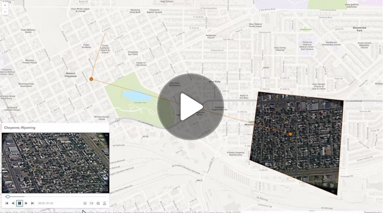](https://mediaspace.esri.com/media/1_ctc3psfr)\n--\n\n### Events\n- **arcgisPropertyChange** - Emitted when the value of a property is changed. Use this to listen to changes to properties.\n- **arcgisReady** - Emitted when the component associated with a map or scene view is is ready to be interacted with.\n- **arcgisVideoReady**\n\n### Methods\n- `componentOnReady(): Promise<void>` - Create a promise that resolves once component is fully loaded.\n- `destroy(): Promise<void>` - Permanently destroy the component.",
"attributes": [
{
"name": "auto-destroy-disabled",
"description": "If true, the component will not be destroyed automatically when it is\ndisconnected from the document. This is useful when you want to move the\ncomponent to a different place on the page, or temporarily hide it. If this\nis set, make sure to call the [destroy](https://developers.arcgis.com/javascript/latest/references/map-components/arcgis-video-player/#destroy) method when you are done to\nprevent memory leaks.",
"values": []
},
{
"name": "following-mode",
"description": "Determines which telemetry elements to follow when the video layer is playing.",
"values": [
{
"name": "follow-both"
},
{
"name": "follow-frame"
},
{
"name": "follow-sensor"
},
{
"name": "none"
}
]
},
{
"name": "hide-header",
"description": "Indicates whether to display the video player's header information.",
"values": []
},
{
"name": "icon",
"description": "Icon which represents the component.\nTypically used when the component is controlled by another component (e.g. by the Expand component).",
"values": []
},
{
"name": "label",
"description": "The component's default label.",
"values": []
},
{
"name": "position",
"values": [
{
"name": "bottom-leading"
},
{
"name": "bottom-left"
},
{
"name": "bottom-right"
},
{
"name": "bottom-trailing"
},
{
"name": "manual"
},
{
"name": "top-leading"
},
{
"name": "top-left"
},
{
"name": "top-right"
},
{
"name": "top-trailing"
}
]
},
{
"name": "reference-element",
"description": "By assigning the `id` attribute of the Map or Scene component to this property, you can position a child component anywhere in the DOM while still maintaining a connection to the Map or Scene.",
"values": []
},
{
"name": "state",
"description": "The current state of the component.",
"values": [
{
"name": "can-play"
},
{
"name": "data-loaded"
},
{
"name": "error"
},
{
"name": "not-ready"
},
{
"name": "paused"
},
{
"name": "playing"
},
{
"name": "ready"
},
{
"name": "waiting"
}
]
}
],
"references": [
{
"name": "Docs",
"url": "https://developers.arcgis.com/javascript/latest/references/map-components/arcgis-video-player/"
}
]
},
{
"name": "arcgis-weather",
"description": "The Weather component allows easy selection and configuration of weather effects in a\n[Scene](https://developers.arcgis.com/javascript/latest/references/map-components/arcgis-scene/) component.\nThe available weather types are:\n[sunny](https://developers.arcgis.com/javascript/latest/api-reference/esri-views-3d-environment-SunnyWeather.html),\n[cloudy](https://developers.arcgis.com/javascript/latest/api-reference/esri-views-3d-environment-CloudyWeather.html),\n[rainy](https://developers.arcgis.com/javascript/latest/api-reference/esri-views-3d-environment-RainyWeather.html),\n[snowy](https://developers.arcgis.com/javascript/latest/api-reference/esri-views-3d-environment-SnowyWeather.html), and\n[foggy](https://developers.arcgis.com/javascript/latest/api-reference/esri-views-3d-environment-FoggyWeather.html).\n\nTo set the weather programmatically, apply the desired weather type to the\n[environment](https://developers.arcgis.com/javascript/latest/references/map-components/arcgis-scene/#environment) property of the Scene component.\n\n```js\n// Access the Scene component.\nconst viewElement = document.querySelector(\"arcgis-scene\");\nawait viewElement.viewOnReady();\n// Specify the weather settings.\nviewElement.environment.weather = {\n type: \"rainy\", // autocasts as new RainyWeather({ cloudCover: 0.7, precipitation: 0.3 })\n cloudCover: 0.7,\n precipitation: 0.3\n};\n```\n\nTo determine if the weather visualization is available, check the boolean value of `viewElement.environment.weatherAvailable`. The weather is only available:\n * in `global` [viewing mode](https://developers.arcgis.com/javascript/latest/references/map-components/arcgis-scene/#viewingMode),\n * when `atmosphereEnabled` property on [environment](https://developers.arcgis.com/javascript/latest/references/map-components/arcgis-scene/#environment) is `true`,\n * at lower altitudes, near the ground.\n\n**Known limitations**\n\nWeather is only supported in a 3D [Scene](https://developers.arcgis.com/javascript/latest/references/map-components/arcgis-scene/) component.\n\n**See also**\n\n- [SunnyWeather](https://developers.arcgis.com/javascript/latest/api-reference/esri-views-3d-environment-SunnyWeather.html)\n- [CloudyWeather](https://developers.arcgis.com/javascript/latest/api-reference/esri-views-3d-environment-CloudyWeather.html)\n- [RainyWeather](https://developers.arcgis.com/javascript/latest/api-reference/esri-views-3d-environment-RainyWeather.html)\n- [SnowyWeather](https://developers.arcgis.com/javascript/latest/api-reference/esri-views-3d-environment-SnowyWeather.html)\n- [FoggyWeather](https://developers.arcgis.com/javascript/latest/api-reference/esri-views-3d-environment-FoggyWeather.html)\n- [Sample - Weather component](https://developers.arcgis.com/javascript/latest/sample-code/weather/)\n--\n\n### Events\n- **arcgisPropertyChange** - Emitted when the value of a property is changed. Use this to listen to changes to properties.\n- **arcgisReady** - Emitted when the component associated with a map or scene view is is ready to be interacted with.\n\n### Methods\n- `componentOnReady(): Promise<void>` - Create a promise that resolves once component is fully loaded.\n- `destroy(): Promise<void>` - Permanently destroy the component.",
"attributes": [
{
"name": "auto-destroy-disabled",
"description": "If true, the component will not be destroyed automatically when it is\ndisconnected from the document. This is useful when you want to move the\ncomponent to a different place on the page, or temporarily hide it. If this\nis set, make sure to call the [destroy](https://developers.arcgis.com/javascript/latest/references/map-components/arcgis-weather/#destroy) method when you are done to\nprevent memory leaks.",
"values": []
},
{
"name": "heading-level",
"description": "Indicates the heading level to use for the title of the component. By default, this message is rendered as a level 4\nheading (e.g. `<h4>Time range</h4>`). Depending on the component's placement in your app, you may need to adjust\nthis heading for proper semantics. This is important for meeting accessibility standards.",
"values": [
{
"name": "1"
},
{
"name": "2"
},
{
"name": "3"
},
{
"name": "4"
},
{
"name": "5"
},
{
"name": "6"
}
]
},
{
"name": "hide-header",
"description": "Whether to hide the component's header.",
"values": []
},
{
"name": "icon",
"description": "Icon which represents the component.\nTypically used when the component is controlled by another component (e.g. by the Expand component).",
"values": []
},
{
"name": "label",
"description": "The component's default label.",
"values": []
},
{
"name": "position",
"values": [
{
"name": "bottom-leading"
},
{
"name": "bottom-left"
},
{
"name": "bottom-right"
},
{
"name": "bottom-trailing"
},
{
"name": "manual"
},
{
"name": "top-leading"
},
{
"name": "top-left"
},
{
"name": "top-right"
},
{
"name": "top-trailing"
}
]
},
{
"name": "reference-element",
"description": "By assigning the `id` attribute of the Map or Scene component to this property, you can position a child component anywhere in the DOM while still maintaining a connection to the Map or Scene.",
"values": []
},
{
"name": "state",
"description": "The current state of the component.",
"values": [
{
"name": "disabled"
},
{
"name": "error"
},
{
"name": "ready"
}
]
}
],
"references": [
{
"name": "Docs",
"url": "https://developers.arcgis.com/javascript/latest/references/map-components/arcgis-weather/"
},
{
"name": "Weather",
"url": "https://developers.arcgis.com/javascript/latest/storybook/map-components/?path=/story/arcgis-weather--demo&singleStory=true"
}
]
},
{
"name": "arcgis-zoom",
"description": "The Zoom component allows users to zoom in/out within a map or scene.\n--\n\n### Events\n- **arcgisPropertyChange** - Emitted when the value of a property is changed. Use this to listen to changes to properties.\n- **arcgisReady** - Emitted when the component associated with a map or scene view is is ready to be interacted with.\n\n### Methods\n- `componentOnReady(): Promise<void>` - Create a promise that resolves once component is fully loaded.\n- `destroy(): Promise<void>` - Permanently destroy the component.\n- `zoomIn(): Promise<void>` - Zooms the view in by an LOD factor of 0.5.\n- `zoomOut(): Promise<void>` - Zooms the view out by an LOD factor of 2.",
"attributes": [
{
"name": "auto-destroy-disabled",
"description": "If true, the component will not be destroyed automatically when it is\ndisconnected from the document. This is useful when you want to move the\ncomponent to a different place on the page, or temporarily hide it. If this\nis set, make sure to call the [destroy](https://developers.arcgis.com/javascript/latest/references/map-components/arcgis-zoom/#destroy) method when you are done to\nprevent memory leaks.",
"values": []
},
{
"name": "icon",
"description": "Icon which represents the component.\nTypically used when the component is controlled by another component (e.g. by the Expand component).",
"values": []
},
{
"name": "label",
"description": "The component's default label.",
"values": []
},
{
"name": "layout",
"description": "Determines the layout/orientation of the Zoom widget.",
"values": [
{
"name": "horizontal"
},
{
"name": "vertical"
}
]
},
{
"name": "position",
"values": [
{
"name": "bottom-leading"
},
{
"name": "bottom-left"
},
{
"name": "bottom-right"
},
{
"name": "bottom-trailing"
},
{
"name": "manual"
},
{
"name": "top-leading"
},
{
"name": "top-left"
},
{
"name": "top-right"
},
{
"name": "top-trailing"
}
]
},
{
"name": "reference-element",
"description": "By assigning the `id` attribute of the Map or Scene component to this property, you can position a child component anywhere in the DOM while still maintaining a connection to the Map or Scene.",
"values": []
},
{
"name": "state",
"description": "The current state of the component.",
"values": [
{
"name": "disabled"
},
{
"name": "ready"
}
]
}
],
"references": [
{
"name": "Docs",
"url": "https://developers.arcgis.com/javascript/latest/references/map-components/arcgis-zoom/"
},
{
"name": "Zoom",
"url": "https://developers.arcgis.com/javascript/latest/storybook/map-components/?path=/story/arcgis-zoom--demo&singleStory=true"
}
]
}
]
}