@arcgis/core
Version:
ArcGIS Maps SDK for JavaScript: A complete 2D and 3D mapping and data visualization API
637 lines (633 loc) • 28.3 kB
TypeScript
import type Widget from "./Widget.js";
import type ValuePickerCollection from "./ValuePicker/ValuePickerCollection.js";
import type ValuePickerCombobox from "./ValuePicker/ValuePickerCombobox.js";
import type ValuePickerLabel from "./ValuePicker/ValuePickerLabel.js";
import type ValuePickerSlider from "./ValuePicker/ValuePickerSlider.js";
import type ValuePickerVisibleElements from "./ValuePicker/ValuePickerVisibleElements.js";
import type { Icon } from "@esri/calcite-components/components/calcite-icon";
import type { Layout, ValuePickerViewModelEvents } from "./ValuePicker/types.js";
import type { ValuePickerSliderProperties } from "./ValuePicker/ValuePickerSlider.js";
import type { ValuePickerLabelProperties } from "./ValuePicker/ValuePickerLabel.js";
import type { ValuePickerComboboxProperties } from "./ValuePicker/ValuePickerCombobox.js";
import type { ValuePickerCollectionProperties } from "./ValuePicker/ValuePickerCollection.js";
import type { ValuePickerVisibleElementsProperties } from "./ValuePicker/ValuePickerVisibleElements.js";
import type { WidgetProperties } from "./Widget.js";
export interface ValuePickerProperties extends WidgetProperties, Partial<Pick<ValuePicker, "caption" | "disabled" | "layout" | "loop" | "playRate" | "values">> {
/**
* An optional component for presenting and managing data. This property can be assigned one of the following:
* [ValuePickerCollection](https://developers.arcgis.com/javascript/latest/references/core/widgets/ValuePicker/ValuePickerCollection/)
* [ValuePickerCombobox](https://developers.arcgis.com/javascript/latest/references/core/widgets/ValuePicker/ValuePickerCombobox/),
* [ValuePickerLabel](https://developers.arcgis.com/javascript/latest/references/core/widgets/ValuePicker/ValuePickerLabel/), or
* [ValuePickerSlider](https://developers.arcgis.com/javascript/latest/references/core/widgets/ValuePicker/ValuePickerSlider/).
*
* If this property is not set then the play, next and previous buttons will always be enabled. In this case, listen to the
* widget events, for example, [@previous](https://developers.arcgis.com/javascript/latest/references/core/widgets/ValuePicker/#event-previous) and [@next](https://developers.arcgis.com/javascript/latest/references/core/widgets/ValuePicker/#event-next), when the user interacts with the
* widget.
*
* @example
* // Add a ValuePicker with a slider ranging from 0 to 10.
* const steps = [0, 1, 2, 3, 4, 5, 6, 7, 8, 9, 10];
* const valuePicker = new ValuePicker({
* component: {
* type: "slider",
* min: 0,
* max: 10,
* steps,
* labels: steps,
* labelFormatFunction: (value) => `${value} km`
* },
* values: [0]
* });
*/
component?: ((ValuePickerCollectionProperties & { type: "collection" }) | (ValuePickerComboboxProperties & { type: "combobox" }) | (ValuePickerLabelProperties & { type: "label" }) | (ValuePickerSliderProperties & { type: "slider" })) | null;
/**
* Icon which represents the widget. It is typically used when the widget is controlled by another
* one (e.g. in the Expand widget).
*
* @default "list-rectangle"
* @since 4.27
* @see [Calcite Icon Search](https://developers.arcgis.com/calcite-design-system/icons/)
* @see [Calcite Icon Search](https://developers.arcgis.com/calcite-design-system/icons/)
*/
icon?: Icon["icon"] | null;
/**
* This property provides the ability to display or hide the individual elements of the widget.
*
* @example
* // Create a ValuePicker widget with a slider and the Play button hidden.
* const valuePicker = new ValuePicker({
* layout: "horizontal",
* component: {
* type: "slider",
* min: 0,
* max: 100
* },
* visibleElements: {
* nextButton: true,
* playButton: false,
* previousButton: true
* }
* };
*/
visibleElements?: ValuePickerVisibleElementsProperties;
}
/**
* An optional component for presenting and managing data.
*
* @see [component](https://developers.arcgis.com/javascript/latest/references/core/widgets/ValuePicker/#component)
*/
export type ValuePickerComponent = ValuePickerCollection | ValuePickerCombobox | ValuePickerLabel | ValuePickerSlider;
export interface ValuePickerEvents extends ValuePickerViewModelEvents {}
/**
* * [Configuring ValuePicker](https://developers.arcgis.com/javascript/latest/references/core/widgets/ValuePicker/#configuration)
* * [Configuring ValuePicker without data](https://developers.arcgis.com/javascript/latest/references/core/widgets/ValuePicker/#nodata)
* * [Using the label component to present items](https://developers.arcgis.com/javascript/latest/references/core/widgets/ValuePicker/#from-labels)
* * [Using an arbitrary collection component to present predefined list](https://developers.arcgis.com/javascript/latest/references/core/widgets/ValuePicker/#from-collection)
* * [Using the combobox component to present selectable items](https://developers.arcgis.com/javascript/latest/references/core/widgets/ValuePicker/#selectable-items)
* * [Using the slider component to navigate numeric values](https://developers.arcgis.com/javascript/latest/references/core/widgets/ValuePicker/#numeric-values)
* * [ValuePicker orientation](https://developers.arcgis.com/javascript/latest/references/core/widgets/ValuePicker/#orientation)
*
* ValuePicker is a widget that allows users to step or play through a list of values. ValuePicker widget can be configured
* with an optional [collection](https://developers.arcgis.com/javascript/latest/references/core/widgets/ValuePicker/#from-collection), [label](https://developers.arcgis.com/javascript/latest/references/core/widgets/ValuePicker/#from-labels), [combobox](https://developers.arcgis.com/javascript/latest/references/core/widgets/ValuePicker/#selectable-items) or [slider](https://developers.arcgis.com/javascript/latest/references/core/widgets/ValuePicker/#numeric-values)
* control to help users navigate values.
*
* Similar to a media player, values can be interactively stepped through using the `next` and `previous` buttons.
* ValuePicker can also be set to automatically progress (play) through an ordered
* list of items at a [preset interval](https://developers.arcgis.com/javascript/latest/references/core/widgets/ValuePicker/#playRate).
*
* <span id="configuration"></span>
* ### Configuring ValuePicker
*
* ValuePicker can be configured in variety of ways, depending on your use case.
* The following are the five possible configurations of the ValuePicker widget.
*
* <span id="nodata"></span>
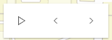
* #### 1. Configuring ValuePicker without data
*
* It is important to note that the ValuePicker widget is not associated with a [View](https://developers.arcgis.com/javascript/latest/references/core/views/View/) nor does it
* necessarily require data. In the example below, the ValuePicker is added to the view's
* `ui` property without any assigned data.
*
* 
*
* ```js
* const valuePicker = new ValuePicker();
* view.ui.add(valuePicker, "top-right");
* ```
*
* Since the widget is not associated with any data, it is necessary to listen and respond to widget events generated by
* the widget. This could be useful when data is not static like positional changes for bus features currently in service, for example.
*
* ```js
* valuePicker.on("play", () => { console.log("user clicks play"); })
* valuePicker.on("pause", () => { console.log("user clicks pause"); })
* valuePicker.on("previous", () => { console.log("user clicks previous"); })
* valuePicker.on("next", () => { console.log("user clicks next"); })
* ```
*
* <span id="nodata"></span>
* #### 2. Using the label component to present items
*
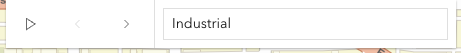
* Consider using the [label component](https://developers.arcgis.com/javascript/latest/references/core/widgets/ValuePicker/ValuePickerLabel/) to step through a fixed list of predefined values like land use zones.
* In the following snippet a ValuePicker is added to the View UI containing three coded land use zones.
*
* 
*
* ```js
* const labelComponent = {
* type: "label",
* items: [
* { value: "ind", label: "Industrial" },
* { value: "res", label: "Residential" },
* { value: "com", label: "Commercial" }
* ]
* };
*
* const valuePicker = new ValuePicker({
* component: labelComponent,
* values: ["ind"]
* });
* view.ui.add(valuePicker, "top-right");
* ```
*
* The user's interaction can be handled by monitoring the [values](https://developers.arcgis.com/javascript/latest/references/core/widgets/ValuePicker/#values) property.
*
* ```js
* reactiveUtils.watch(
* () => valuePicker.values,
* (values) => console.log(`The land use zone code is: ${values[0]}`)
* );
* ```
*
* <span id="from-collection"></span>
* #### 3. Using an arbitrary collection component to present predefined list
*
* It may be required to step through a fixed collection of items like [extents](https://developers.arcgis.com/javascript/latest/references/core/geometry/Extent/),
* [bookmarks](https://developers.arcgis.com/javascript/latest/references/core/webmap/Bookmark/), or [basemaps](https://developers.arcgis.com/javascript/latest/references/core/Basemap/). If only the `play`,
* `next` and `previous` buttons are required then the collection component may be used. The [collection component](https://developers.arcgis.com/javascript/latest/references/core/widgets/ValuePicker/ValuePickerCollection/)
* consists of the same user interface as option 1 above with the distinction that the current item is accessible and
* tracked.
*
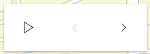
* In the following example, a ValuePicker is created and added with a collection of three items. ValuePicker is
* initialized with starting value of "hybrid". Since "hybrid" is the first item in the collection only the _next_
* button will be enabled.
*
* 
*
* ```js
* const valuePicker = new ValuePicker({
* component: { // autocasts ValuePickerCollection when type is "collection".
* type: "collection",
* collection: ["hybrid", "oceans", "osm"]
* },
* values: ["hybrid"]
* });
* view.ui.add(valuePicker, "top-right");
* ```
*
* As the user clicks the _next_, _previous_, and _play_ buttons the [values](https://developers.arcgis.com/javascript/latest/references/core/widgets/ValuePicker/#values) property will update. This
* property can be monitored as demonstrated below.
*
* ```js
* reactiveUtils.watch(
* () => valuePicker.values,
* (values) => console.log(`The current basemap is: ${values[0]}`)
* );
* ```
*
* <span id="selectable-items"></span>
* #### 4. Using the combobox component to present selectable items
*
* Consider using the [combobox component](https://developers.arcgis.com/javascript/latest/references/core/widgets/ValuePicker/ValuePickerCombobox/) when a searchable
* dropdown list is required. In the following snippet the ValuePicker widget is added to the View UI containing three coded land use zones.
*
* <img src="https://developers.arcgis.com/javascript/latest/assets/references/core/widgets/valuepicker/option-combobox.png" height="300 !important" width="200 !important">
*
* ```js
* const valuePicker = new ValuePicker({
* component: { // autocasts ValuePickerCombobox when type is "combobox".
* type: "combobox",
* placeholder: "Pick Zoning Type",
* items: [
* { value: "ind", label: "Industrial" },
* { value: "res", label: "Residential" },
* { value: "com", label: "Commercial" }
* ]
* },
* values: ["res"]
* });
* view.ui.add(valuePicker, "top-right");
* ```
*
* As demonstrated in option 3 above, the user's interaction can be handled by monitoring the [values](https://developers.arcgis.com/javascript/latest/references/core/widgets/ValuePicker/#values) property.
*
* ```js
* reactiveUtils.watch(
* () => valuePicker.values,
* (values) => console.log(`The land use zone code is: ${values[0]}`)
* );
* ```
*
* <span id="numeric-values"></span>
* #### 5. Using the slider component to navigate numeric values
*
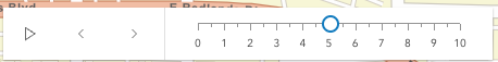
* The [slider component](https://developers.arcgis.com/javascript/latest/references/core/widgets/ValuePicker/ValuePickerSlider/), as the name suggests, appends a slider to end
* of the ValuePicker widget. The slider is ideal
* for users that need to select a value within a fixed numeric range. For example, the snippet below presents a
* ValuePicker with a slider for picking a layer's opacity. The starting value is 50%.
*
* 
*
* ```js
* const valuePicker = new ValuePicker({
* component: { // autocasts ValuePickerSlider when type is "slider".
* type: "slider",
* min: 0, // Start value
* max: 100, // End value
* steps: [0, 10, 20, 30, 40, 50, 60, 70, 80, 90, 100], // Thumb snapping locations
* minorTicks: [5, 15, 25, 35, 45, 55, 65, 75, 85, 95], // Short tick lines
* majorTicks: [0, 10, 20, 30, 40, 50, 60, 70, 80, 90, 100], // Long tick lines
* labels: [0, 20, 40, 60, 80, 100], // Long ticks with text
* labelFormatFunction: (value) => `${value}%` // Label definition
* },
* values: [50] // "current value"
* });
* view.ui.add(valuePicker, "top-right");
* ```
*
* Note that [ValuePickerSlider.steps](https://developers.arcgis.com/javascript/latest/references/core/widgets/ValuePicker/ValuePickerSlider/#steps) (positions the slider thumb snaps
* to), [ValuePickerSlider.minorTicks](https://developers.arcgis.com/javascript/latest/references/core/widgets/ValuePicker/ValuePickerSlider/#minorTicks),
* [ValuePickerSlider.majorTicks](https://developers.arcgis.com/javascript/latest/references/core/widgets/ValuePicker/ValuePickerSlider/#majorTicks) and
* [ValuePickerSlider.labels](https://developers.arcgis.com/javascript/latest/references/core/widgets/ValuePicker/ValuePickerSlider/#labels) are independent of each other and optional.
*
* The following code will watch for changes and apply the user's modification to a feature layer.
* ```js
* reactiveUtils.watch(
* () => valuePicker.values,
* (values) => {
* featureLayer.opacity = values[0] / 100;
* }
* );
* ```
*
* <span id="orientation"></span>
* ### ValuePicker Orientation
*
* By default ValuePicker is oriented horizontally. ValuePicker (with the exception of combobox and label components) can be oriented
* vertically. The following snippet demonstrates how to orient a collection based ValuePicker vertically.
*
* ```js
* const valuePicker2 = new ValuePicker({
* layout: "vertical", // default is "horizontal"
* component: {
* type: "collection",
* collection: ["hybrid", "oceans", "osm"]
* },
* values: ["hybrid"] // Set the initial value to "hybrid"
* });
* ```
*
* @deprecated since version 5.0. Use the [Value Picker (Legacy) component](https://developers.arcgis.com/javascript/latest/references/map-components/components/arcgis-value-picker-legacy/) instead. For information on widget deprecation, read about [Esri's move to web components](https://developers.arcgis.com/javascript/latest/components-transition-plan/).
* @since 4.27
* @see [ValuePickerCollection](https://developers.arcgis.com/javascript/latest/references/core/widgets/ValuePicker/ValuePickerCollection/)
* @see [ValuePickerCombobox](https://developers.arcgis.com/javascript/latest/references/core/widgets/ValuePicker/ValuePickerCombobox/)
* @see [ValuePickerLabel](https://developers.arcgis.com/javascript/latest/references/core/widgets/ValuePicker/ValuePickerLabel/)
* @see [ValuePickerSlider](https://developers.arcgis.com/javascript/latest/references/core/widgets/ValuePicker/ValuePickerSlider/)
* @see [Slider](https://developers.arcgis.com/javascript/latest/references/core/widgets/Slider/)
*/
export default class ValuePicker extends Widget<ValuePickerProperties> {
/**
* @deprecated
* Do not directly reference this property.
* Use EventNames and EventTypes helpers from \@arcgis/core/Evented
*/
"@eventTypes": ValuePickerEvents;
constructor(properties?: ValuePickerProperties);
/**
* Returns `true` if the ValuePicker can be advanced to the next position.
*
* @example
* // Create a new ValuePicker and then test if canNext is true before advancing.
* const valuePicker = new ValuePicker({
* values: ["hybrid"],
* component: {
* type: "collection",
* collection: ["hybrid", "oceans", "osm"]
* }
* });
*
* if (valuePicker.canNext) {
* valuePicker.next();
* } else {
* console.log("Already at the end of the collection. Please press the 'previous' button instead.");
* }
*/
get canNext(): boolean;
/**
* Returns `true` if the ValuePicker can be played.
*
* @example
* // Create a new ValuePicker and then check canPlay before playing.
* const valuePicker = new ValuePicker({
* values: ["hybrid"],
* component: {
* type: "collection",
* collection: ["hybrid", "oceans", "osm"]
* }
* });
*
* if (valuePicker.canPlay) {
* valuePicker.play();
* } else {
* console.log("Cannot play this collection.");
* }
*/
get canPlay(): boolean;
/**
* Returns `true` if the ValuePicker can moved to the previous item.
*
* @example
* // Create a new ValuePicker and then test if canPrevious is true before selecting the preceding item.
* const valuePicker = new ValuePicker({
* values: ["hybrid"],
* component: {
* type: "collection",
* collection: ["hybrid", "oceans", "osm"]
* }
* });
*
* if (valuePicker.canPrevious) {
* valuePicker.previous();
* } else {
* console.log("Already at the beginning of the collection. Please press the 'next' button instead.");
* }
*/
get canPrevious(): boolean;
/**
* An optional caption that appears on the ValuePicker widget to give context for the user. This is particularly
* useful when an application is using more than one ValuePicker widget.
*
* @example
* // Disable the ValuePicker when the user picks "shutdown".
* const valuePicker = new ValuePicker({
* component: new ValuePickerCombobox({
* collection: ["Newton", "Einstein"]
* },
* caption: "Scientist"
* });
*/
accessor caption: string | null | undefined;
/**
* An optional component for presenting and managing data. This property can be assigned one of the following:
* [ValuePickerCollection](https://developers.arcgis.com/javascript/latest/references/core/widgets/ValuePicker/ValuePickerCollection/)
* [ValuePickerCombobox](https://developers.arcgis.com/javascript/latest/references/core/widgets/ValuePicker/ValuePickerCombobox/),
* [ValuePickerLabel](https://developers.arcgis.com/javascript/latest/references/core/widgets/ValuePicker/ValuePickerLabel/), or
* [ValuePickerSlider](https://developers.arcgis.com/javascript/latest/references/core/widgets/ValuePicker/ValuePickerSlider/).
*
* If this property is not set then the play, next and previous buttons will always be enabled. In this case, listen to the
* widget events, for example, [@previous](https://developers.arcgis.com/javascript/latest/references/core/widgets/ValuePicker/#event-previous) and [@next](https://developers.arcgis.com/javascript/latest/references/core/widgets/ValuePicker/#event-next), when the user interacts with the
* widget.
*
* @example
* // Add a ValuePicker with a slider ranging from 0 to 10.
* const steps = [0, 1, 2, 3, 4, 5, 6, 7, 8, 9, 10];
* const valuePicker = new ValuePicker({
* component: {
* type: "slider",
* min: 0,
* max: 10,
* steps,
* labels: steps,
* labelFormatFunction: (value) => `${value} km`
* },
* values: [0]
* });
*/
get component(): ValuePickerComponent | null | undefined;
set component(value: ((ValuePickerCollectionProperties & { type: "collection" }) | (ValuePickerComboboxProperties & { type: "combobox" }) | (ValuePickerLabelProperties & { type: "label" }) | (ValuePickerSliderProperties & { type: "slider" })) | null | undefined);
/**
* When `true`, sets the widget to a disabled state so the user cannot interact with it.
*
* @default false
* @example
* // Disable the ValuePicker when the user picks "shutdown".
* const valuePicker = new ValuePicker({
* component: new ValuePickerCombobox({
* collection: ["activate", "shutdown"]
* },
* values: ["activate"]
* });
*
* reactiveUtils.when(
* () => valuePicker.values?.[0] === "shutdown",
* () => {
* valuePicker.disabled = true;
* }
* );
*/
accessor disabled: boolean;
/**
* Icon which represents the widget. It is typically used when the widget is controlled by another
* one (e.g. in the Expand widget).
*
* @default "list-rectangle"
* @since 4.27
* @see [Calcite Icon Search](https://developers.arcgis.com/calcite-design-system/icons/)
* @see [Calcite Icon Search](https://developers.arcgis.com/calcite-design-system/icons/)
*/
get icon(): Icon["icon"];
set icon(value: Icon["icon"] | null | undefined);
/**
* Indicates if the widget should be orientated horizontally (default) or vertically.
*
* Please note that [ValuePickerCombobox](https://developers.arcgis.com/javascript/latest/references/core/widgets/ValuePicker/ValuePickerCombobox/) and
* [ValuePickerLabel](https://developers.arcgis.com/javascript/latest/references/core/widgets/ValuePicker/ValuePickerLabel/) do not support vertical layout.
*
* @default "horizontal"
* @example
* // Display a ValuePicker vertically with a slider component.
* const valuePicker = new ValuePicker({
* component: new ValuePickerSlider({
* min: 0,
* max: 10
* },
* values: [0],
* layout: "vertical"
* });
*/
accessor layout: Layout;
/**
* If true, playback will restart when it reaches the end.
*
* @default false
* @example
* // Add a ValuePicker with looping enabled and start playing.
* const valuePicker = new ValuePicker({
* component: new ValuePickerSlider({
* min: 0,
* max: 10
* },
* values: [0],
* loop: true
* });
* valuePicker.play();
*/
accessor loop: boolean;
/**
* The pause, in milliseconds between playback advancement.
*
* @default 1000
* @example
* // Add a playing ValuePicker that only passes 100 milliseconds at each step.
* // The slider's thumb will start at 0 and move to 10 in exactly one second.
* const steps = [0, 1, 2, 3, 4, 5, 6, 7, 8, 9, 10];
* const valuePicker = new ValuePicker({
* component: new ValuePickerSlider({
* min: 0,
* max: 10,
* steps
* },
* values: [0],
* playRate: 100
* });
* valuePicker.play();
*/
accessor playRate: number;
/**
* The current value of the ValuePicker. The type for this property depends on which [component](https://developers.arcgis.com/javascript/latest/references/core/widgets/ValuePicker/#component) is being used. For example, a
* [slider](https://developers.arcgis.com/javascript/latest/references/core/widgets/ValuePicker/ValuePickerSlider/) component will return an array of numbers.
*
* If the `component` is not set then this property will return `null`. Similarly this property can be `null`
* if the widget is created without an initial value.
*
* Once a `component` and an initial value has been assigned this property will return an array
* containing a value.
*
* @see [ValuePickerCollection.collection](https://developers.arcgis.com/javascript/latest/references/core/widgets/ValuePicker/ValuePickerCollection/#collection)
* @see [ValuePickerCombobox.items](https://developers.arcgis.com/javascript/latest/references/core/widgets/ValuePicker/ValuePickerCombobox/#items)
* @see [ValuePickerLabel.items](https://developers.arcgis.com/javascript/latest/references/core/widgets/ValuePicker/ValuePickerLabel/#items)
* @example
* reactiveUtils.watch(
* () => valuePicker.values,
* (v) => updateRenderer("StdZ", v[0])
* );
*
* function updateRenderer(dimensionName, sliderData) {
* const dimInfo = [];
*
* dimInfo.push(
* new DimensionalDefinition({
* dimensionName: "StdZ",
* values: [sliderData]
* })
* );
*
* // TIME: only show temperatures for the week of April 7, 2014
* dimInfo.push(
* new DimensionalDefinition({
* dimensionName: "StdTime", // time temp was recorded
* values: [1396828800000], // Week of April 7, 2014
* })
* );
*
* const mosaicRule = new MosaicRule({
* multidimensionalDefinition: dimInfo
* });
* layer.mosaicRule = mosaicRule;
* }
*/
accessor values: null | undefined | [
any
];
/**
* This property provides the ability to display or hide the individual elements of the widget.
*
* @example
* // Create a ValuePicker widget with a slider and the Play button hidden.
* const valuePicker = new ValuePicker({
* layout: "horizontal",
* component: {
* type: "slider",
* min: 0,
* max: 100
* },
* visibleElements: {
* nextButton: true,
* playButton: false,
* previousButton: true
* }
* };
*/
get visibleElements(): ValuePickerVisibleElements;
set visibleElements(value: ValuePickerVisibleElementsProperties);
/**
* Select the next value or advance to next.
*
* @example
* // Create a ValuePicker widget with a slider and the Play button hidden.
* const valuePicker = new ValuePicker({
* component: {
* type: "slider",
* min: 0,
* max: 3,
* steps: [0, 1, 2, 3]
* labels: [0, 1, 2, 3]
* },
* values: [0]
* };
* console.log(`current value: ${valuePicker.values[0]}`); // "current value: 0"
*
* valuePicker.next();
* console.log(`current value: ${valuePicker.values[0]}`); // "current value: 1"
*/
next(): void;
/** Pause playing. */
pause(): void;
/**
* Start playing. ValuePicker will advance at the rate specified by [playRate](https://developers.arcgis.com/javascript/latest/references/core/widgets/ValuePicker/#playRate).
*
* @example
* // Add a playing ValuePicker widget that is continuously looping.
* const valuePicker = new ValuePicker({
* component: {
* type: "slider",
* min: 0,
* max: 3,
* steps: [0, 1, 2, 3]
* labels: [0, 1, 2, 3]
* },
* loop: true,
* values: [0]
* };
*
* reactiveUtils.watch(
* () => valuePicker.values,
* (values) => console.log(`current value: ${values[0]}`)
* );
*
* valuePicker.play();
* // output: 1, 2, 3, 0, 1, 2, 3, 0...
*/
play(): void;
/**
* Select the previous value.
*
* @example
* // Create a ValuePicker widget with a slider and the Play button hidden.
* const valuePicker = new ValuePicker({
* component: {
* type: "slider",
* min: 0,
* max: 3,
* steps: [0, 1, 2, 3]
* labels: [0, 1, 2, 3]
* },
* values: [3]
* };
* console.log(`current value: ${valuePicker.values[0]}`); // "current value: 3"
*
* valuePicker.previous();
* console.log(`current value: ${valuePicker.values[0]}`); // "current value: 2"
*/
previous(): void;
}