@arcgis/core
Version:
ArcGIS Maps SDK for JavaScript: A complete 2D and 3D mapping and data visualization API
86 lines (84 loc) • 3.53 kB
TypeScript
import type Accessor from "../../core/Accessor.js";
/** @since 5.0 */
export interface FeaturesVisibleElementsProperties extends Partial<Pick<FeaturesVisibleElements, "actionBar" | "closeButton" | "collapseButton" | "featureListLayerTitle" | "featureMenuHeading" | "featureNavigation" | "flow" | "heading" | "spinner">> {}
/**
* The visible elements that are displayed within the widget.
* This provides the ability to turn individual elements of the widget's display on/off.
* Disabling all `visibleElements` on the Features widget allows the look and feel of the [Feature](https://developers.arcgis.com/javascript/latest/references/core/widgets/Feature/) widget, while supporting related record browsing and clustering.
*
* 
*
* @deprecated since 5.0, use the [Features](https://developers.arcgis.com/javascript/latest/references/map-components/components/arcgis-features) component instead.
* @since 5.0
*/
export default class FeaturesVisibleElements extends Accessor {
constructor(properties?: FeaturesVisibleElementsProperties);
/**
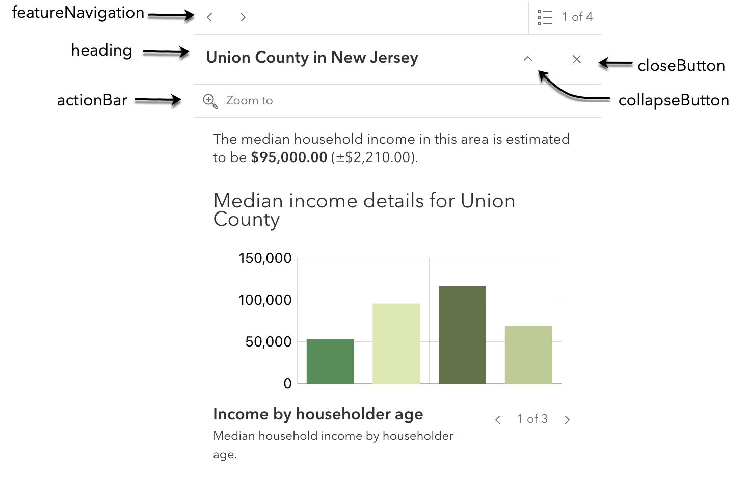
* Indicates whether to display the action bar that holds the feature's [FeaturesViewModel.actions](https://developers.arcgis.com/javascript/latest/references/core/widgets/Features/FeaturesViewModel/#actions) will be displayed.
*
* @default true
* @since 5.0
*/
accessor actionBar: boolean;
/**
* Indicates whether to display a close button on the widget dialog.
*
* @default true
* @since 5.0
*/
accessor closeButton: boolean;
/**
* Indicates whether to display the collapse button on the widget dialog.
*
* @default false
* @since 5.0
*/
accessor collapseButton: boolean;
/**
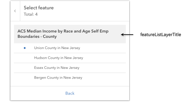
* Indicates whether to display the group heading for a list of multiple features.
*
* 
*
* @default true
* @since 5.0
*/
accessor featureListLayerTitle: boolean;
/**
* Indicates whether to display a heading and description on the widget feature menu list.
*
* @default true
* @since 5.0
*/
accessor featureMenuHeading: boolean;
/**
* Indicates whether pagination for feature navigation will be displayed. This allows the user to scroll through various [selected features](https://developers.arcgis.com/javascript/latest/references/core/widgets/Features/#features) using pagination arrows.
*
* @default true
* @since 5.0
*/
accessor featureNavigation: boolean;
/**
* Determines whether the widget should be shown within its built-in [flow component](https://developers.arcgis.com/calcite-design-system/components/flow/) or if the flow component should be excluded.
* The widget will be displayed within its original flow component if set to `true`.
* The flow component will be omitted from the widget if set to `false`.
* To place the widget into an existing Calcite flow component, set this property to `false`.
*
* @default true
* @since 5.0
*/
accessor flow: boolean;
/**
* Indicates whether to display the widget heading.
*
* @default true
* @since 5.0
*/
accessor heading: boolean;
/**
* Indicates whether to display the widget's loading spinner.
*
* @default true
* @since 5.0
*/
accessor spinner: boolean;
}